Simplifying an Audio App Design — UI UX Case study
Disclaimer
Radio Rajkot reach out to me via my father and asked if I can help them design a radio application for a community in Rajkot, and obviously, I said yes!
About Radio Rajkot
Radio Rajkot is a community based organization which aims to provide a platform for the young and emerging talent of the city, promoting their skills and abilities. The platform provides live radio, recorded podcasts, and condensed news broadcasts.
This radio channel is relatively new, and they use a third-party application called ATC Labs to publish their audio. However, they want to replace it with a custom app.
In this case study, my main focus will be on the app’s main pages and the UX decisions behind them.
Alright, let’s dive right into the case study!
Understanding the requirement
In order for the app to be used by a large number of people from the general public of Rajkot, it is important to design it in a simple and user-friendly manner.
Here are some functional requirements that the organization wants to include in the app:
Radio: The primary function of the Radio Rajkot app is to provide a seamless and intuitive radio listening experience for users. The app should allow users to access live radio streams, enabling them to tune in to Radio Rajkot’s broadcasts from anywhere. Key features to consider for the radio functionality include: Playback Controls, Favorites and History of events
Podcast: Recognizing the growing popularity of podcasts, Radio Rajkot aims to incorporate a dedicated section within the app for podcast streaming.
News: To keep users informed about local news, the Radio Rajkot app should include a news section.
Events and Contest: Engaging users through events and contests can help create a sense of community and increase app usage.
Design process and challenges
During the design and development process of the Radio Rajkot app, several challenges were encountered.
One of the major challenges was the need for quick delivery. Balancing the desire for a swift launch with the need for thorough testing and refinement posed a significant challenge.
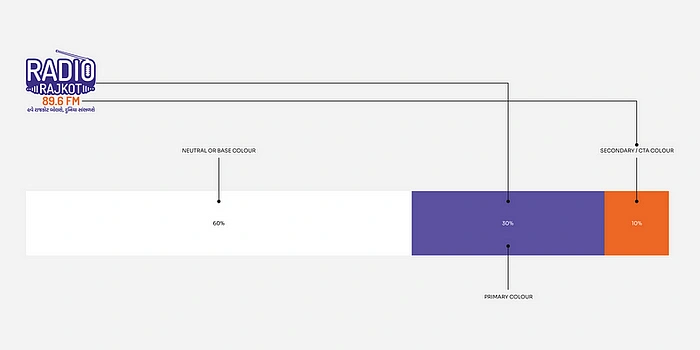
Color palette for the app
Additionally, decisions regarding color palettes and fonts presented another challenge. I wanted the app to feel simple and easy to use. So I chose to keep the app minimal and utilized the 60–30–10 color rule.
Okay now let’s dive into individual pages of the app.
Onboarding
Before we begin to write design the onboarding experience and keeping in mind of our target audience in mind is important.
Assuming that general public is not that well versed with English language, how would the app onboard the users?
Now this had two options:
The traditional approach of introducing the features and then asking for their details, but in the regional language.
Keeping the language as simple as possible and onboarding the user with just mobile number and OTP.
I chose the second approach
Here’s a quick flow of how the user will be onboarded.
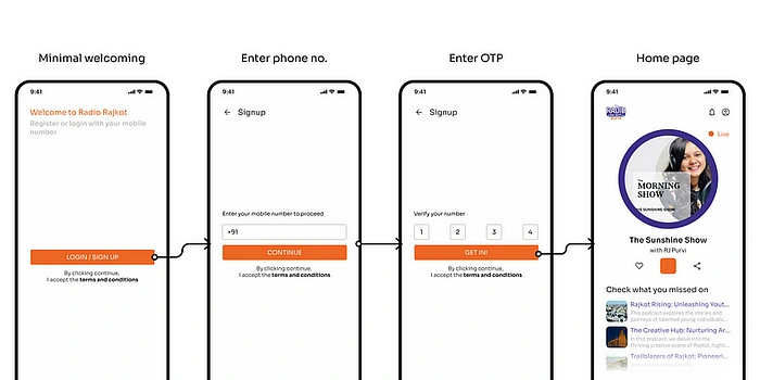
Quick and easy to onboard
To ensure a seamless and hassle-free onboarding experience I later added the feature to change the language for better communication better the app and user.
Home page
Diving into the home page, my foremost goal was to create a visually appealing and user-friendly home page that would captivate users from the moment they opened the app.
With a focus on the target audience, I carefully crafted the design to ensure a seamless and immersive experience.
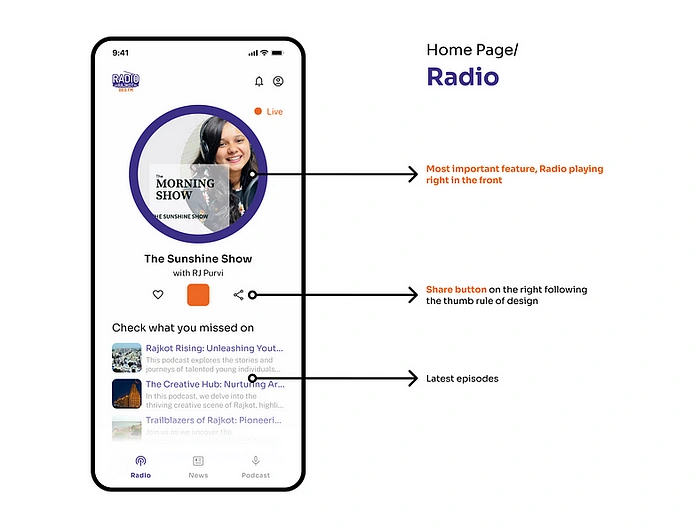
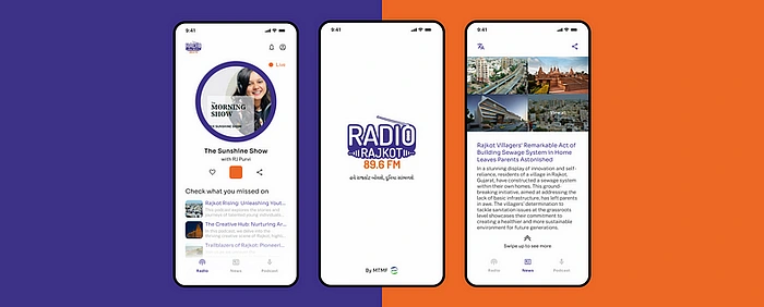
Radio Rajkot Home Page: Radio
Upon opening the app, I wanted users to feel instantly connected to the content that mattered most to them. To achieve this, I made the deliberate decision to streamline the navigation bar.
How?
By showcasing only the three primary tabs — Radio, News, and Podcasts — I created a clutter-free interface that enabled users to access the core features effortlessly.
Recognizing the significance of screen real estate, I strategically placed the user’s profile at the top right corner of the interface.
Why?
To not declutter the navigation bar, now this adjustment not only optimized space in the navigation bar but also provided users with quick and convenient access to their personal settings and preferences.
News
Moving to the next part of the app, the News page.
There were 2 main objectives with the news tab:
Provide users with a concise and immersive reading experience
Present news articles in a short and crisp format, typically within 100 words, allowing users to quickly catch up on the latest updates without feeling overwhelmed.
To facilitate seamless browsing and ensure an engaging reading experience, I incorporated scrollable news pages.
Why swipe through?
Because, well, why not? The trend these days seems to be endless swiping anyway! 😂
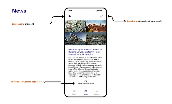
Radio Rajkot News page
Anyways, this feature enabled users to effortlessly swipe through a series of news articles, allowing them to consume bite-sized information and stay informed at their convenience.
Podcast
For the podcast I kept it simple and easy and just included what was required for users.
Name of the Podcast: The podcast title was prominently displayed, grabbing users’ attention and immediately conveying the essence of the podcast.
Date of Launch: To provide users with an understanding of the podcast’s timeline and relevance, the launch date was included.
Description: A brief but compelling description to enable users quickly assess whether the podcast aligned with their interests.
Call-to-Action (CTA): To encourage engagement and action, a clear call-to-action was included for each podcast entry.
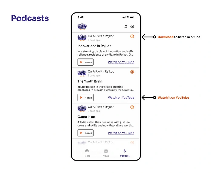
Radio Rajkot Podcasts
Client also wanted to include the YouTube link of the video of podcast, so I placed it as a tertiary button on the right which will help in:
Easy to reach
Cross platform promotion
More revenue
Let’s wind it up
So yeah, this was my entire process on designing the app. I hope that this article has provided you with valuable insights and proven to be a helpful resource. If you have any feedback or thoughts to share, please don’t hesitate to reach out. This project is under development by flutter developers having the app, both on android as well as iOS.
See you in the next one.
Keep designing experiences✌🏼
PS: Did you just figure out today that by pressing and holding the clap button for a short while, you can give a burst of 50 claps all at once? Mind blown!
Like this project
Posted Sep 9, 2023
Radio Rajkot reach out to me via my father and asked if I can help them design a radio application for a community in Rajkot, and obviously, I said yes! Radio …
Likes
0
Views
9

