Creaitivity
Duration: End of July - September 2021 (5 weeks)
📝 Background
Creaitivity is a student-run nonprofit organization that aims to provide resources and spread awareness about the field of artificial intelligence and its role in developing creative solutions to current issues. As the organization's new Chief Creative Officer, I led the rebrand and redesign project to refresh its identity.
I (virtually) met with the previous and new leadership to discuss our mission and how we wanted to reposition the organization moving forward before beginning the redesign process. I had prior experience using Wix for website development and Adobe Illustrator for logo creation, however, I wanted to better plan out the layout and contents of the website so I challenged myself by using Figma for the first time.
🤖 Branding
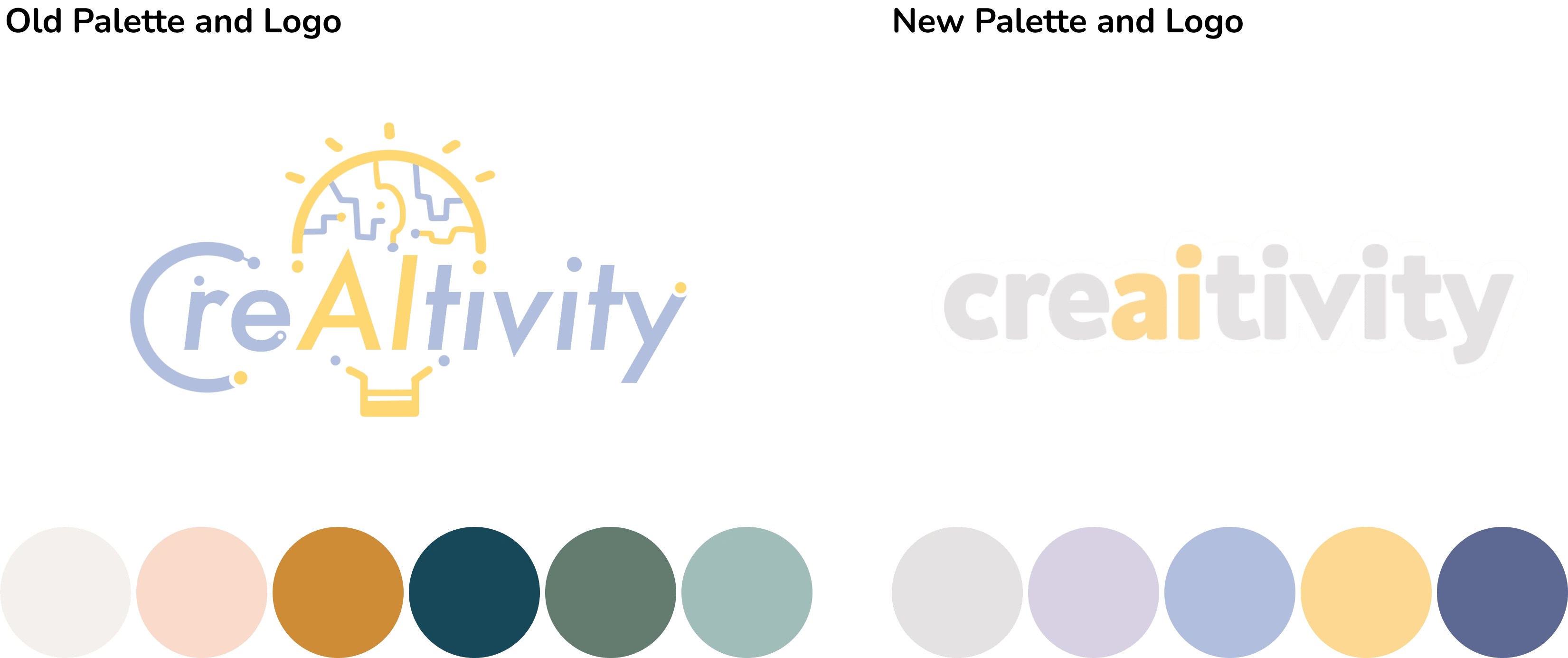
First, we began by identifying Creaitivity's personality. We wanted to have a welcoming, playful, and friendly feel, as that was what we imagine upon hearing the word "creativity" (as the name is pronounced). A color palette had already been established before, but the colors didn't reflect the personality we envisioned for the organization. To retain some of Creaitivity's past branding, I decided to use a few similar colors from the old logo so that it could still be recognizable even after the rebrand.
Due to usability issues with the old logo, we decided to simplify the new logo but kept an element of the original design.
🎨 Design
Old Design
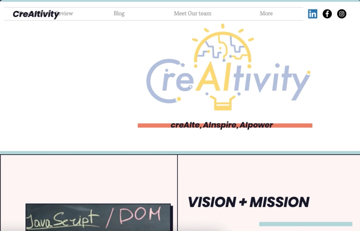
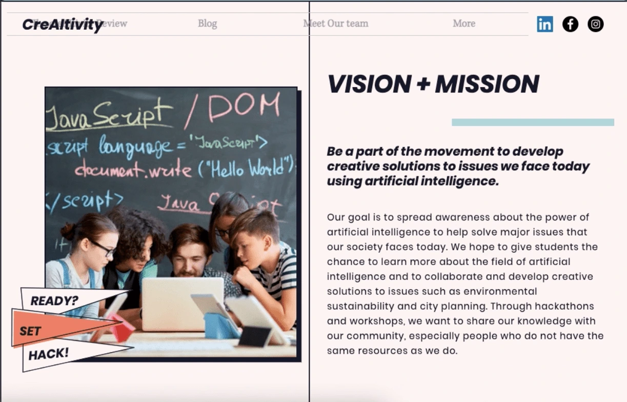
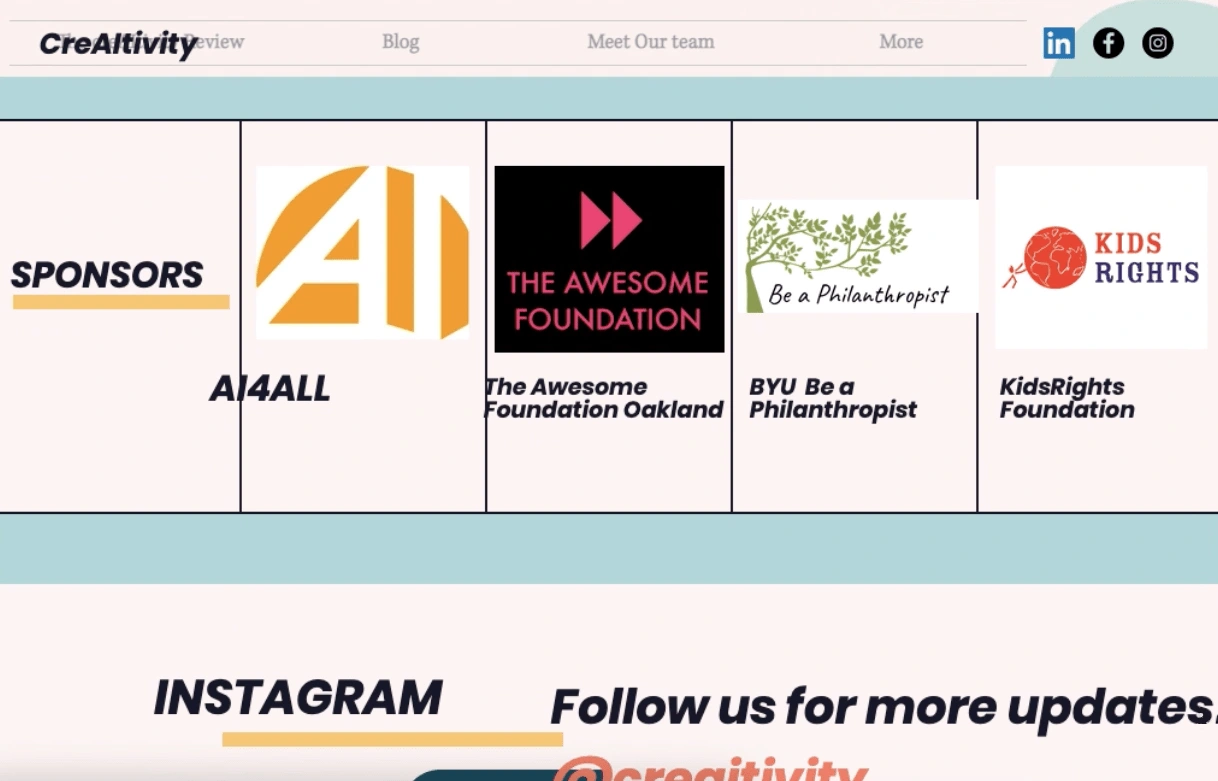
Next, I took a look at the current website and noted some things that could be improved:
Doesn't follow branding guidelines
Navigation bar only appears while on landing page
Text overlapping other elements on the page
Image and text misaligned
Lack of white space, cluttered
New Design
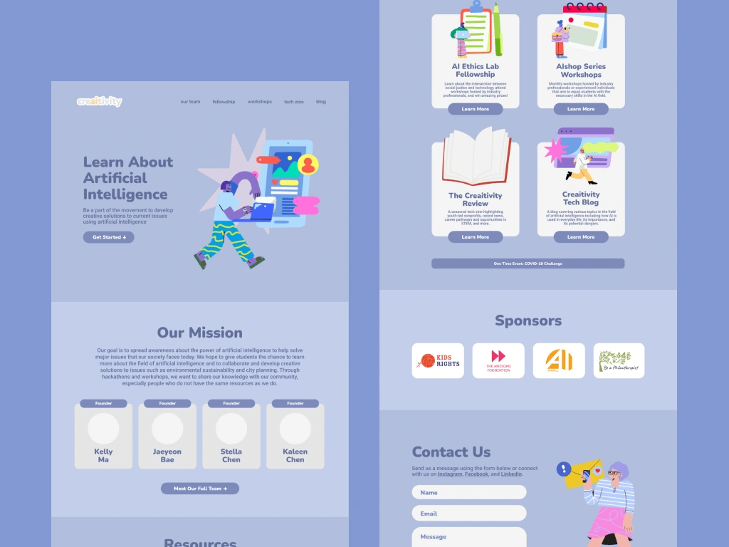
In the updated design, I addressed each of the issues noted earlier and made the landing page an overview of everything the organization offers.

💭 Reflections
I had a lot of fun doing this project! It was my first time using Figma. I worked primarily on the web version, but I also did make the website mobile compatible. Wix's mobile version still has its limitations and I found it frustrating at times when I couldn't resize objects or round some corners, for example, but I was able to work around it and would have loved to have worked more on the mobile website! Later, I learned about wireframing and prototyping and I would have done that too before designing the hi-fi version if I could go back.
Like this project
Posted Sep 3, 2022
(UI Design) Redesign of Creaitivity website
Likes
0
Views
14


