Diágata Studio
Maria Fernanda de Sá
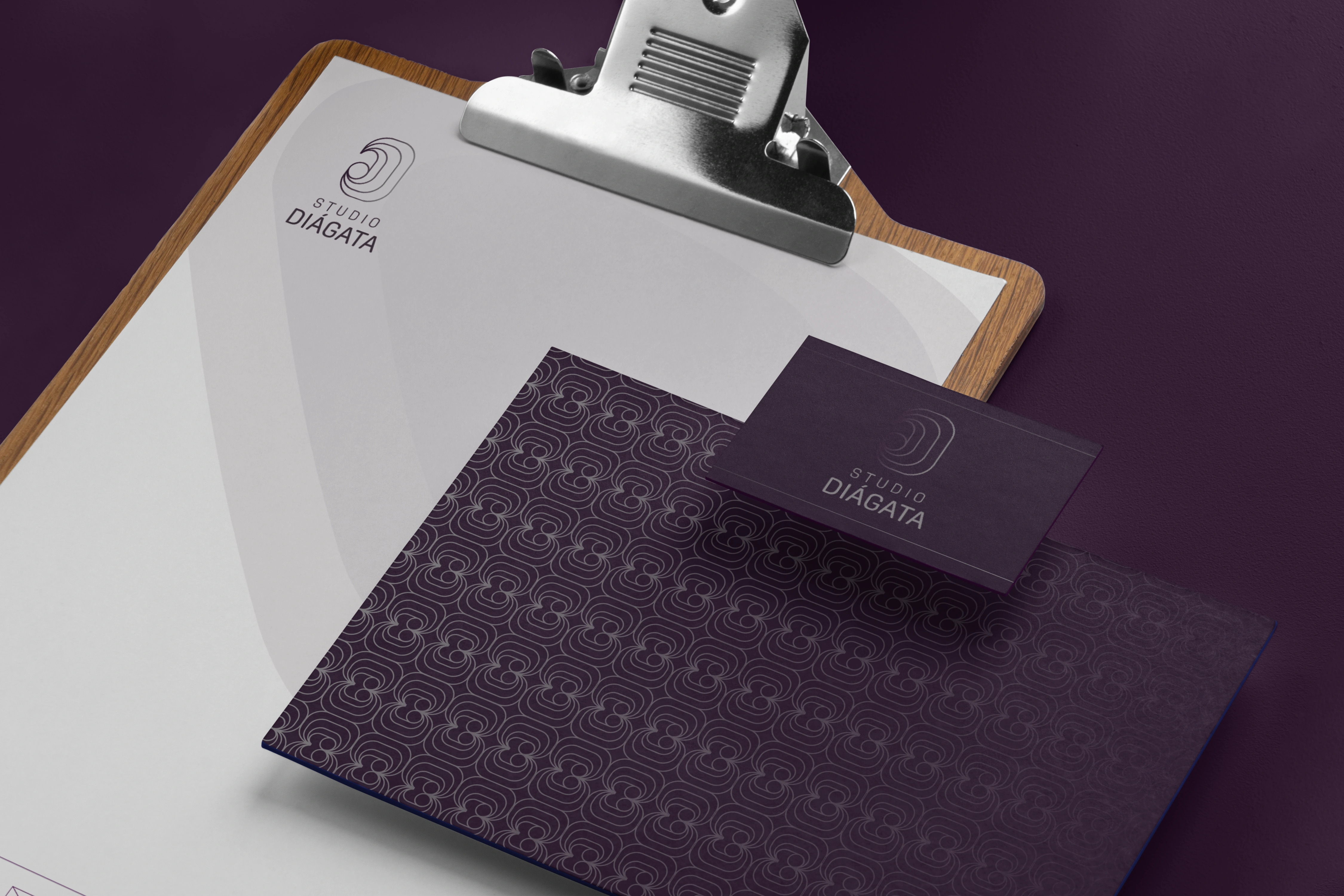
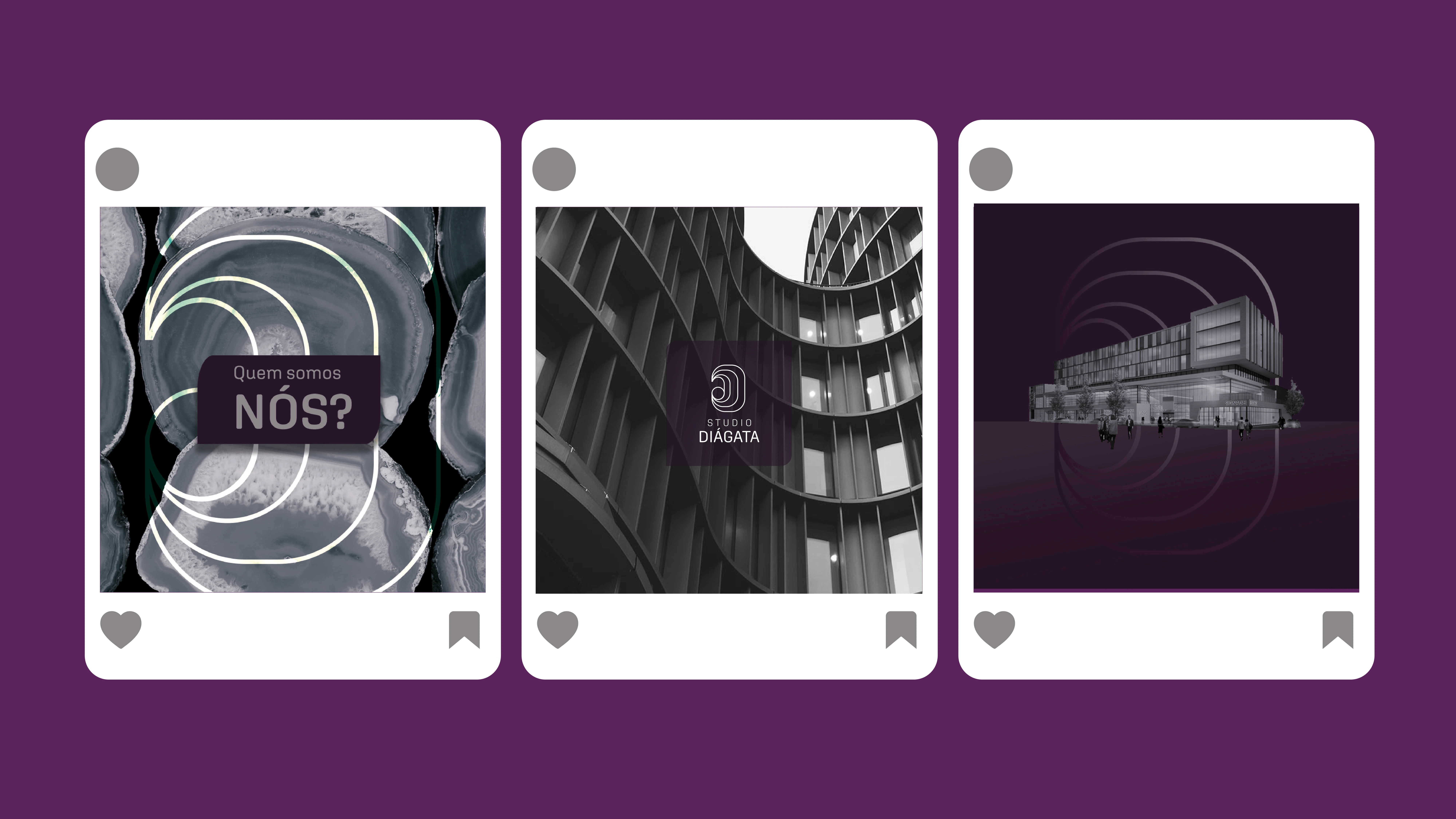
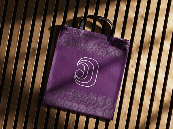
At the heart of Studio Diágata’s visual identity lies the agate stone — a natural element layered with depths, tonalities, and organic forms that inspire both the brand’s name and its aesthetic direction. The new symbol takes this inspiration further: the letter “D” appears in a more abstract form, curving fluidly to suggest the stone’s natural shapes, while the subtle inclusion of an “A” recalls the agate itself. This abstraction evokes a sense of mysticism, reinforced by a colour palette that mirrors the stone’s layered beauty. The gradient, in turn, reflects the shifting tones of the agate, bringing movement and depth to the identity.
Purple plays a key role in this system. Traditionally linked to luxury and extravagance — qualities that resonate with the studio’s audience — purple also embodies wisdom and a touch of magic, aligning with Studio Diágata’s pursuit of authenticity. The supporting pastel hues, inspired by agate’s own variations, introduce a soft sobriety that balances the richness of purple. Together, they create a palette that feels luxurious yet approachable, elegant yet inviting.


Like this project
Posted Feb 3, 2026
At the heart of Studio Diágata’s visual identity lies the agate stone — a natural element that inspires both the brand’s name and its aesthetic direction.
Likes
0
Views
3