Built with Rive
Real-Time Value Comparison Animation
Alex Prokhorov
Animated value comparison built in Rive
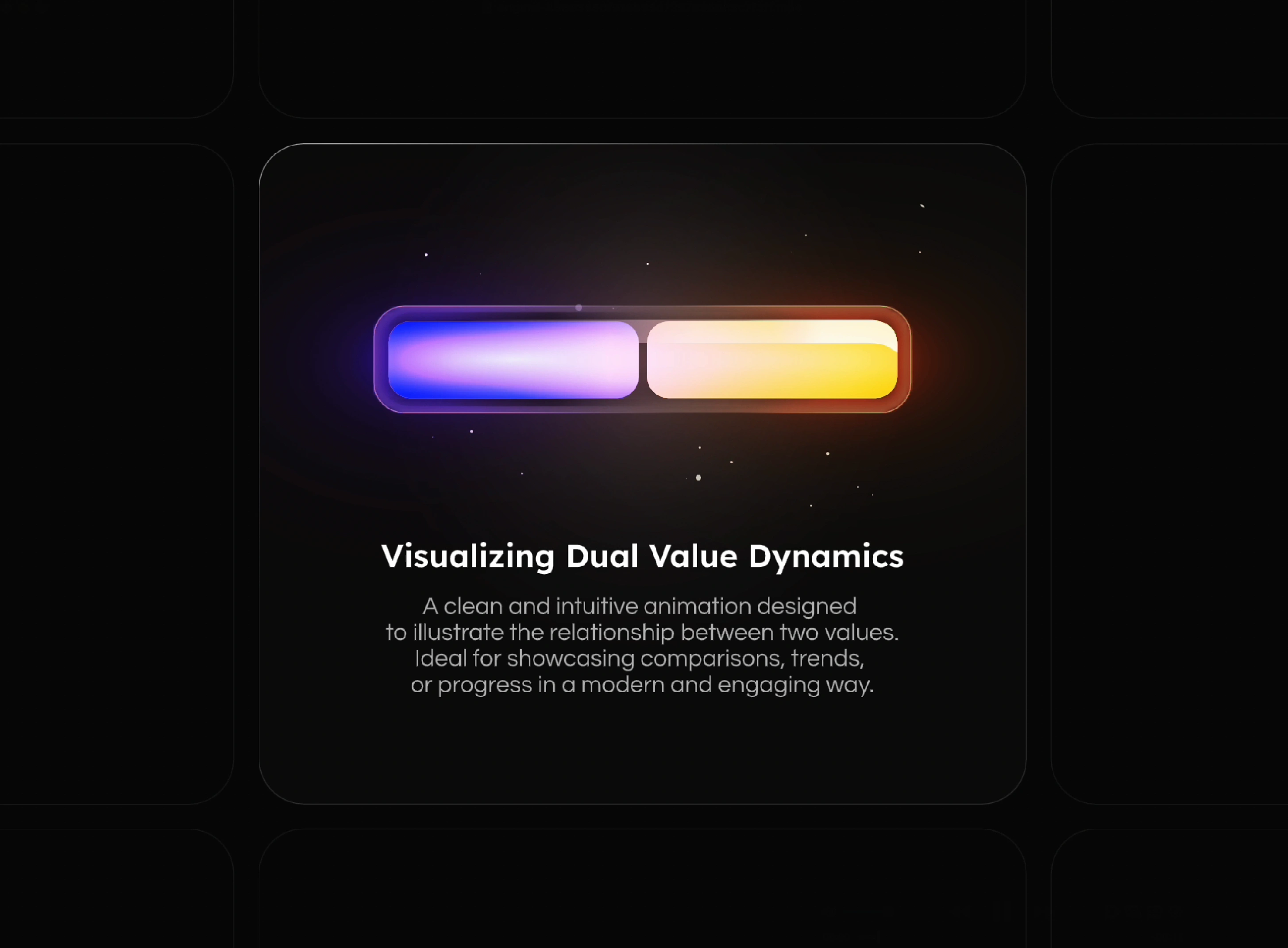
This animation showcases a dynamic comparison between two values, visually representing their proportions in real-time. As one color gradually overtakes the other, it highlights the shifting balance between data points — an engaging way to reflect trends, progress, or competition.
The motion is smooth and continuous, designed to feel intuitive and responsive without overwhelming the interface. It’s ideal for data-rich environments like analytics dashboards, KPI modules, or any UI where quick visual interpretation is key.
Crafted in Rive, this animation leverages real-time tooling for easy iteration, curve control, and seamless playback. It’s lightweight, scalable, and easy to integrate into both web and mobile interfaces — bringing data to life with subtle yet expressive motion.
Like this project
Posted Jun 26, 2025
Dynamic value comparison animation built in Rive. Perfect for dashboards or analytics. Smooth, real-time motion that brings data to life.
Likes
15
Views
678