TerraViva
Paolo Tomei
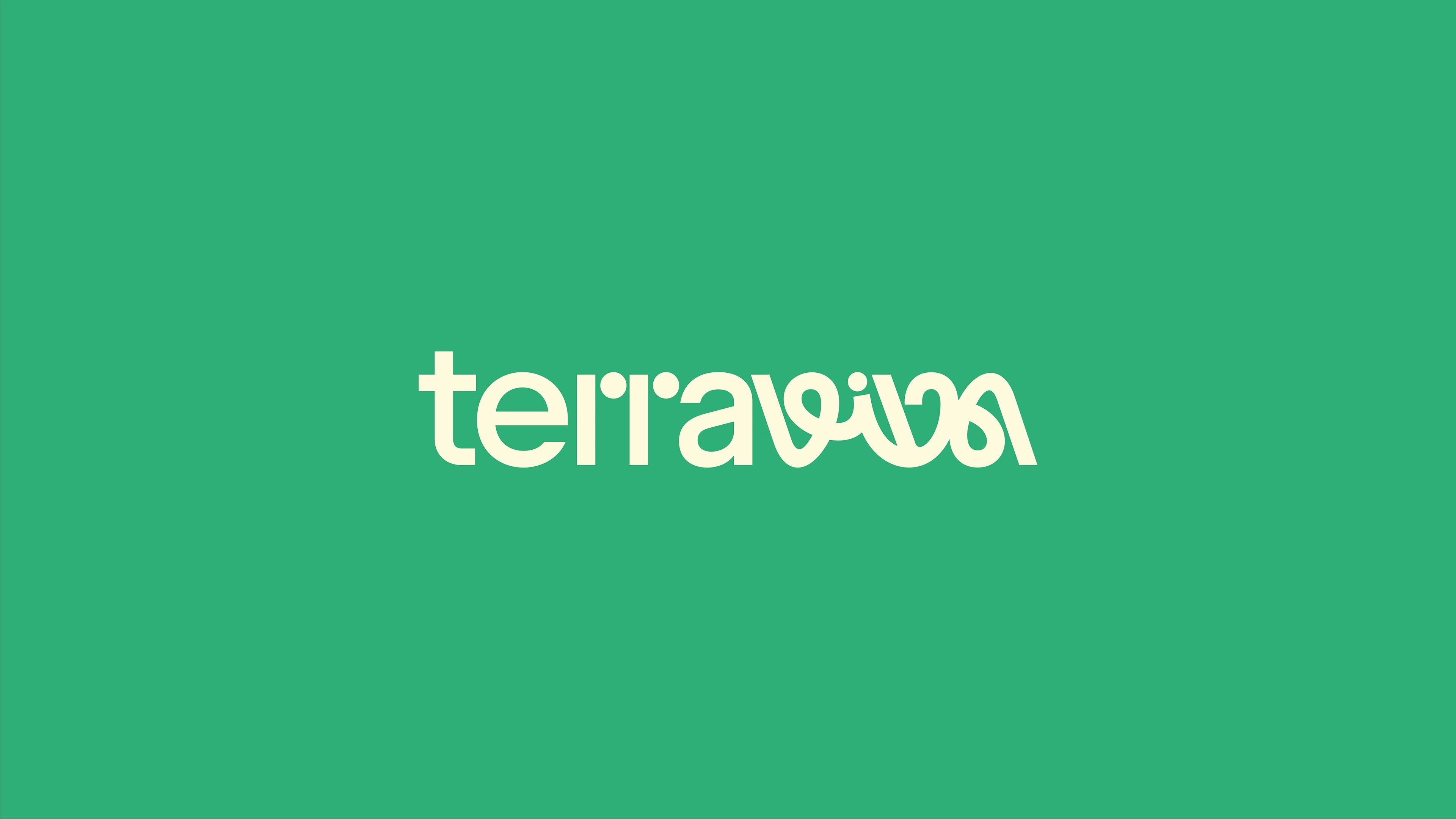
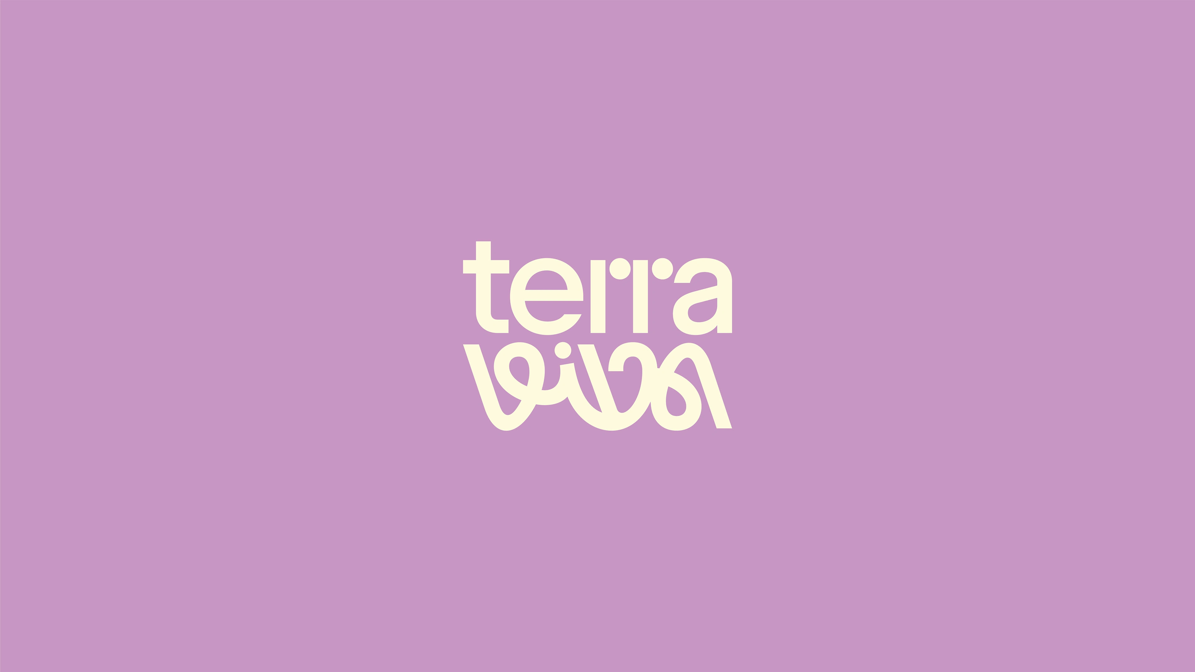
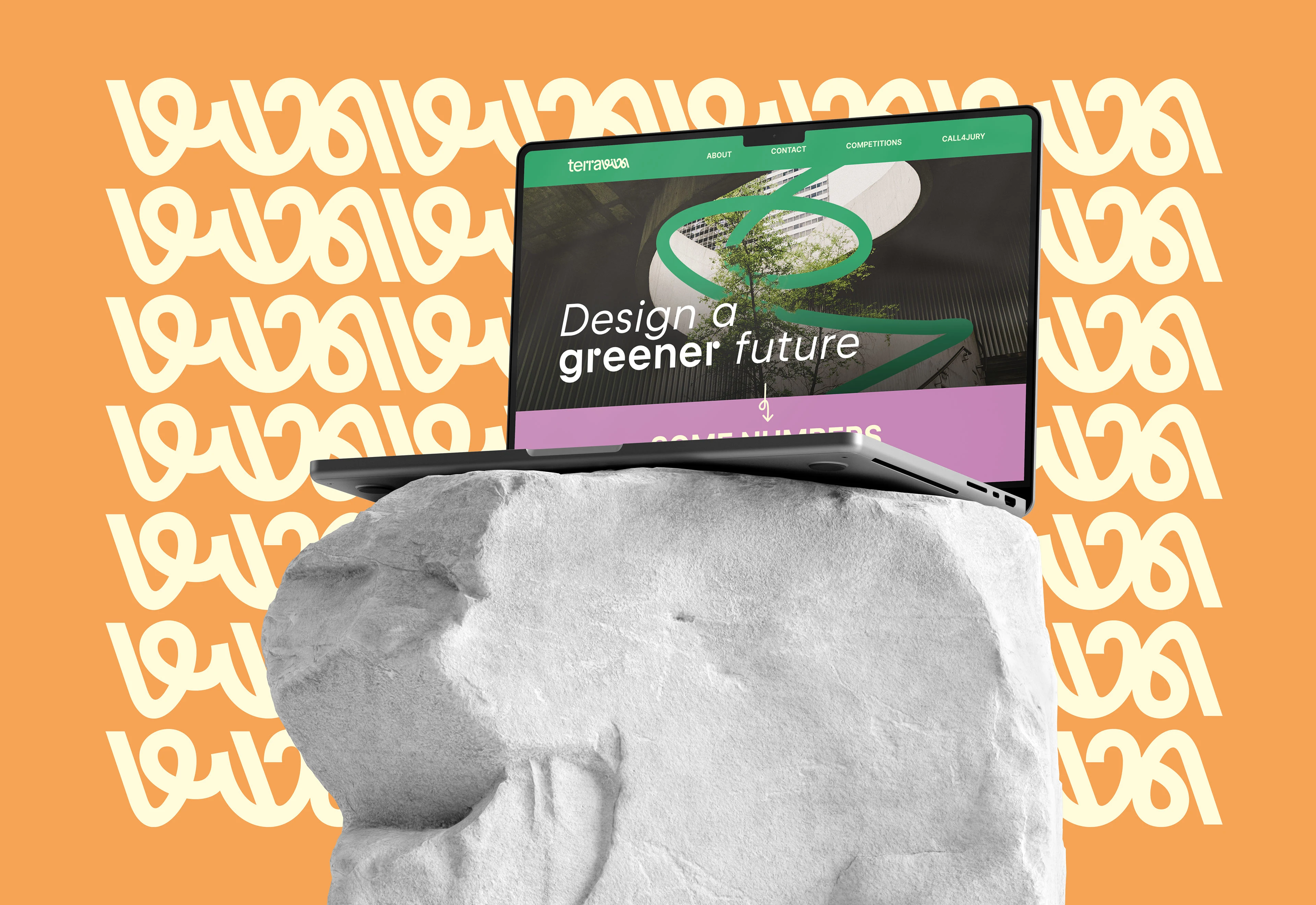
The concept of my proposal for the brand identity of TerraViva takes shape from the fusion of architecture and nature.
Architecture, with its strict and precise forms, finds inspiration in the structures found in nature.
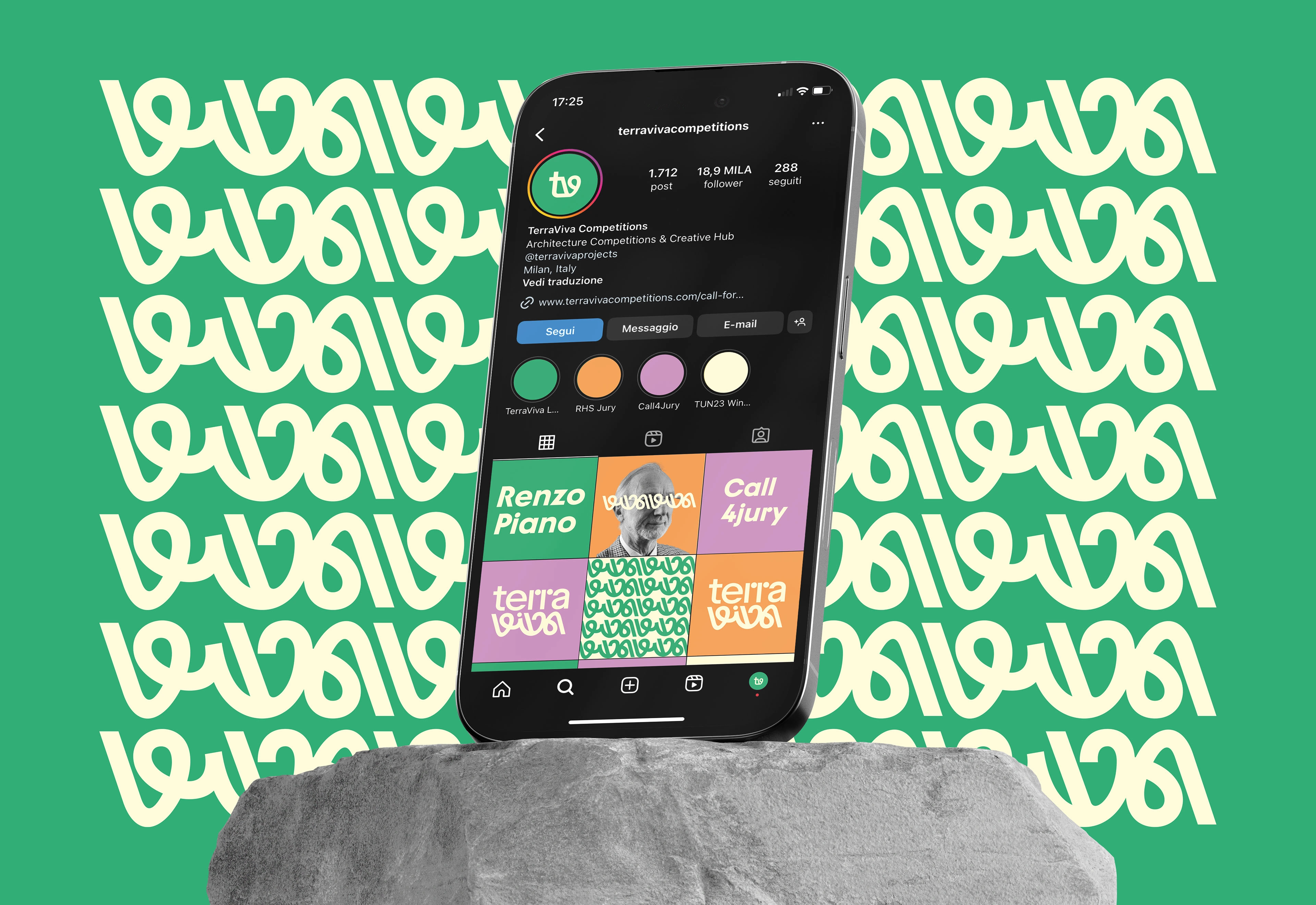
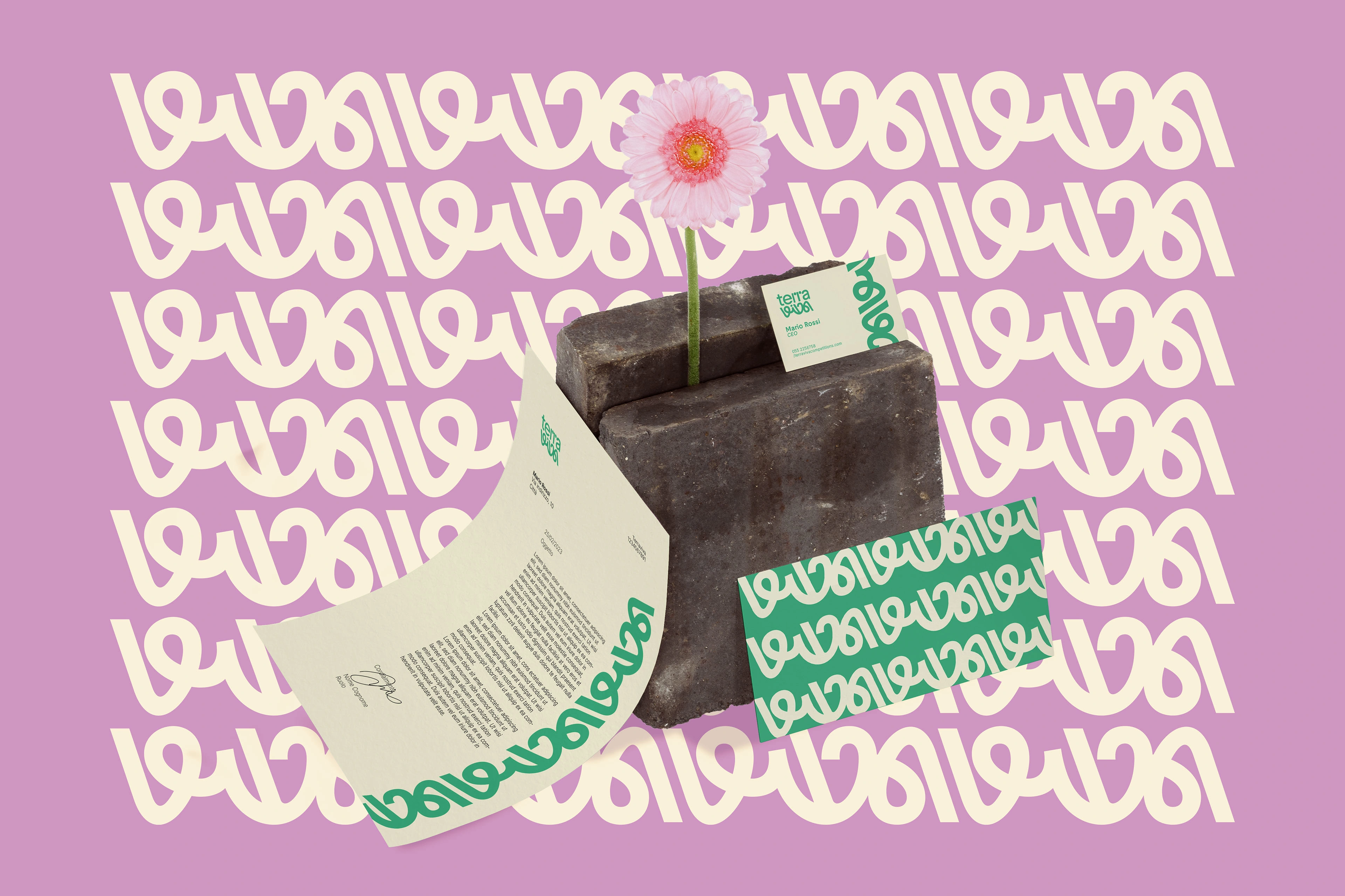
The word "Terra" features precise and geometric shapes, symbolizing architecture.
The font used for the word “viva” features organic and dynamic shapes, representing nature.
In addition, since this font recalls the shape of roots, the logotype can be interpreted as if the word “terra” has as roots the word “viva”.
Finally, the fact that the letters are linked together represents the community that TerraViva has created through its contests.
Like this project
Posted Jan 6, 2025
I developed a brand identity proposal for the international competition organized by TerraViva Competitions.