Brand Starter Kit for a Barre & Functional Workout Studio
Neha Bhatnagar
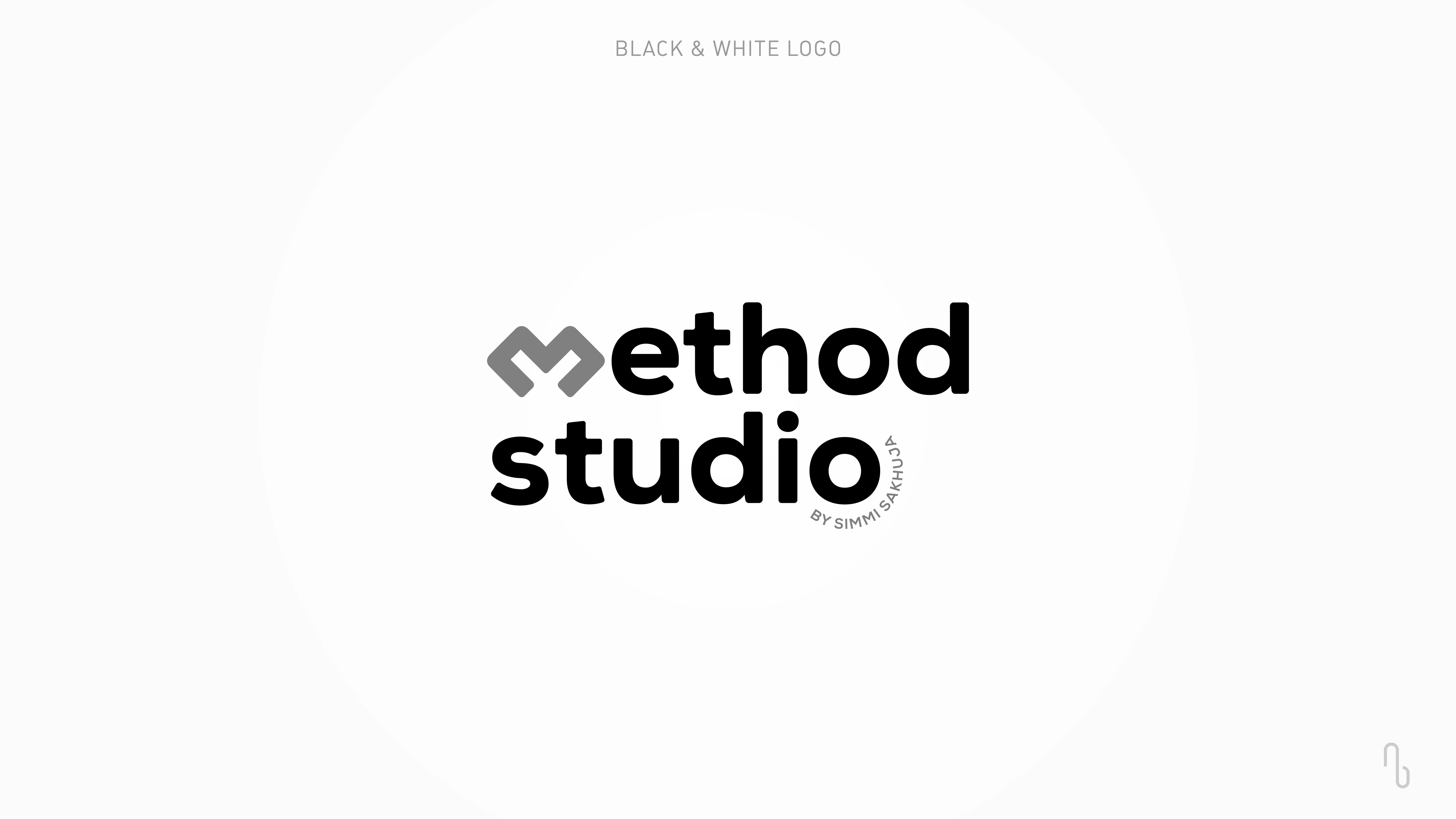
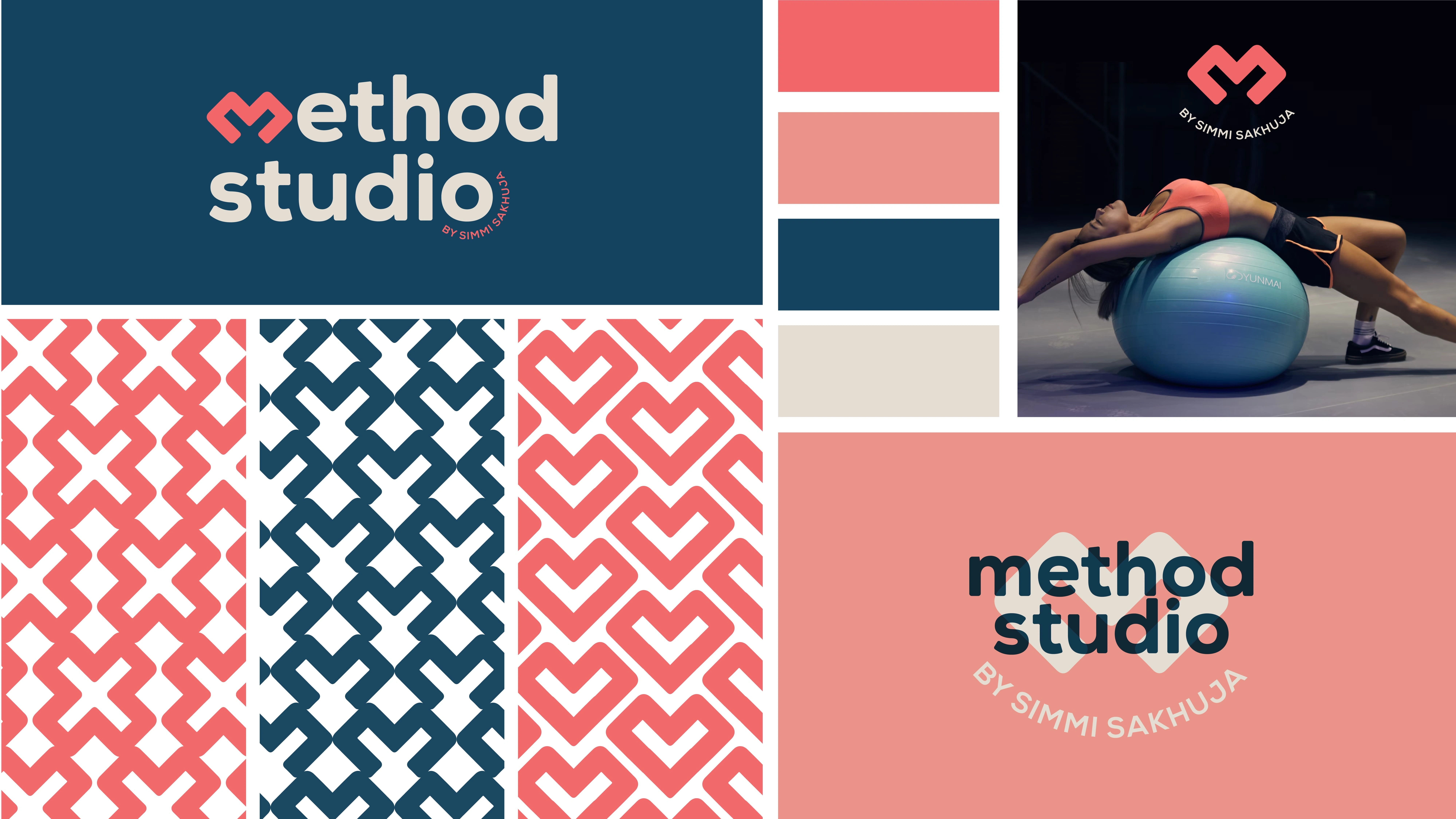
Client Name: Method Studio
About Method Studio
Method Studio is not just a place for physical workouts; it’s a space where strength, balance, and overall well-being are nurtured with care and passion. A community-driven space, where members are supported on their journey to better health, where the mind, body, and spirit are equally prioritised.
Branding
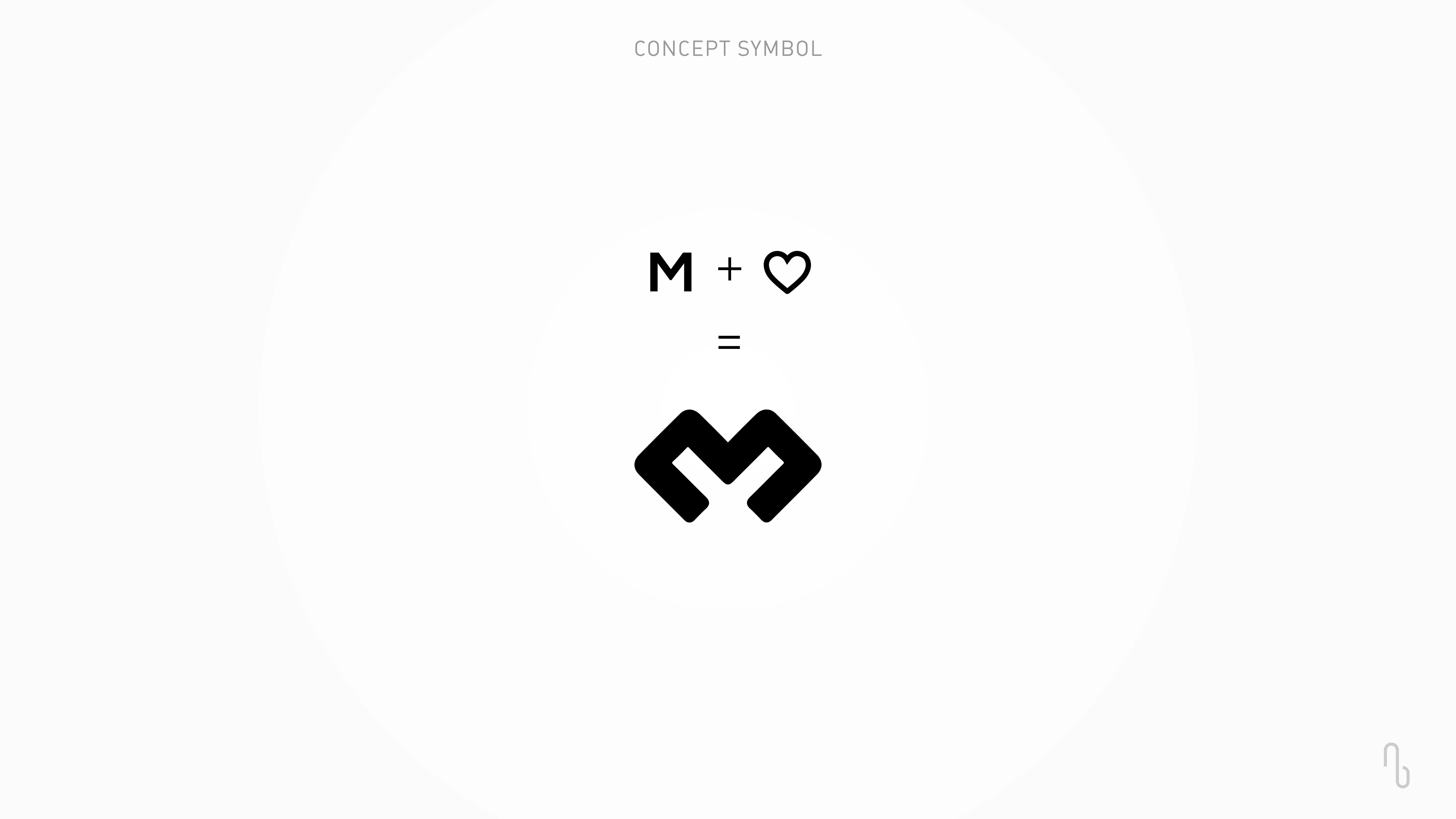
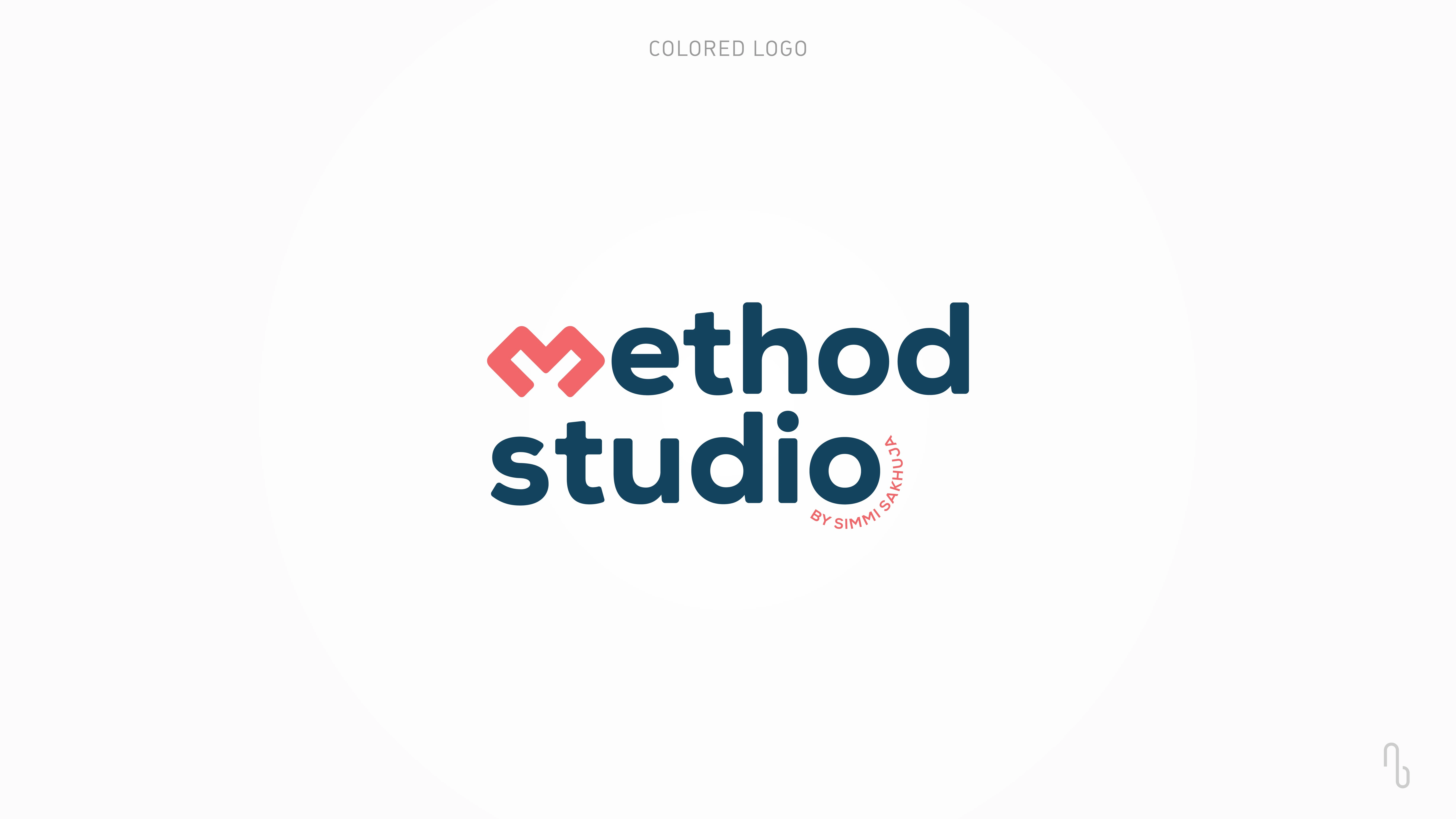
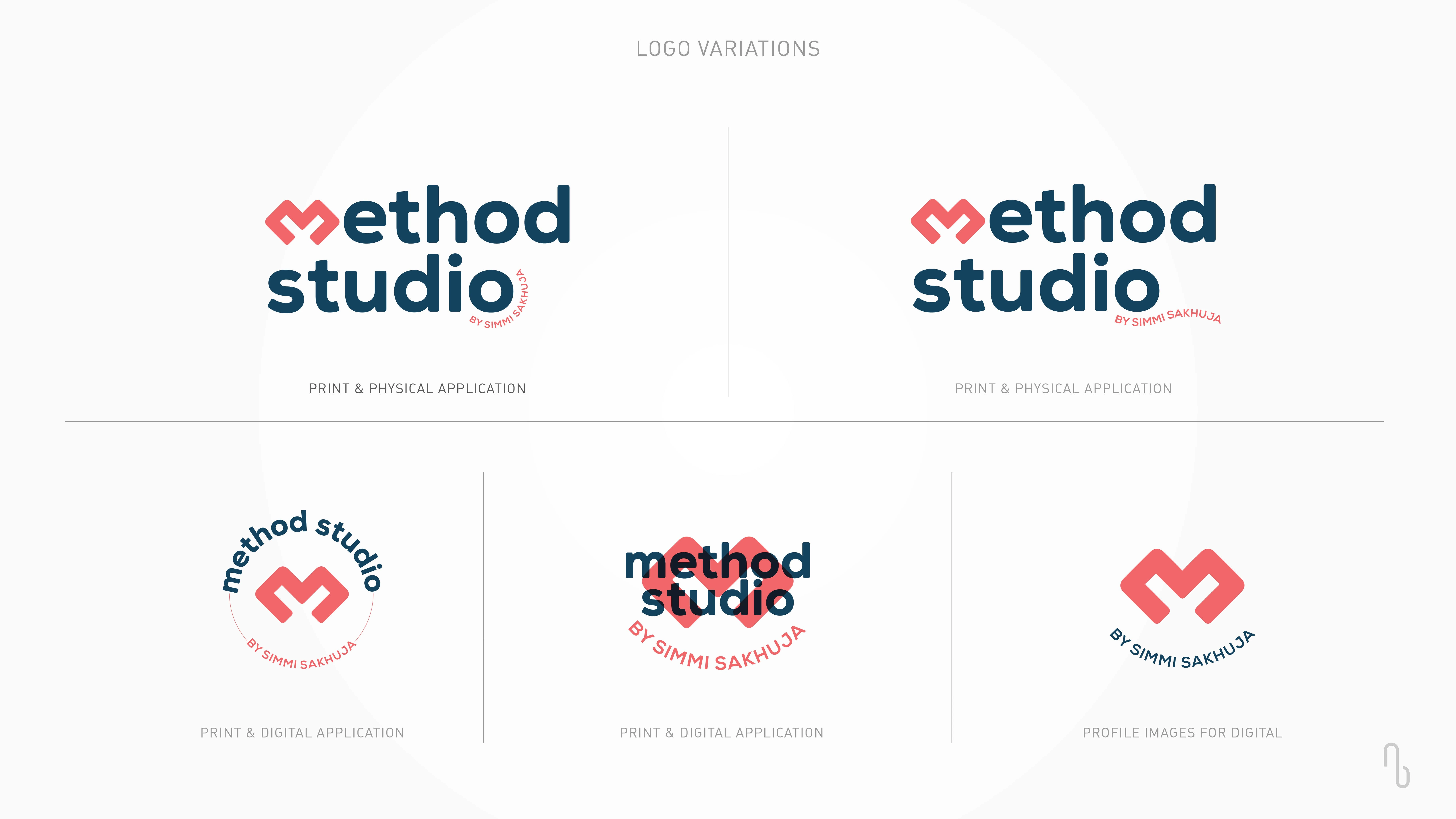
M + <3
The heart represents this nurturing environment, emphasizing the studio’s commitment to holistic health - where the mind, body, and spirit are equally prioritized.
Incorporating the heart into the logo reinforces the idea that Method Studio is a community-driven space, where members are supported on their journey to better health. It adds an element of warmth and approachability to the brand, distinguishing Method Studio from other fitness centers that might focus solely on physical transformation. By blending the heart with the letter "M," the logo will visually communicate that every method practiced here is rooted in care, compassion, and a genuine investment in the well-being of its members.
The logo visually represents Method Studio’s ethos of combining strength with care, making it not just a fitness studio, but a sanctuary for personal growth and wellness.
Like this project
Posted Jan 3, 2025
The branding represents the ethos of combining strength with care, making it not just a fitness studio, but a sanctuary for personal growth & wellness.
Likes
0
Views
6