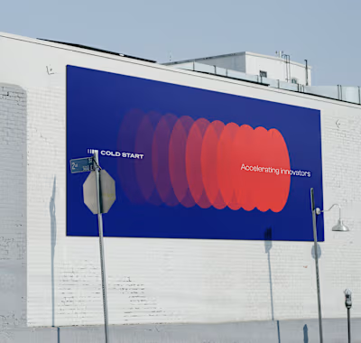
Kepler
Task
Developed a brand identity system for Kepler, a technology company that implements innovative and universal warehouse automation solutions.
As a forward-looking and dynamically growing company, Kepler provides support at all stages of the automation project: from planning to delivery of ready-made complex systems.
Kepler offers a variety of products such as Conveyor Systems, Sorting Systems, Storage Systems within different areas of project implementation.
Deliverables
Concept, Logo design, Visual identity, UX/ Web design
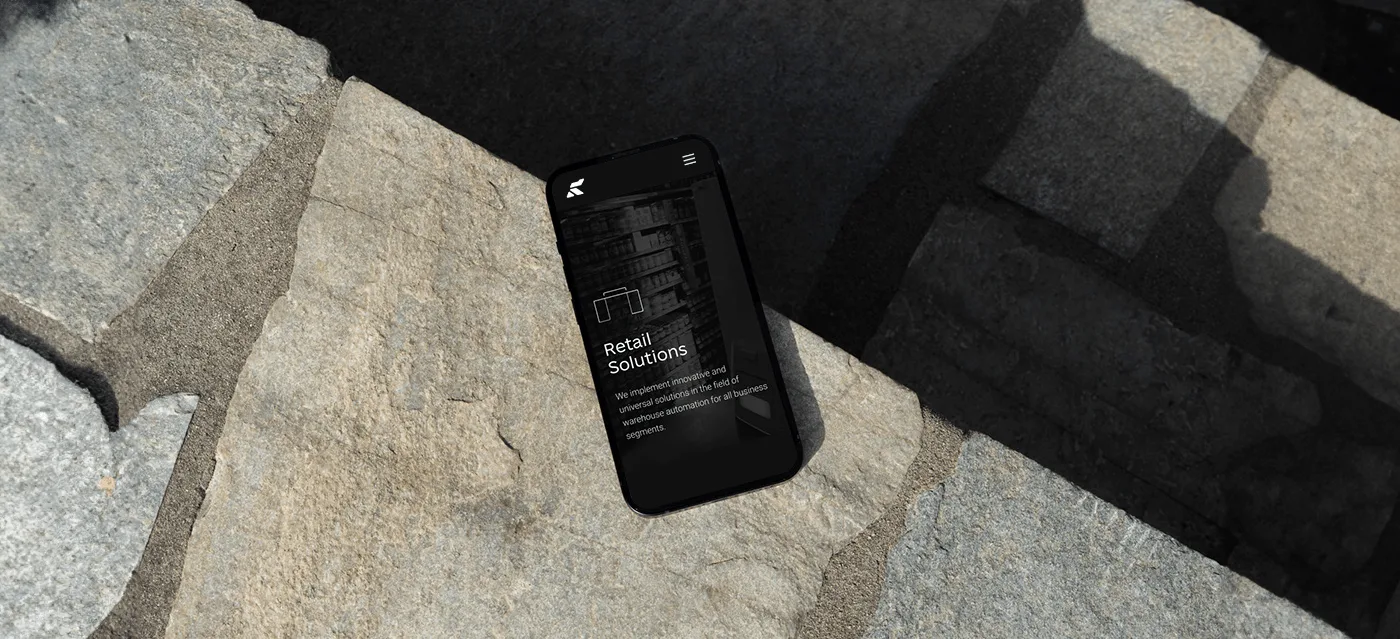
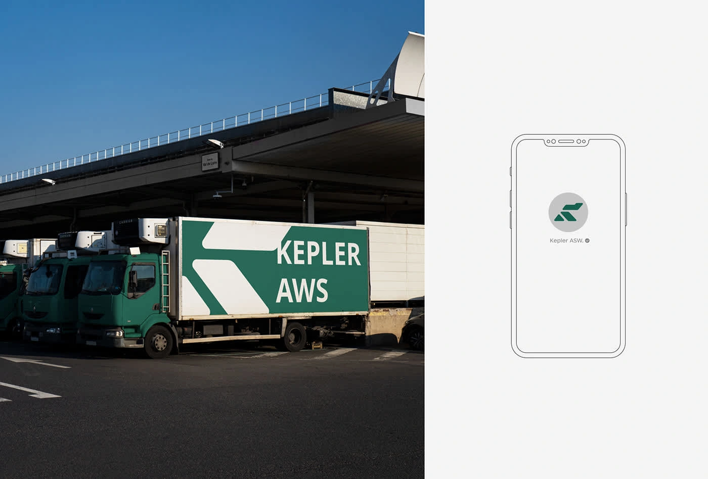
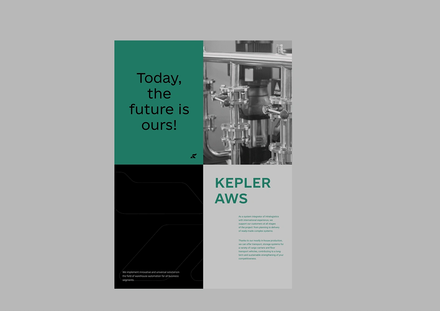
Visual style—minimalist yet distinctive with couple of key accents.
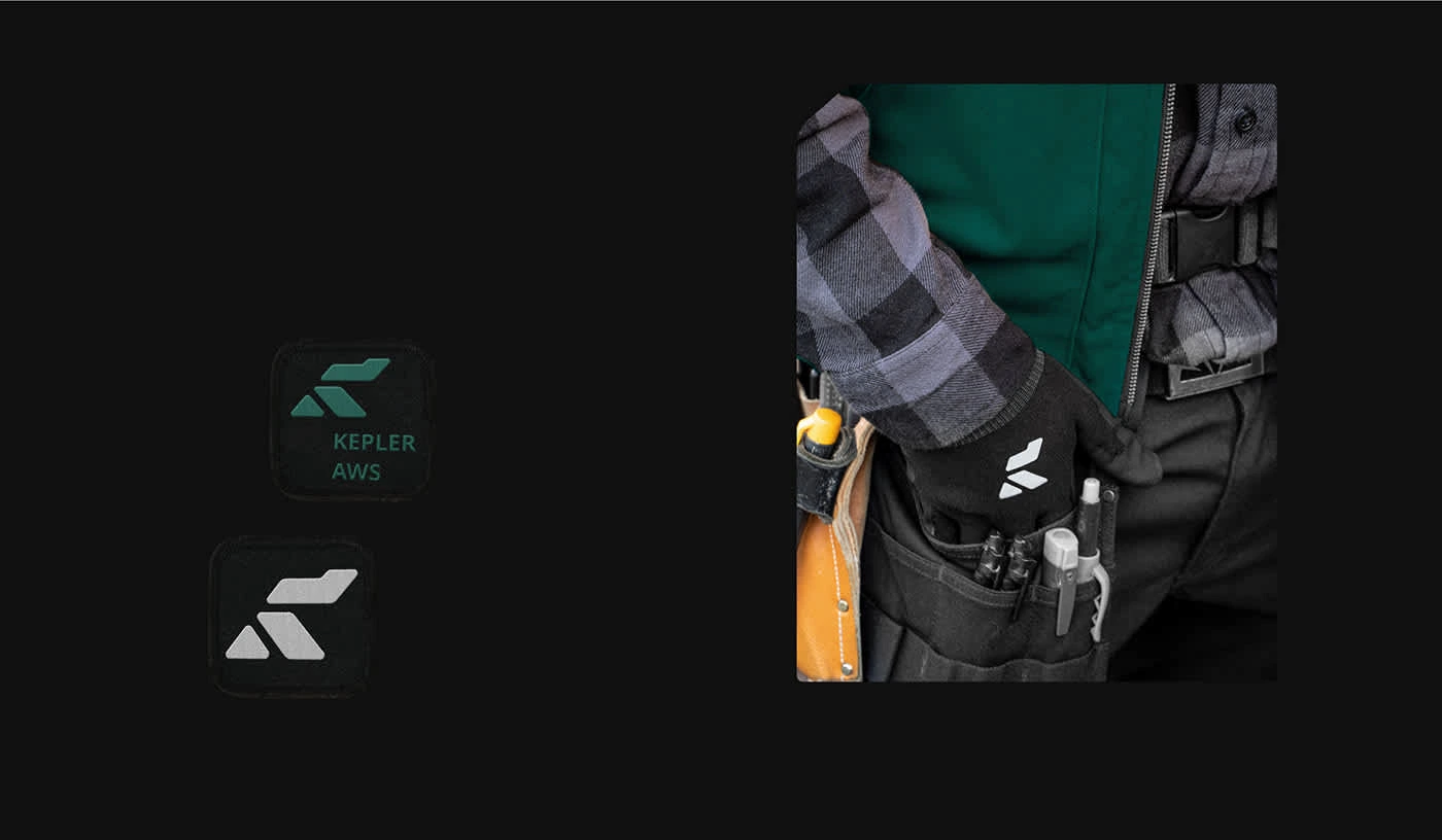
Symbol—being a first letter of the company’s name “K”, reflects company’s vision always pushing forward. Its soft edges hint human centred approach within the company. Symbol itself is a stylized icon of a person in action. In addition, typography part continues the movement of symbol, being pushed to the right direction.
Visual style is built around symbol "K", its cuts, linear version and dominant typography. Thin lines, light font styles white spaces work together as one with dark restrained color palette and bnw photos. Same as people happen to collaborate with absolute technology.
All shades of Grey indicate technological part of Kepler. Calm Greens, on the other hand, show human presence.



Like this project
Posted Sep 11, 2024
Kepler is a technology company that implements innovative and universal warehouse automation solutions.

