
Black Candle Press Brand Identity
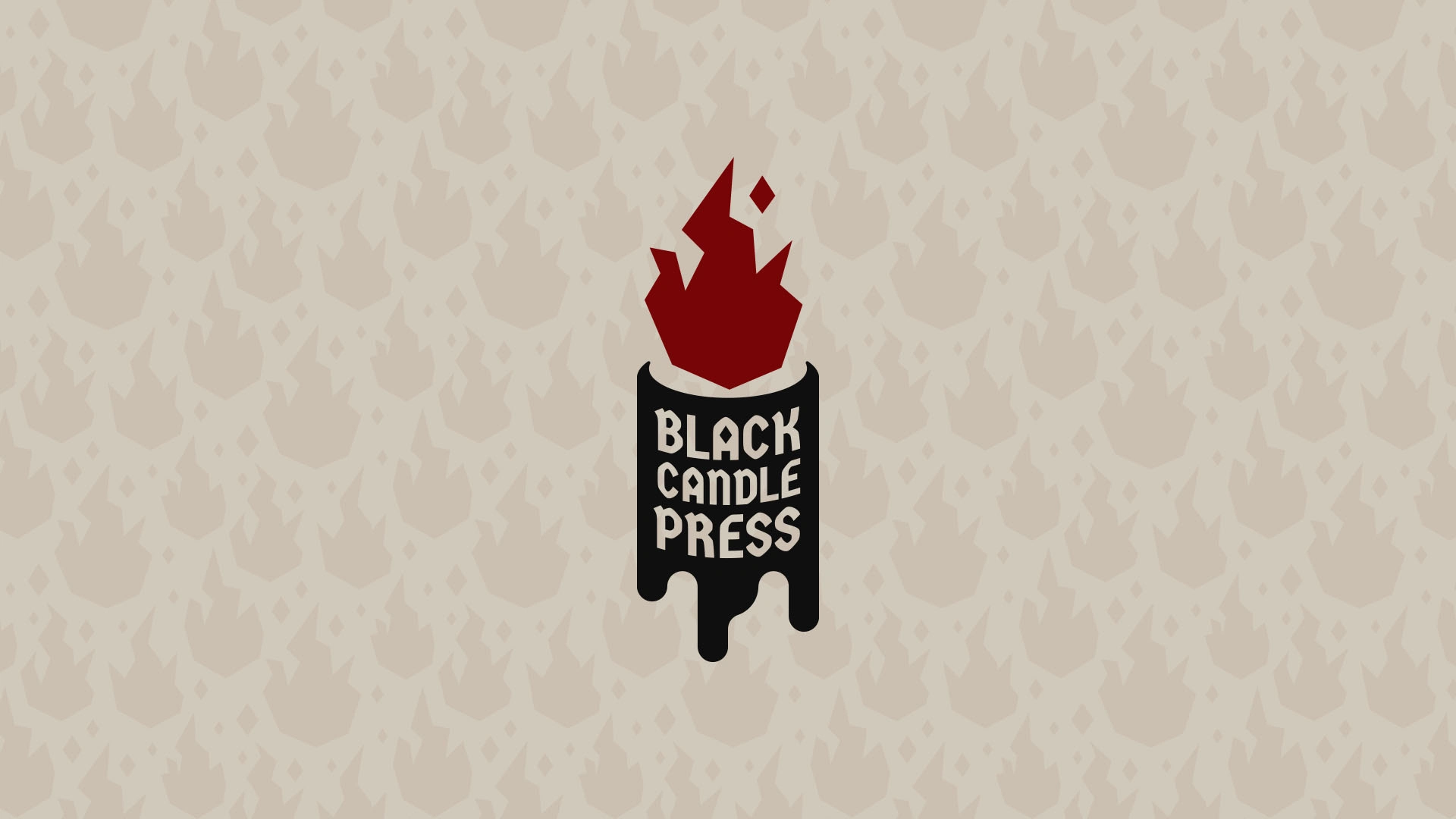
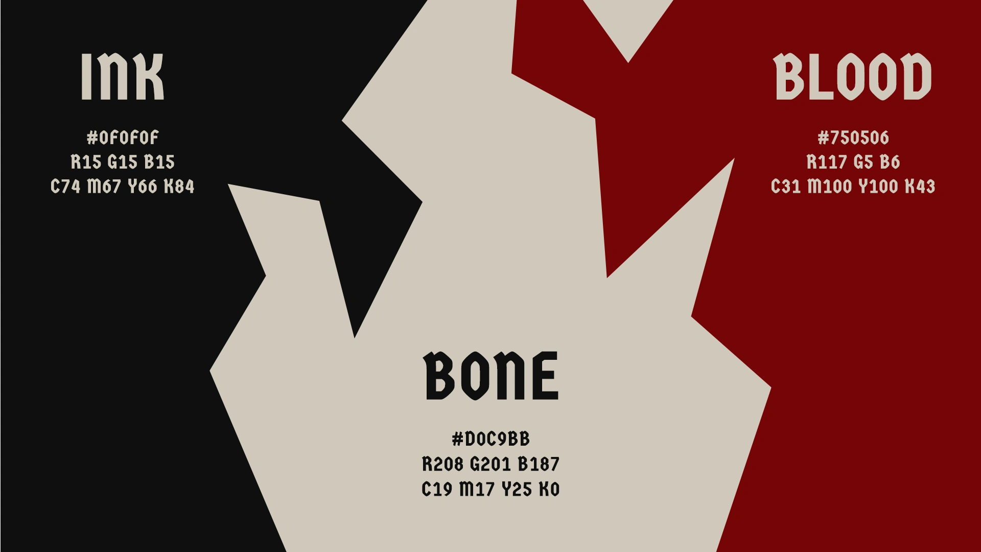
Black Candle Press is a brand identity for a fictional publisher of spooky tabletop RPGs and horror fiction. I wrote the brief myself, then designed a complete brand kit to answer it: a logo in several formats, a bold pattern, and a style sheet that makes the brand easy to use. The palette is ink, blood red and bone, and it was made to look good by candlelight.
The Logo Lockups
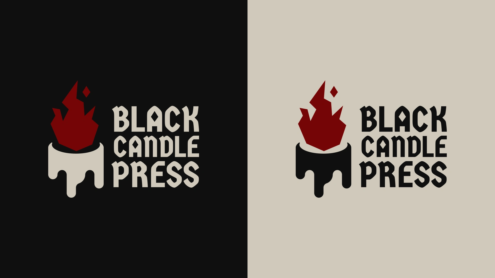
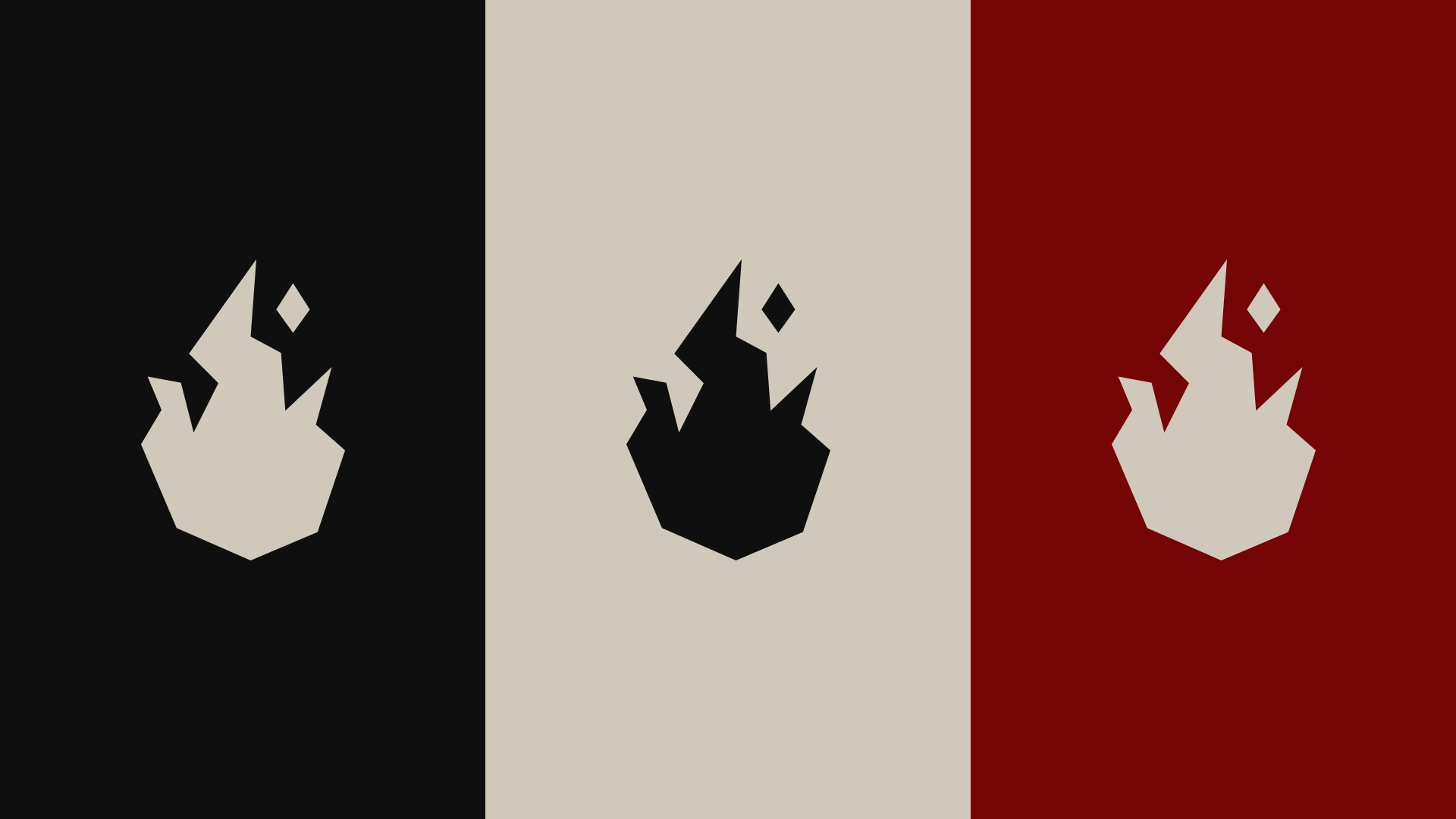
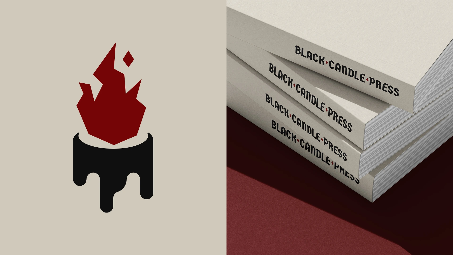
The logo is built from a flame and a candle, and I made them deliberately different. The flame is sharp and geometric, while the candle is soft. That contrast gives the mark tension and makes it easy to recognise at small sizes.
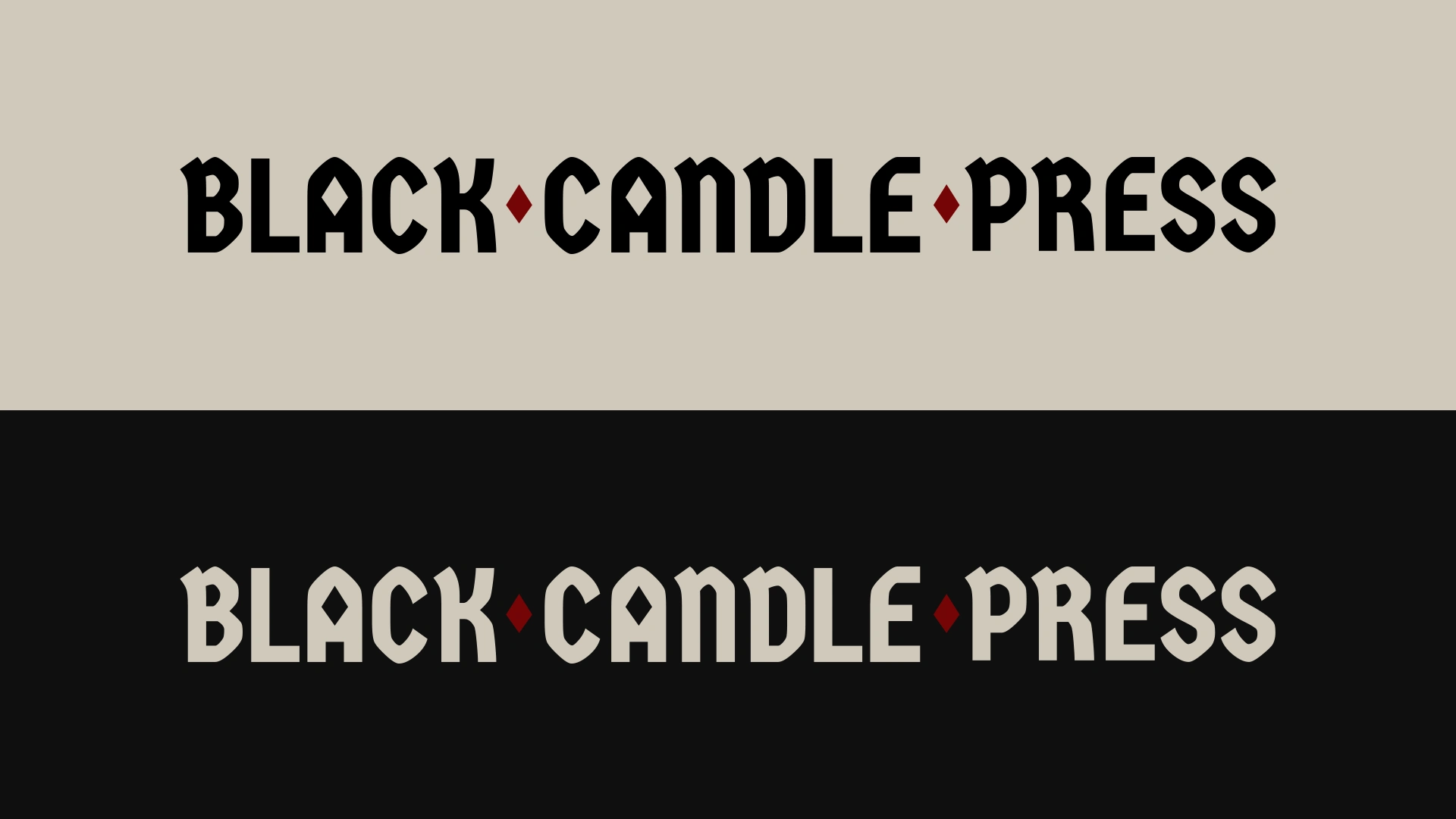
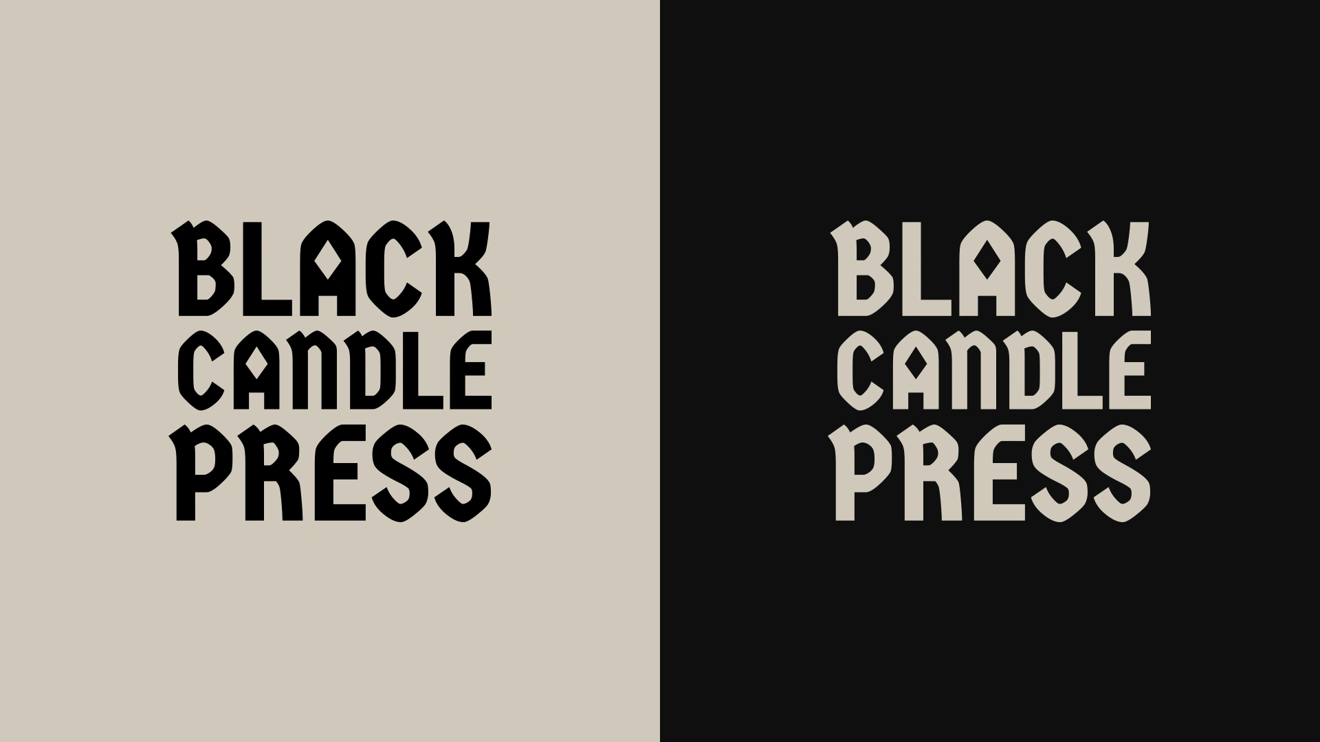
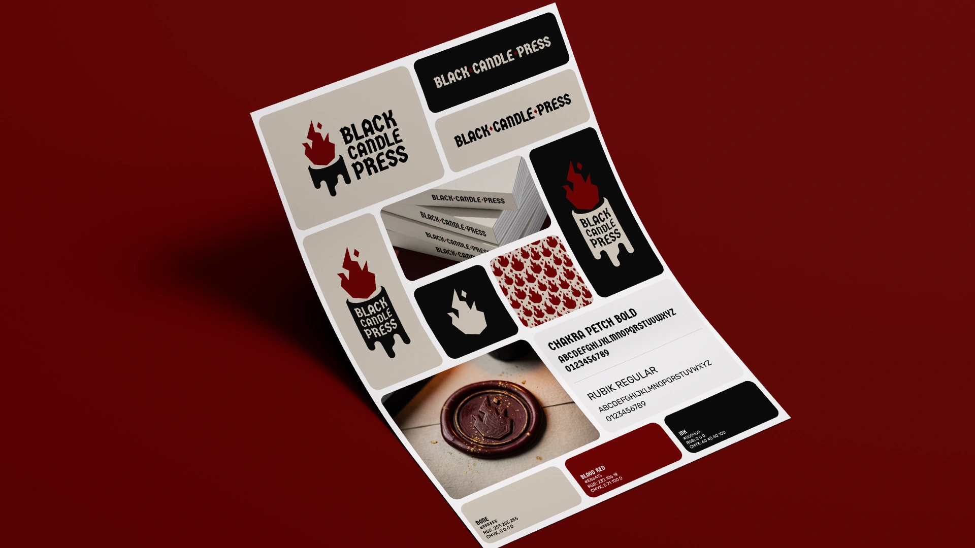
The flame works on its own, and so does the full candle and flame. I also made horizontal and stacked lockups in full-logo and mark-only versions. Brands often fail because the logo doesn’t fit the space it’s put in, so I try to give every brand an option for each placement.
The Brand Assets
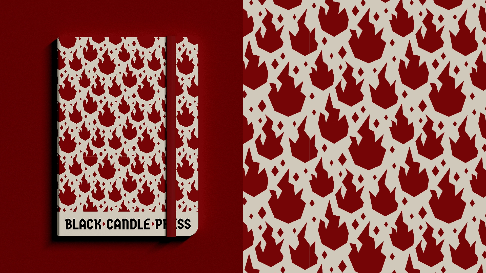
I turned the flickering flame into a bold repeating pattern, ready for packaging, merchandise, website backgrounds and social posts. I also made a one-page style sheet that covers colours, logo use and the basics, so anyone working with the brand can keep it consistent without asking me.
The Result
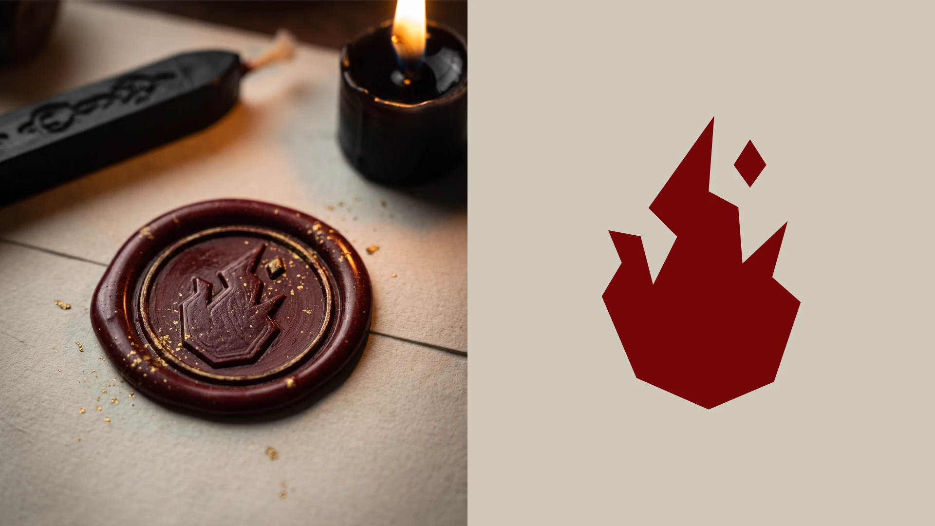
Black Candle Press is a flexible, memorable brand with a strong personality. It would suit a tabletop RPG studio, an indie game publisher or a horror-themed merch shop, and it shows how I approach branding for gaming and creative businesses.
0 likes · 0 views · Nov 13, 2026
Black Candle Press is a brand identity for a fictional publisher of spooky tabletop RPGs and horror fiction.

