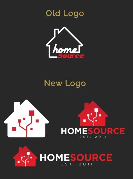
HomeSource Systems Logo Redesign
Claire Burnett
Our CEO's biggest complaint about their old logo was that it looked "too much like a real estate company and not enough like a tech company". HomeSource was built on being the "home source for everything your business needs" and he wanted to keep the house in the logo.
What we ended on was something that blended modern elements and the house symbol while also introducing a touch of tech in the form of circuits. These circuits would later become a large part of the brand standards.
Like this project
Posted Jan 9, 2024
A new logo for HomeSource Systems.
Likes
0
Views
5