Guide: Use component variants in your Bubble App
Sebastian Avelar
Introduction
Component variants refer to different versions of a reusable component that are adapted for specific purposes or contexts. In this guide, we will create a 'blog card' component and its variants to explain the concept and how to use it in Bubble. We will also see a more advanced use case at the end of this guide
Variants
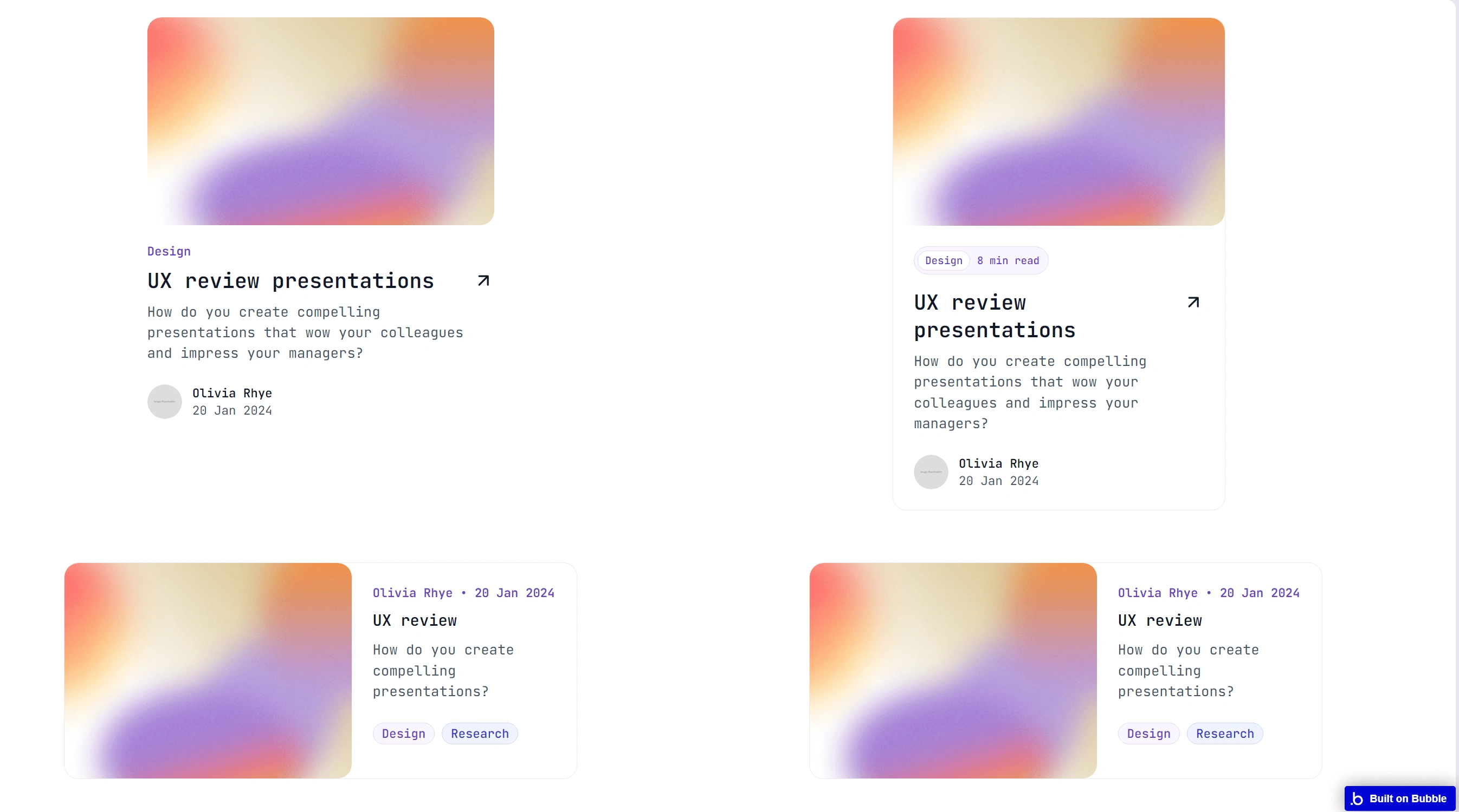
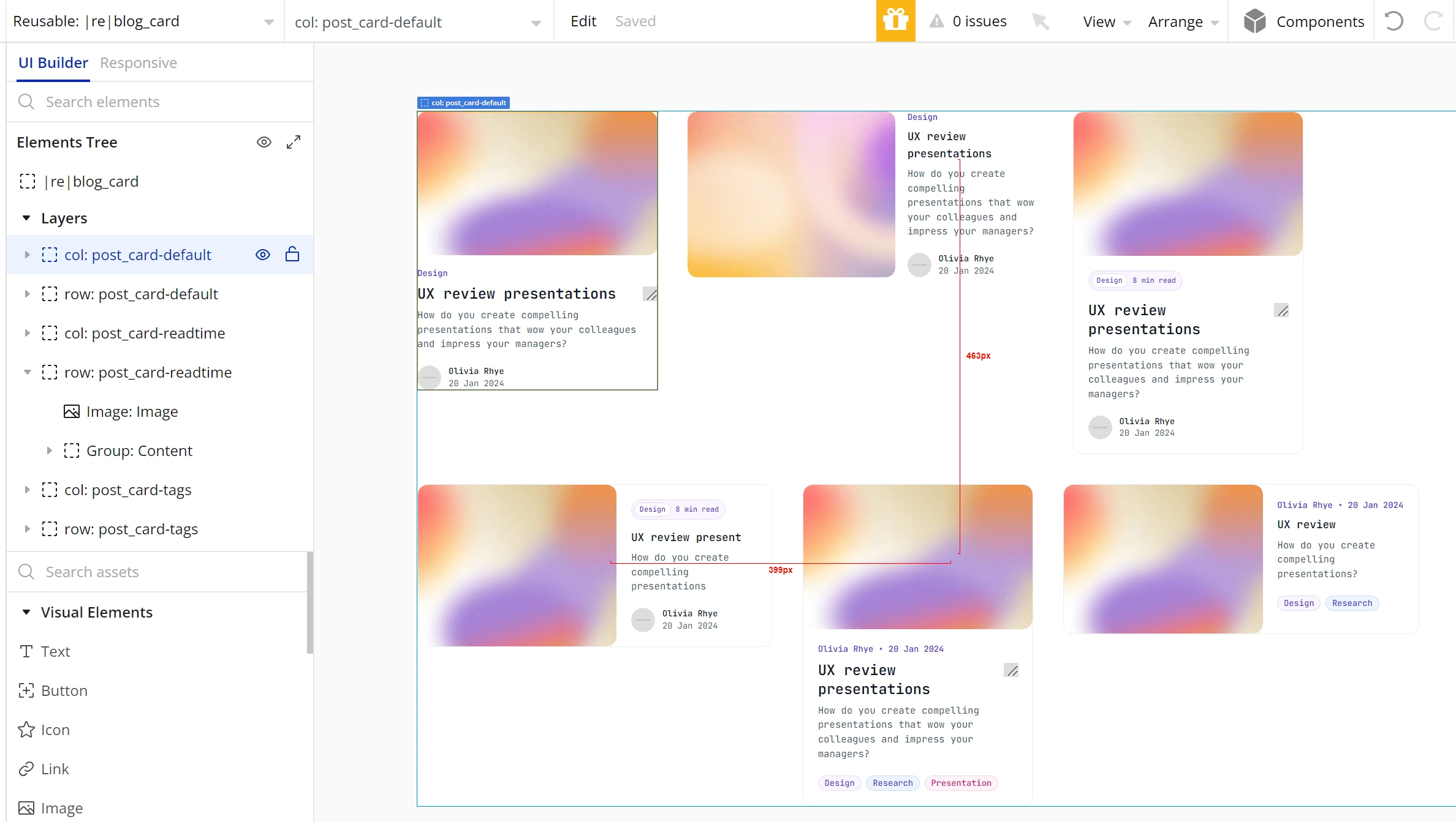
UI variants of a card for displaying a blog post information
These are the variants we will add inside the reusable component. We will create an option set to handle each of the variants.
In the image below, I named the option set the same as my reusable component. Then I added an option for each of my variants
|re|blog_card
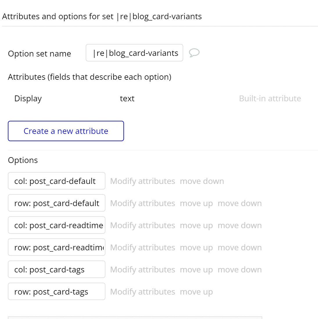
Image of the |re|blog_card option set
Create a component with Variants
I have created a reusable component and added all my variants. Next, we will add the property to the reusable component to handle when the variants should be visible.
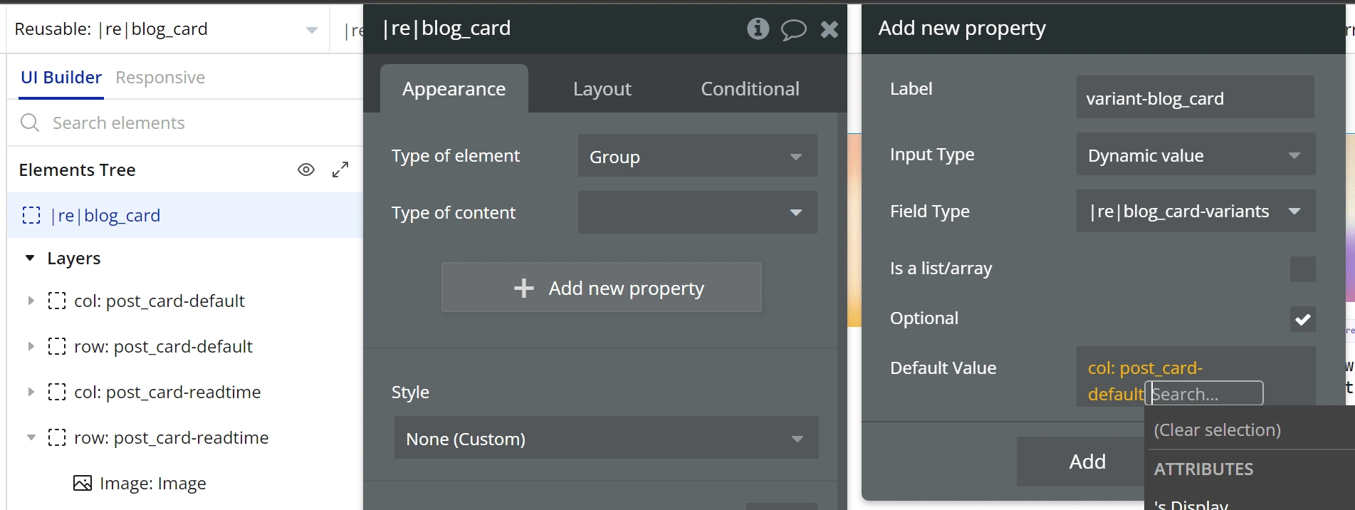
Here I selected the reusable component and added a new property. I called it
variant-blog_card and set the value to the option set I showed before, |re|blog_card.
We can also set up a default value and in my case I chose the variant col: post_card-default.
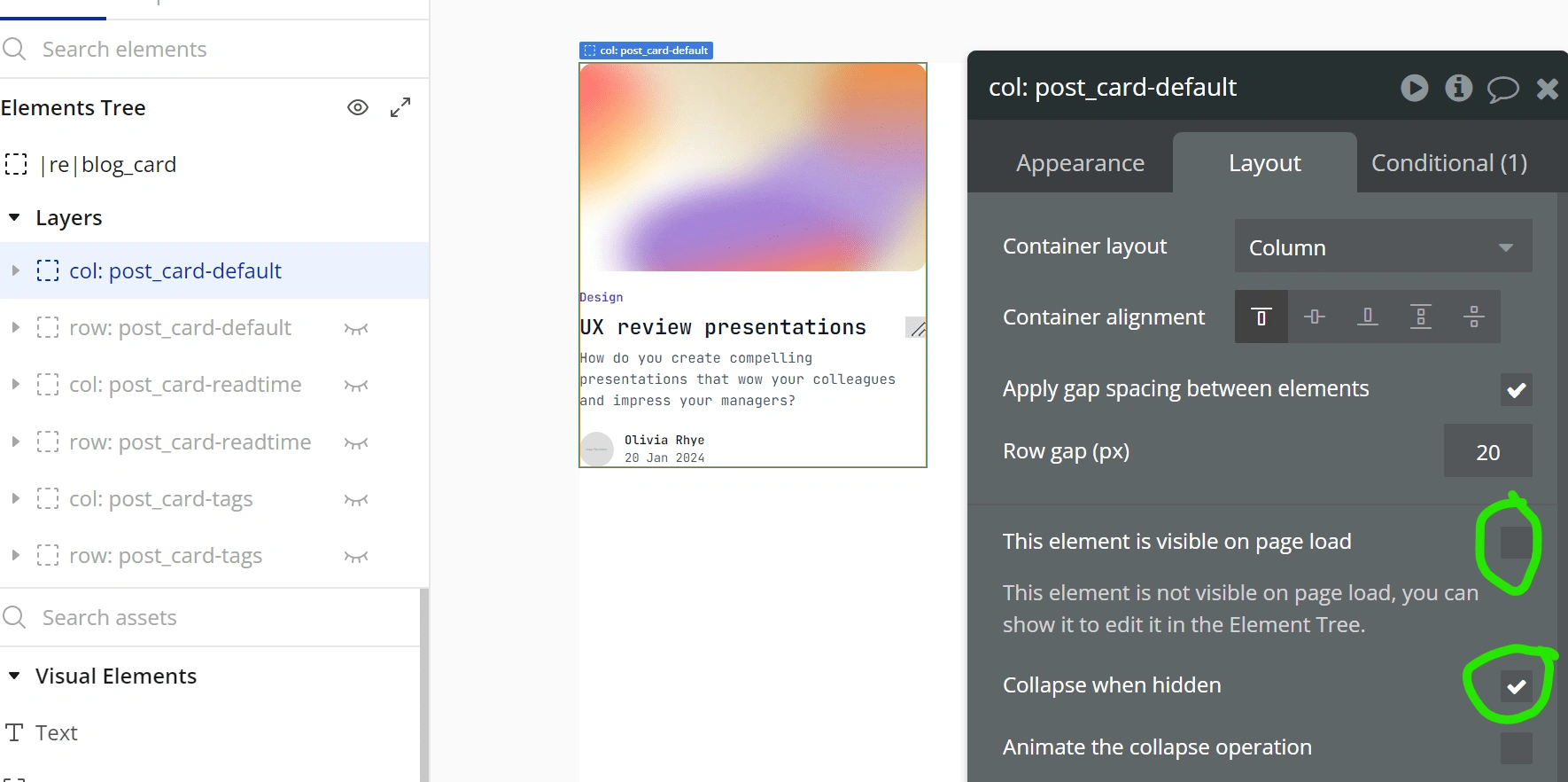
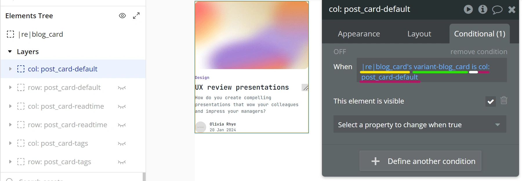
The last thing is adding a conditional to show the correct variant and uncheck 'This element is visible' and check 'Collapse when hidden'.
Using Components
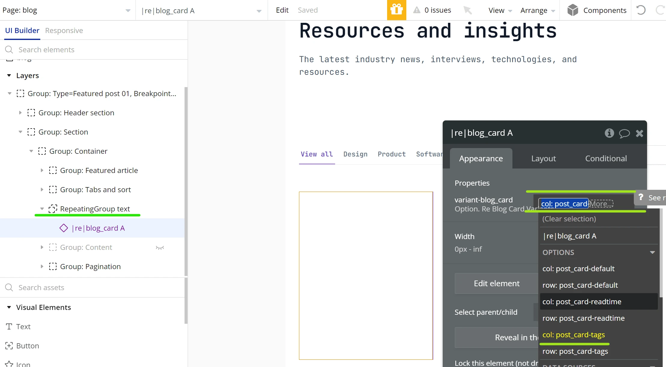
By changing the value of variant-blog_card, we select which variant to show
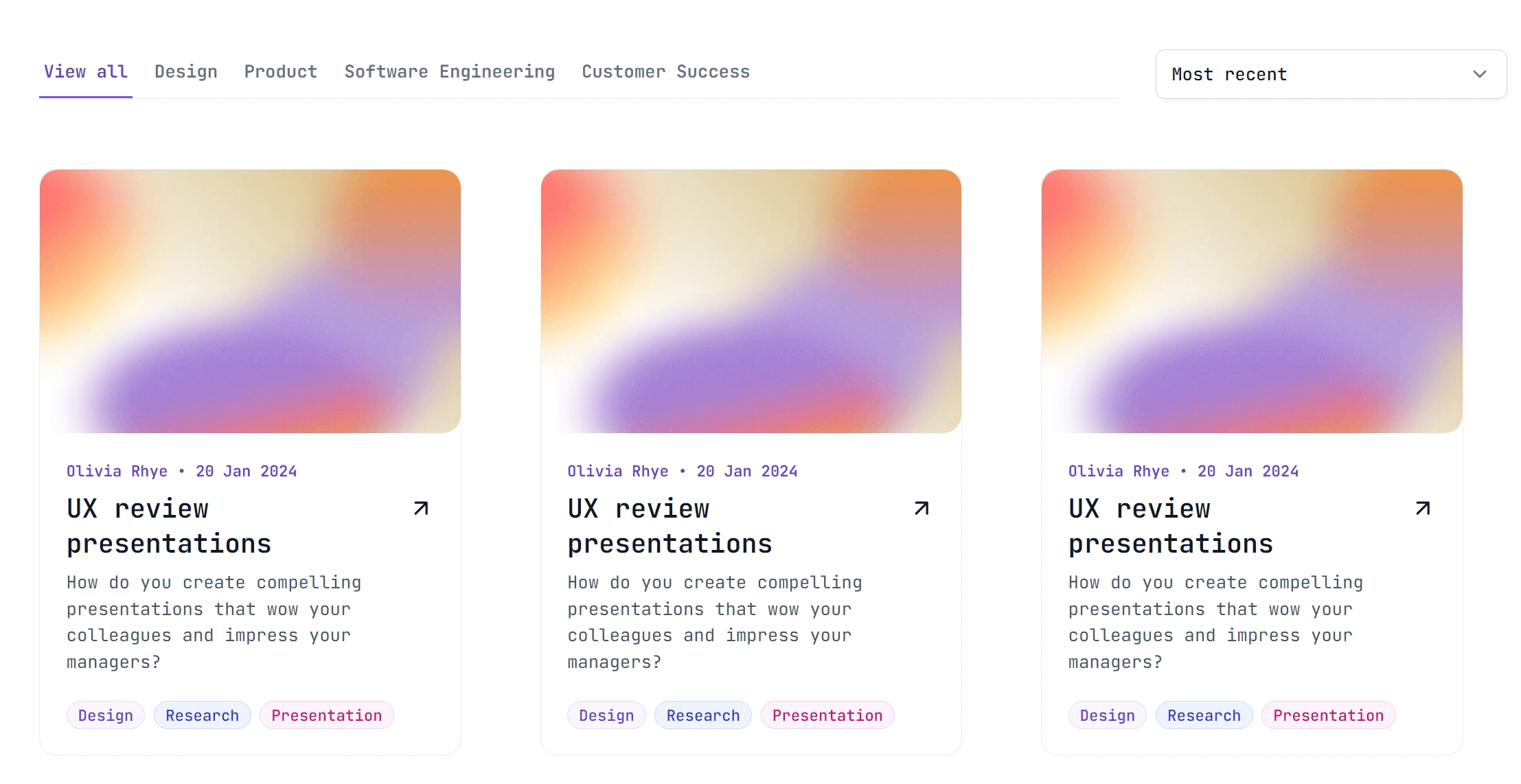
Variants preview
We can also change which variant to show according to a condition.
In this example, I chose to show the blog post card with a horizontal layout when the current page with is less than 992px.
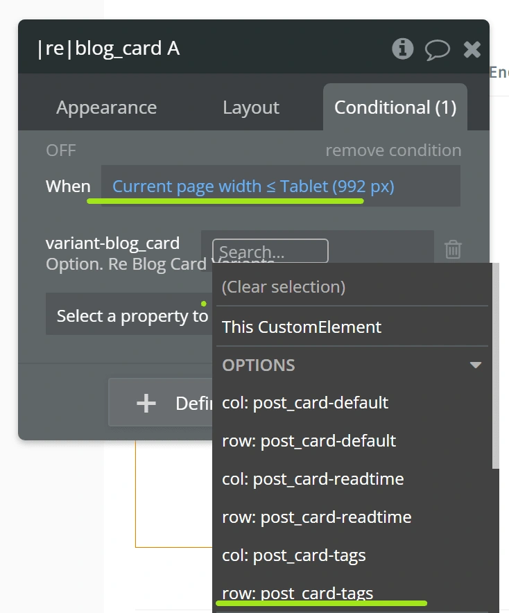
Adding conditions to change variants allow us to have more flexibility when using components on different pages.
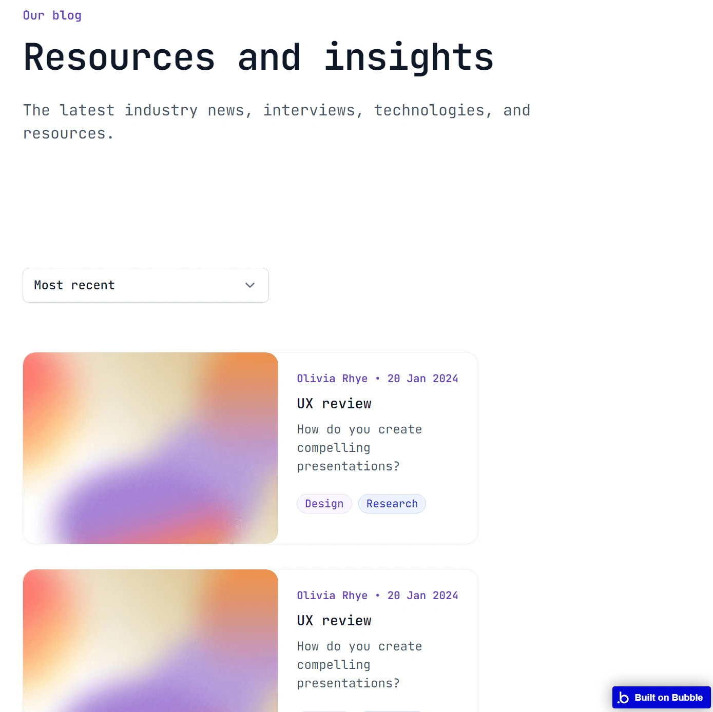
The horizontal verion of the blog post card after adding the condition
Advanced Use cases
In the example below, we have a reusable element called: r/ pokemon-team-card
This is how the reusable is composed:
r/ pokemon-team-card
web-pokemon: information
mobile-pokemon: information
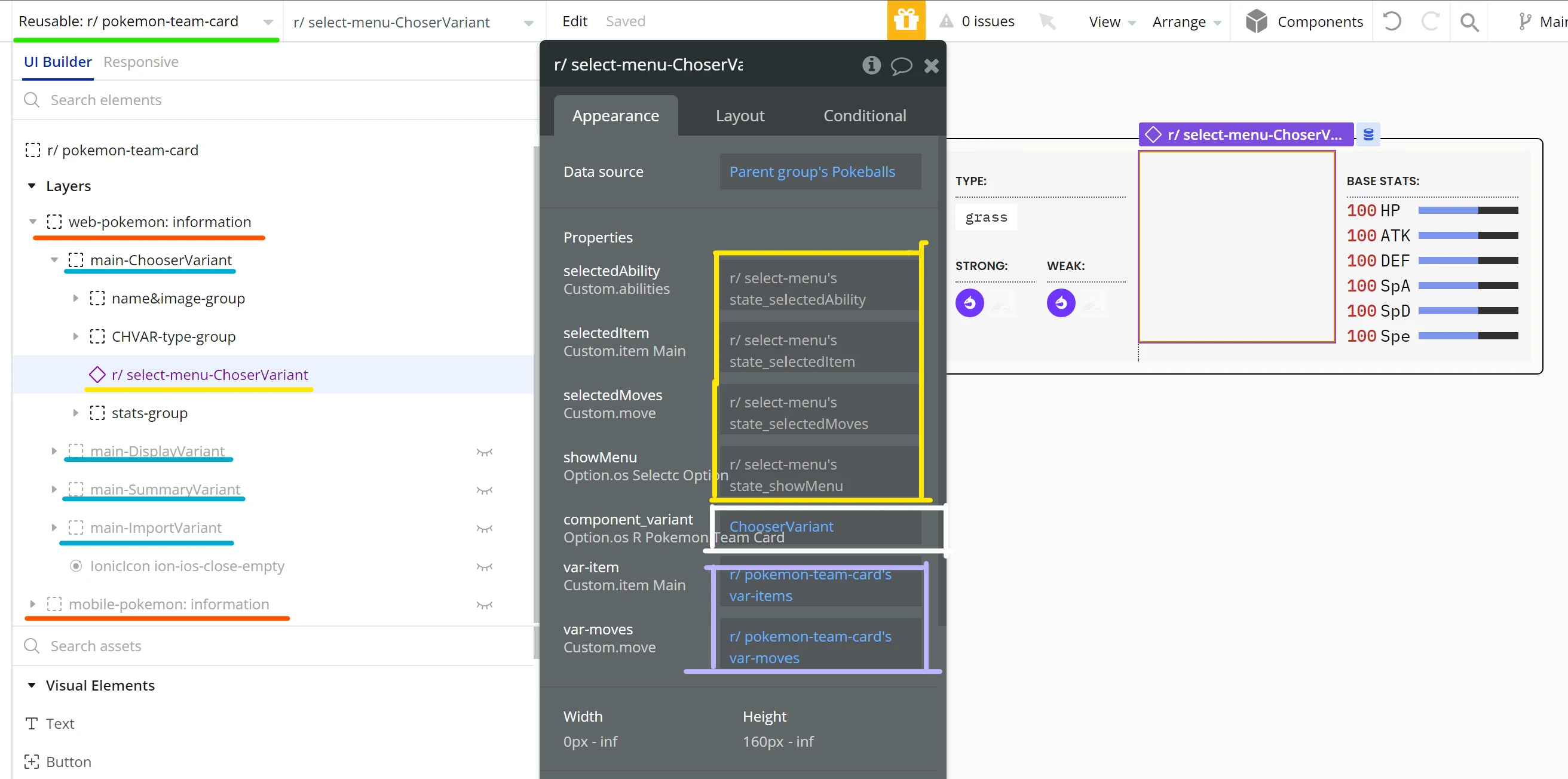
The parent variants are in orange, being the web version and mobile version.
There are 4 variants in blue and each of them has another reusable with its own variants.
The menu displayed shows in yellow the properties of my reusable element, r/ select-menu. This component has properties attached to inner custom states to pass the data that is being manipulated inside the component.
It also has a property to select which variants to display and other properties to pass data from the parent group to this component.
Like this project
Posted Apr 29, 2024
Keep your app organized by creating variants of your reusable elements. It helps keep design consistent and reusable workflows.
Likes
0
Views
101