Movrs Branding and Brand Architecture
Deliverables:
Branding - Visual Language - Packaging - Posters - Social Media Design
The Project:
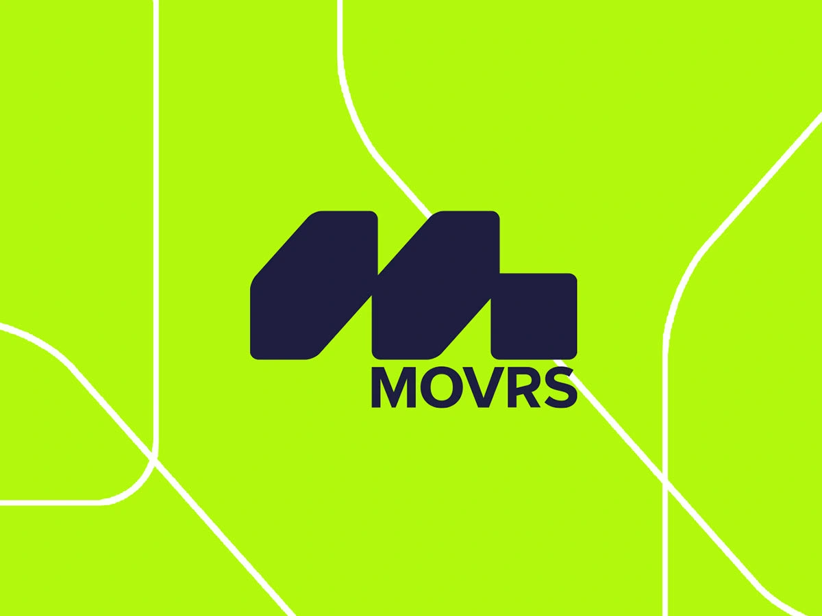
Movrs is a multi-brand sneaker store located just off Grafton Street, stocking a range of sustainable brands. The challenge was creating a unique brand to embody the brands sustainable ethos. We did a deep dive into the market to get a better understanding of the competition and we could set Movrs apart.
From this, we developed a unique symbol and logo for the brand and developed a flexible visual style using a mix of typography, urban imagery, vibrancy and sustainable features. We developed out a number of brand patterns to use across the various touch points also. This then became the foundation for the brands visual style and was rolled out to all the brands touch points. The design has an urban feel but also brings elements of sustainable within the visuals, like a large tree scape which has been used within the store and on some of the visual elements. We brought this styling to the other main brand touch points like the shoe boxes which uses a mix of vibrant colours and brand patterns, as well as the reusable shop bags to reduce single use packaging.
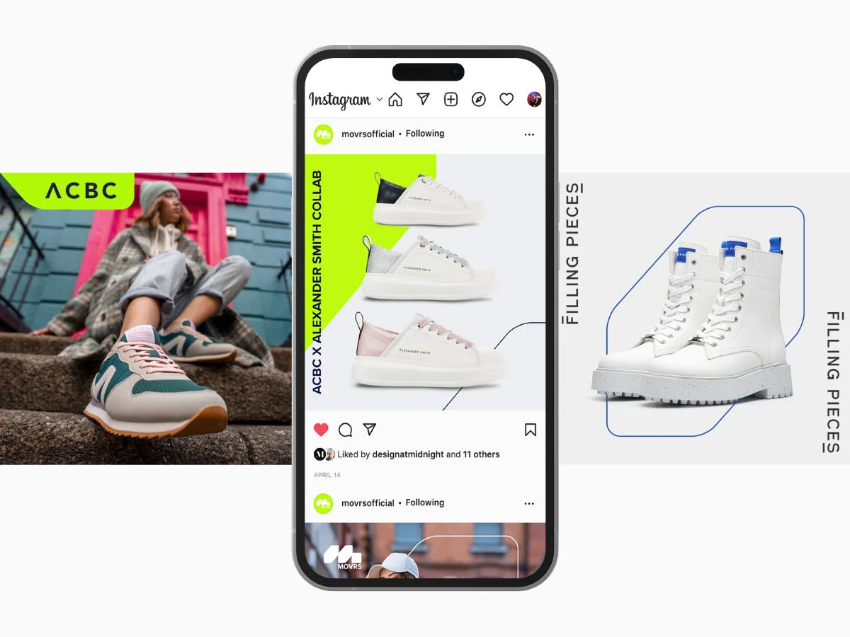
Social Media Design
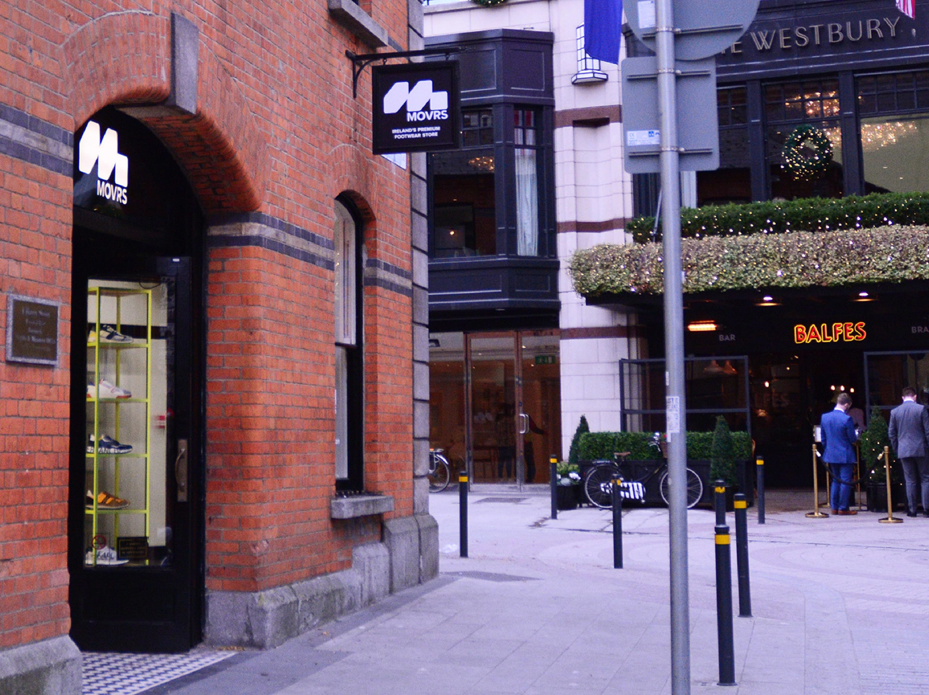
Shop Front Signage
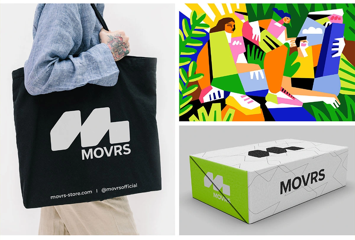
Tote bags, Shoe Box and Wall Design (Wall design by Artist)
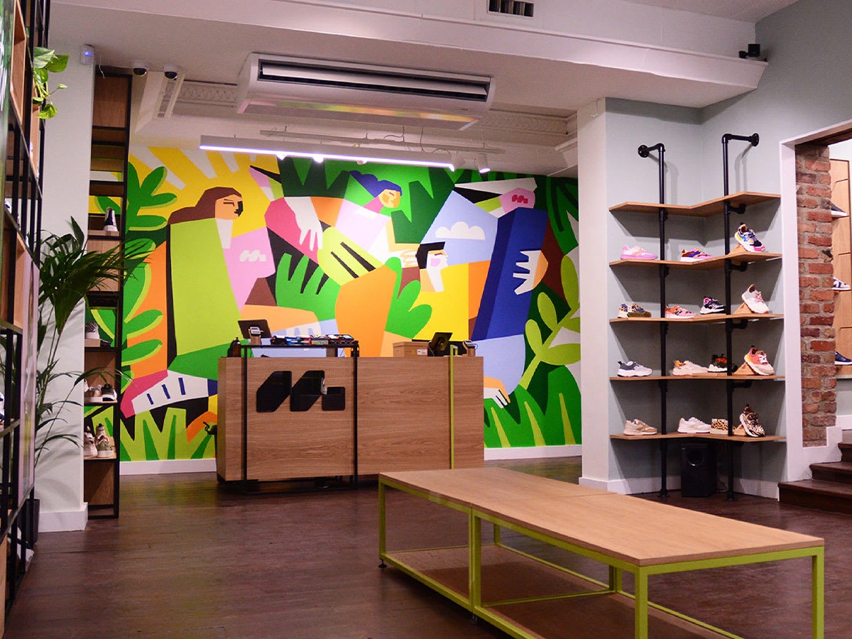
Shop Till Area Design
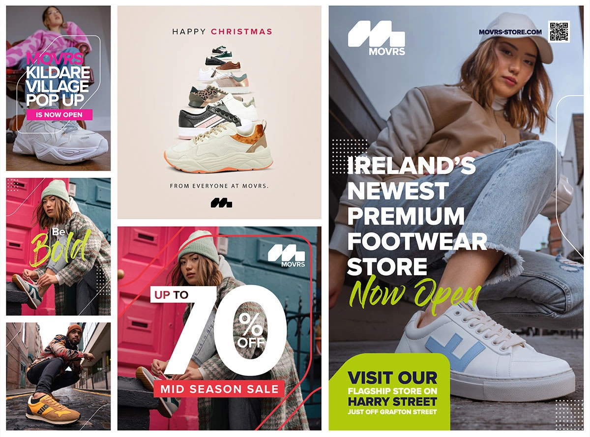
Advertising Assets
Like this project
Posted Dec 5, 2023
Brand development for the Movrs shoe brand. The project included branding, packaging, visual language, website and shop design
Likes
0
Views
8

