GoMasterCoach Rebranding Project

Tamires Oliveira


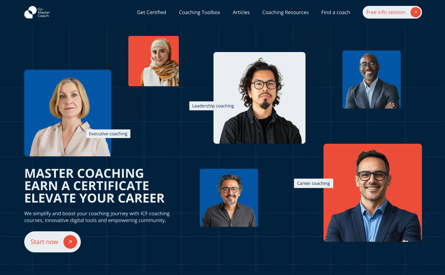
GoMasterCoach is a coaching business based in Singapore that needed a full rebrand of its looks. Warm and inviting, the concept we proposed embodies communication, community, and growth. The icon blends a speech bubble and a circle, symbolizing open conversations and shared progress. Light and friendly, the logo elements extend into a modular system, creating a flexible identity that adapts across different applications.
The color palette—cream, orange, blue, and light teal—reinforces the approachable and uplifting tone, while the modular iconography brings a sense of playfulness and adaptability. This direction fosters connection and engagement, making the brand feel dynamic, accessible, and welcoming.
Like this project
Posted Jun 4, 2025
Rebranded GoMasterCoach with a dynamic, adaptable identity to reflect its innovative coaching approach in Singapore’s competitive space.
Likes
0
Views
1


Brand Development for Personal Training

Website Ideation for Smash Burgers (Lisbon)

FTI Rebranding Strategy
FLEXeCHARGE Website and Video Design