Reimagining Fingertip


Live website: https://fingertip.com
Background
When the Insert Frame team approached me to help them redesign an existing product called Fingertip and make it look friendly and modern, I was excited to jump on board and experiment. By setting a clear design vision and closely collaborating with the Fingertip team for almost 6 months, we made it happen. In this article, I’ll show you how we did it, and I’ll explain what we did and why we did it.
Existing product and need for redesign
Let’s begin by framing the problem. In the early days, Fingertip was a web-based app that allowed users to create a microsite through a simple, drag-and-drop interface. However, their founders found that the user experience was... inconsistent. This prompted them to seek alignment between the existing interface and modern design trends.
Original design
Users and needs
Before jumping into fix mode, we wanted to define the most common site visitors, their goals, and the problems they were encountering. We tried to see opportunities so that we could begin exploring how to create a good experience for both existing and new users. Early discussions were crucial in establishing needs of businesses, entrepreneurs, professionals, or freelancers who want to create their site.
Voice and concept
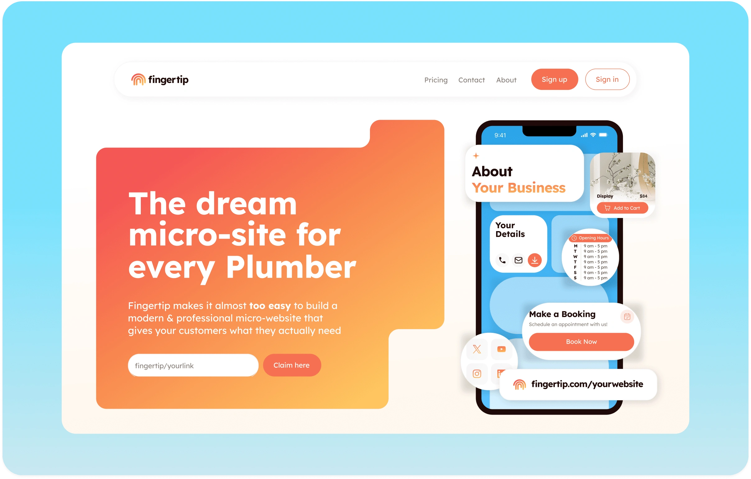
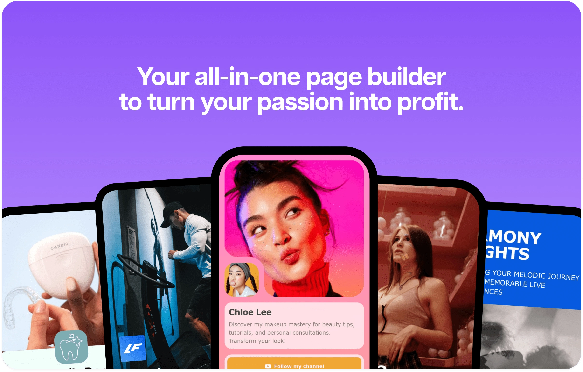
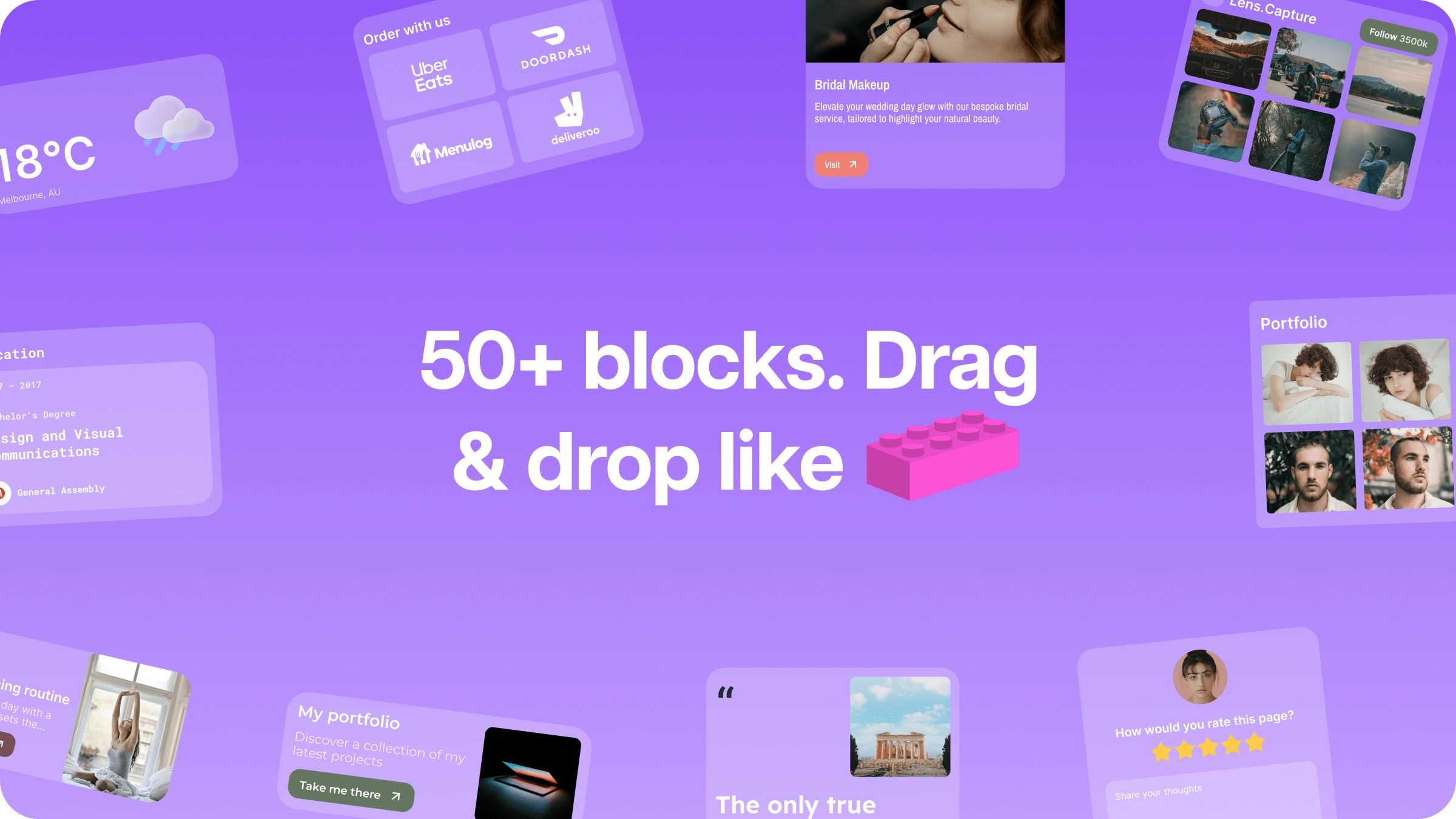
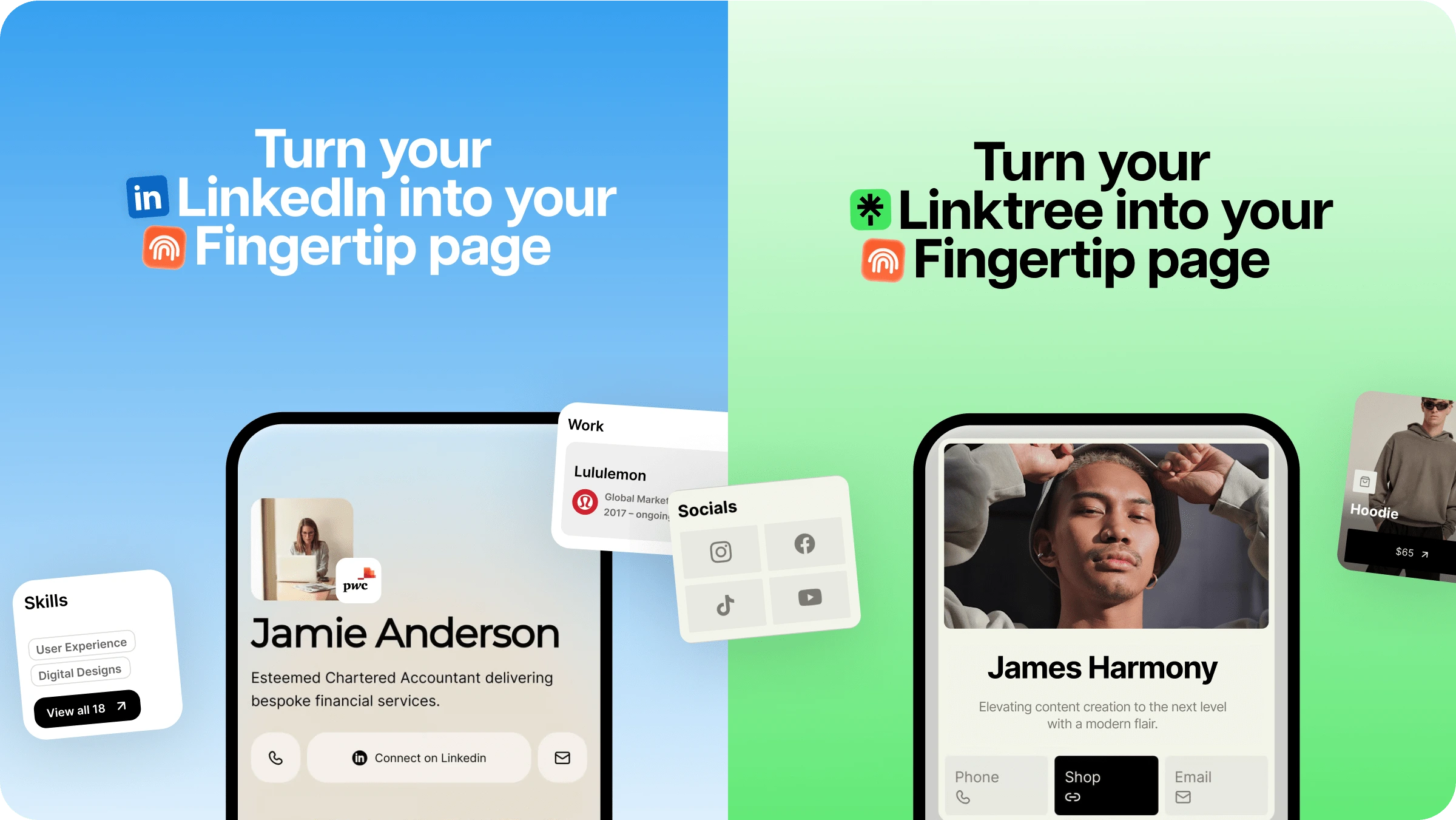
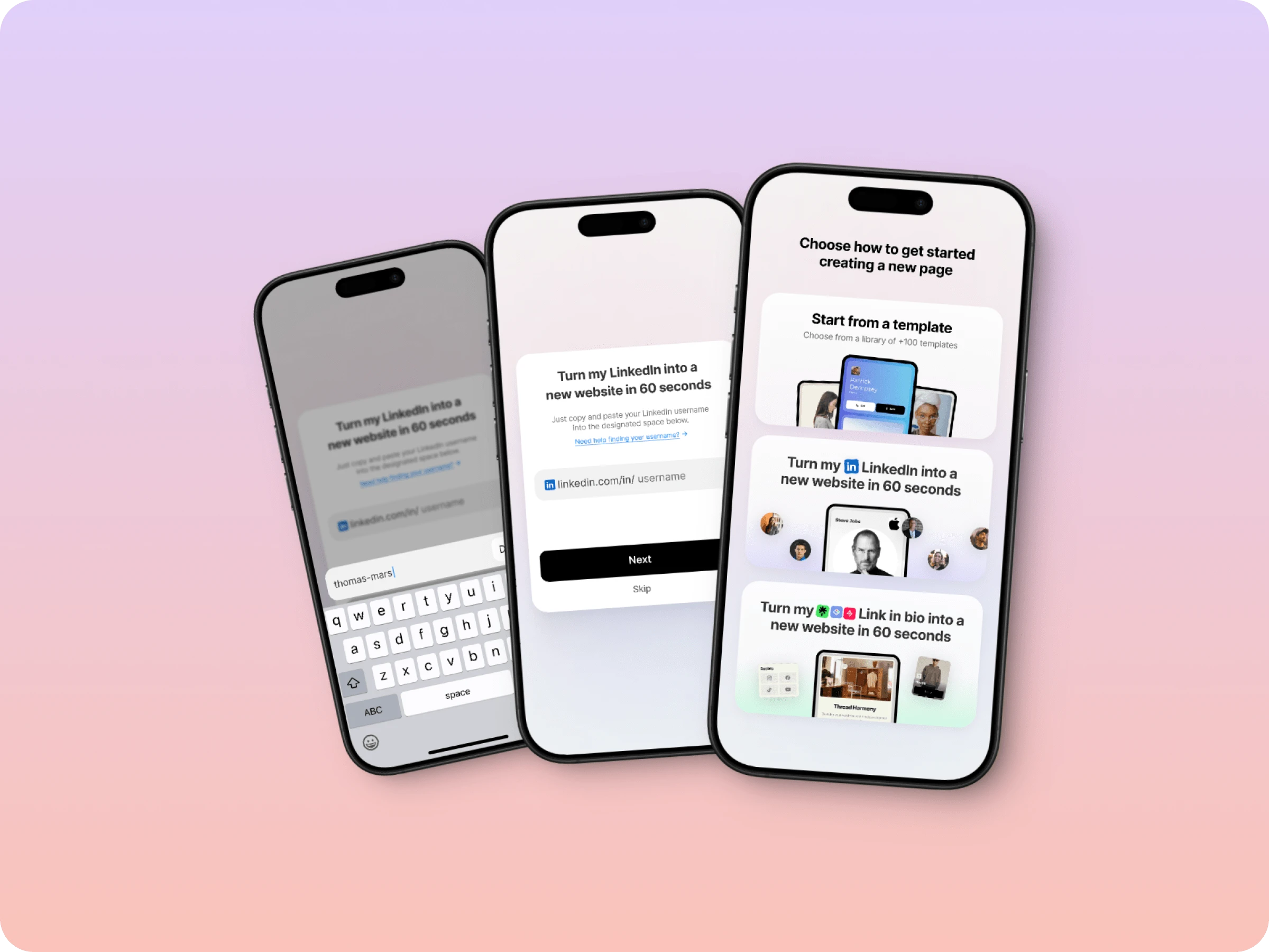
After several rounds of exploration, we translated the needs of our users and stakeholders into the shape of what started being Fingertip 2.0, a modern, user-friendly brand that refines the concept of widgets as blocks to build a personal site in just minutes with no technical skills required and accessible to everyone. By this point, we were a few weeks into the process, and we felt comfortable taking this concept and moving on to tackle some of the most important pieces of the project.
Branding
Our process at this stage encompassed two parts:
Figuring out the rules of the existing Fingertip universe first, what worked and what not. We wanted to consolidate the resources we had. Once we had a grasp on that, we started building out the rest of Fingertip and filling it with our very own trademark.
Design
The design sprints enabled our team to explore a variety of ideas, break down silos, and craft a more cohesive set of solutions for Fingertip. Throughout the project, we maintained close collaboration through jam sessions, and weekly meetings to share progress and updates. Naturally, we encountered some negative user feedback during experiments, which prompted us to tweak design elements and re-test them. This new iteration of Fingertip opened up numerous opportunities to enhance the user experience and drive further growth for the platform.
Education
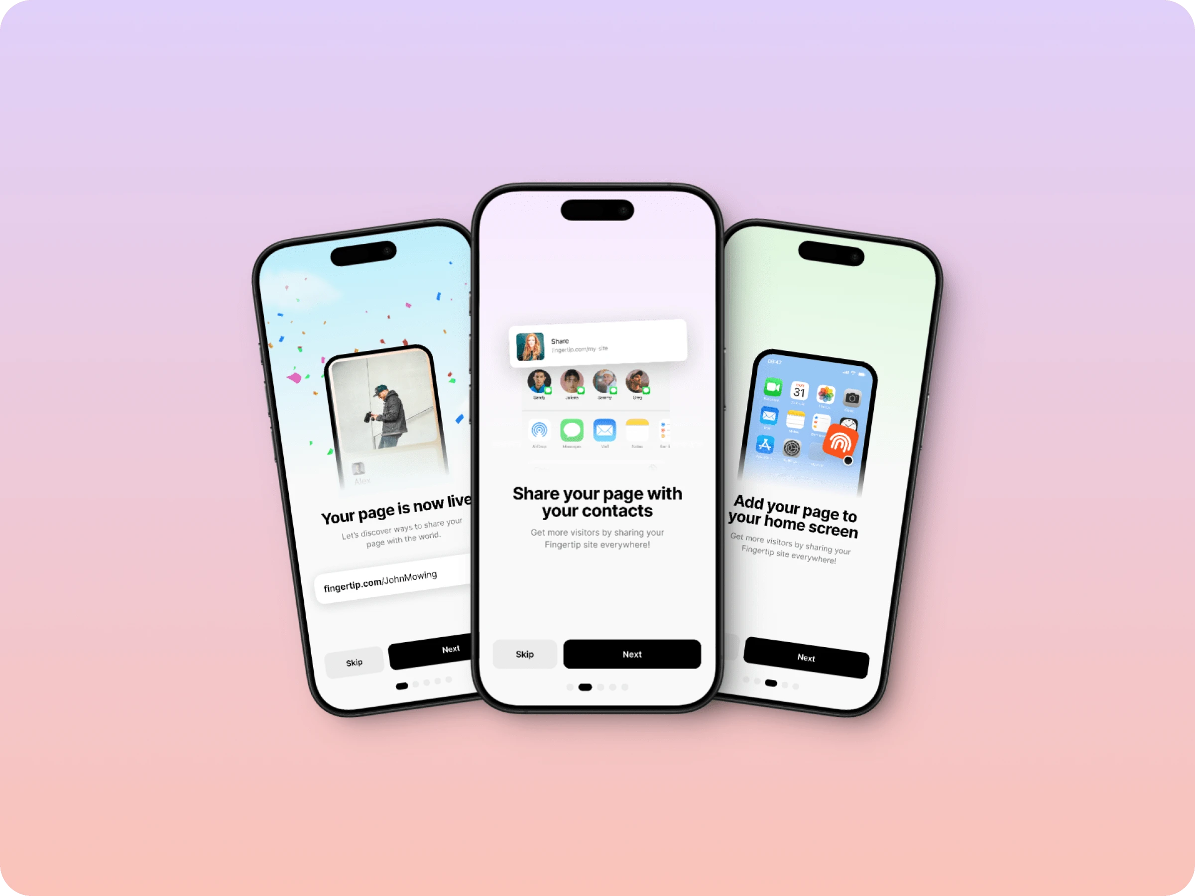
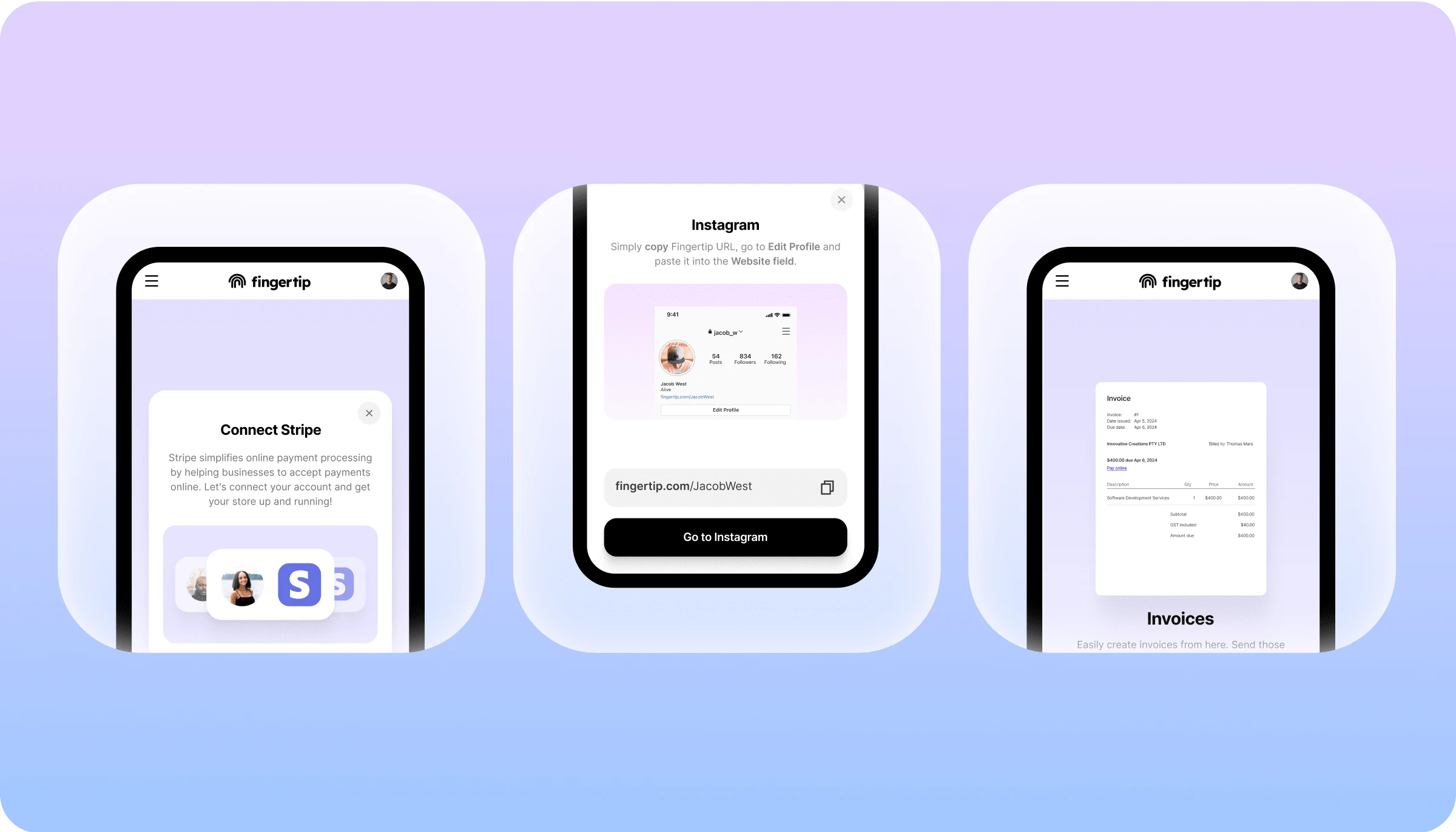
During the process, our team also placed a strong emphasis on ensuring accessibility and ease of use, specially because our target users are non-tech savvy users. We understood the importance of making every step of the process—from signing up and onboarding them, to creating microsites—as straightforward and intuitive as possible. Our design approach focused on clarity, simplicity, and user-friendly tools, ensuring that users could create their sites without feeling overwhelmed by technical jargon or complexity. The feedback we received from users and metrics obtained served as validation that our efforts to prioritise education and user experience were successful.
Website
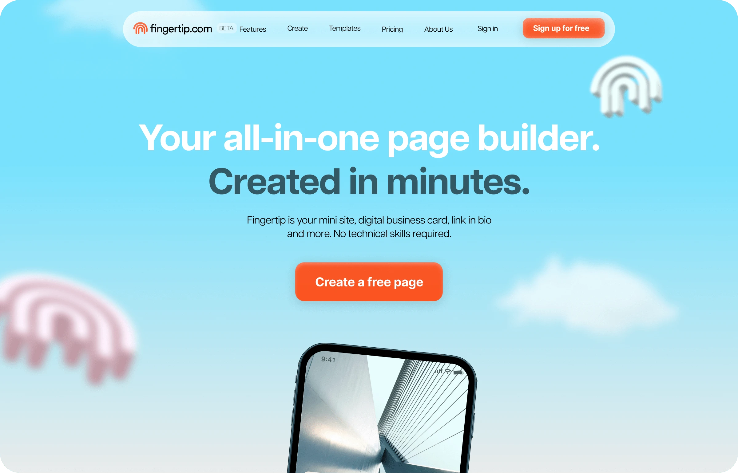
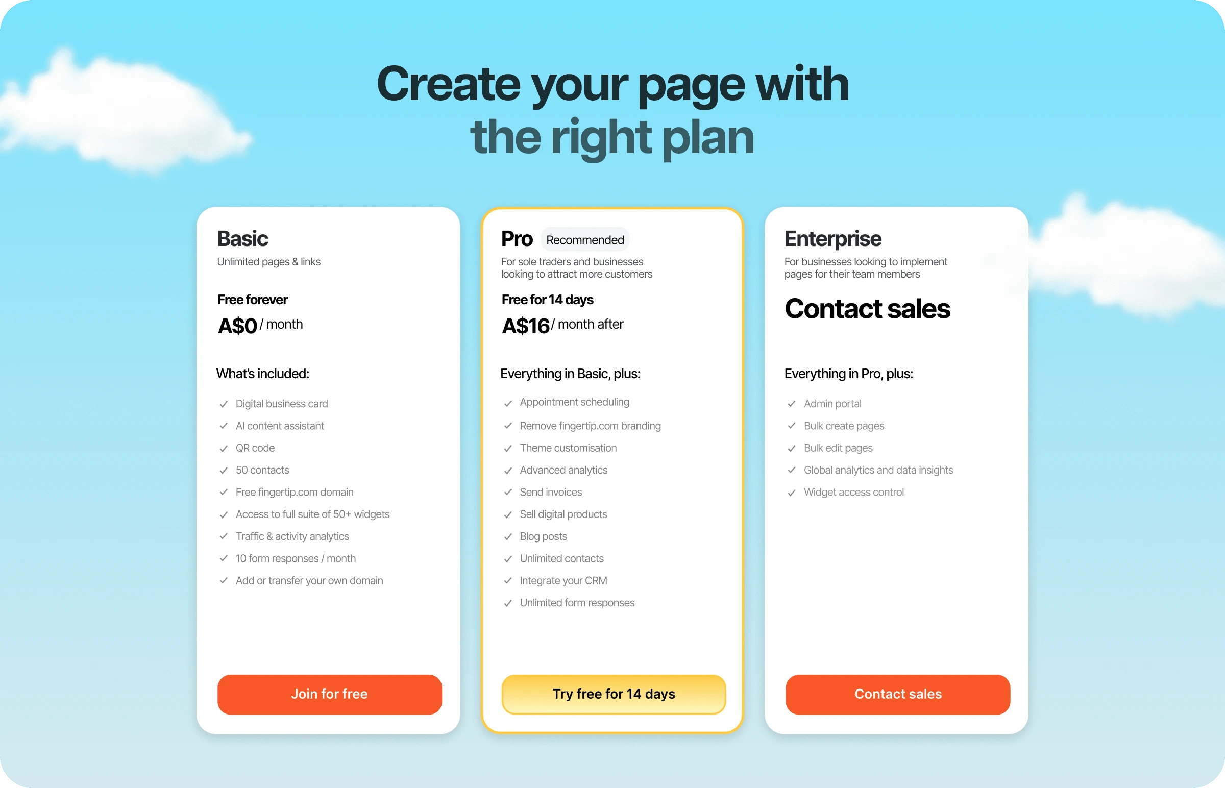
So we had a new product, and we thought it looked really nice. But there was one especially important place that needed our attention: the Fingertip website! Because a digital product is nothing without a slick website. We used Framer to bring our vision to life. With each iteration, we delved deeper into the possibilities of animation, colors, and brand elements, refining our design to create a website that was a success! Note: We measure the site’s success not just through the usual metrics of employer brand growth and conversion. We’re also interested in internal pride; in creating visually stunning and also incredibly engaging sites and we believe we achieved this!
Outcome
A fresh product that is visually modern and cohesive, highly functional, and user-centric.
Iterative design processes, and continuous feedback loops ensured every aspect of Fingertip was meticulously crafted with an enhanced overall user experience.
Success reflected in flow of conversions. Fingertip adopted thousands of new users since launching.
A new website that is on-brand, designed to convert more visitors into customers, and build greater brand awareness for Fingertip. Success reflected in user engagement.
We designed social media assets, imagery, templates, and more, ensuring all could be used across multiple platforms.
Like this project
0
Posted Oct 25, 2024
A behind-the-scenes look at researching, designing and giving a new voice and look to fingertip.com
Likes
0
Views
0


Kite.site's refreshed website

Thenty · Landing Page