Kay's Dessert Brand Identity
AMY CASSIDY
The Brief
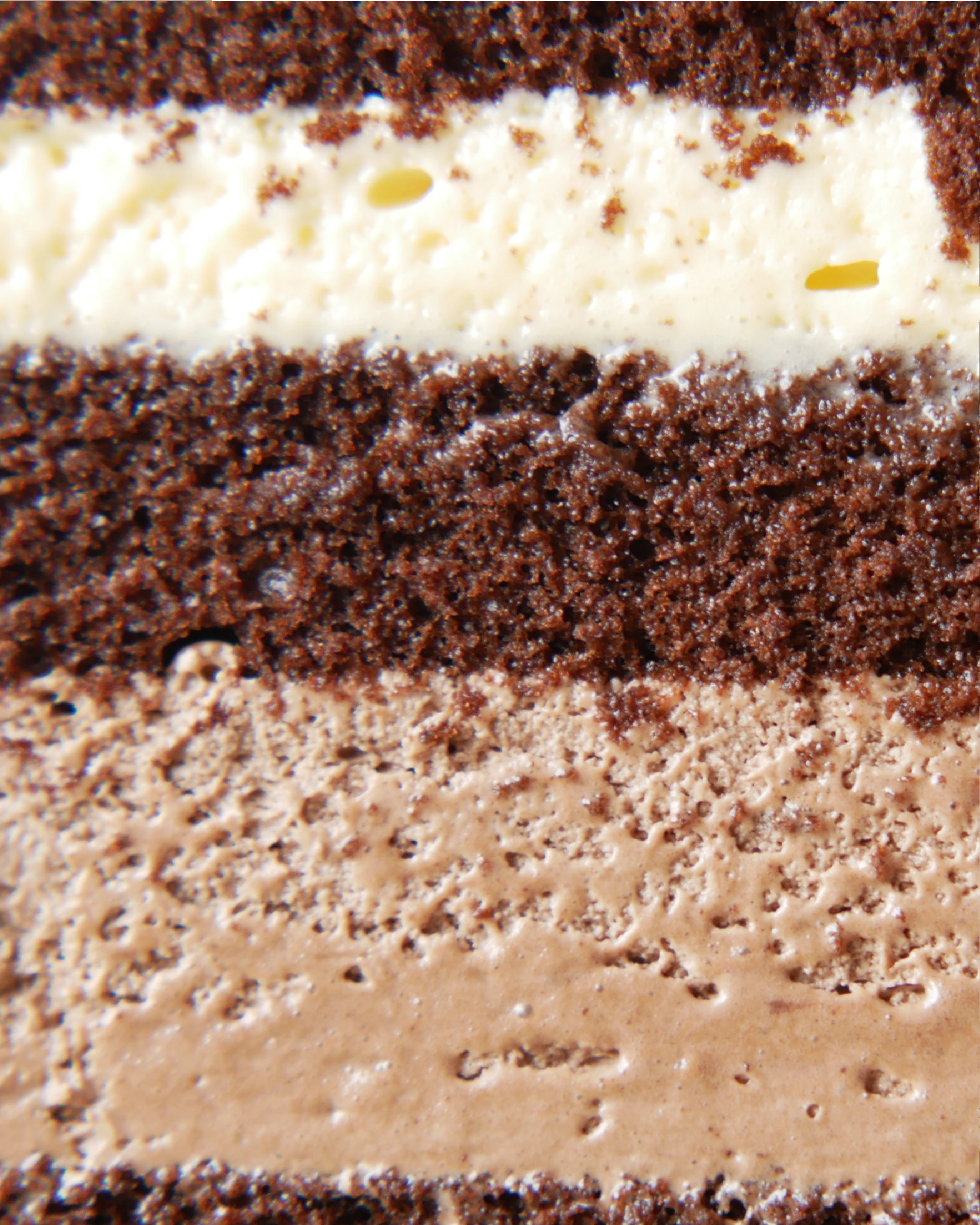
Kay’s is a space where every dessert tells a story. Specialising in bespoke, homemade treats, no two cakes are ever the same. Kay’s brings a personal touch to every order, ensuring it’s tailored to each customer.
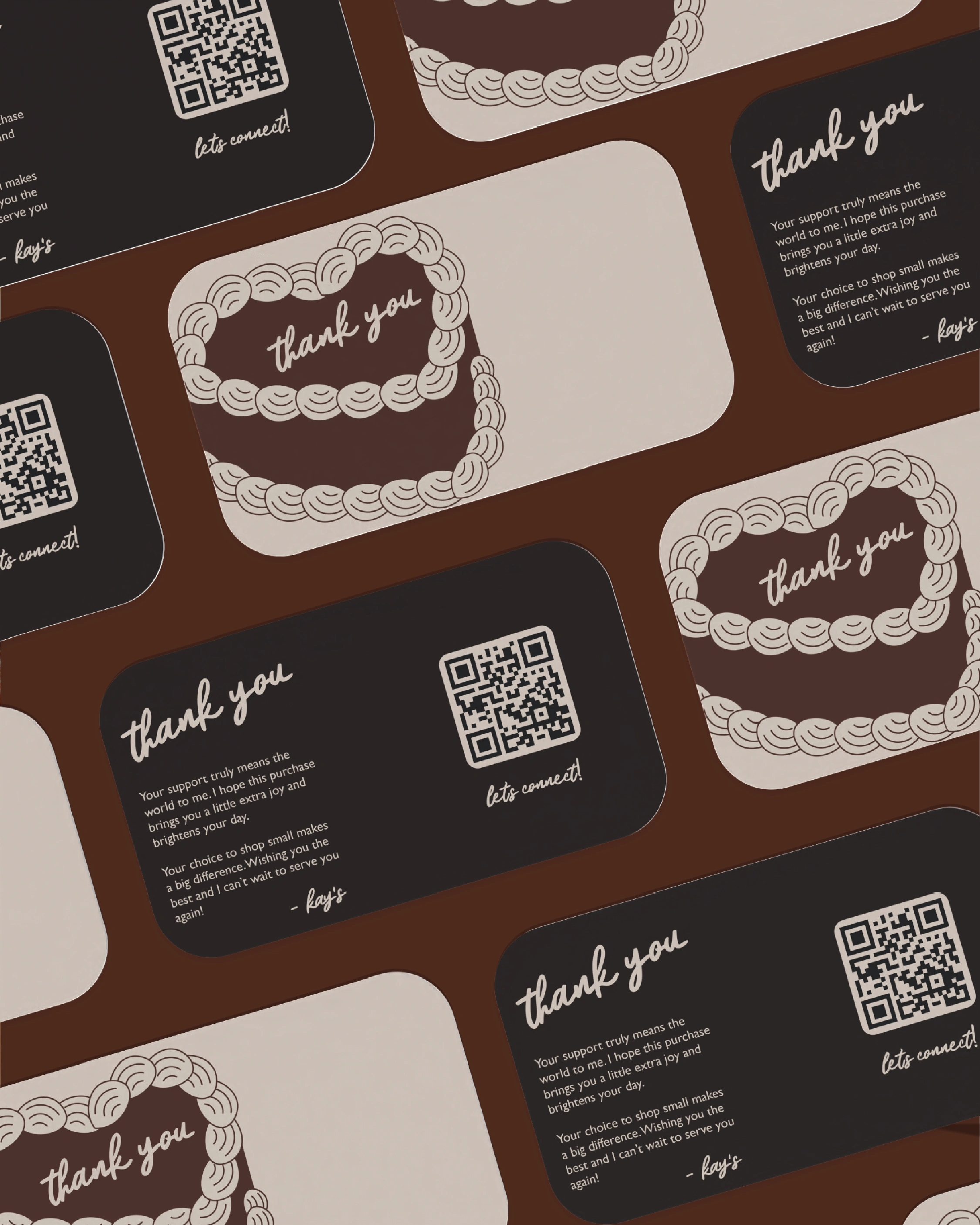
When I met Kay she was just at the start of her thriving business journey. But despite booming business, Kay felt she was disconnected from her brand. It didn’t feel like it was hers anymore. She was spending too much time figuring out how to style social media posts and thank you cards.
Like many small businesses, Kay’s started with a logo she made on Canva. Convenient and easy DIY. Nothing wrong with it, but Kay knew that her business had outgrown its DIY branding as her products became more premium and she began to scale her business to retailers.
Our goal with this rebrand was to completely reimagine who Kay’s could be. How can we share her story while standing out in a saturated market?
The Solution
When we dived into what makes Kay’s so special and unique, it boiled down to how bespoke her products were. It wasn’t just about a cake for an event. It was creating a moment in time to celebrate with friends, family and loved ones with something delicious and beautiful.
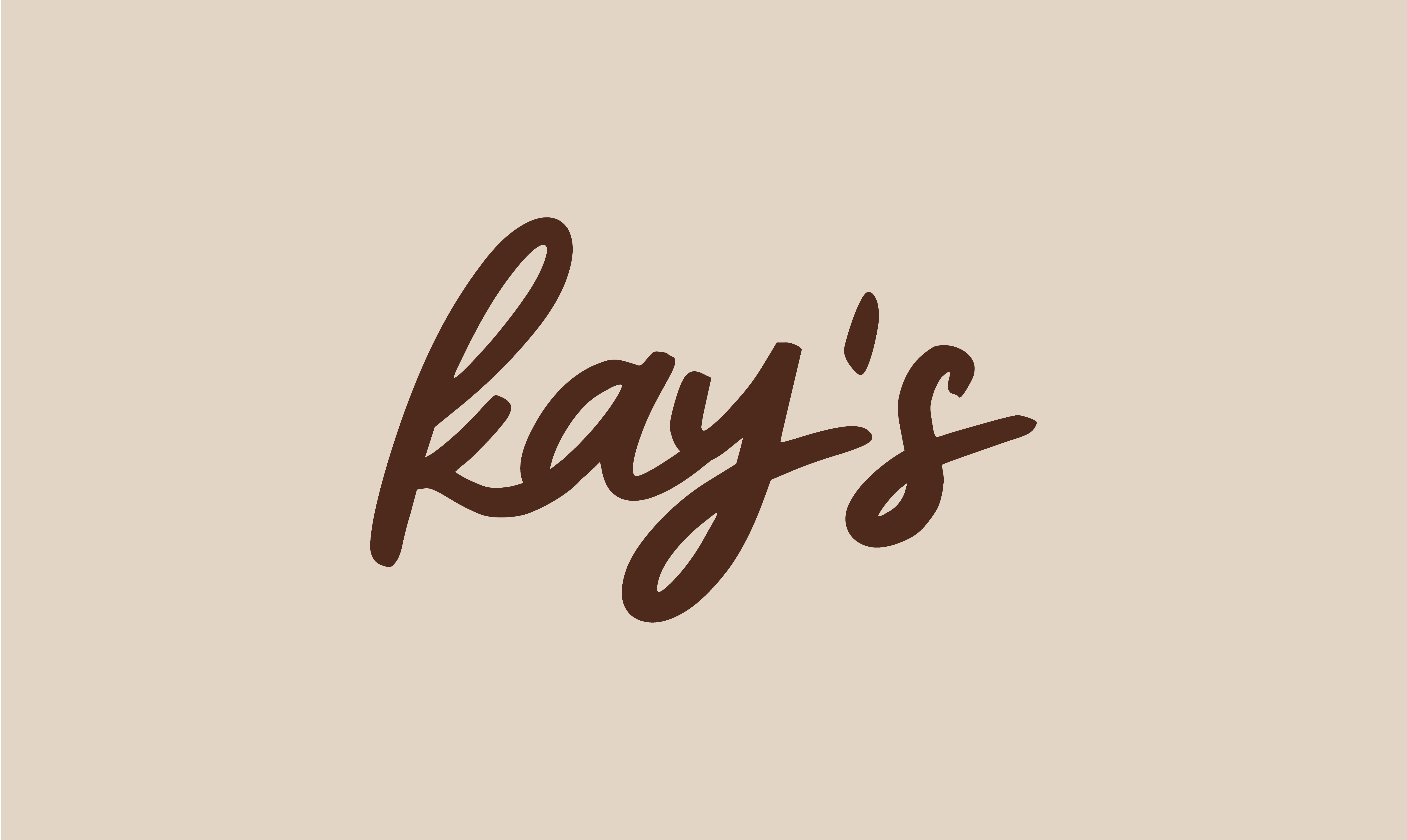
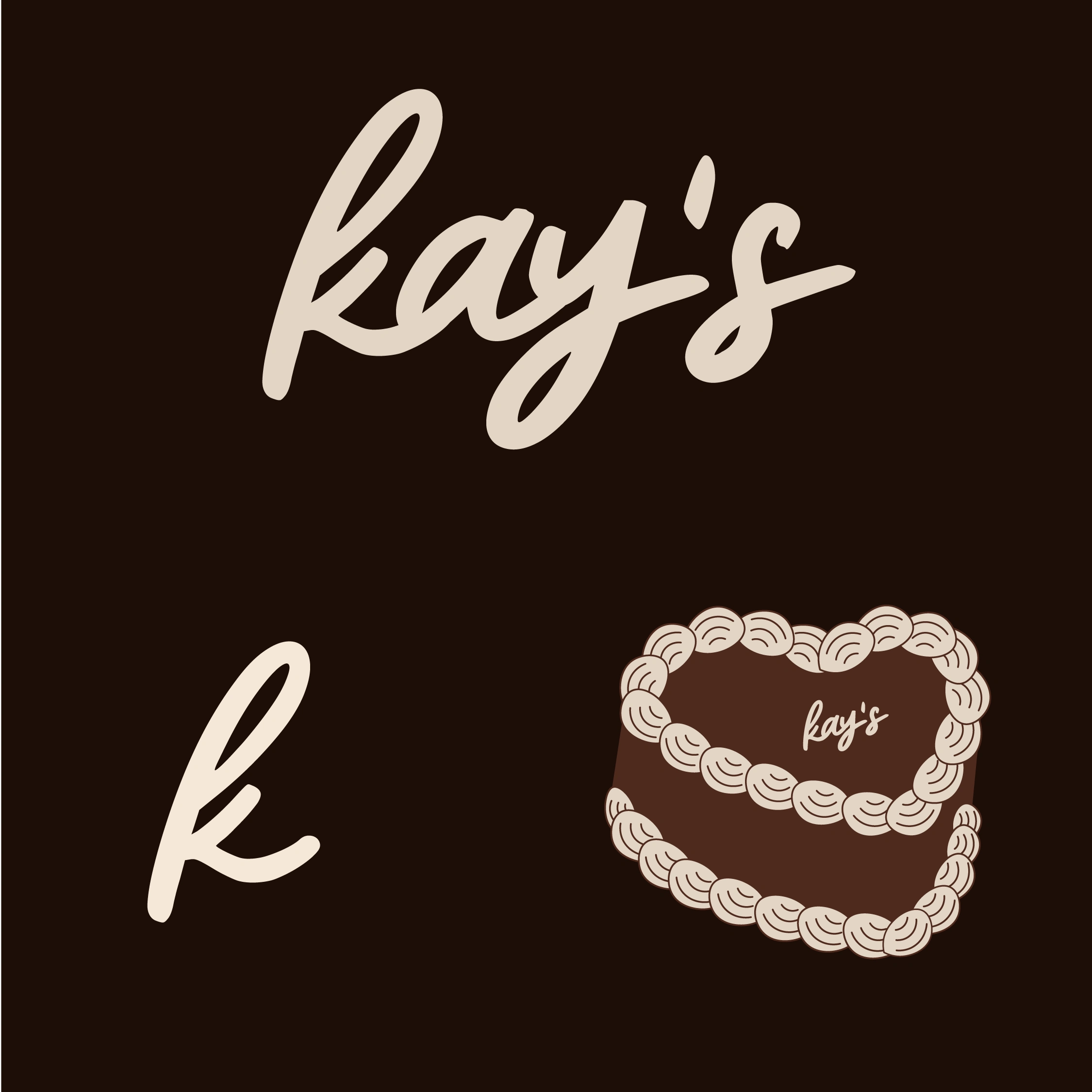
We chose a tailor’s pin to represent Kay’s story, and subtly slot it into the ‘K’. We paired it with a sans serif that mirrored the artisan nature of the brand, and brought it all together with an italian colour theme.
This isn’t simply about producing cakes for occasions; it’s about crafting meaningful, sensory moments, centrepieces that elevate gatherings and create lasting memories with friends, family, and loved ones.
To reflect this level of care and craftsmanship, we developed a visual identity rooted in the idea of tailoring and precision. The tailor’s pin became a key brand symbol. An elegant nod to the meticulous approach Kay brings to each piece. By subtly integrating the pin into the form of the ‘K’, we created a mark that feels both personal and refined, reinforcing the brand’s dedication to detail, artistry, and individuality. We paired the mark with a sans serif that mirrored the artisan nature of the brand and a Tuscany-inspired colour palette.
Like this project
Posted Jun 7, 2026
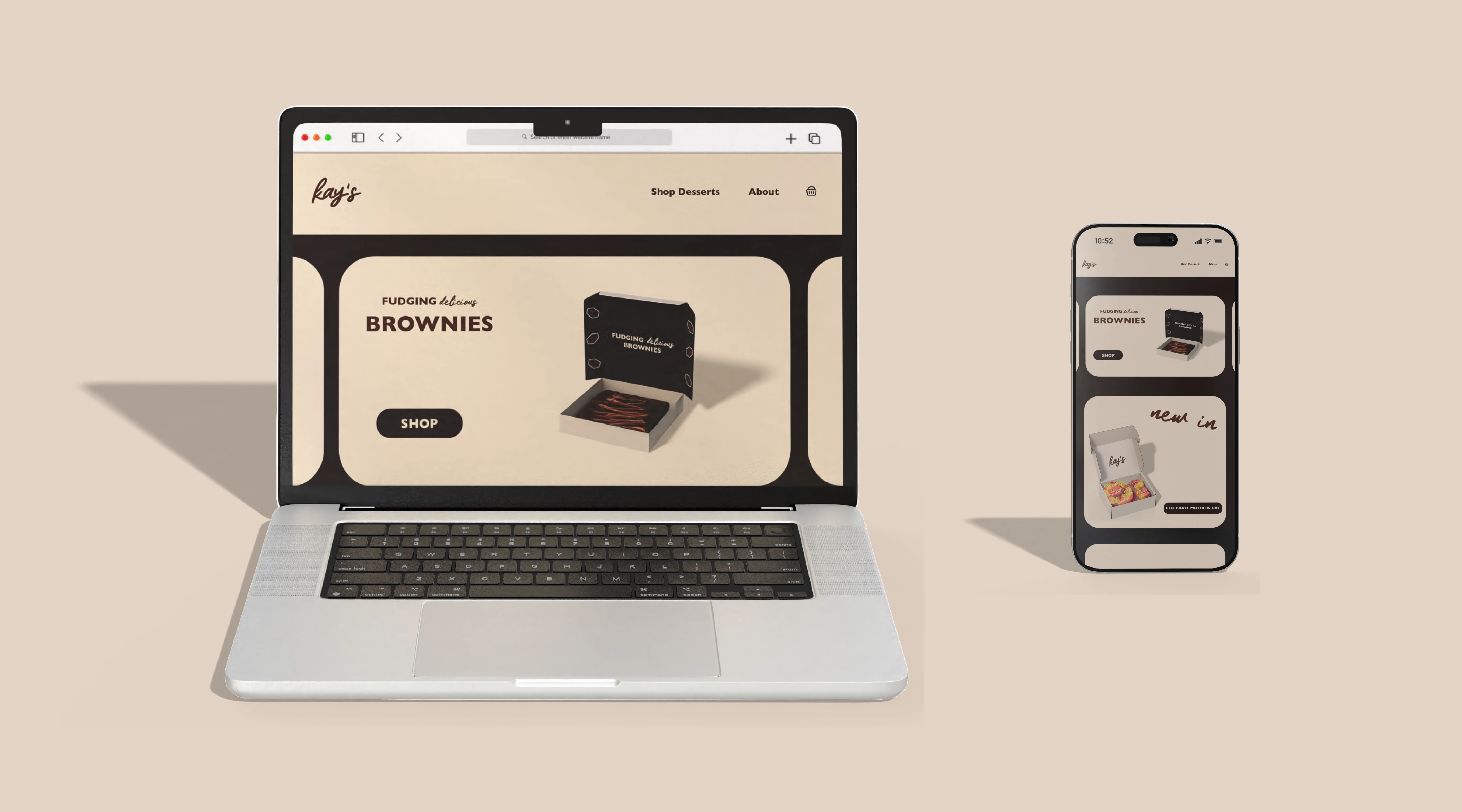
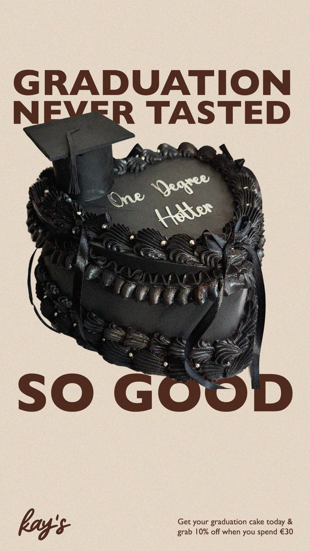
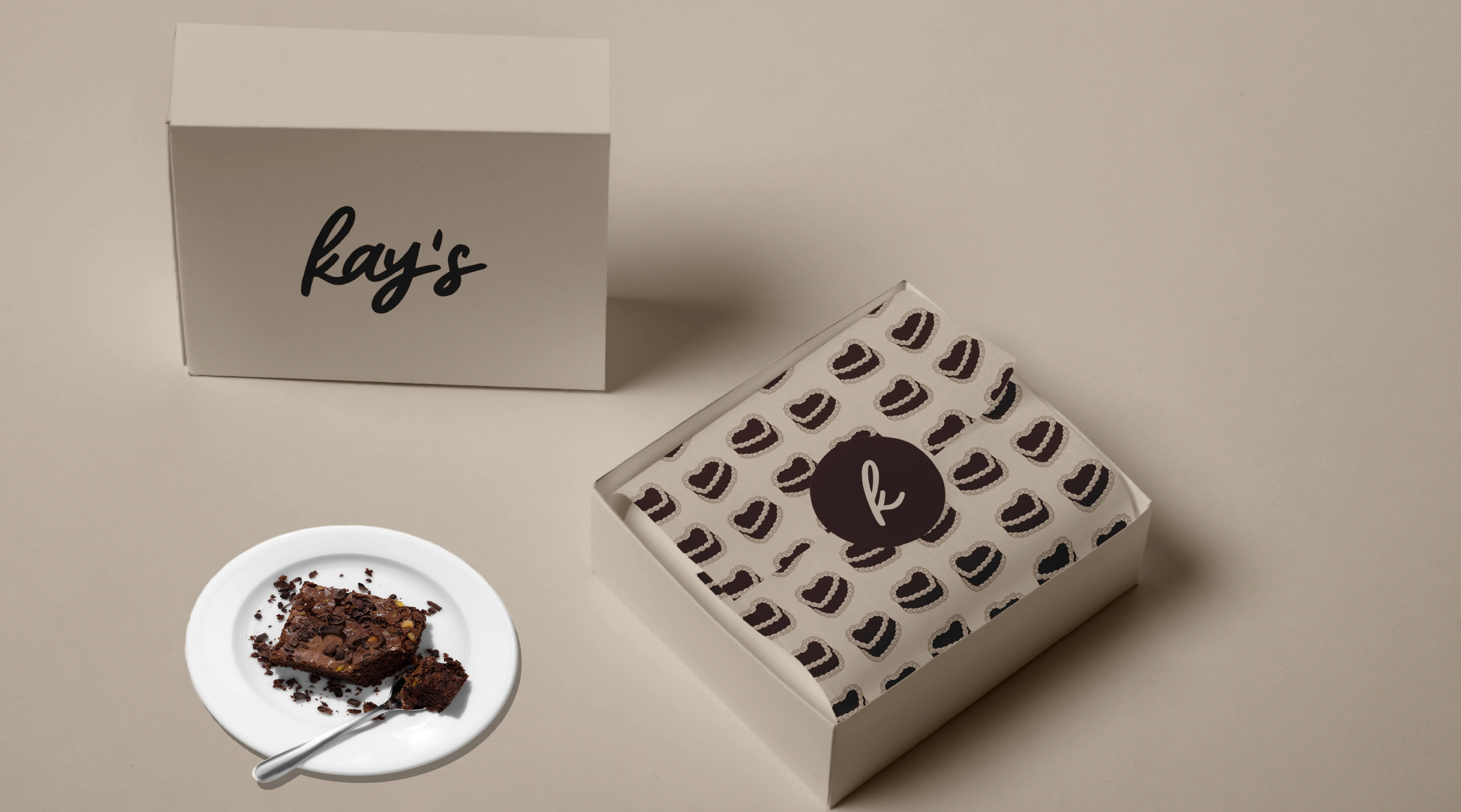
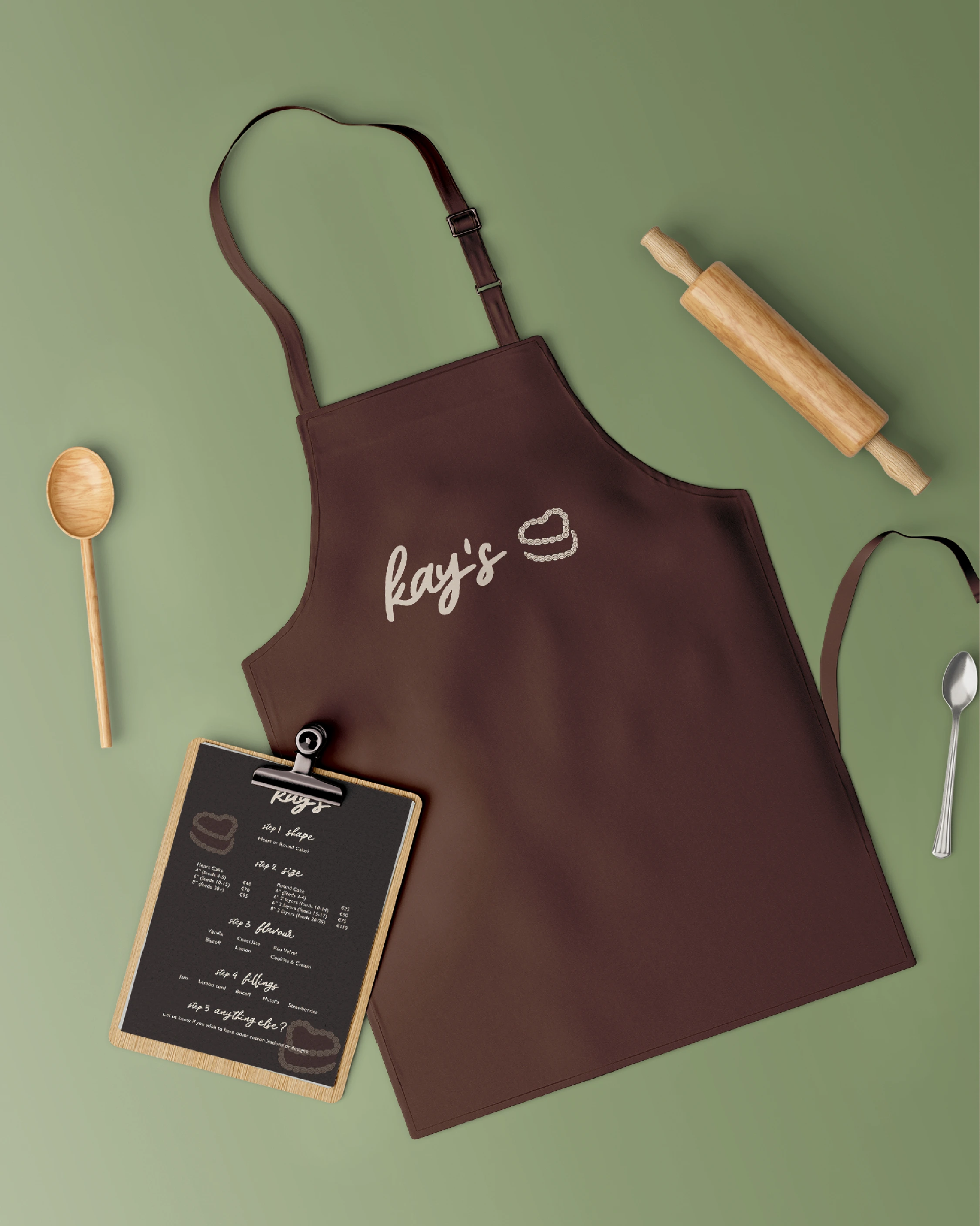
Kay's is a dessert bakery based in Dublin. They needed a new brand identity, social media posts, business cards and packaging design.
Likes
0
Views
5
Clients
Kay's