Rebrand for an AI Lab

Savva Sicevs

Brand identity and product design for Datura AI — an AI lab building on Bittensor. Brand concept, logo, wordmark, imagery system, color and type, and the website.
Role: Brand & Product Design
Team: 2 designers
Scope: Brand concept · logo · wordmark · imagery · color & type · website
The brand concept
The datura flower: beautiful but dangerous. Yet in the right hands its power can be transformative — both poisonous and healing. Datura AI represents that duality: innovation wrapped in rebellion, beauty with a sharp edge. The rebrand had to hold both sides at once — an AI lab whose decentralized tools challenge centralized systems, presented with the clarity of a company you can trust. The personality line that set the tone for everything after: "Bold in our belief. Dangerous in our disruption."

The chosen mark — the floral cross patonce
The mark
Four logo directions were explored, each testing how far the duality could be pushed. The floral cross patonce won: its symmetry conveys discipline and order while the floral ends carry the beauty — a mark standing at the intersection of tradition and rebellion. Hidden readings do the storytelling: four hearts sit in the negative spaces (authenticity and innovation), and read against a radiation symbol, the mark is upfront about the risks and power of what the lab builds.
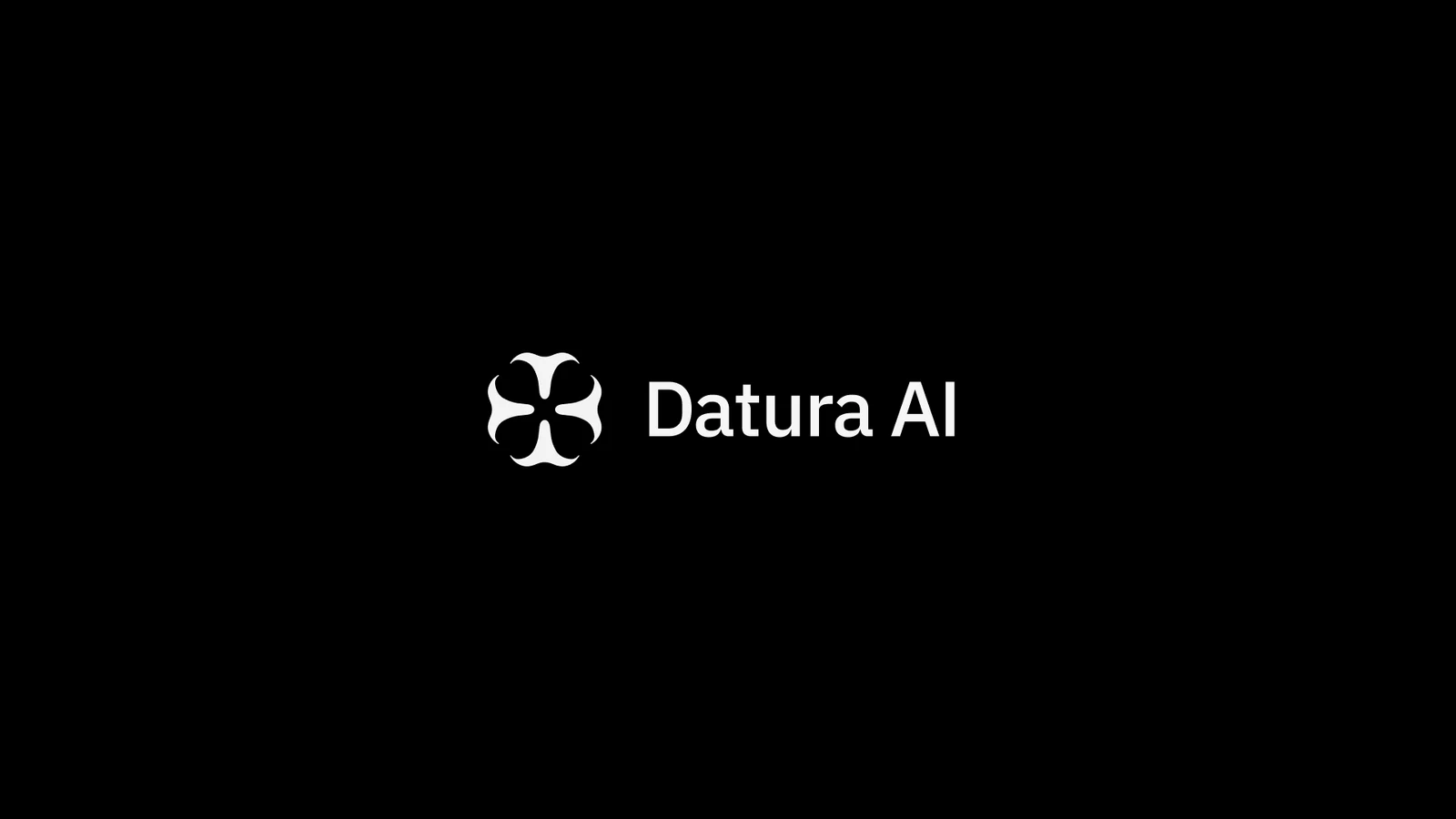
The wordmark — GT Planar with a nod to the Bittensor T
A system split down the duality
Neutral, disciplined grays carry the data-dense surfaces; a saturated chaotic band — pink, blue, green, yellow — is rationed for the moments the brand wants to disrupt.
Clean minimal elements present data with precision; bold color and punk-inspired textures inject the edge.
Glassmorphic UI renders transparency literally — data layers visible beneath frosted surfaces.
In motion, the mark disperses into particles and reassembles — beauty scattering into chaos and resolving back into structure. One motion behavior reused across site, decks and social.
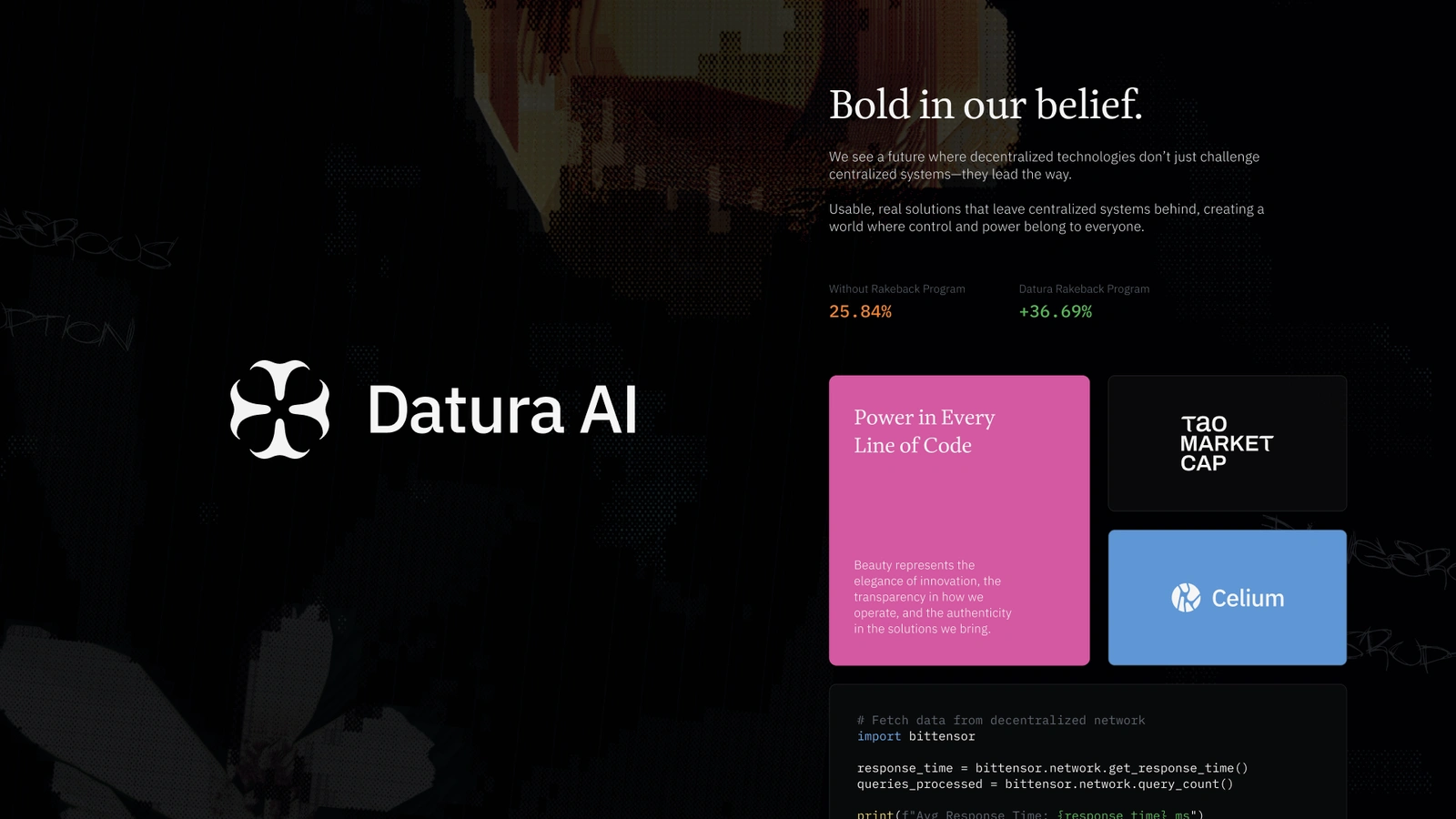
The identity shipped — datura.ai
The identity is live at https://www.datura.ai — full case study → https://www.ssicevs.com/work/datura
Like this project
Posted Jul 17, 2026
Brand identity and website for an AI lab on Bittensor, built around the duality of the datura flower: beautiful but dangerous.
Likes
0
Views
13