The Long Sentence - Brand Identity Design

Supreet S


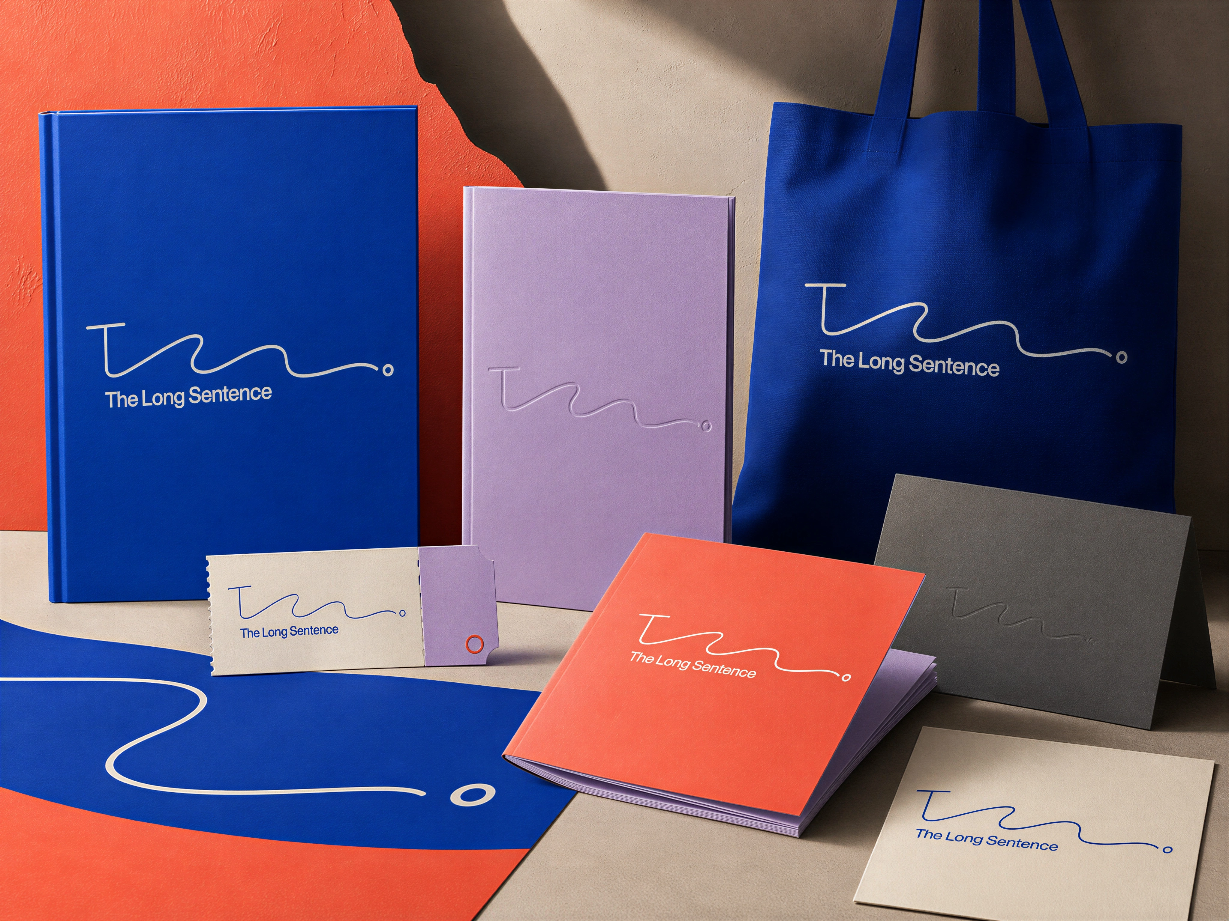
The Long Sentence is a complete brand identity design system developed across visual identity, typography, print, editorial applications, packaging, merchandise, and environmental graphics.
Core Design
A bold colour palette establishes the visual character of the brand. Deep royal blue acts as the dominant brand colour, complemented by vivid coral orange, soft lavender, warm cream, and charcoal. The combination creates strong contrast while maintaining a refined editorial aesthetic.
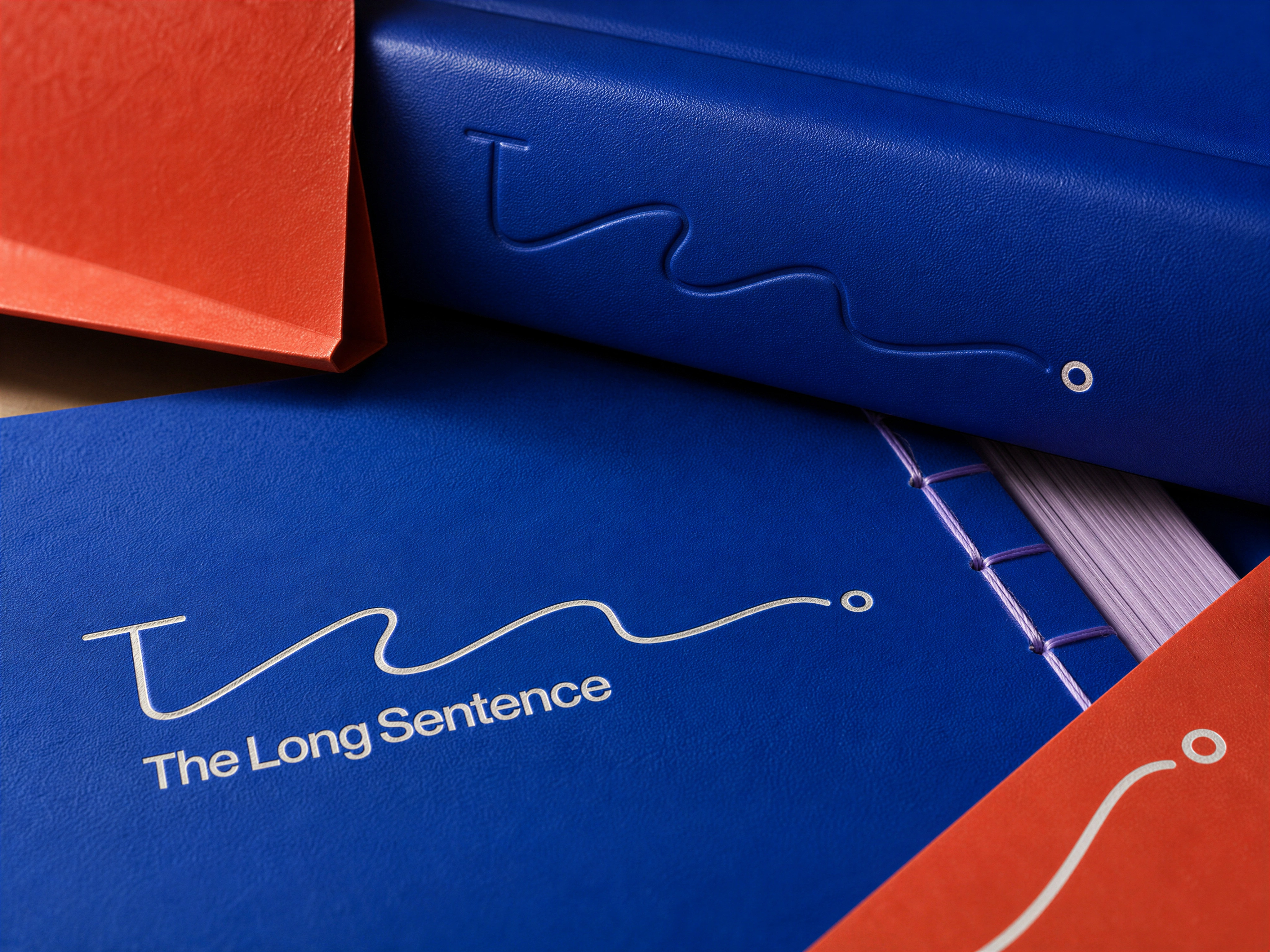
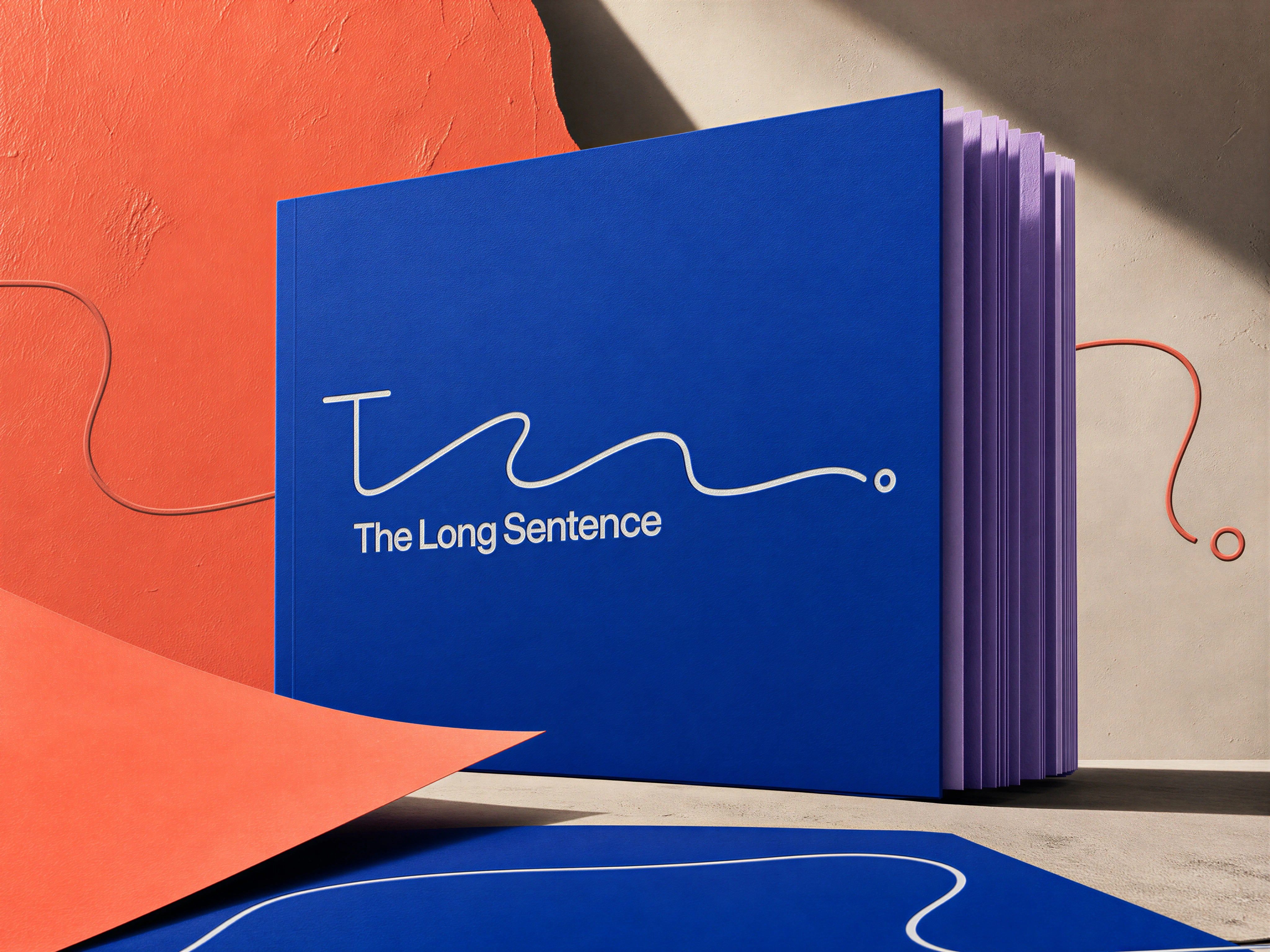
The identity uses a restrained typographic approach, allowing the continuous-line mark to remain the strongest graphic element. Its scale and placement change across applications while maintaining a consistent visual relationship with the wordmark.
Brand Stationery Design
Print and Editorial Design
The visual system extends naturally into book covers, notebooks, stationery, cards, and printed collateral. The identity is applied through clean layouts, tactile surfaces, embossed treatments, contrasting colours, and carefully controlled typography.
Material texture plays an important role in the final art direction. Paper grain, fabric surfaces, stitched bindings, embossed details, and physical finishes give the identity a tangible, premium quality.
Brand Icon Presentation
Brand Applications
The identity was developed as a flexible system rather than a single logo application.
The brand language appears across editorial products, tote bags, stationery, posters, display graphics, packaging, and merchandise, with the same graphic elements adapted to different formats and materials.
This creates a consistent brand experience across both small-format printed pieces and larger physical applications.
Environmental Branding
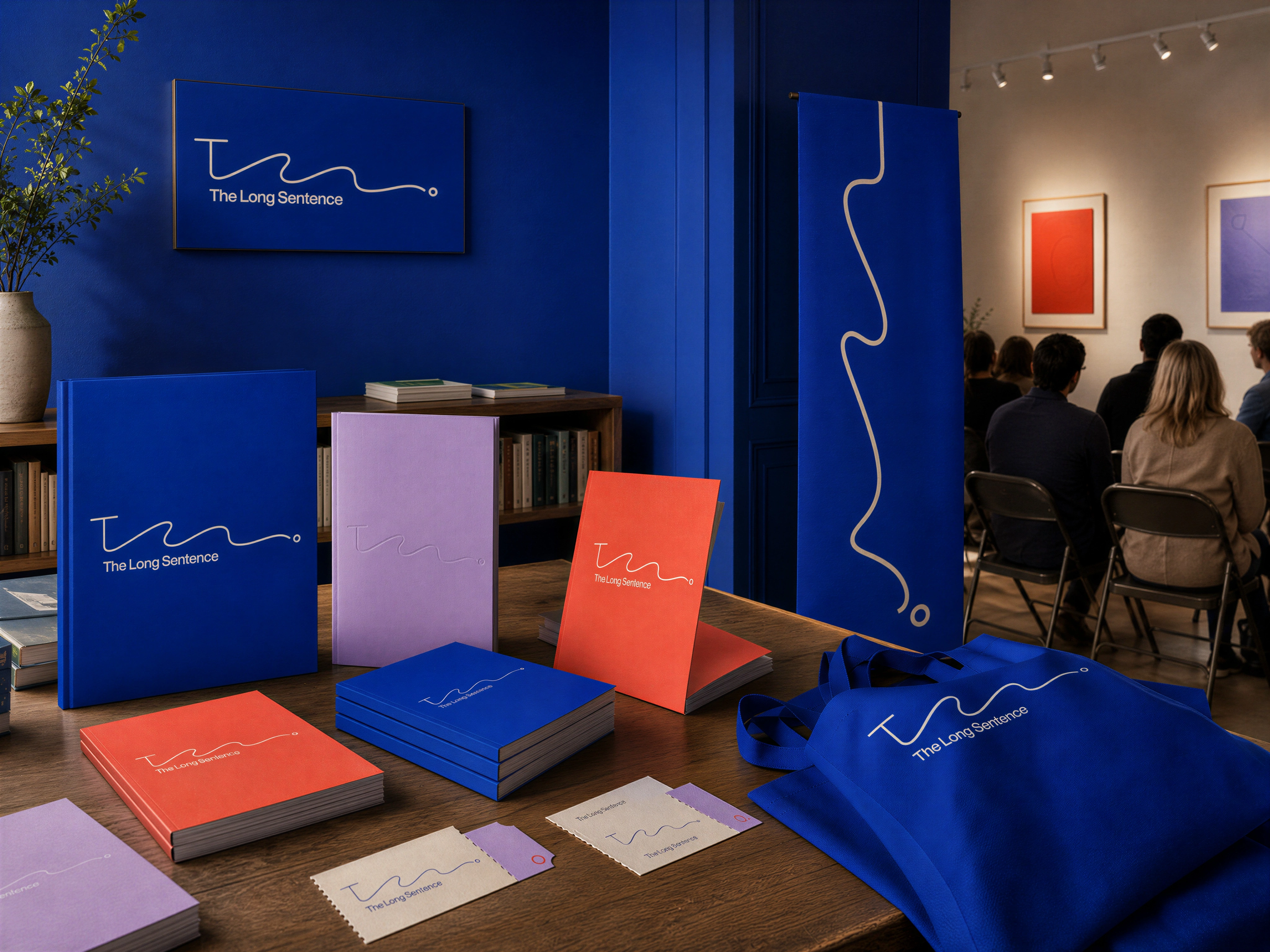
The same identity system extends into a branded environment through wall graphics, framed artwork, banners, display materials, and exhibition-style applications. The continuous line becomes a large-scale graphic element while the colour palette creates a strong connection between individual touchpoints.
For brand identity, visual identity, graphic design, art direction, and creative projects, get in touch:
Like this project
Posted Aug 21, 2026
The Long Sentence brand identity case study featuring logo design, typography, editorial design, packaging, merchandise, and environmental branding plus print.
Likes
1
Views
12