Noon & Night Aperitif Packaging Design

Supreet S


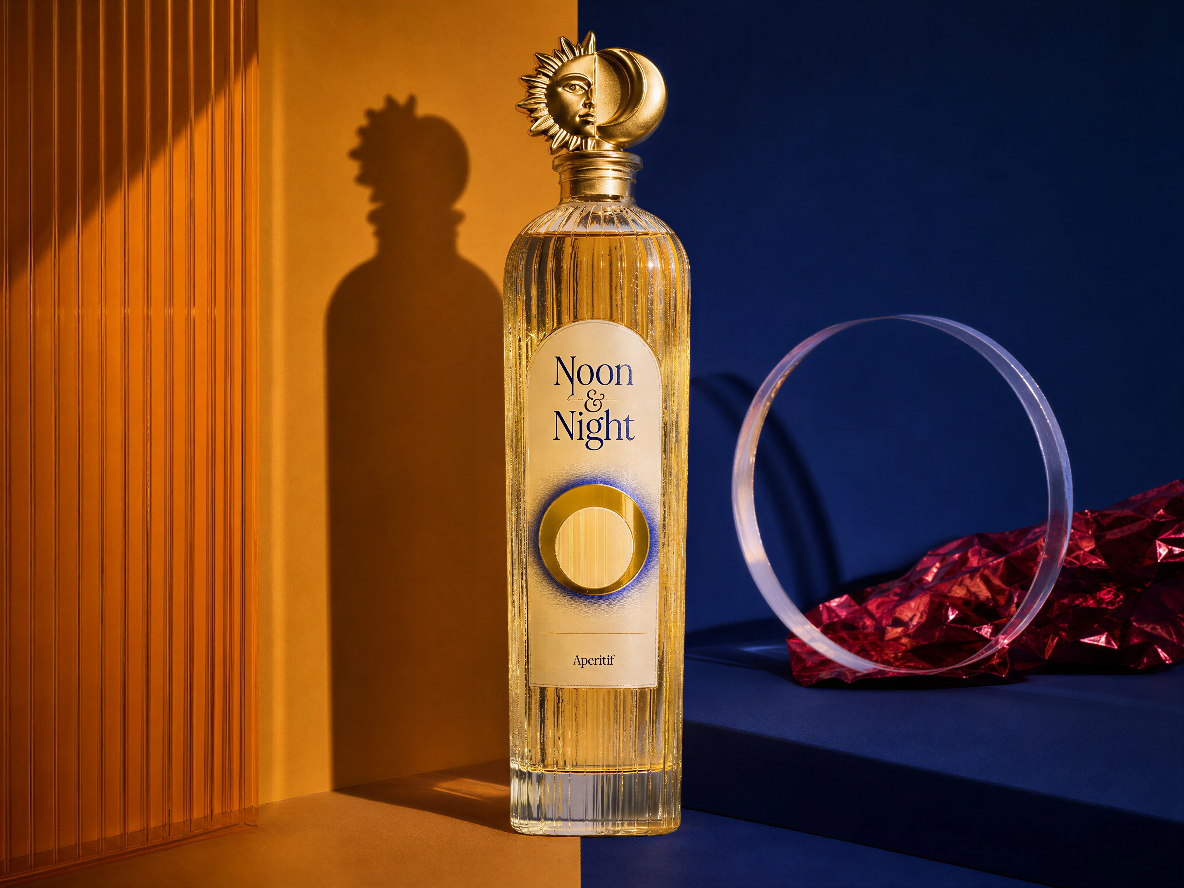
Noon & Night is a premium aperitif concept built around a simple idea: two opposing moments, brought together in a single experience.
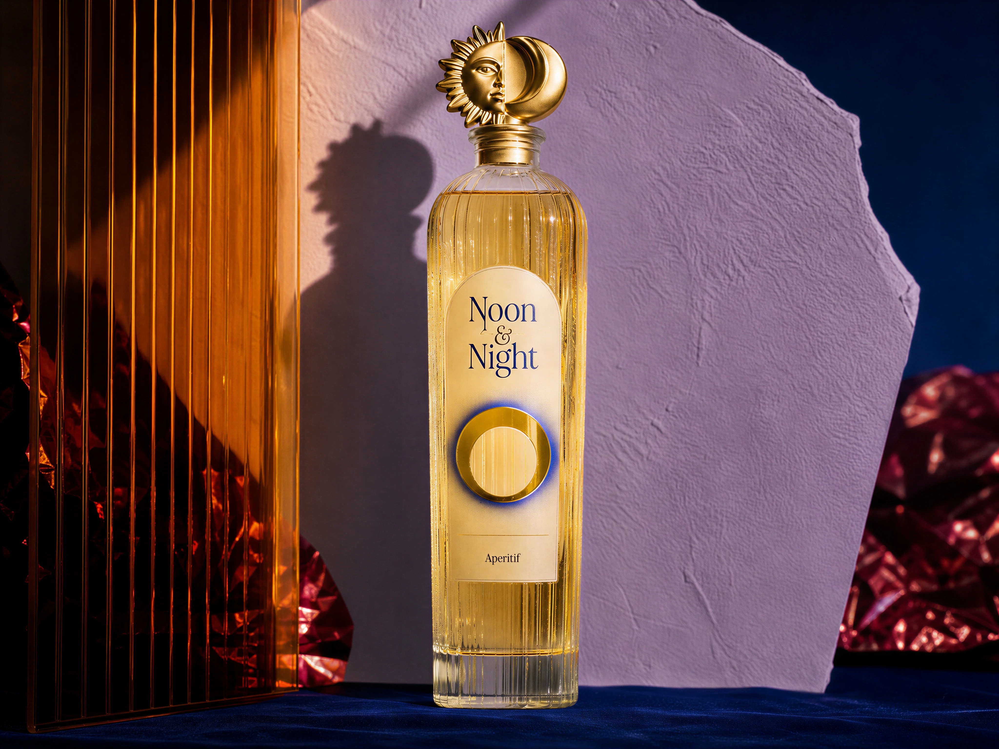
Product
The packaging needed to communicate that duality immediately while still feeling sophisticated, collectible, and distinctive. Rather than relying on conventional luxury cues, the design language was built around contrast: sunlight and shadow, gold and midnight blue, softness and structure, day and night.
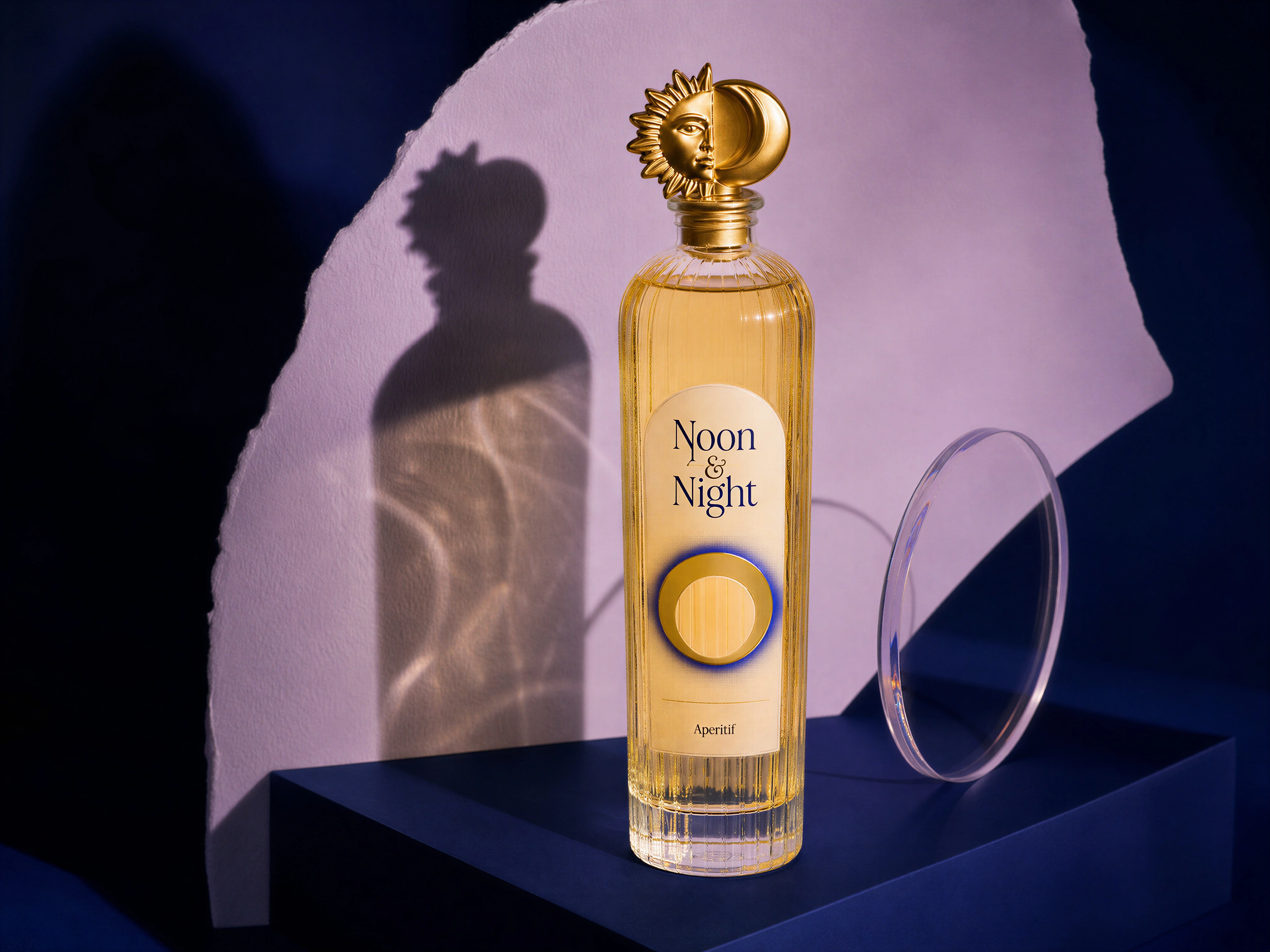
Noon & Night Product Presentation
The Core Idea
The visual identity begins with the bottle itself.
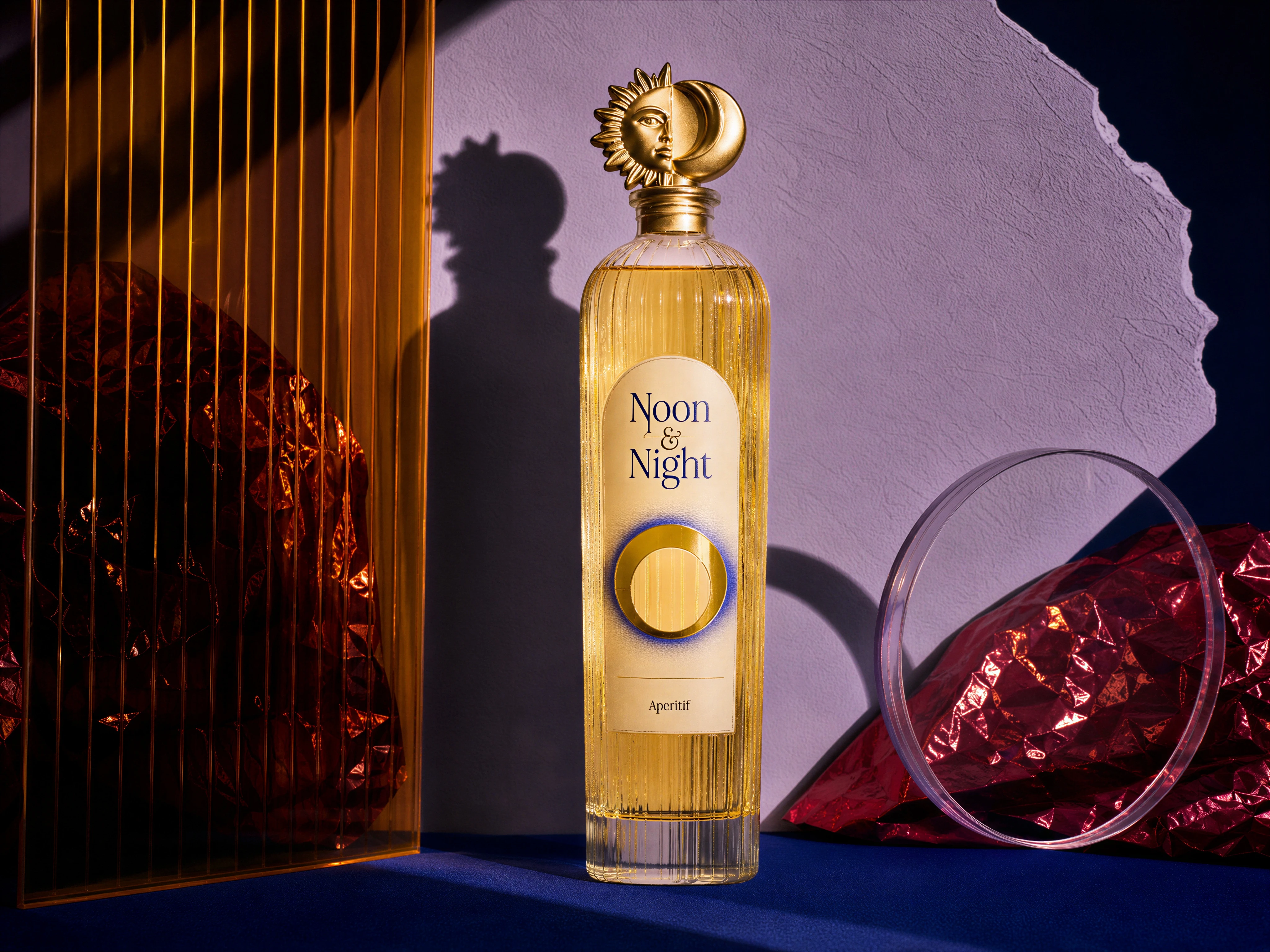
A tall, fluted glass silhouette creates a refined architectural presence, while the warm golden liquid introduces an immediate sense of richness. At the top, a sculptural sun and moon closure becomes the defining brand signature.
The symbol is intentionally literal yet elevated. One side represents the sun. The other represents the moon. Together, they establish the central visual idea of Noon & Night before the viewer even reads the label.
Packaging Design
The label uses an understated editorial composition to balance the expressive bottle.
Noon & Night is set prominently in an elegant serif, creating a timeless, almost literary character. A circular gold detail anchors the lower portion of the label and reinforces the celestial language established by the cap.
The restrained typography allows the physical packaging to do most of the visual storytelling.
Glass, gold, translucent elements, deep blue surfaces, and warm amber liquid work together as a single material system rather than as isolated decorative details.
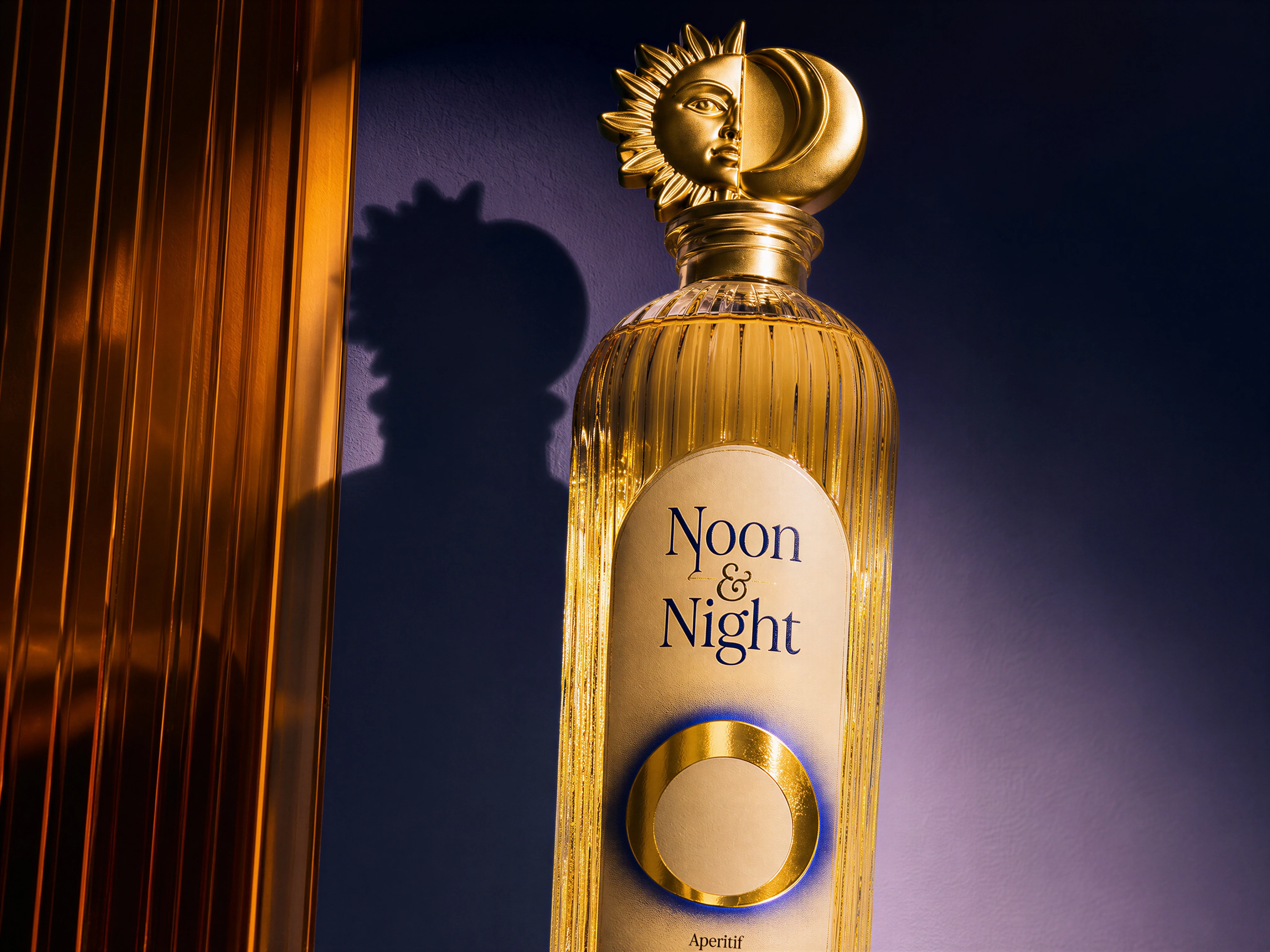
Label & Cap Design
Visual Language
The system revolves around five recurring principles:
Celestial symbolism
The sun and moon provide an instantly recognizable visual signature.
Material contrast
Glass, metal, paper, acrylic, and liquid create a tactile luxury language.
Light and shadow
Lighting is treated as a compositional element, not simply illumination.
Editorial typography
A restrained serif system gives the packaging a premium, sophisticated character.
Architectural composition
The bottle is consistently positioned as the hero, surrounded by sculptural forms that frame rather than compete with it.
The Result
The final direction turns a simple aperitif bottle into a visual object with a distinct point of view.
It feels premium without becoming predictable, expressive without becoming ornamental, and contemporary without losing timelessness.
Most importantly, the packaging and campaign imagery tell the same story. The bottle establishes the concept, while the art direction expands it into an entire visual universe.
Final Result
Let's connect
For packaging, branding, visual identity, art direction, and creative projects:
Like this project
Posted Aug 23, 2026
A premium packaging design case study exploring duality, celestial symbolism, tactile materials, and art direction for Noon & Night.