Cooderz Brand Identity Design

FOXXY ™
Verified



Challenge & Solution
Cooderz is a full-stack token engineering studio building smart contracts, launch infrastructure, and dApps for Web3 teams. Their mission is direct: help projects launch the right way — secure, scalable, and built to last beyond the hype cycle. They've shipped for projects like Ponke, Neiro, and Ovpp, with hundreds of millions in combined ATH market cap behind their work.
Web3 brands often fall into two common directions: they either look too corporate or too noisy. Cooderz needed something more focused. The identity had to build trust for founders and teams launching serious token projects, while still feeling bold enough for the crypto space. The brand also needed to communicate its message quickly across web, social, decks, product visuals, and launch materials.
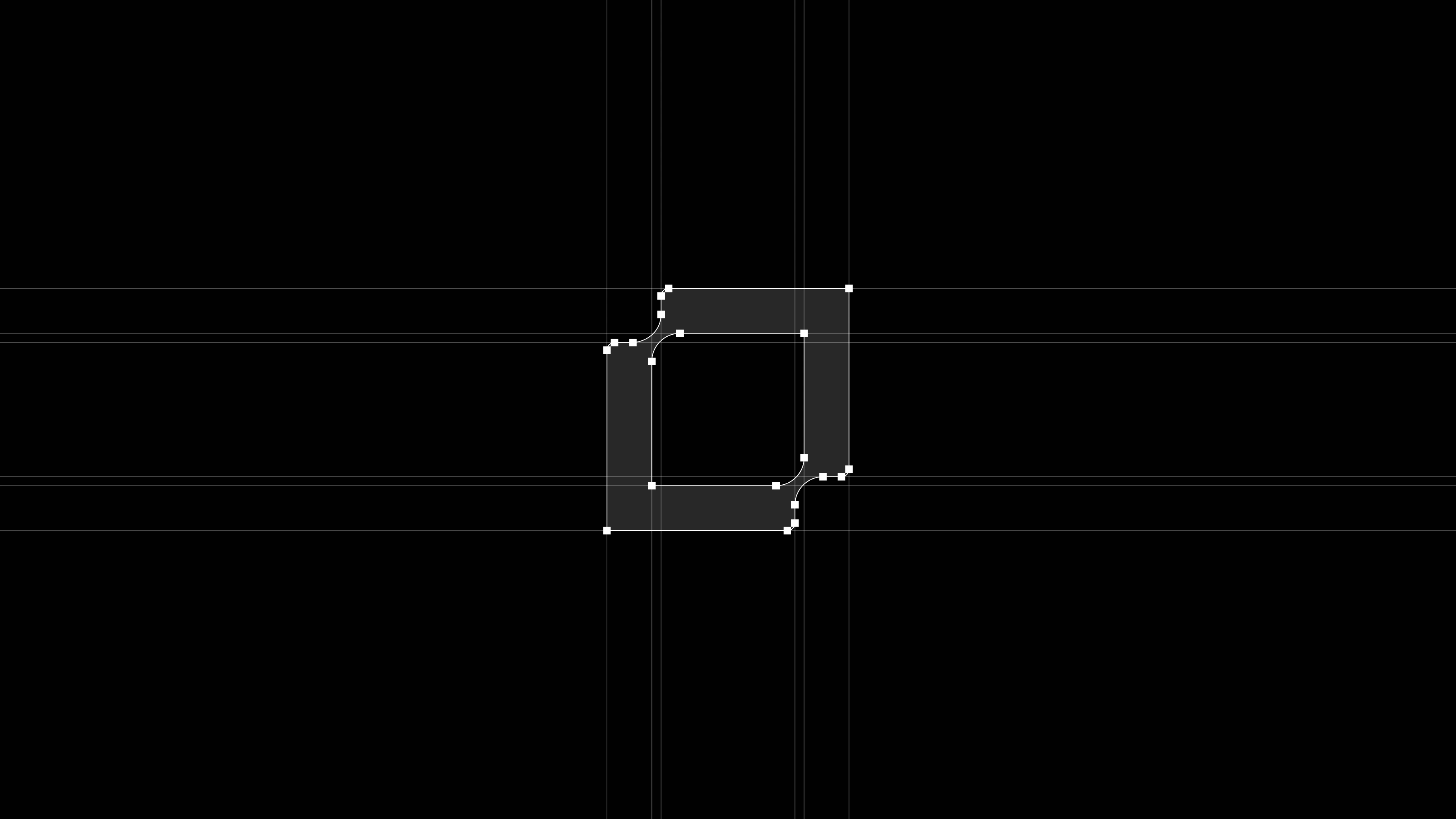
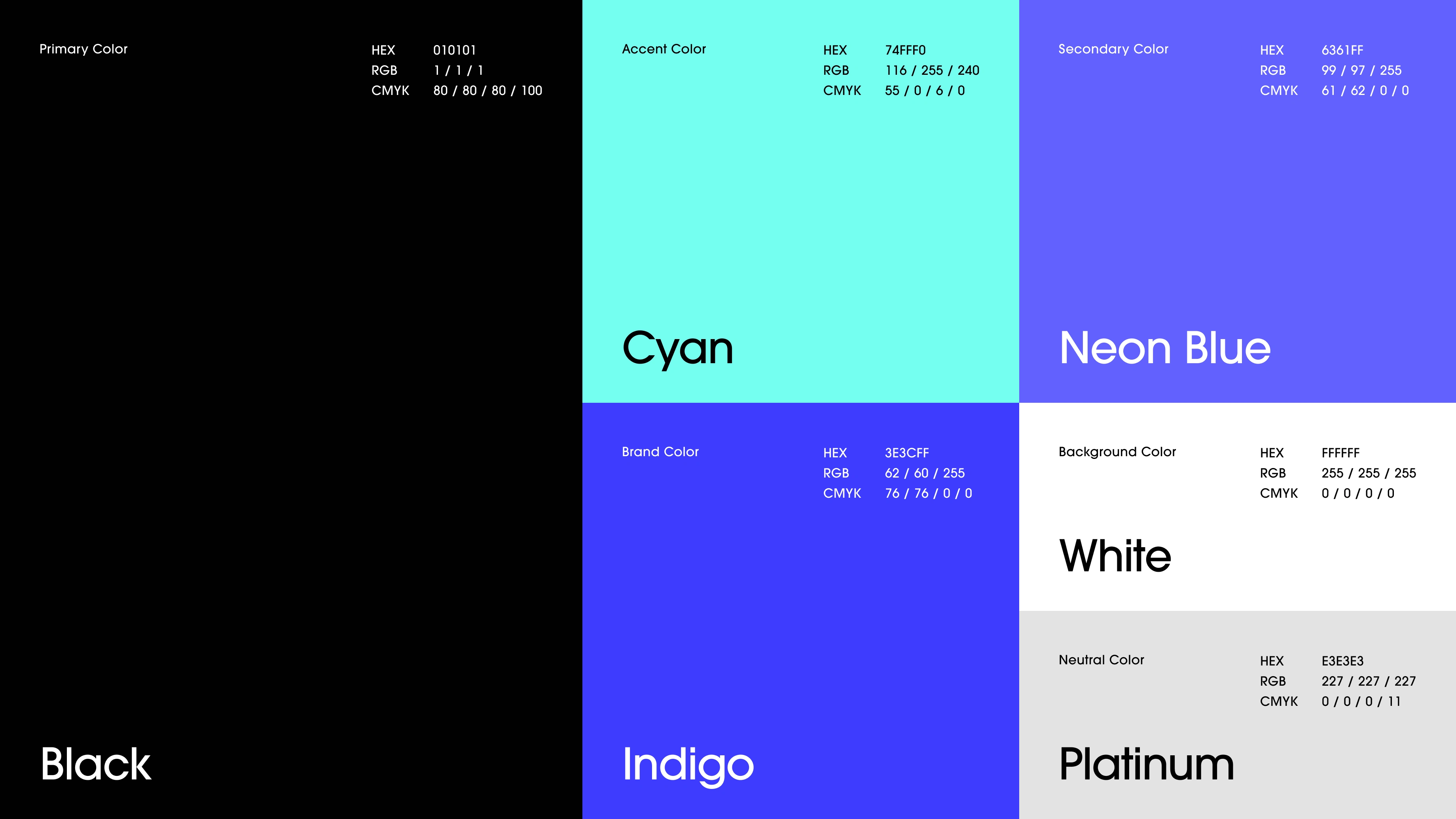
We designed a simple but recognizable identity system built around a tilted square symbol that feels like a code block, a chain unit, and a modular piece of infrastructure. Paired with a clean geometric wordmark, the logo gives Cooderz a technical but memorable look. The color system, typography, gradients, and layout style were extended across key brand touchpoints, creating a visual system that feels scalable, secure, and ready for launch.
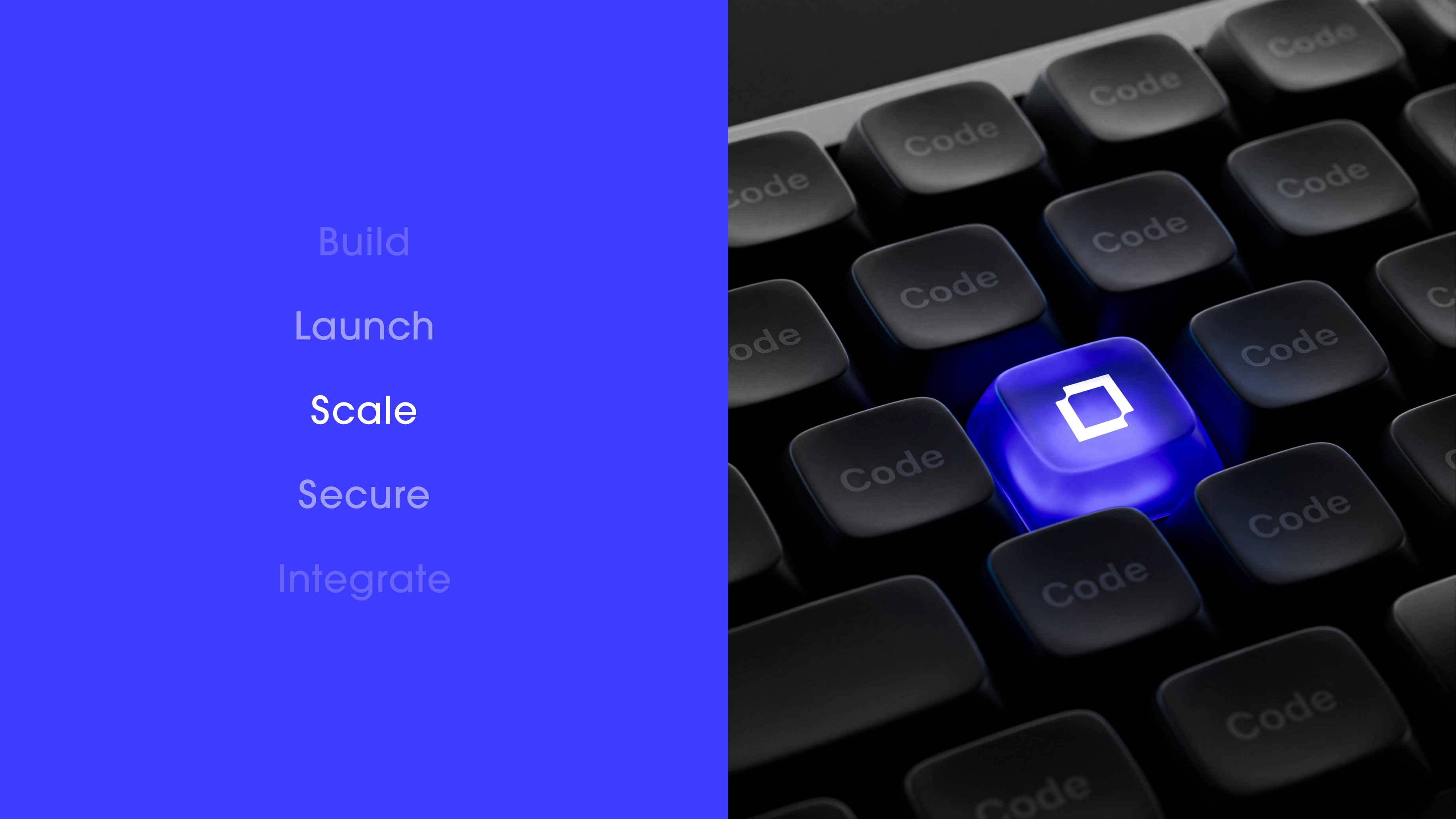
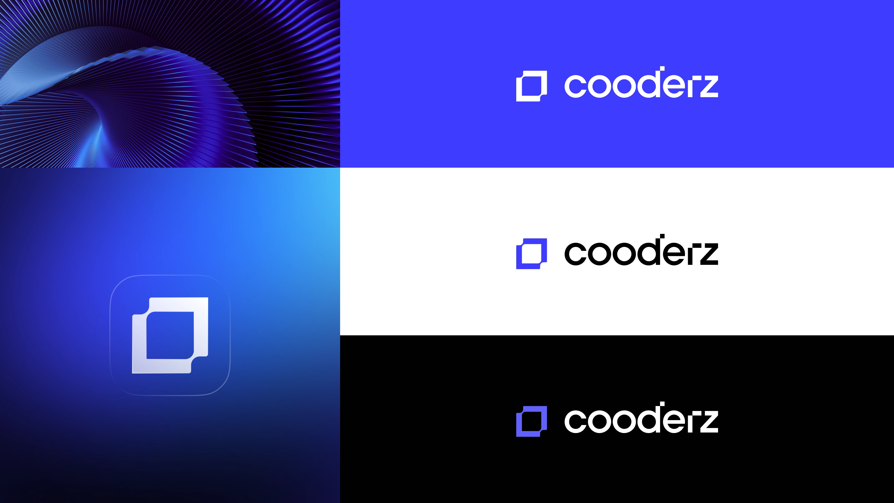
The Cooderz identity is built to feel like infrastructure in motion. Every visual decision supports the same message: reliable code, secure launches, and scalable systems. The gradient backgrounds, dark interfaces, and glowing blue accents create a high performance technology feel without making the brand look overly complex.
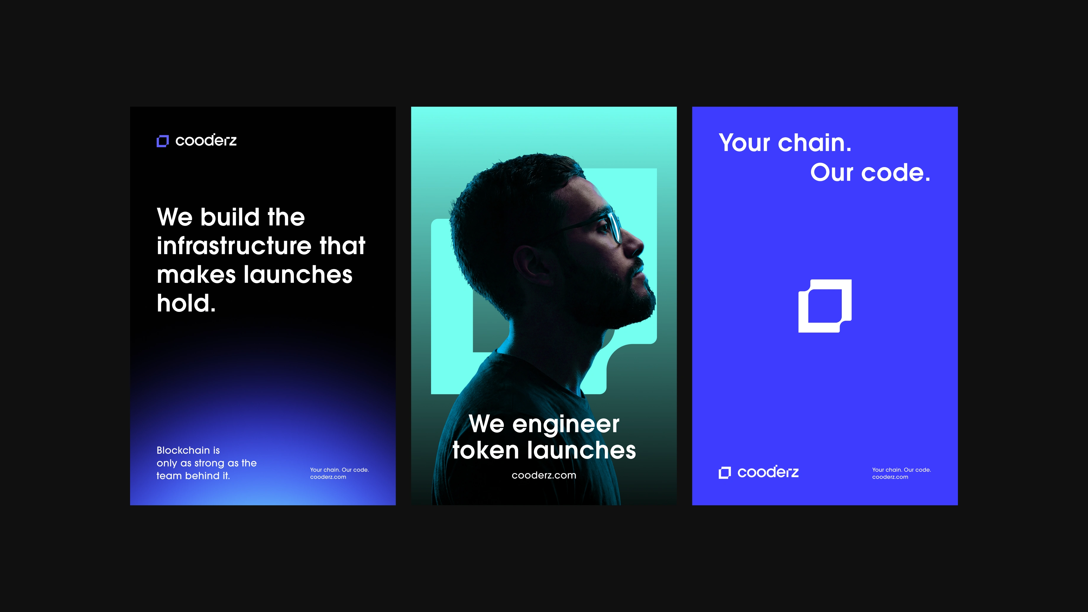
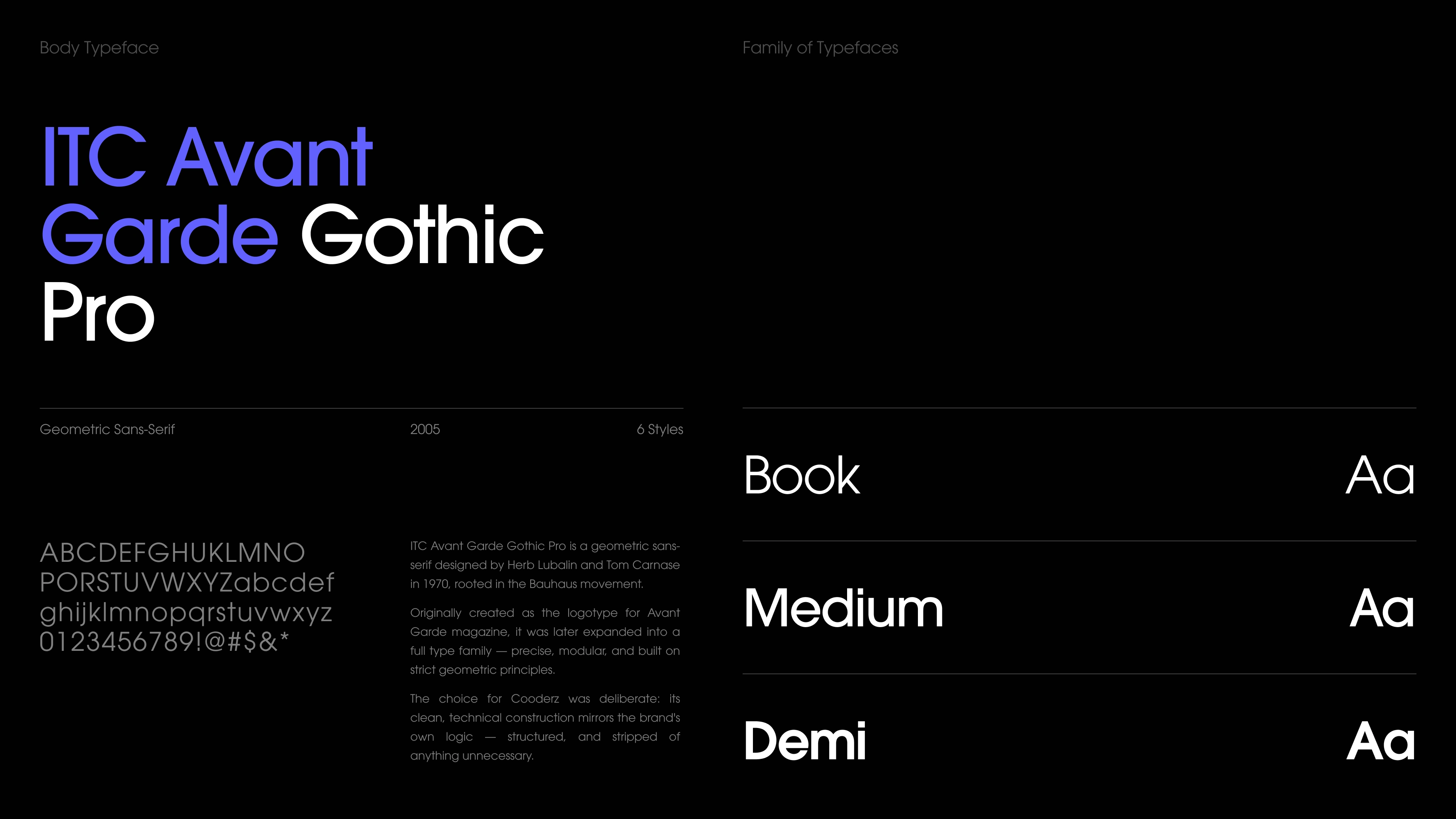
Typography plays a major role in the system. ITC Avant Garde Gothic Pro gives the brand a geometric, confident, and clean voice. It works well for bold statements like “We build the infrastructure that makes launches hold” and also stays readable across smaller product and interface details.
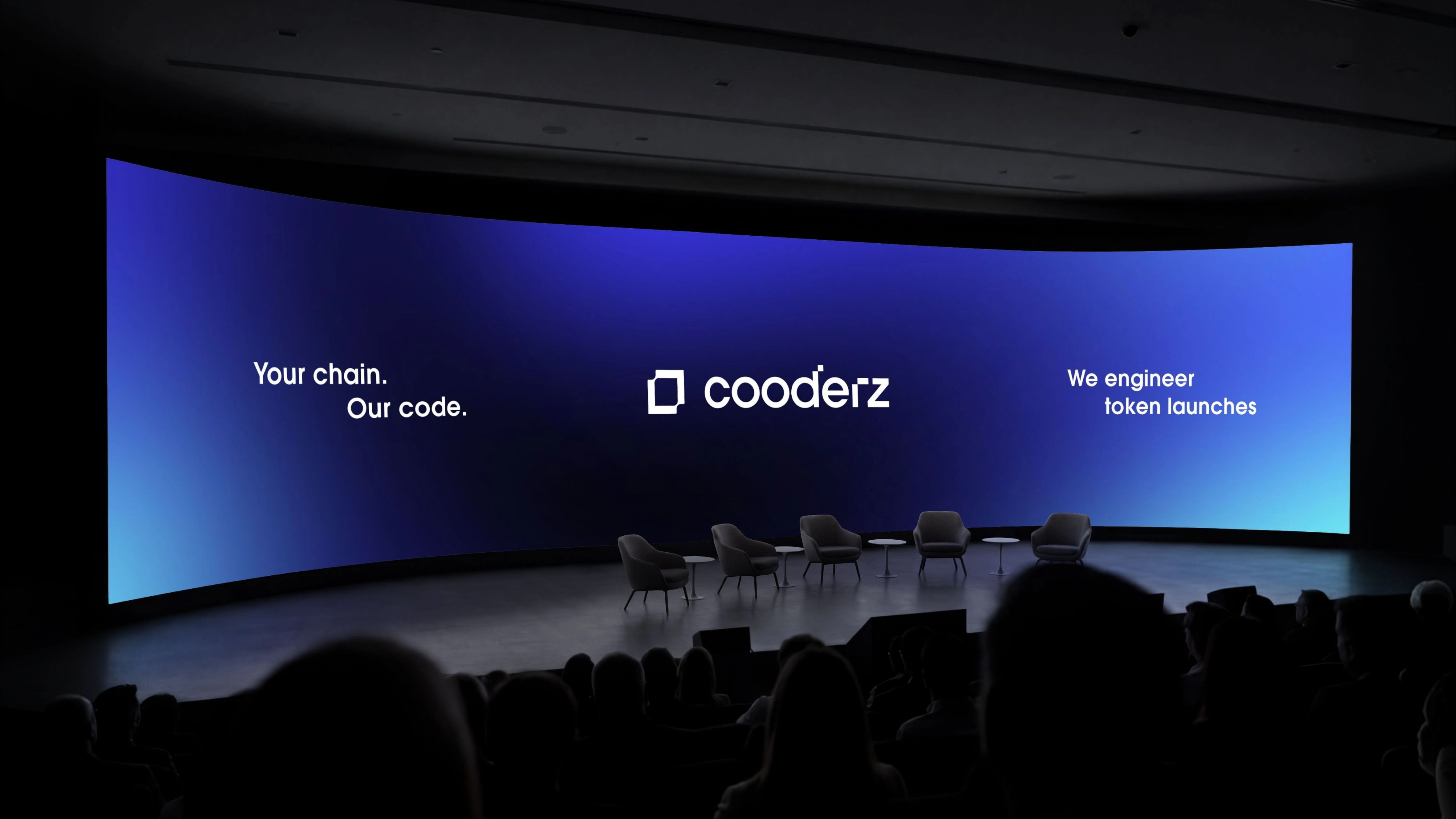
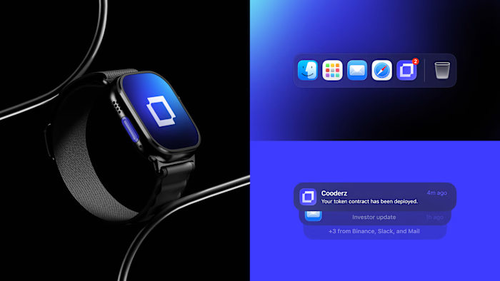
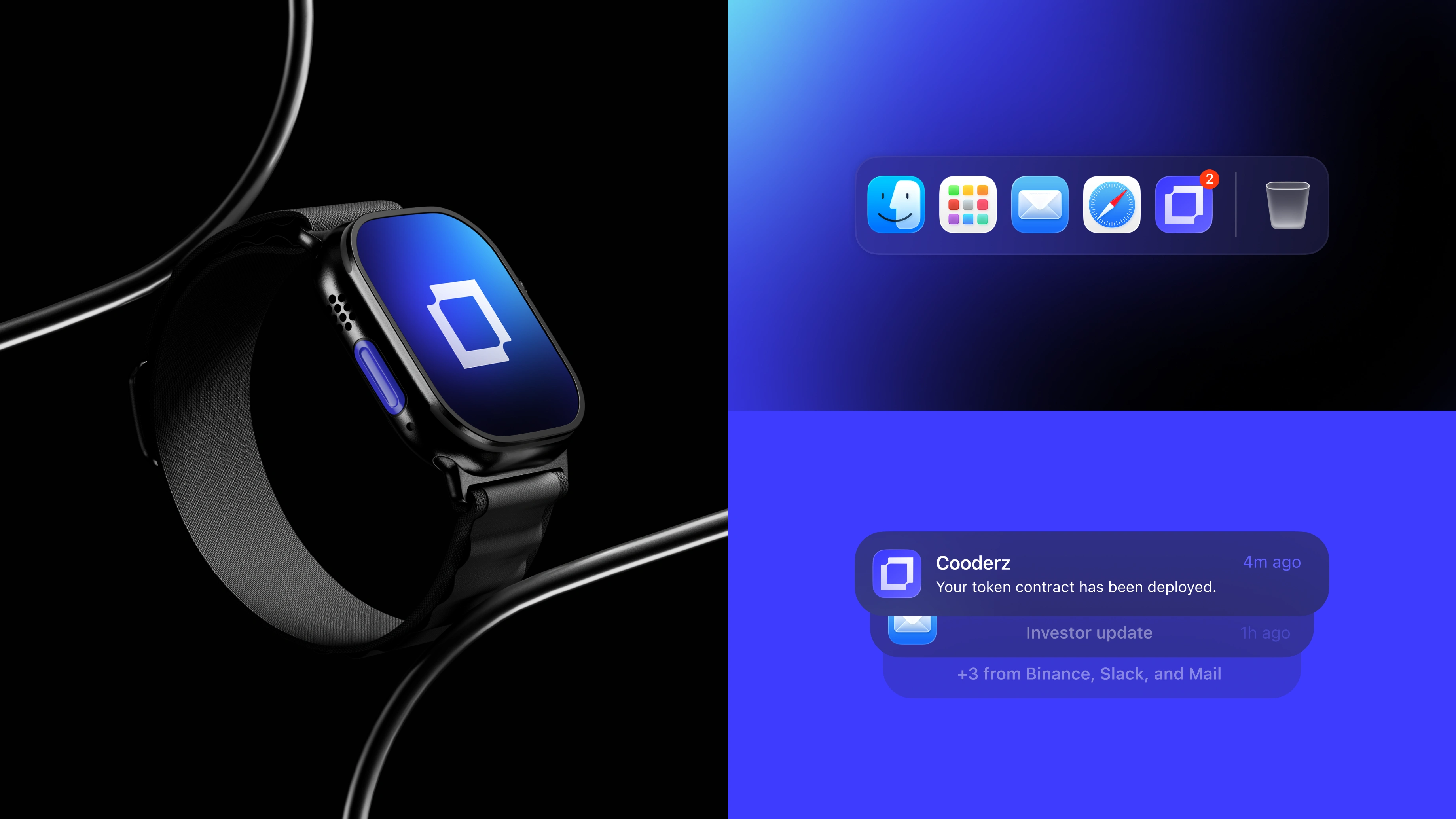
The brand language was extended into multiple use cases, including presentation screens, social posts, billboard style layouts, smartwatch visuals, app notifications, hats, tote bags, and apparel. This helped turn Cooderz from a simple logo into a complete identity system with enough flexibility for both product communication and community presence.
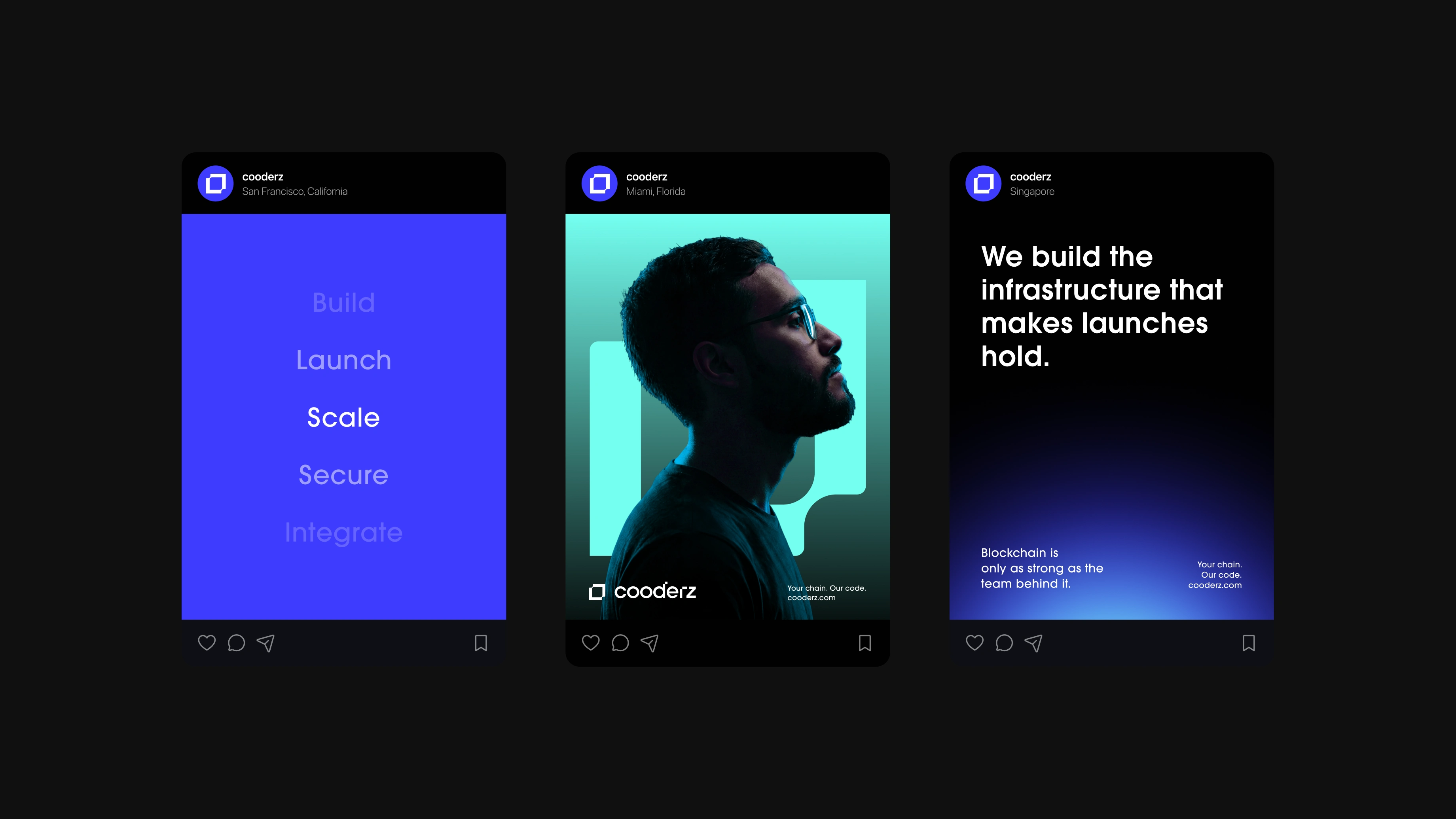
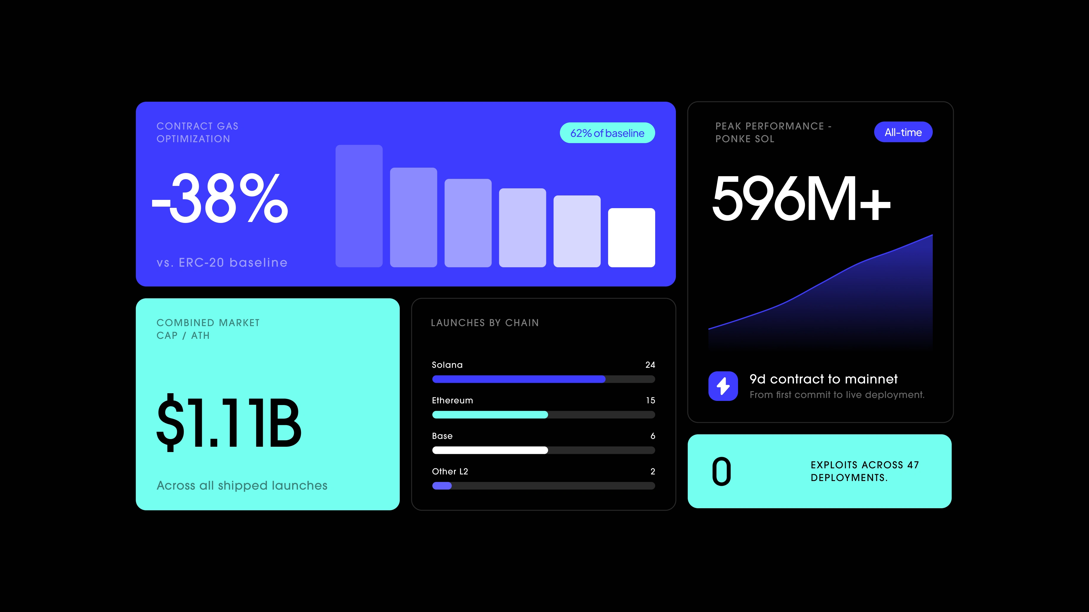
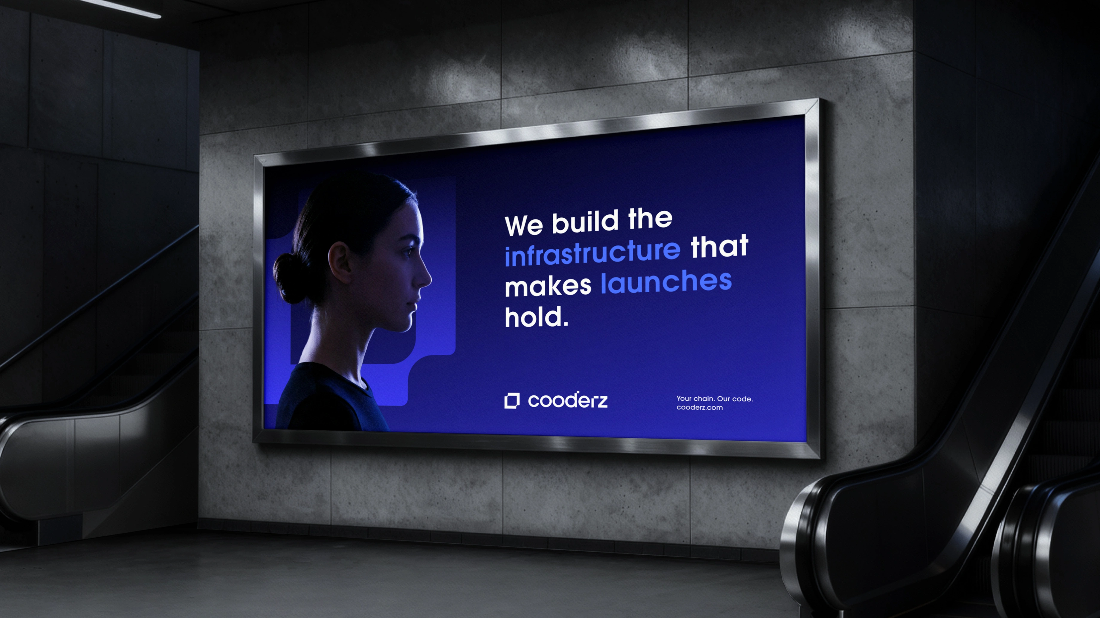
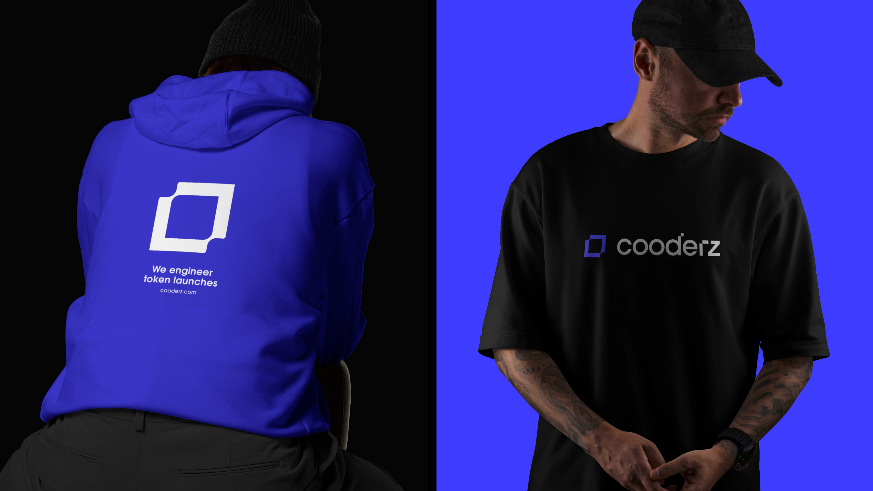
The final identity gives Cooderz a clear and ownable presence in the Web3 infrastructure space. It feels technical, confident, and launch ready, while staying simple enough to scale across every touchpoint.
Like this project
Posted May 26, 2026
Brand identity for a Web3 token engineering studio. Logo, visual system, and full rollout built to feel technical, confident, and launch-ready.
Likes
2
Views
18
Timeline
Feb 28, 2025 - Mar 2, 2025