
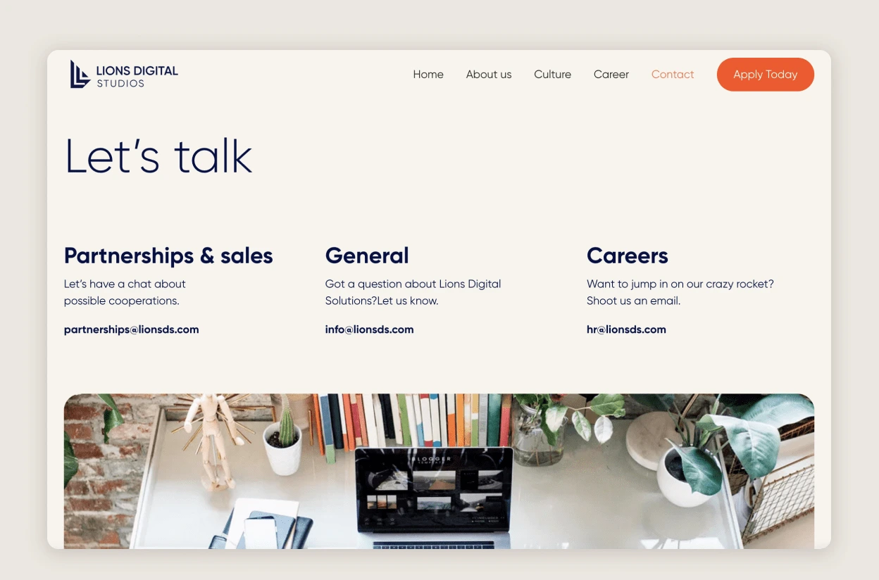
The task was to rebrand Lions Digital Solution company logo and redesign the website from scratch to give the company a more in-depth view of its culture for potential employees & partners.
The idea was to create a visual identity that would be design neutral but still have the capacity to communicate the culture of the company within its simplicity.
The logo redesign
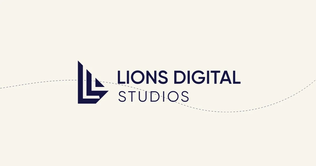
The icon represents the letter L in a boat form, symbolizing the agile culture of the company to move into new horizons.
The website
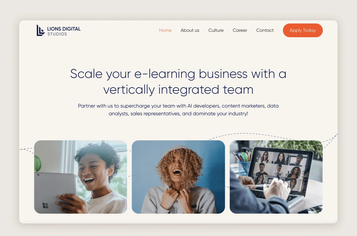
The idea of the website was first prototyped on figma and then built on Webflow with the Relume library & Finsweet's design system
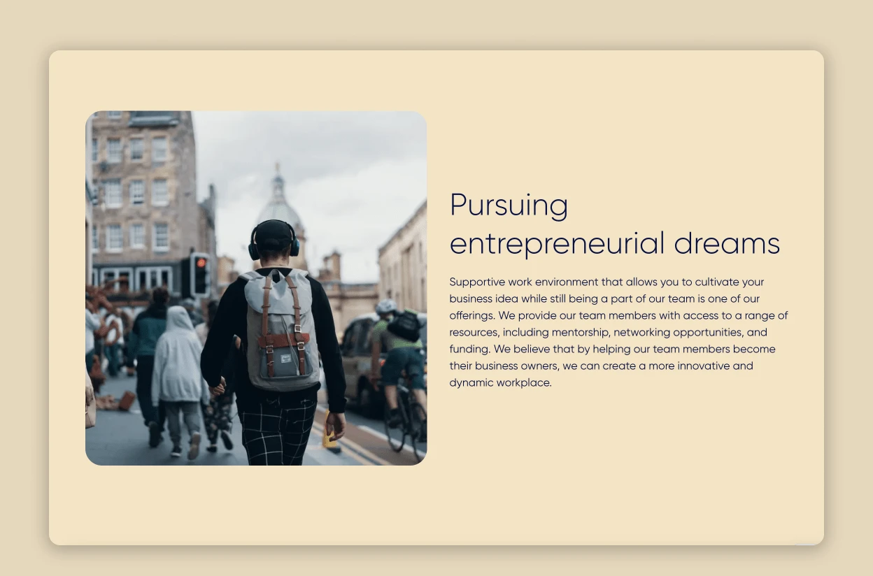
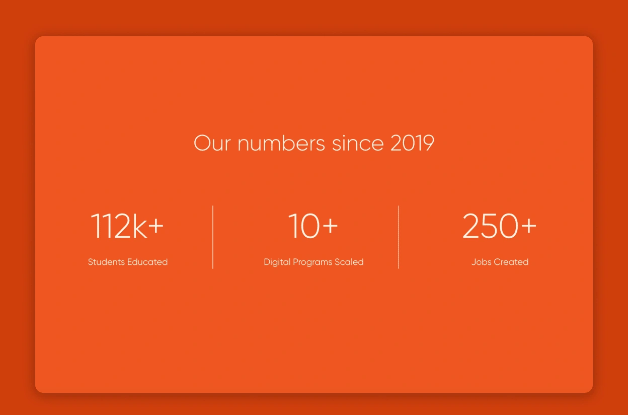
The concept of the website was to keep a clean and simple design system but have an interesting interaction that would make the background color transition as the user scrolls.
0 likes · 18 views · Sep 22, 2023
Lions Digital Solutions Logo redesign, rebranding, Website design & development.


