Rethinking the Insight page for

Bearplus Fullstack Agency


Rethinking the Insight page for Binder Consulting
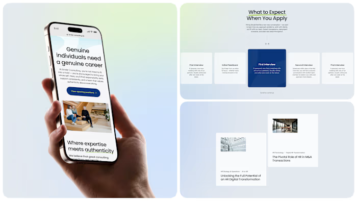
A small but meaningful UX call on this build. Most consultancies split their content into three separate pages: articles here, success stories there, whitepapers somewhere else. We put all three on one page, controlled by one shared filter. And the filter applies live, the moment you tap a tag, no Apply button to chase. Sounds minor, but it changes how the page feels. Less like navigating a site, more like flipping through a well-organised library. Open to new projects if you're working on something in this space.
Like this project
Posted May 12, 2026
Rethinking the Insight page for Binder Consulting A small but meaningful UX call on this build. Most consultancies split their content into three separate p...
Likes
0
Views
4