Product Simplification – Enhancing Usability & Readability
Nicolas Renou
Product Simplification – Enhancing Usability & Readability
When I joined Flynt in February 2023, the interface of the product was overly complex, making it difficult for users to navigate and extract meaningful insights. The goal was to simplify the product’s interface, ensuring a seamless user experience that maximized efficiency and engagement. The redesign focused on enhancing table readability, improving dashboard visualization, and structuring performance data in an intuitive manner. Additionally, we introduced a design system to standardize components and ensure consistency across the platform.
User Journey & Research
Understanding the Problem
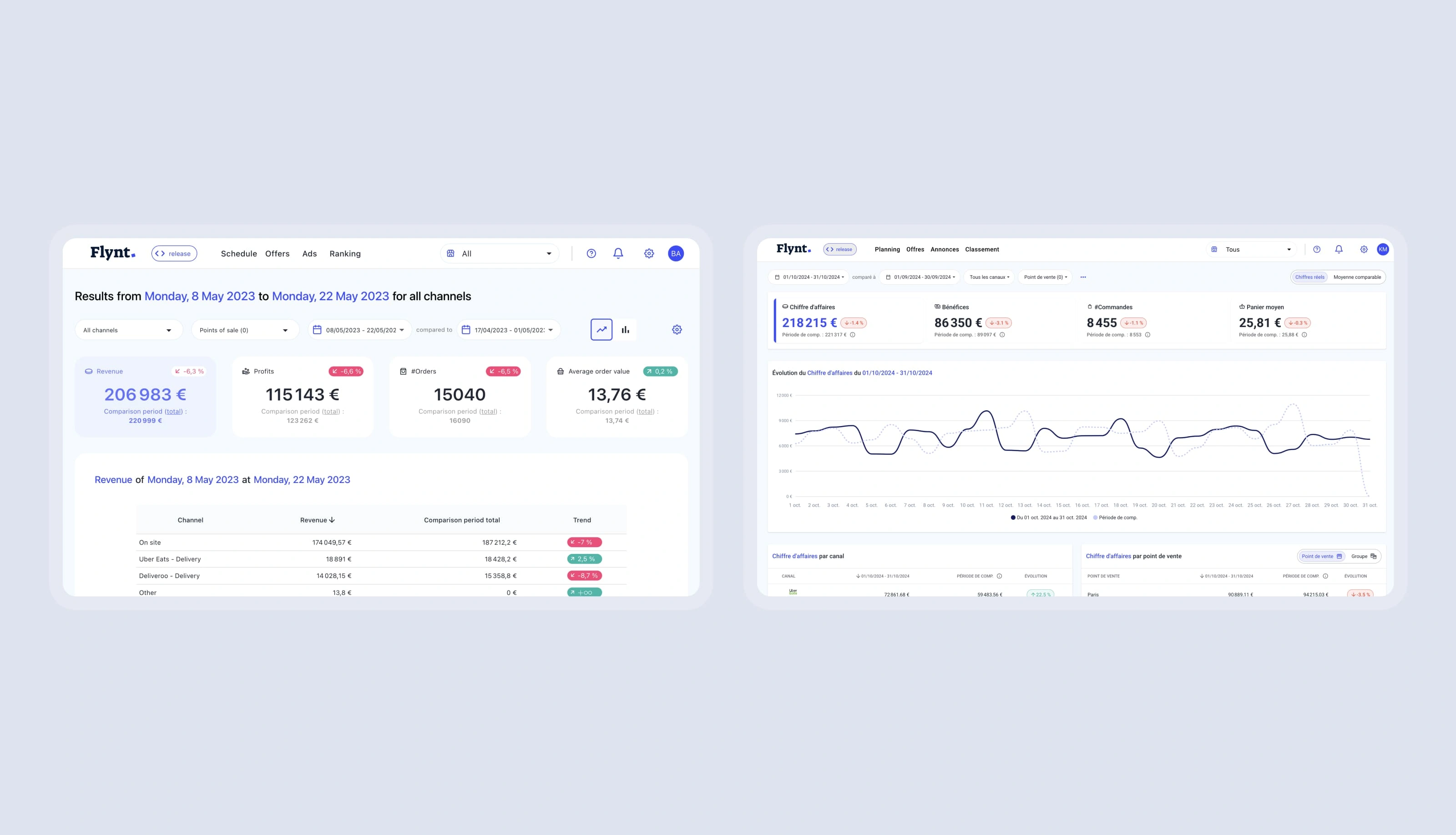
The product’s interface was cluttered and required users to sift through excessive amounts of information. Key performance data was difficult to interpret, and the absence of a structured design system led to inconsistencies across different sections of the platform.
Research Approach
Conducted user interviews to identify friction points in navigation and data interpretation.
Analyzed competitors and best practices in data visualization.
Collaborated with internal teams and customers to identify the most valuable KPIs for the performance dashboard.
Key Features & UX Challenges
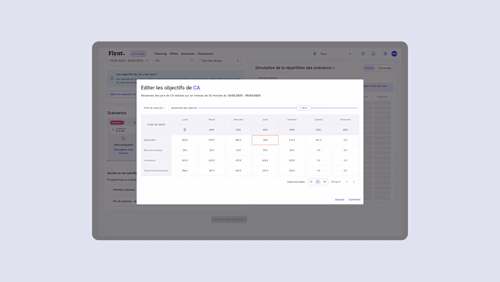
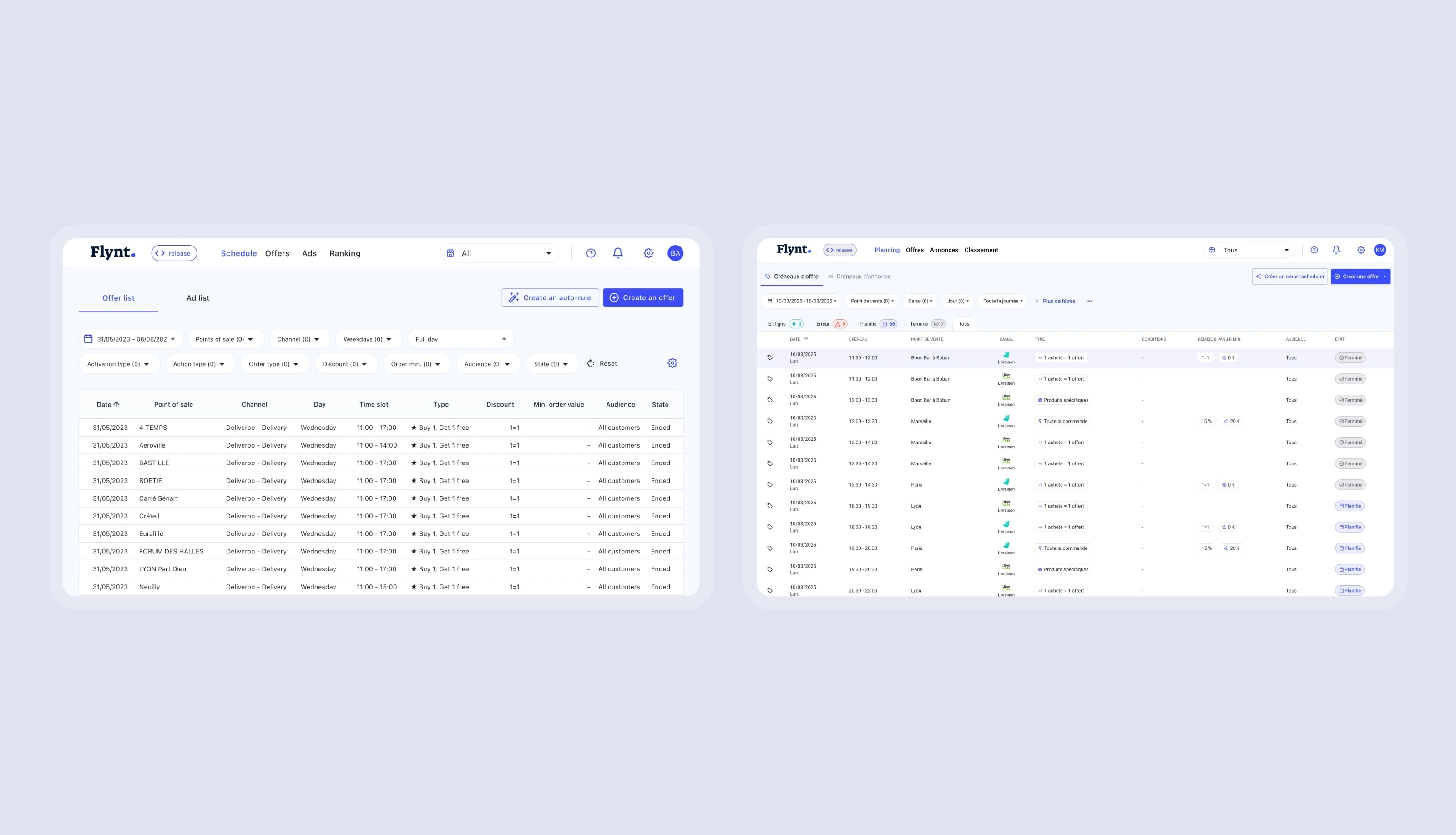
Redesigned Tables for Better Readability
We revamped all tables to improve their readability, making it easier for users to scan and interpret key information. This included:
Improved spacing and hierarchy.
Clearer typography and visual grouping.
Sticky headers and optimized sorting options.
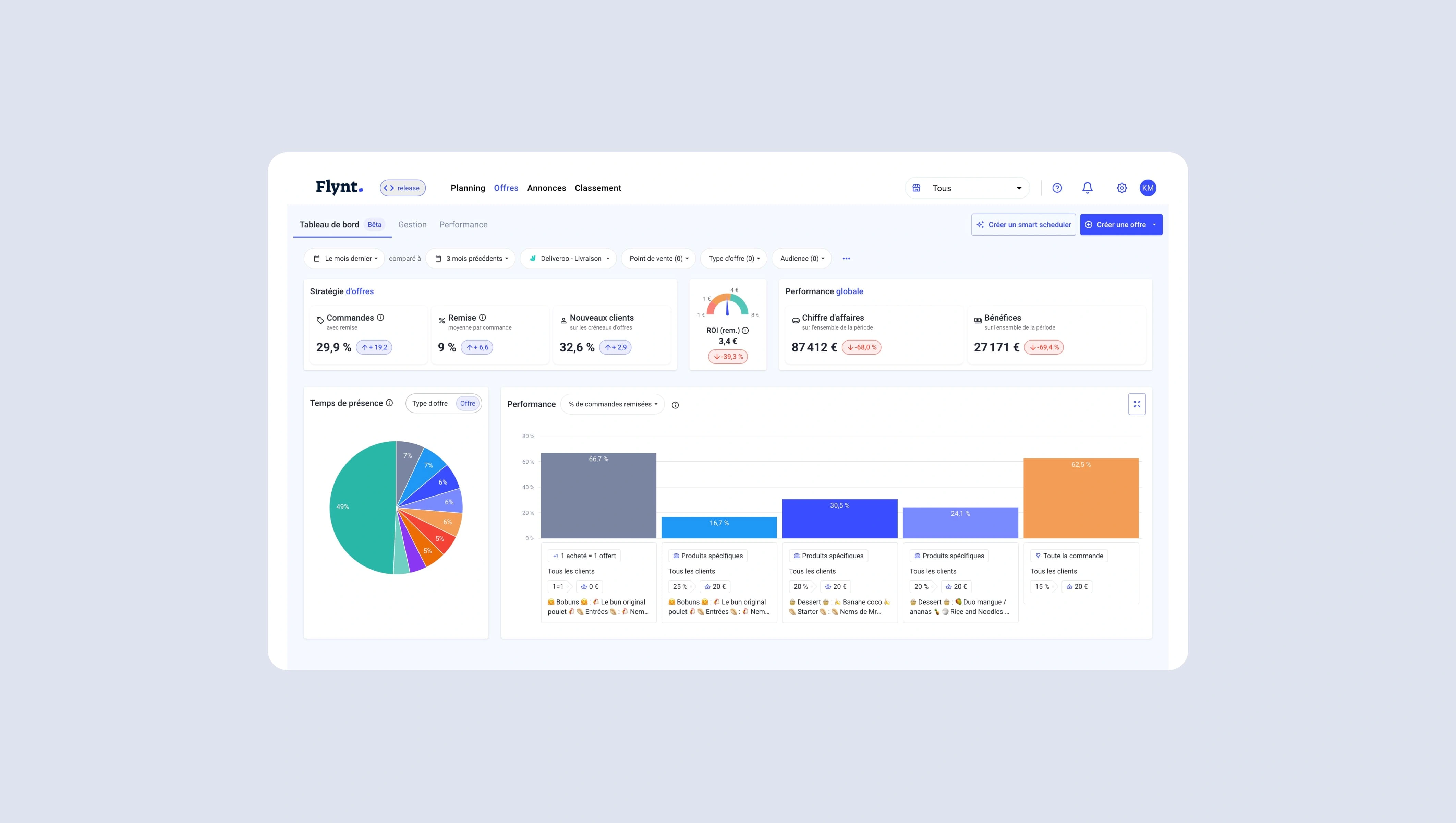
Enhanced Dashboard with a Chart Line for Data Insights
To simplify the reading of critical data, we introduced a chart line in the main dashboard, enabling users to quickly grasp trends and fluctuations without having to analyze raw numbers.
Offer Performance Dashboard
Users struggled to interpret performance metrics due to information overload. We designed a dedicated dashboard that streamlined key insights using:
Circular charts for proportional analysis.
Bar charts to visualize performance trends over time.
A selection of the most relevant KPIs to avoid cognitive overload.
Introduction of a Design System
To bring coherence across all product components, we developed a design system that standardized:
Color schemes and typography.
Component structure for tables, charts, and dashboards.
Spacing and layout guidelines to ensure visual consistency.
Interaction & Visual Feedback
Consistency & Simplicity
By introducing a structured design system, we ensured a smoother user experience, reducing cognitive load and making navigation intuitive.
Real-Time Data Interpretation
Users now receive clear, real-time feedback on offer performance through intuitive chart-based visualizations.
Impact & Learnings
Results
The simplification of the interface led to measurable improvements:
Increased engagement, as users found it easier to navigate the platform.
Reduction in support requests, indicating better usability.
Higher adoption of performance tracking features, with more users leveraging the dashboard for decision-making.
Future Enhancements
The next step involves further refining data visualization by introducing predictive analytics and AI-driven insights for an even more user-friendly experience.
Like this project
Posted Jun 24, 2025
Simplified Flynt's interface for better usability and engagement.