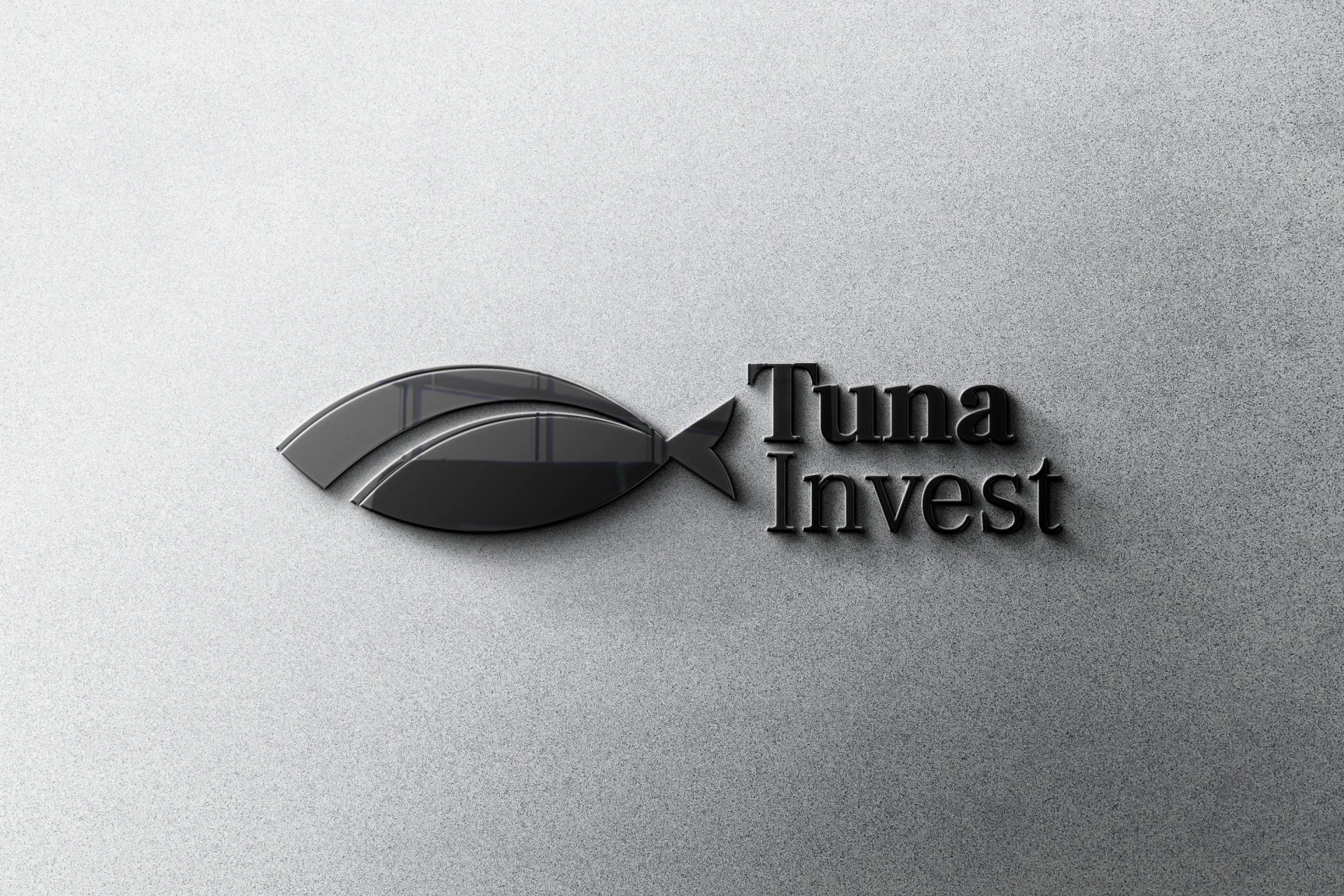
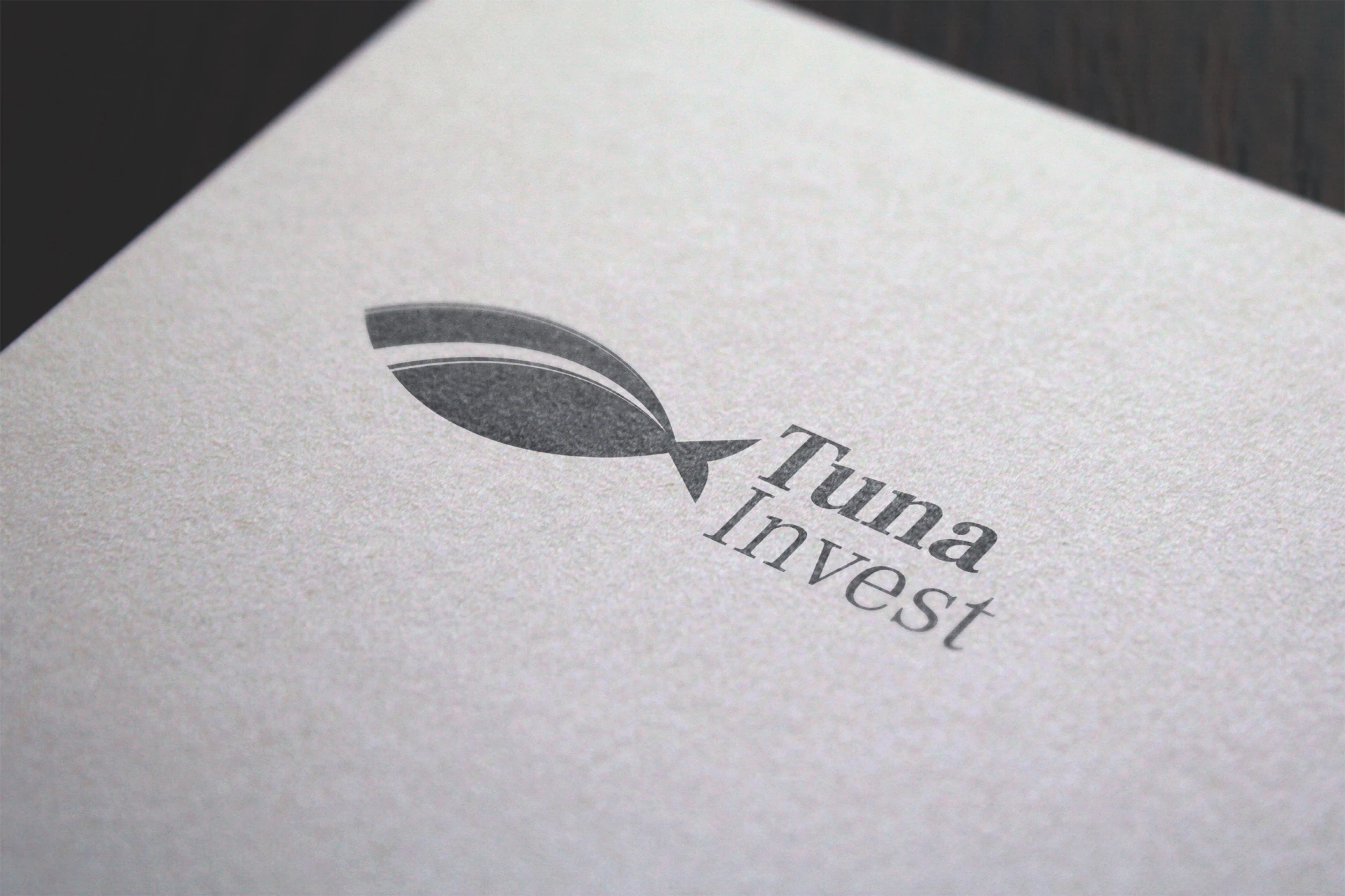
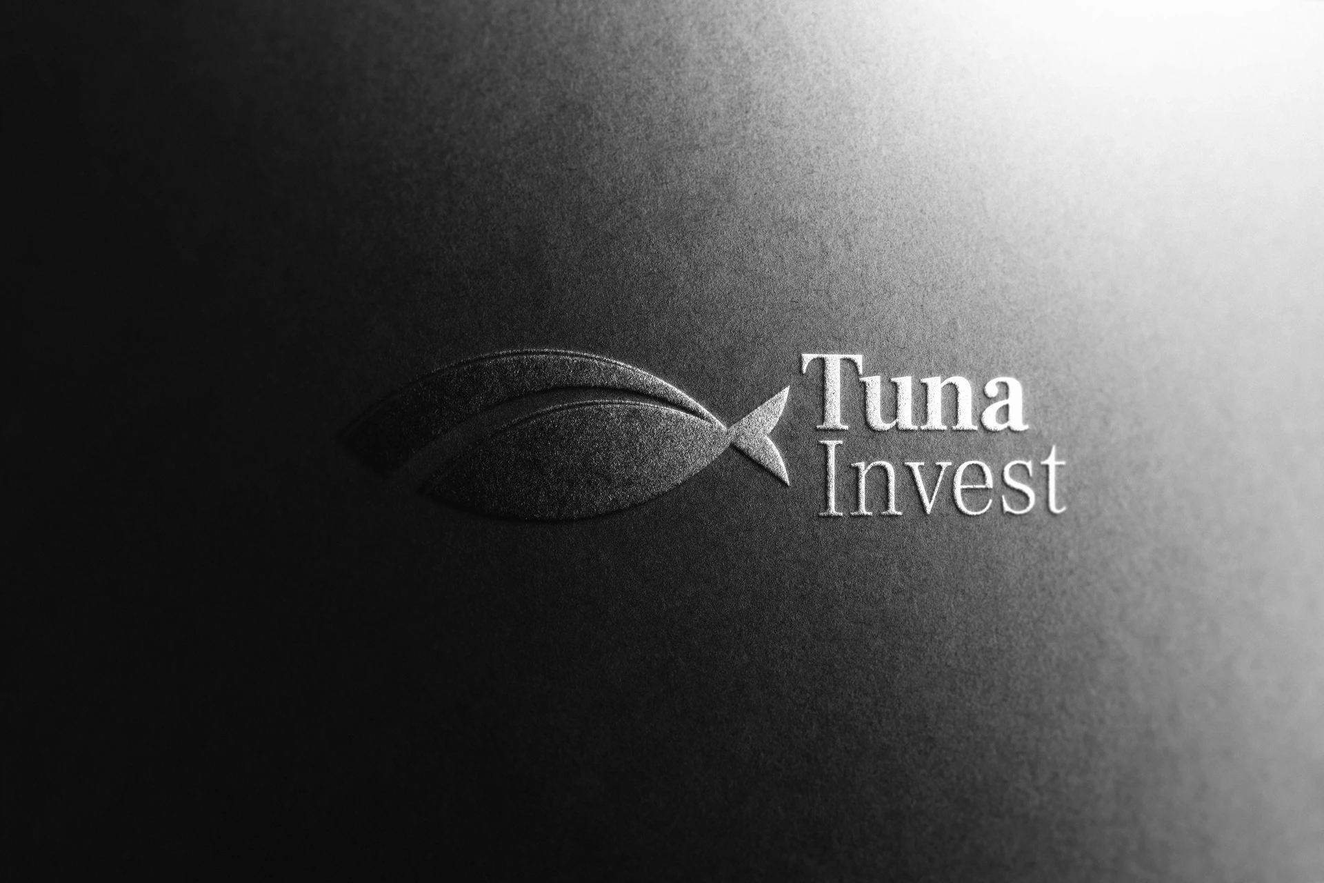
Logo & Brand Identity for Tuna Invest

Rosana Stamenkova


🔘 Case Study for Tuna Invest 💸
💸 Tuna Invest is a financial services provider that specializes in delivering modern, strategic investment solutions for individuals and businesses. Their mission is to offer reliable, data-driven strategies that align with their clients' long-term goals.
➡️ Challenges: The primary challenge was to design a brand identity that reflected Tuna Invest’s business professionalism and modern approach, while also appealing to a corporate audience. The logo needed to be simple yet effective in projecting reliability, expertise, and business acumen.
➡️ Solutions Implemented: We focused on creating a sleek, modern identity by using a minimalistic design approach with structured, clean lines and neutral colors. This allowed us to convey the brand’s focus on professionalism, business orientation, and reliability.
➡️ Results: The new logo and brand identity increased Tuna Invest’s recognition within the financial industry. The modern, professional design resonates with clients looking for reliable financial solutions, reinforcing Tuna Invest’s commitment to delivering quality and precision.
➡️ Conclusion: Tuna Invest’s new brand identity effectively communicates the brand’s core values of reliability, modernity, and professionalism. The combination of a structured design, neutral color palette, and bold typography sets the brand apart as a trusted partner in the financial sector.
💡 Looking to refresh your brand identity? ⭐ Let’s create a modern, professional visual identity for your business!
#brandidentity #visualidentity #casestudy #financialservices #branding
🔘 Logo & Brand Identity for Tuna Invest 💸
💸 Tuna Invest is a professional investment firm focused on providing modern, business-oriented financial services. Their clients range from individuals to businesses looking for reliable, strategic financial solutions in an ever-evolving market.
✅ The logo design establishes a sleek, minimalist visual identity. It emphasizes professionalism and clarity, ensuring that the brand resonates with a business audience. The use of modern, neutral tones combined with clean, structured lines represents the brand’s precision and forward-thinking approach.
➡️ Challenge: Create a brand identity that conveys Tuna Invest’s professionalism and business acumen while maintaining a modern and minimalistic aesthetic. The design had to appeal to corporate clients while being visually engaging and approachable.
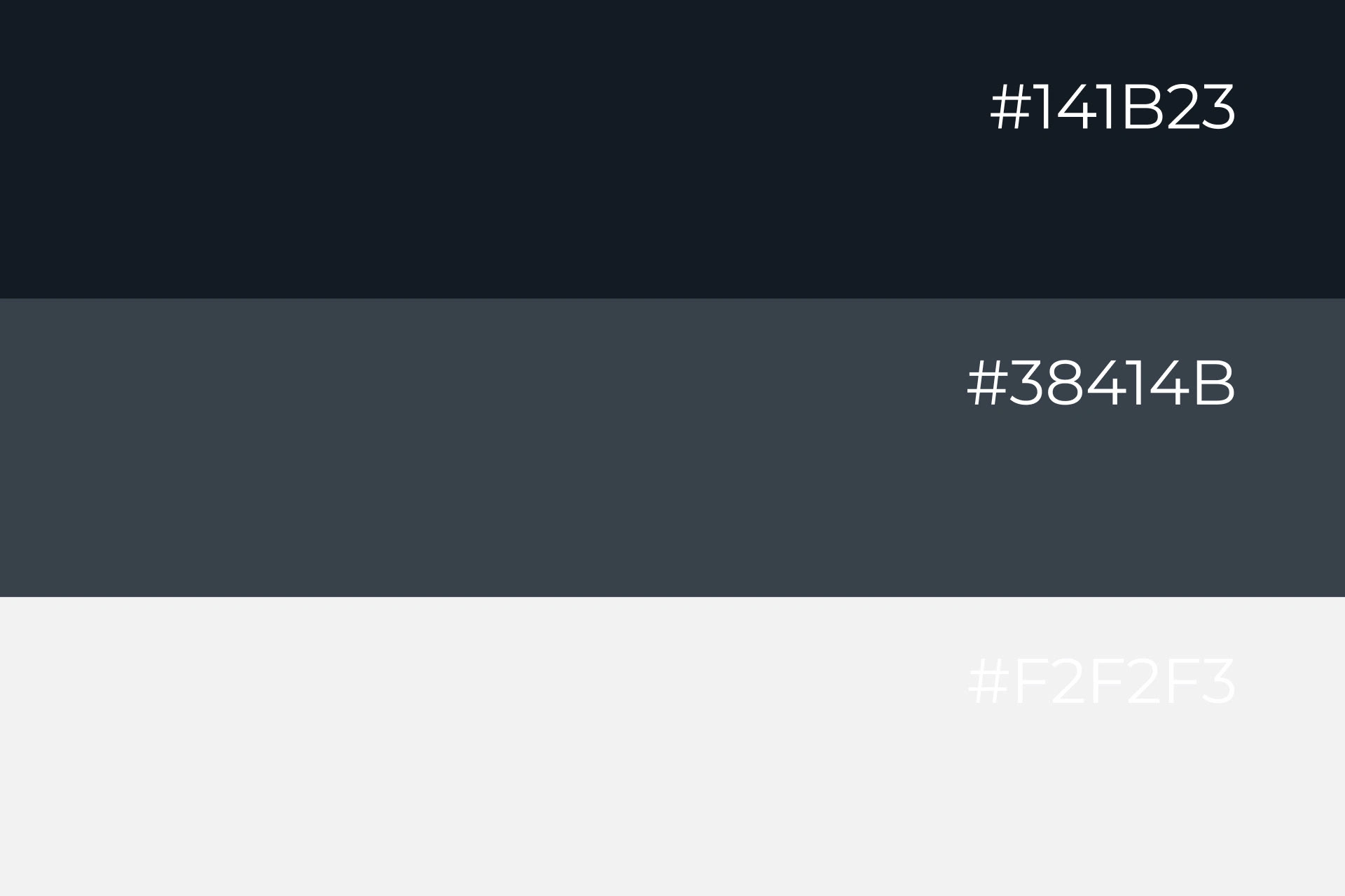
⚫ Darker Version (Eerie Black hashtag#141b23): A dark, authoritative tone that communicates seriousness and dependability.
⚫ Primary Colour (Arsenic Gray hashtag#38414b): A balanced gray that signifies neutrality, professionalism, and trust.
⚫ Lighter Version (Anti-Flash White hashtag#f2f2f3): A bright, clean white for a modern, minimalistic touch that maintains visual clarity.
➡️ The new brand identity has positioned Tuna Invest as a reliable and professional brand within the financial industry. The minimalist design, bold typography, and sophisticated color palette project confidence, while still staying modern and approachable.
⭐ The choice of Frank Ruhl Libre for headlines provides an authoritative, professional feel, while Roboto for body text ensures clarity and a modern touch.
#logo #logodesign #branding #brandidentity #financialservices


Like this project
Posted Oct 4, 2024
Tuna Invest delivers modern, data-driven financial strategies tailored to long-term goals of individuals and businesses.


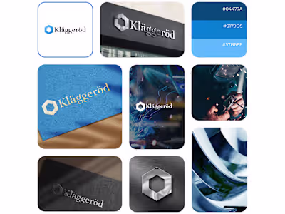
Logo & Brand Identity for Klaggerod
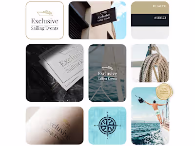
Logo & Brand Identity for Exclusive Sailing Events
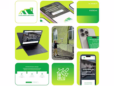
Lukas Dienstleistungen - Web Design & Development

Unlocked Coaching - Web Design & Dev / WordPress