MUBI UX Writing Case study
Case study: MUBI
🔎 In September 2023, I carried out an unsolicited analysis of the Brazilian version of the MUBI platform website. In this file, I intend to show my analysis process and suggestions for improving the Portuguese-language UX Writing of the platform.
What will we see next?
About MUBI;
Proposal and Methodology;
Evaluating MUBI's UX Writing.
1. About MUBI
Mubi is a global streaming service that distributes a catalog of independent, experimental and authorial films. Mubi's work is characterized by the curation and dissemination of cinematographic works outside the commercial circuit.
2. Proposals and Methodology
As a UX Writer and, above all, as a user of the platform since 2021, I set out to analyze and suggest alternatives to the textual elements of Mubi's website.
If I really worked for MUBI, I would start by doing (or reviewing) research that included:
🧑💻 Interviews with users;
🤝 Interviews with stakeholders;
🗣 Social listening.
Since I don't have access to stakeholders or other users of the platform, I asked two friends to identify the pain points. I then used my own judgment to assess the usability of the texts, based on Nielsen's heuristics and the parameters of good practice in UX Writing.
3. Evaluating MUBI's UX Writing
🎬 Landing page
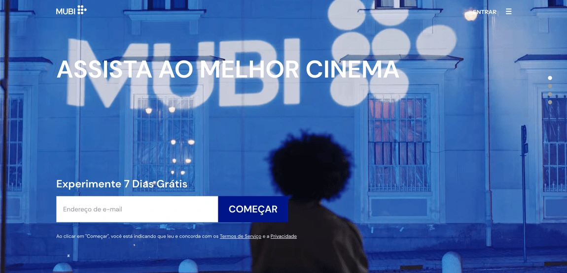
👍 The writing makes good use of the Call-to-Action (CTA) feature, with action verbs such as Assista, Experimente, Veja (Watch, Try, See). This feature makes the page's copy more persuasive.
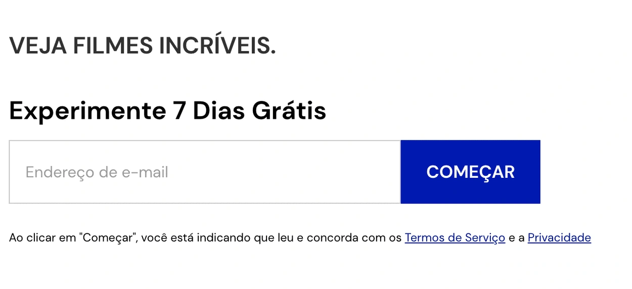
💡 It's also worth mentioning the lexical choice of the COMEÇAR (START) button, which provides the user with the value of the Mubi experience. In this section of the landing page, I believe it would be a valid explanation of what will happen when users register on the platform just below the e-mail field.
🏠 Homepage
Current menu bar (Portuguese)

Corrected menu bar

❌ Problems:
"Em exibição” (Now showing) and "Para assistir” (Watchlist) similar items that generate ambiguity. Brazilian users were unable to distinguish between the two pages. Here we apply Nielsen's fourth heuristic.
"Notebook" is a term that seems vague to a Portuguese-speaking audience and doesn’t allude to Mubi's annual publication.
✅ Solutions:
“Em exibição” (Now showing) leads to the homepage, where the user can explore the films available on the platform. I chose to keep this item.
“Para assistir” (Watchlist) leads to a personal list of movies. I therefore chose to rename the item "Minhas listas” (My lists). As this is a customizable item, I used the pronoun "My" to reflect the user's first-person perspective.
"Notebook" leads to the page of Mubi's official publication of the same name, published in print and online. This page resembles a blog, which is why I chose the term "Publicações” (Publications).
Footer
Current footer
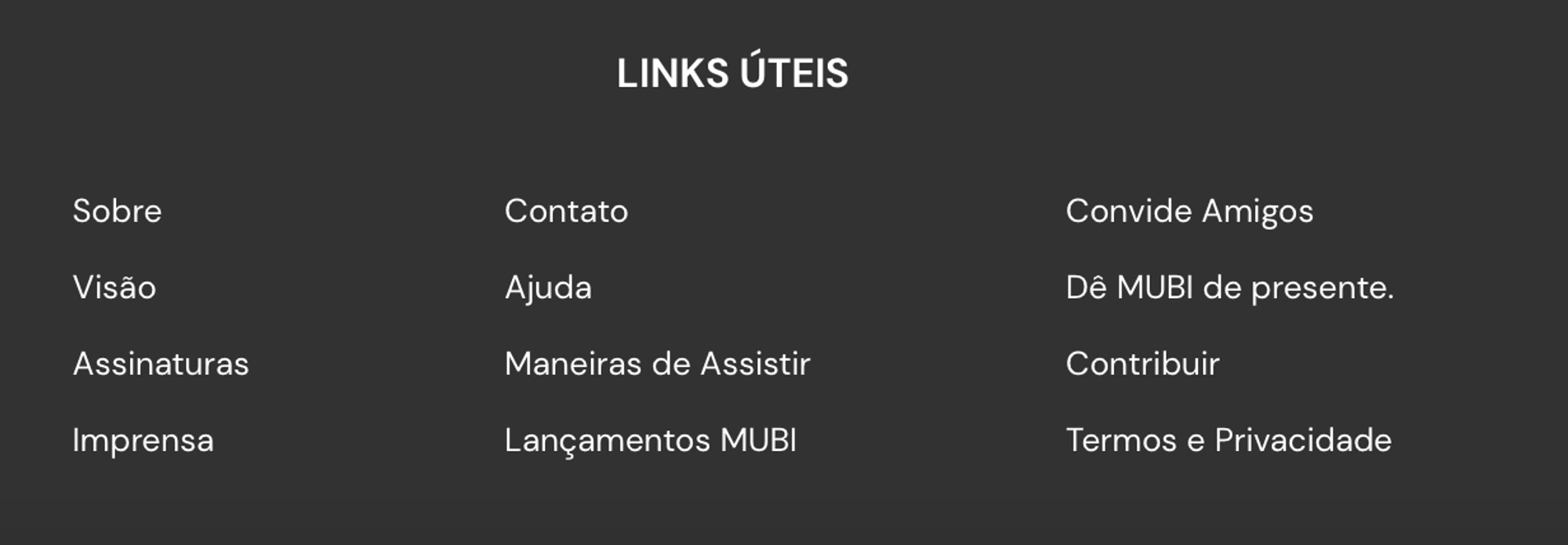
Corrected footer

❌ Problem:
The only footer on the site can only be found on the “Links Úteis” (Useful Links) section on Mubi's "Sobre”(About) page. However, this footer is not standard, nor is it repeated on other pages of the platform.
✅ Solution:
We know that an explicit site map indicates where to find content. I used Nielsen's tenth heuristic, which deals with website documentation (often contained in the footer space) and other streaming products, as a basis for the new footer proposal.
Menu items
💡 The proposed footer for the Mubi homepage is linked to a restructuring of the menu items. I chose to move some of the menu items to the footer area. In this way, the menu could be made simpler and focused on actions that are more relevant to the user's experience on the platform.
Current menu tab
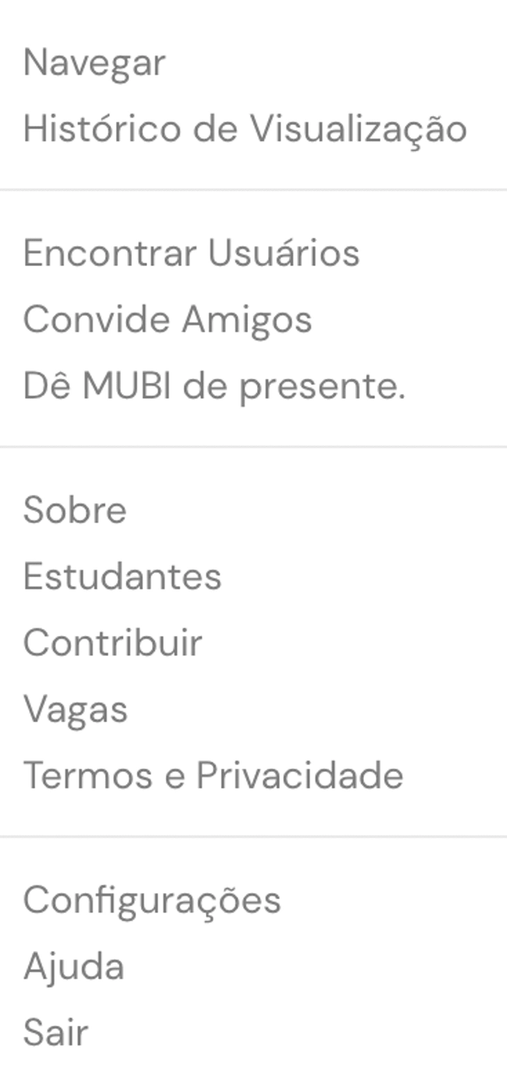
Mubi current menu bar
Corrected menu tab
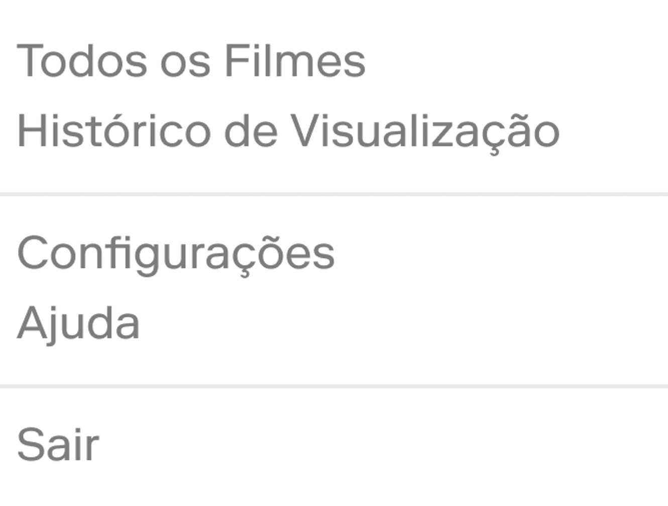
Proposed new menu tab for Mubi
❌ Problem:
The "Navegar” (Browse) item leads to a list of movies cataloged by Mubi, not necessarily available to watch on the platform. Users reported some difficulty in discerning this action.
✅ Solution:
I've labeled this option "Todos os Filmes” (All Movies) to differentiate it from the "Em exibição (Now Showing) option, which covers the movies available on the platform.
Notifications
Current notifications
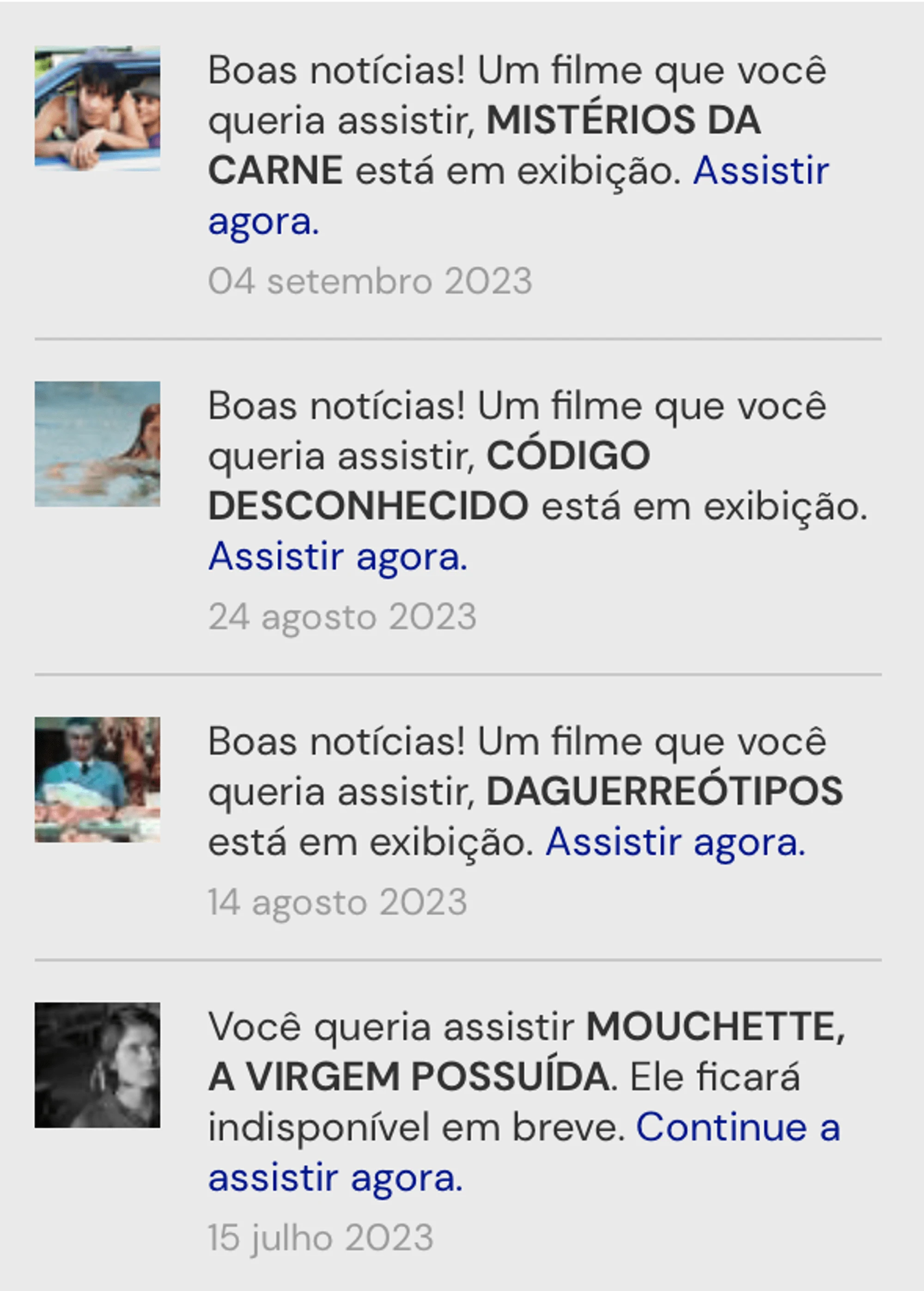
Mubi notification tab
Corrected notifications
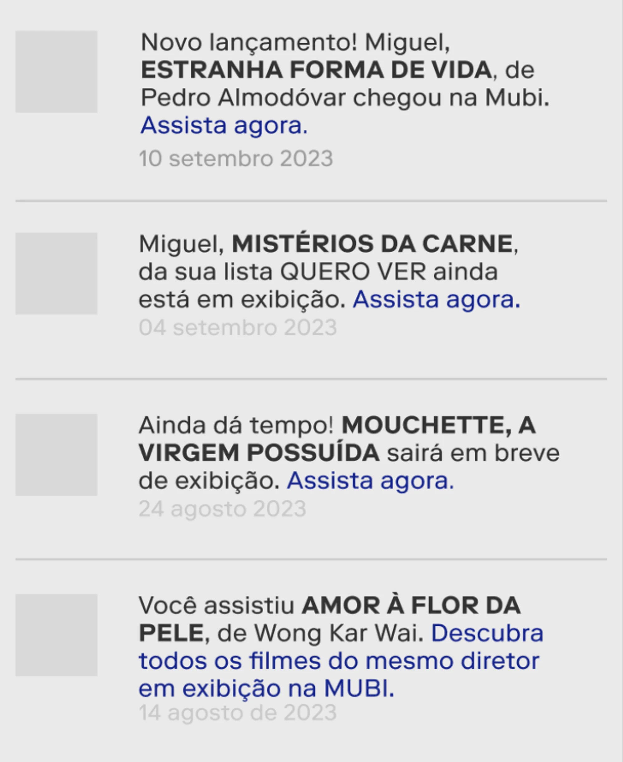
Proposed rewriting of Mubi notifications
💡 As for notifications, no problems have been reported by users. However, I do offer some stronger copywriting alternatives for the Portuguese text.
I added the user's name (Miguel, in my case) to the text to make it closer to the user. Even so, I tried to preserve Mubi's characteristic tone of voice.
I used the scarcity bias to create more persuasive copy for movie notifications that are on the user's personal list.
I suggested a new notification model, which encourages the user to discover more movies on the platform based on the movies they've already seen.
I created a notification for new releases as a way of highlighting the platform's exclusive products.
I used CTAs, in this case imperative verbs, to make the text more persuasive.
Results
I restructured the top menu of the homepage to avoid ambiguity;
I created a standard footer to facilitate access to the site's documentation;
I reduced the number of items in the main menu to reduce information overload;
I rewrote the notification copywriting to make it more persuasive.
Next steps (if I worked for MUBI):
Translate the publications on the "Notebook" page into Portuguese;
Testing password and contact recovery processes;
Like this project
Posted Feb 13, 2024
Unsolicited analysis of MUBI platform's Copy and UX Writing.

