UniFatecie: Redesigning a Fragmented Student Journey

Graziele Costa


Executive summary
Usable did not mean ready to ship
Students relied on five disconnected environments to complete essential academic tasks. I audited the ecosystem, analyzed 80 public complaints, and tested a task-based redesign with eight students. The prototype reached 95.8% direct task success and a SUS score of 81.9, but institutional review exposed the project’s most important decision: approve the interaction model while keeping release blocked until operational, security, and data-governance risks are resolved.
Research evidence
80
public complaints reviewed and 77 classified
Moderated study
8
students completing 48 task attempts
Direct success
95.8%
46 of 48 attempts without moderator help
System usability
81.9
average SUS, above the target of 75
Design decision
Usability gate · GORelease gate · NO-GO
The tested interaction model met its usability criteria. Publication still depends on institutional rules, RBAC, LGPD, retention, implementation, accessibility validation, and production QA.
Evidence-led iteration
1
Evidence
P02 looked under Requests, opened “New request,” and could not find Student Card in 15 seconds. SEQ: 2/7.
2
Decision
I treated the detour as architecture evidence, exposed Student Card as a service, and added the “Photo required” state and action.
3
Revalidation
Home and Requests were tested as separate entry points. All 11 final sessions were direct, averaging 6.2 seconds and SEQ 6.8/7.
Participant behavior, paraphrased: “I looked in Requests because the Student Card felt like a service I needed to request.”
The problem
Understanding the challenge
To complete basic academic and administrative tasks, students move between the Student Portal, Moodle/AVA, AlunoNet/WAEWeb, and Inova Carreira. Each environment uses different navigation, terminology, interface patterns, and task groupings. The resulting problem is not the absence of functionality. It is the lack of orientation and continuity between systems.
Business goal
Explore a clearer onboarding and orientation layer that could help students identify their next actions, understand where tasks take place, and move between essential academic services with less uncertainty.
Users
The primary audience is newly enrolled students learning how to navigate the institution’s digital ecosystem. Returning students are a secondary audience for recurring academic, administrative, and support tasks.
Constraints
•The study did not include production analytics, internal support-ticket data, or access to the institution’s technical architecture
•The moderated sample focused on EAD and semipresential Pedagogy students
•The proposal assumes the existing platforms and their operational ownership remain in place rather than being replaced
•Academic, administrative, learning, and career tasks follow different structures, terminology, and ownership models
•The prototype is not connected to production data, authentication, or integrations, and reviewed business rules still require formal production approval
Understanding the existing experience
Mapping a student experience distributed across five environments
The existing journey was not contained within a single product. The institutional website provided public information and multiple portal entry points, while the authenticated experience redirected students across platforms with different navigation models, terminology, visual patterns, and authentication behaviors.
Existing ecosystem
Institutional website
Public course information and student portal entry points organized by modality.
Student Portal
Dashboard, current subjects, financial information, services, communication, and shortcuts to external platforms.
Moodle / AVA
Classes, learning materials, activities, progress, and activity grades.
AlunoNet / WAEWeb
Official grades, attendance, academic records, requests, documents, and administrative services.
Inova Carreira
Career development, complementary courses, and employability-related services.
Main experience problems
Platform-first navigation
Students had to identify which system owned a task before they could complete it.
Disconnected transitions
Tasks moved across different domains, tabs, interfaces, and authentication states without consistent orientation.
Multiple sources of academic information
Activity grades appeared in Moodle, while official grades and attendance were available through AlunoNet without a clear explanation of the difference.
Institutional terminology
Labels such as DIC, N1, Protocolo, AlunoNet, and WAEWeb required students to understand internal structures before understanding the service.
Inconsistent system feedback
Empty, unavailable, loading, and error states followed different patterns across the ecosystem.
Unclear support routing
Students had to choose between academic support, technical assistance, WhatsApp, tutors, and formal requests without clear guidance.
Research and discovery
Combining ecosystem evidence with observed student behavior
The discovery moved from an expert-led ecosystem audit to moderated testing with students. I combined the public entry journey, an authenticated walkthrough, 80 public complaints, interface and content analysis, a six-task usability study with eight students, and institutional rule reviews. This created a traceable line from recurring service problems to design decisions and revalidation.
Public and authenticated journey audit
I reviewed the institutional entry journey and one recorded authenticated EAD Pedagogy walkthrough, documenting every visible platform, transition, task path, system state, and external destination.
Output
A current-state ecosystem map connecting the institutional website, Student Portal, Moodle / AVA, AlunoNet / WAEWeb, and Inova Carreira.
Public complaint analysis
I reviewed 80 Reclame Aqui complaints published between July 2022 and July 2026. Seventy-seven were classified across six recurring themes and three were excluded.
Output
A quantified view of recurring problems involving grades and attendance, modality and course offering, finance, documents, platform access, and support.
Moderated usability study
Eight EAD and semipresential Pedagogy students completed six task-based scenarios across mobile, desktop, and alternating-device contexts. I captured direct success, time, SEQ, errors, recovery behavior, and SUS.
Output
Forty-eight task attempts, a 95.8% direct-success rate, an average SEQ of 6.4, and an average SUS score of 81.9.
Heuristic, content, and accessibility review
I evaluated navigation, terminology, hierarchy, system feedback, error prevention, responsive behavior, visible accessibility risks, and recovery patterns across the existing experience and prototype.
Output
A prioritized issue backlog, terminology audit, component inventory, and accessibility recommendations.
Journey and information-architecture mapping
I connected public entry, authentication, classes, grades, financial tasks, documents, requests, and support, then reorganized navigation around student goals instead of platform names.
Output
Current-state and proposed journeys, a task-based service model, and priority flows for prototyping.
Institutional rule review
Prototype rules and service states were reviewed with Student Services, Academic Secretariat, Finance, Pole Coordination, and IT, including official-grade timing, financial states, requests, and student-card requirements.
Output
Validated operational rules for the prototype and an explicit list of security, permissions, LGPD, retention, and implementation blockers.
Research limitations
•The moderated sample focused on EAD and semipresential Pedagogy students and should not be generalized to every modality or course
•Public complaints reveal recurring service problems but do not represent the full student population
•No production analytics, retention data, or internal support-ticket data were available
•The authenticated audit began from one EAD Pedagogy account
•Accessibility checks did not include a formal WCAG audit or assistive-technology testing
•Security, RBAC, LGPD, retention, integration, and production feasibility remain institutional responsibilities
Key findings
The experience required students to understand the institution’s systems before completing their goals
The audit, public complaints, and usability sessions showed that the highest-priority risks were not isolated interface defects. They emerged across platform boundaries through fragmented ownership, inconsistent terminology, unclear transitions, and the absence of a shared orientation layer.
01
Academic records concentrated the largest share of public complaints
Evidence
Thirty-one of the 77 classified complaints, 40.3%, involved subjects, assessments, grades, attendance, or internships.
User consequence
Unclear ownership and synchronization rules in high-stakes academic information can increase uncertainty, repeat checking, and support dependency.
Design implication
Prioritize one clear academic entry point, distinguish provisional from official data, and make synchronization timing visible.
02
The platform architecture was exposed to students
Evidence
Public and authenticated journeys required students to choose between the Student Portal, Moodle, AlunoNet, WAEWeb, and other services.
User consequence
Students had to identify which internal system owned a task before they could complete it.
Design implication
Primary navigation should be organized around goals such as Classes, Grades, Finance, Requests, Documents, and Help.
03
Academic information had multiple destinations
Evidence
Activity grades appeared in Moodle, while official grades and attendance were accessed through AlunoNet.
User consequence
The interface did not clearly explain which information was provisional, activity-based, or officially recorded.
Design implication
Create one Grades entry point that explains the distinction and routes students to the correct source.
04
Cross-platform transitions interrupted continuity
Evidence
Tasks moved between domains, tabs, visual systems, and authentication states, including a return to a login screen during an authenticated journey.
User consequence
Students could lose context and become uncertain about whether another credential or action was required.
Design implication
Introduce explicit transition messages, external-link indicators, return paths, and session-recovery guidance.
05
Different routes communicated contradictory states
Evidence
Subjects were accessible through one route while another Moodle-related route indicated that they were unavailable or disabled.
User consequence
The same academic service could appear active and unavailable within the same broader journey.
Design implication
Define one authoritative access path and standardize availability messages.
06
Institutional terminology increased cognitive load
Evidence
Labels such as DIC, N1, Protocolo, AlunoNet, and WAEWeb reflected internal structures rather than student intentions.
User consequence
Students needed to interpret acronyms and department language before understanding a service.
Design implication
Use plain-language task labels, preserving official terminology only as secondary supporting information.
07
Feedback states lacked a shared model
Evidence
Unavailable or empty content appeared as blank screens, generic messages, disabled cards, PDFs, or inconsistent notices.
User consequence
Students could not consistently distinguish between an empty service, an unavailable feature, a loading state, or an error.
Design implication
Create shared loading, empty, unavailable, warning, error, success, and recovery patterns.
Design strategy
Designing an orchestration layer for a fragmented academic ecosystem
Three directions were considered. Consolidating every service into one platform offered the strongest continuity but required organizational and technical access outside the study. A visual reskin was more feasible but would leave the fragmented architecture intact. I chose a third direction: a consistent orientation layer that organizes tasks around student goals, explains system boundaries, and preserves the existing platforms behind the journey.
01
Orchestrate before attempting to replace
The proposal improves orientation and continuity while treating the existing platforms, ownership boundaries, and integrations as constraints.
Problem addressed
A full platform consolidation could not be responsibly designed or scoped without technical, operational, and governance access.
Influence on the solution
The solution adds task-based navigation, transition guidance, and shared feedback patterns without claiming to replace the underlying systems.
02
Organize the experience around student goals
Primary navigation should represent what students want to accomplish rather than the name of the system responsible for the task.
Problem addressed
Students had to choose between internal platforms before understanding which one supported their goal.
Influence on the solution
The proposed navigation uses Classes, Grades, Finance, Requests, Documents, Help, and All services.
03
Activate through outcomes, not a product tour
New students should complete a small number of meaningful academic tasks instead of being introduced to every feature at once.
Problem addressed
The existing experience exposed many services without clearly prioritizing what students should do first.
Influence on the solution
The onboarding checklist focuses on confirming enrollment, reviewing dates, accessing the first subject, checking financial status, and understanding support channels.
04
Reveal complexity progressively
Services should become prominent according to the student’s current academic stage and immediate needs.
Problem addressed
Academic, financial, career, promotional, and administrative services competed at the same hierarchy level.
Influence on the solution
The first-week experience prioritizes classes, dates, finance, and help while secondary services remain available through the complete service directory.
05
Use plain language before institutional terminology
The interface should communicate the user benefit first and introduce official acronyms only when required.
Problem addressed
Labels such as DIC, N1, Protocolo, AlunoNet, and WAEWeb reflected internal structures.
Influence on the solution
Services receive task-based labels, while official terminology appears as supporting information.
06
Make cross-platform transitions explicit
When a task opens Moodle, AlunoNet, or another external environment, the interface should explain where the student is going and why.
Problem addressed
Unexpected tab changes, new domains, and authentication interruptions broke continuity.
Influence on the solution
The redesigned flow introduces transition messages, external-link indicators, return guidance, and session-recovery support.
07
Build a shared feedback language
Loading, empty, unavailable, error, warning, and success states should follow the same semantic and visual logic.
Problem addressed
System feedback varied significantly across products and often failed to explain the next action.
Influence on the solution
The proposal defines shared feedback patterns and reusable component states across the ecosystem.
Information architecture and user flow
Moving from a platform-based structure to a task-based student journey
The existing architecture required students to choose a platform before understanding whether it could complete their task. The proposal reverses that relationship: students select a goal first, while the orientation layer directs them to the appropriate internal or external service. Routing and deep-link behavior remain technical hypotheses to validate.
Previous structure
Organized around platforms
•Institutional website
•Student Portal EAD
•Student Portal Postgraduate
•Student Portal In-Person
•Moodle / AVA
•AlunoNet / WAEWeb
•Inova Carreira
•Libraries and external services
Proposed structure
Organized around student goals
→Home
→Classes
→Grades
→Finance
→Requests
→Documents
→Help
→All services
Main onboarding flow
From enrollment confirmation to the first class
01Enrollment confirmed
02Pre-onboarding communication
03Account activation
04Welcome Screen
05Freshman Checklist
06Confirm enrollment and academic period
07Review important dates
08Access the first subject
09Check financial status
10Understand support channels
11Complete onboarding
12Continue to the first class
Structural decisions
Decisions that connect the architecture to the experience
Task-based primary navigation
Platform names are replaced by goals that students can recognize without prior knowledge of the ecosystem.
One entry point for grades
The Grades destination explains the difference between activity results in Moodle and official academic records in AlunoNet.
Direct path to the first subject
The onboarding flow proposes a direct route to the student’s first available subject. Its feasibility depends on authentication, enrollment data, and deep-link support in the learning platform.
Support organized by intention
Academic questions, access problems, and formal requests are separated according to what the student needs to accomplish.
Explicit external handoffs
Cross-platform transitions communicate the destination, purpose, expected browser behavior, and available return path. Session continuity remains subject to technical validation.
Progressive service visibility
Services are prioritized according to the academic lifecycle while remaining accessible through a complete directory.
The redesigned experience
Turning fragmented services into a guided student journey
The redesigned experience works as an orientation and orchestration layer across the existing academic ecosystem. Instead of hiding the legacy platforms, it gives students clearer priorities, explains transitions, and connects essential tasks through a more consistent interaction model.
01
Welcome and academic orientation
Problem
The existing experience did not provide a clear starting point or explain what newly enrolled students should do first.
Design response
A welcome experience introduces the academic period, confirms the student’s current status, and presents the most important first actions.
Intended effect
Help students understand where they are, what is already active, and what requires attention.
02
Freshman checklist
Problem
Essential tasks competed with secondary services and were not presented in a clear sequence.
Design response
A progressive checklist organizes enrollment confirmation, important dates, first-class access, financial status, and support orientation.
Intended effect
Reduce uncertainty by transforming onboarding into a small set of visible and actionable steps.
03
Task-based navigation
Problem
Students had to recognize platform names before knowing where to complete an academic task.
Design response
Navigation is organized around goals such as Classes, Grades, Finance, Requests, Documents, and Help.
Intended effect
Allow students to begin with their intention while the product handles the underlying system routing.
04
Guided access to the first class
Problem
Accessing learning content required students to discover the correct platform and navigation path.
Design response
The onboarding journey provides a direct route to the first available subject with contextual guidance before the external transition.
Intended effect
Shorten the path from account activation to meaningful academic participation.
05
Explicit cross-platform transitions
Problem
New domains, tabs, authentication states, and interface changes appeared without enough explanation.
Design response
A transition modal identifies the destination, explains why the external system is required, and provides return and recovery guidance.
Intended effect
Preserve context and reduce uncertainty when students move between platforms.
06
Contextual feedback and empty states
Problem
Blank screens, generic notices, and disabled services did not consistently explain what had happened or what the student could do next.
Design response
Contextual empty, unavailable, and recovery states explain the current condition and provide an appropriate next action.
Intended effect
Help students distinguish between missing content, unavailable services, incomplete requirements, and system errors.
07
Support organized by intention
Problem
Students had to choose between departments, tutors, technical support, WhatsApp, and formal requests without clear routing.
Design response
Help options are grouped according to academic questions, access problems, administrative requests, and urgent assistance.
Intended effect
Direct students toward the correct support channel with less institutional knowledge.
Prototype coverage
What was designed and prototyped
✓Three primary end-to-end student flows
✓Responsive high-fidelity screens across onboarding and essential services
✓Controlled mobile variants for route-specific revalidation
✓One cross-platform transition modal
✓Three contextual empty-state variations
✓Responsive interaction patterns
✓Coded interactive prototype
Visual evidence
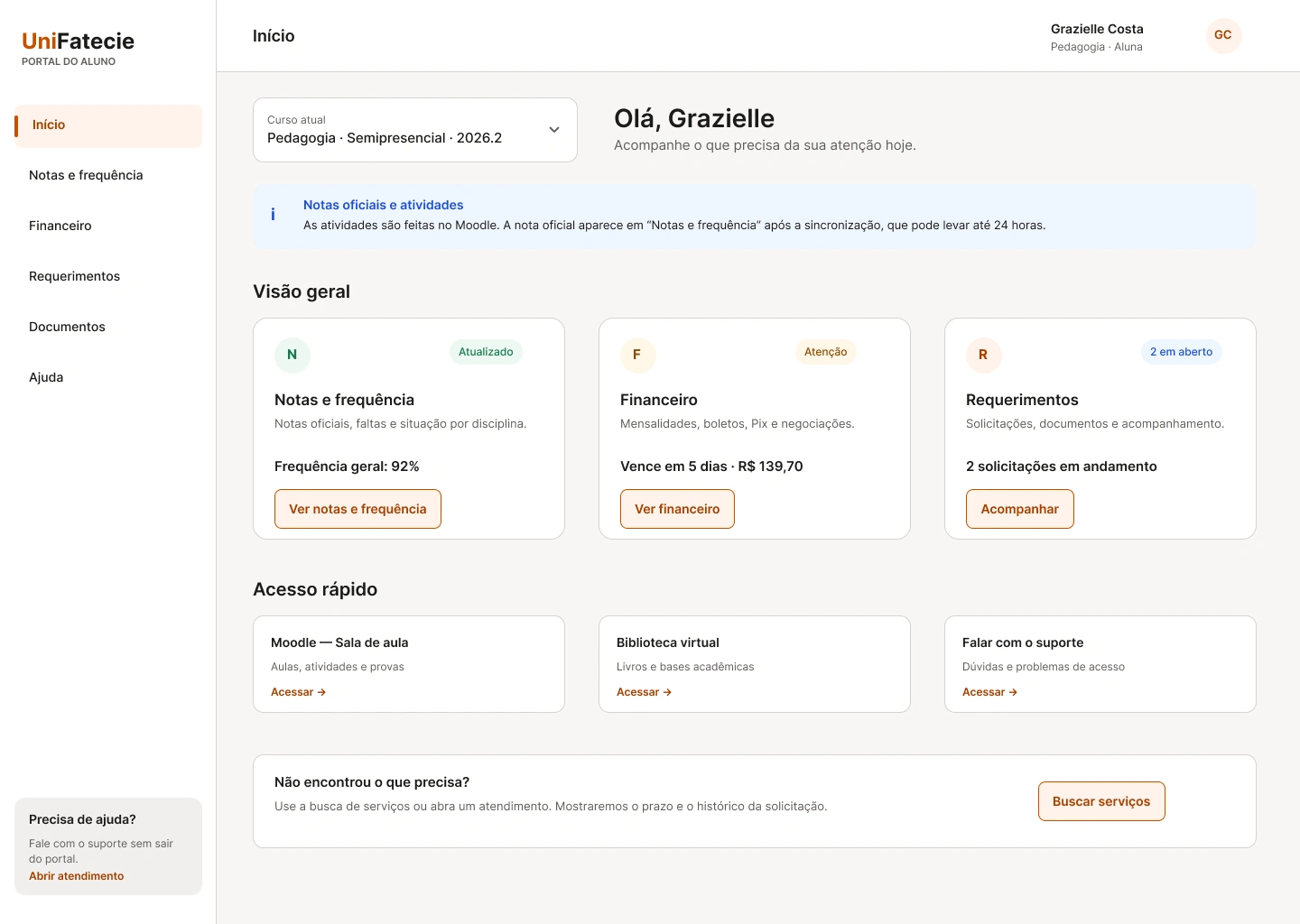
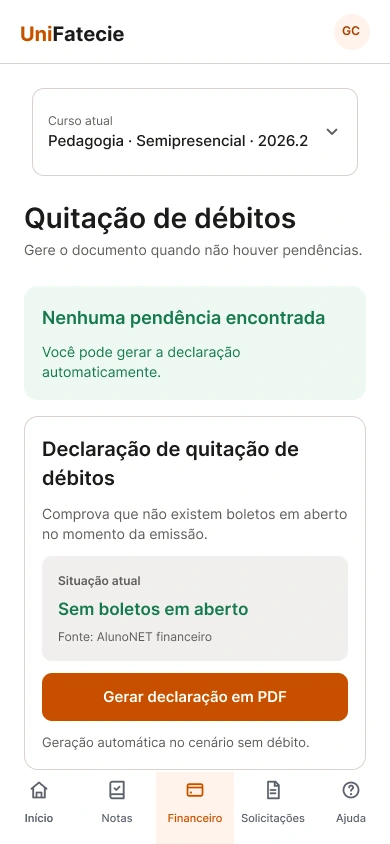
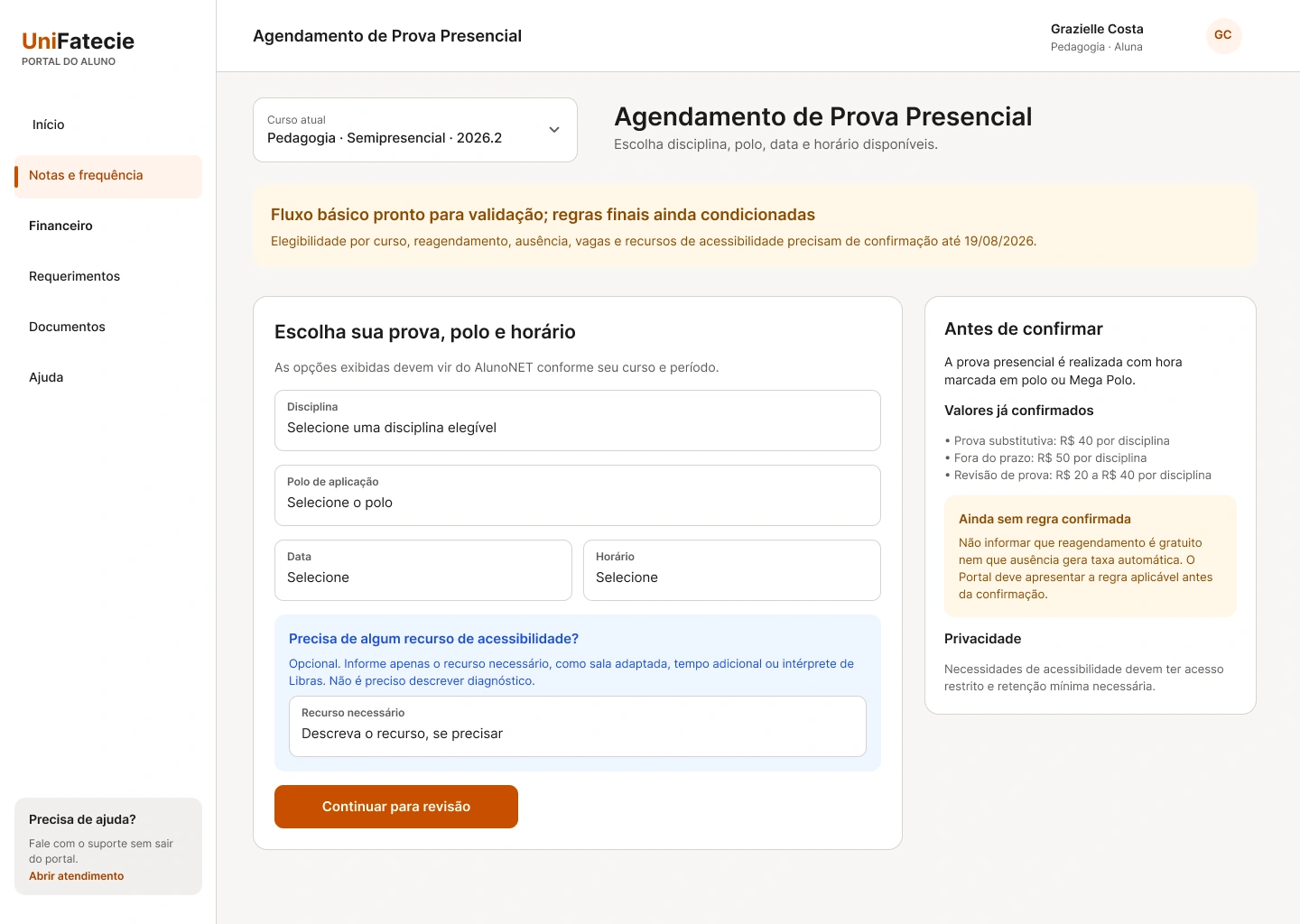
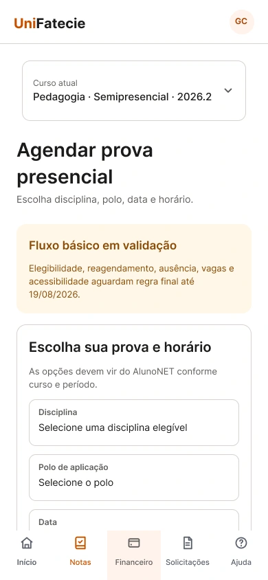
Responsive product screens from the validated student portal
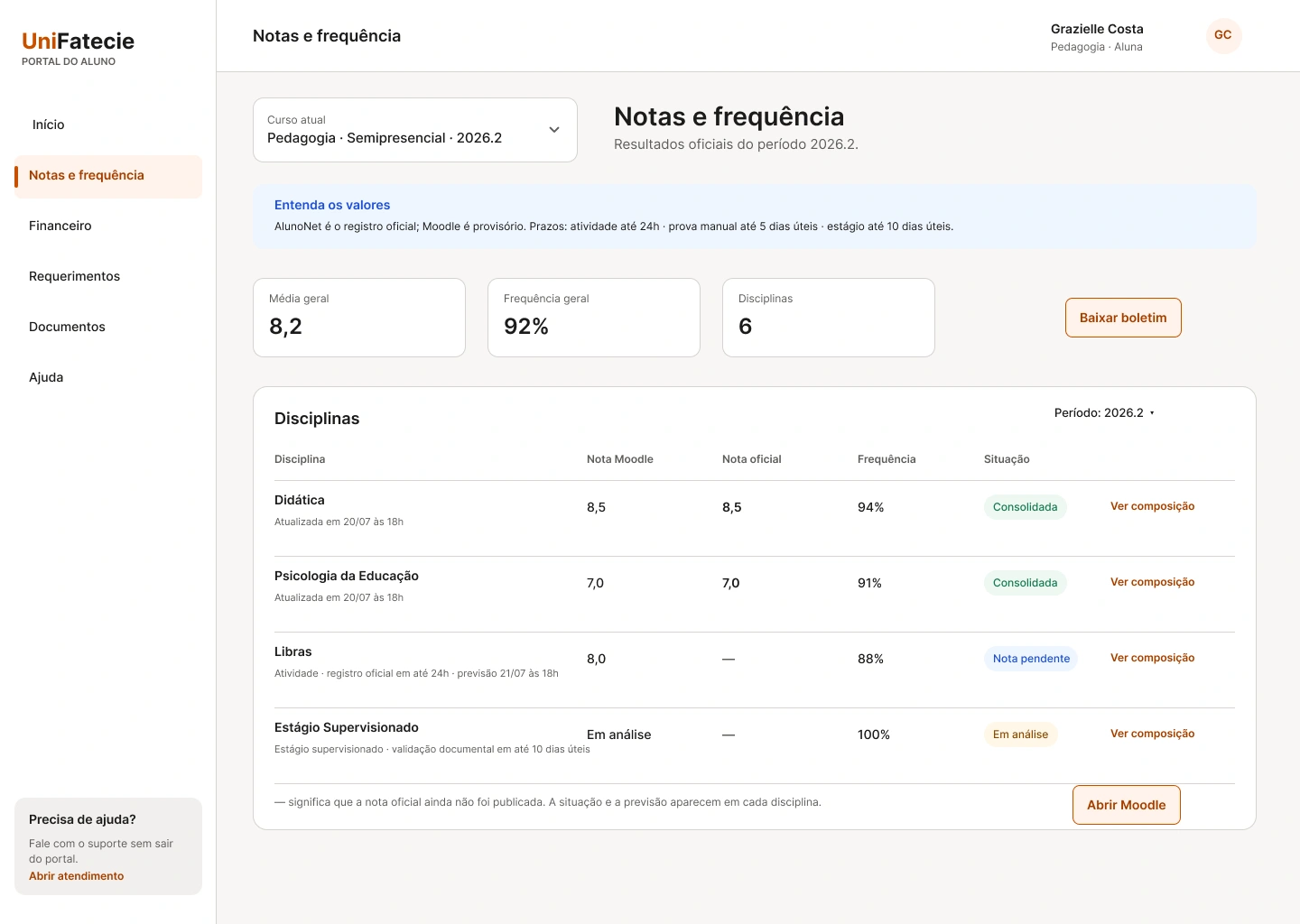
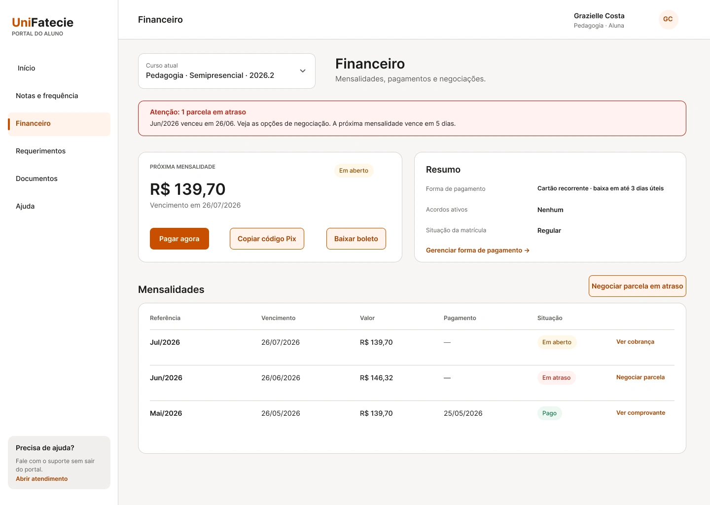
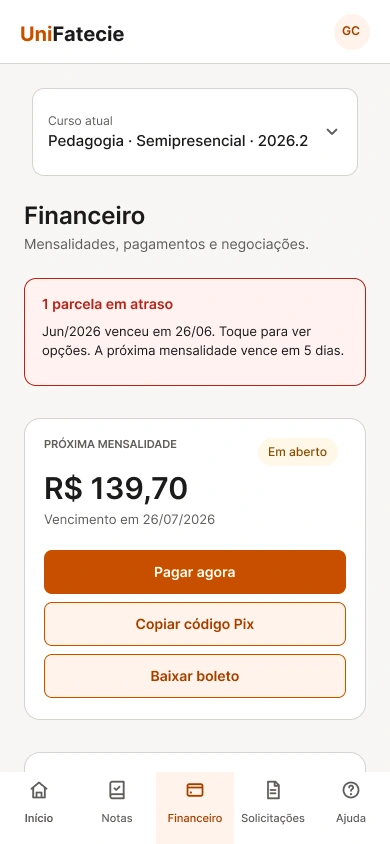
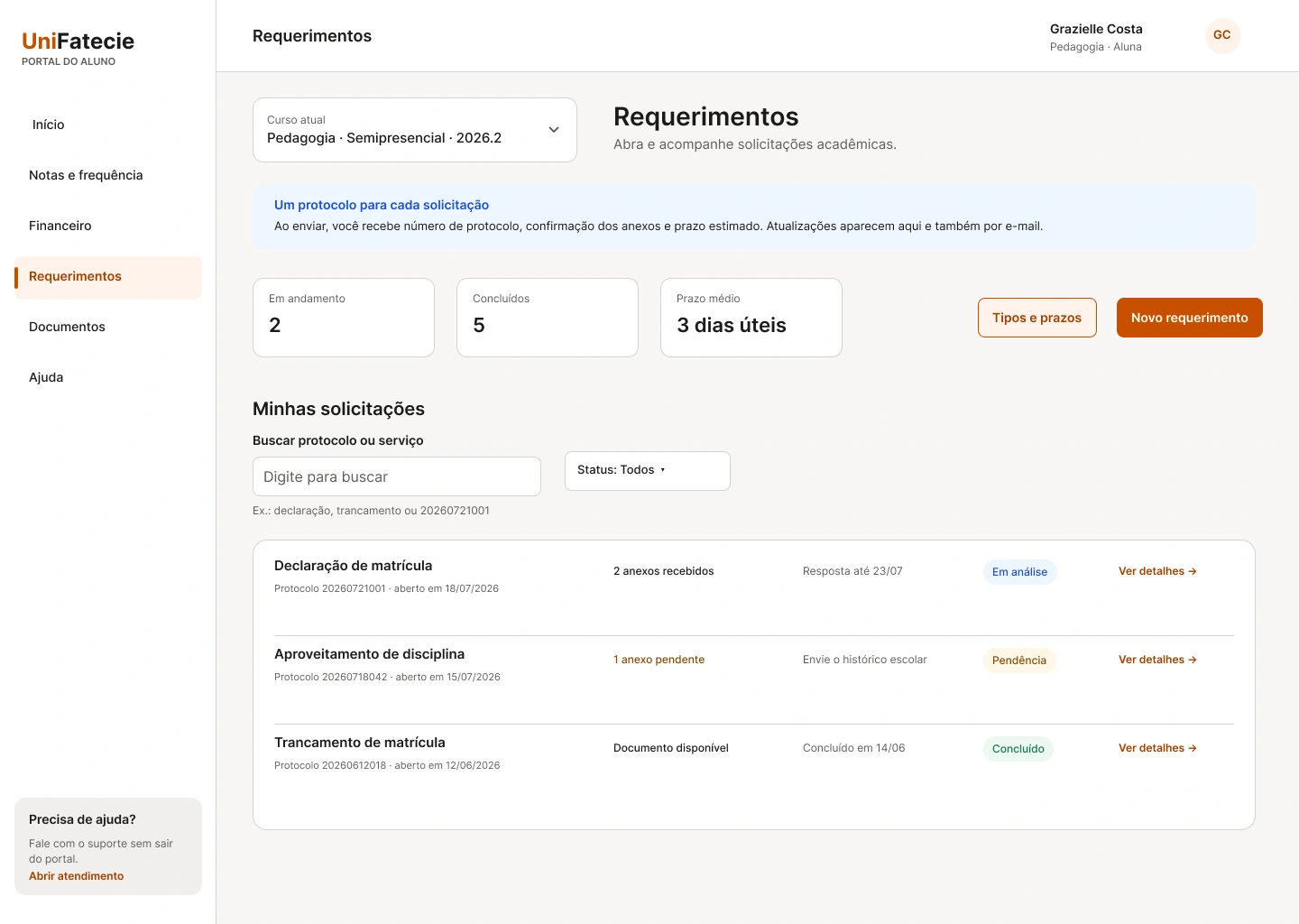
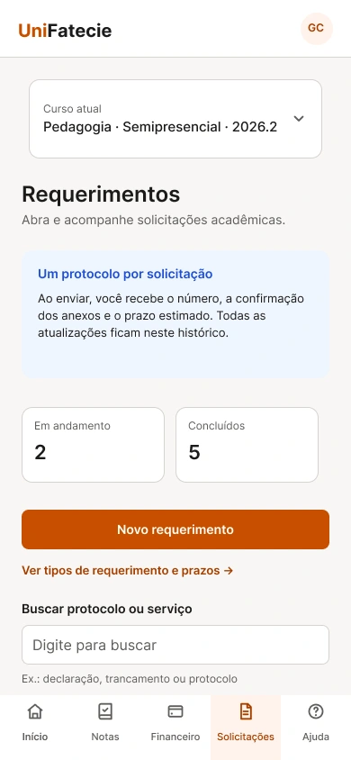
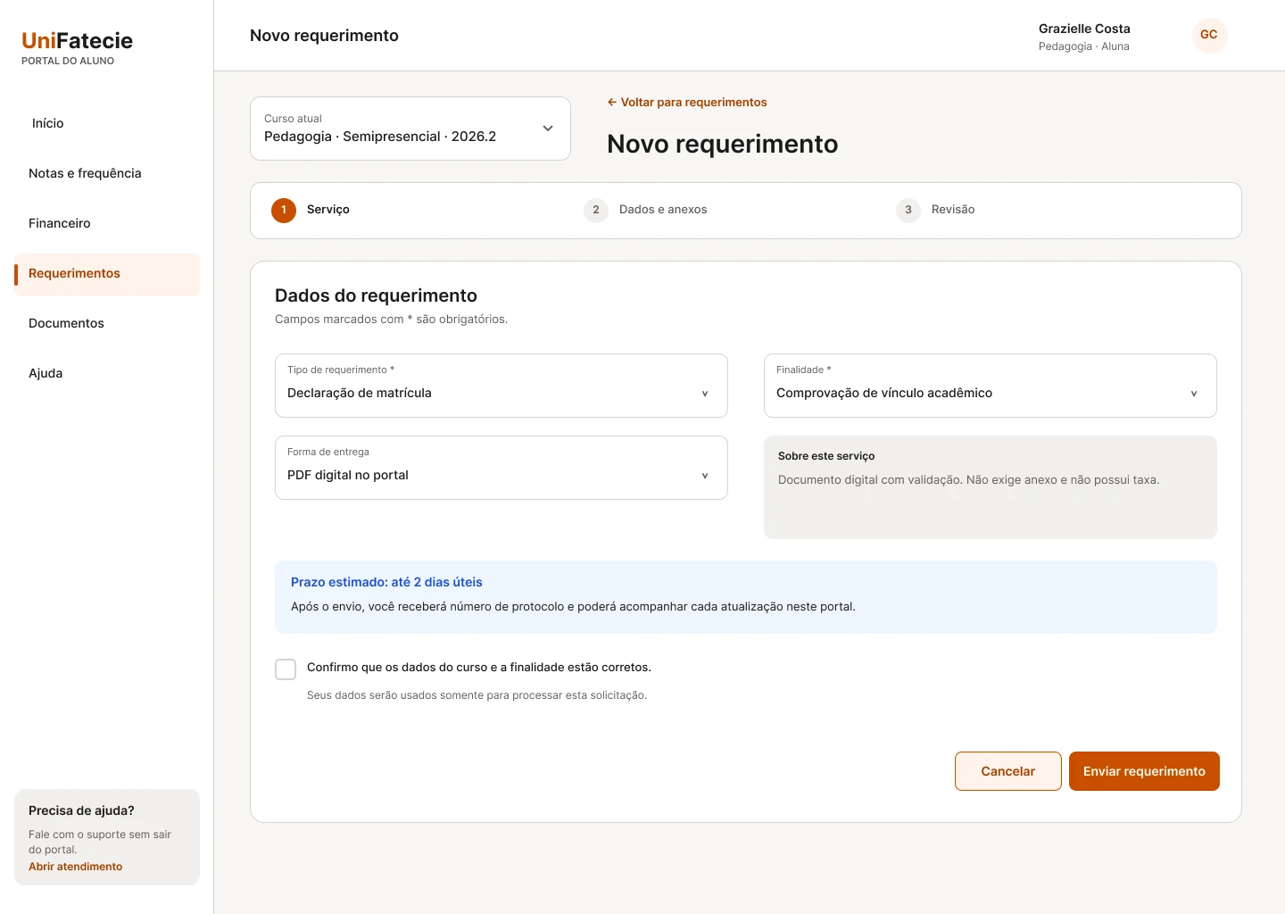
The same 12 product states were designed for desktop and 390 px mobile layouts. The paired screens below document the responsive behavior used across navigation, academic information, finance, requests, Student Card, negotiation, and scheduling. All content uses fictional student data.
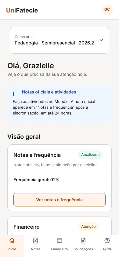
01
Academic overview and finance
Desktop and mobile versions preserve course context, official-grade guidance, payment status, and the same task-based information hierarchy.
Prioritize the next student action without exposing platform ownershipResponsive pair
Desktop · 1440 pxSelect to enlarge
Desktop · 1440 pxSelect to enlarge
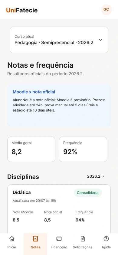
Desktop · 1440 pxSelect to enlarge
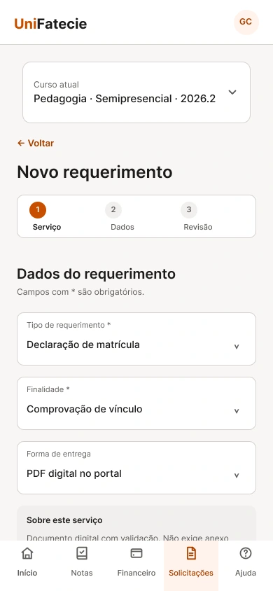
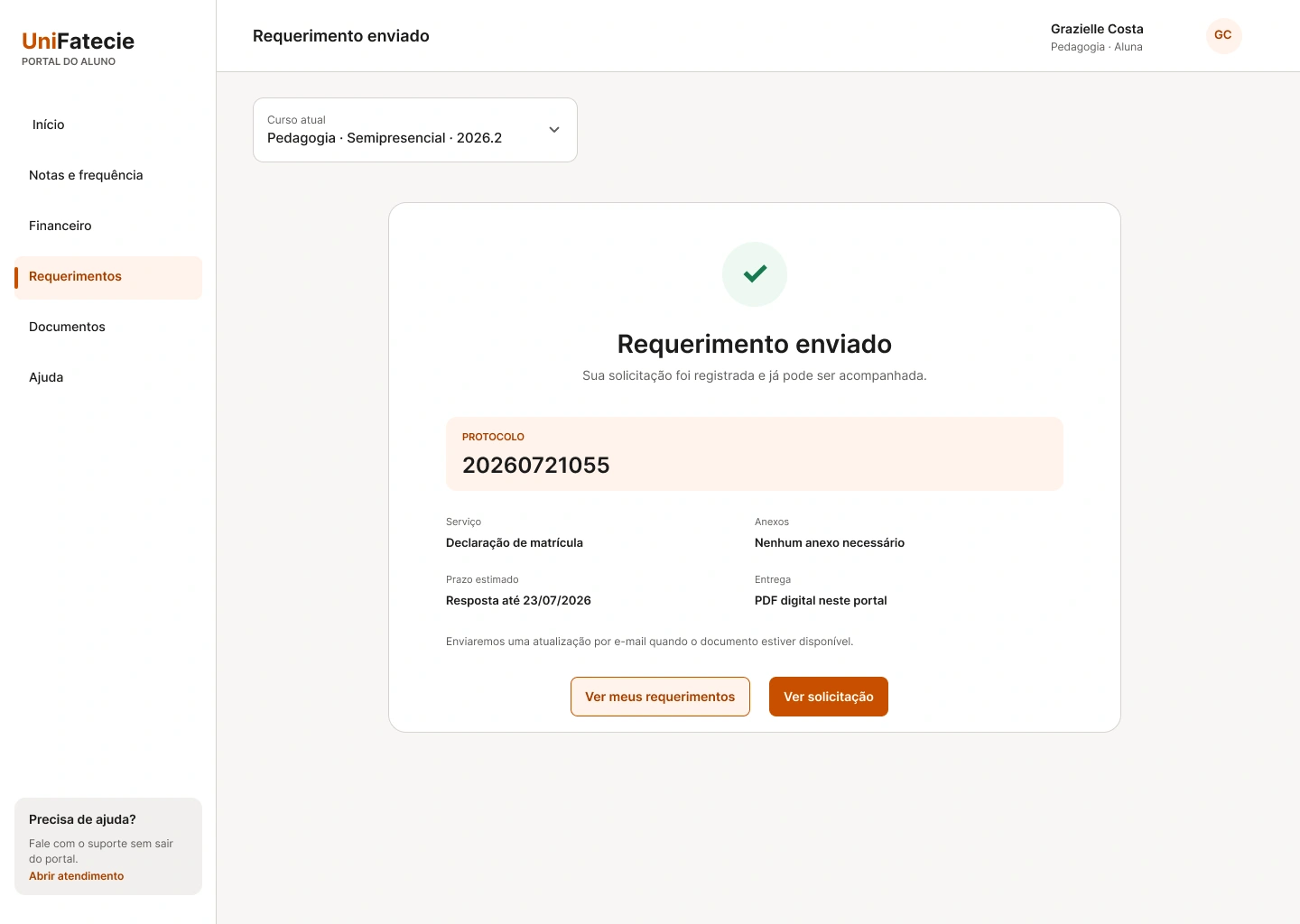
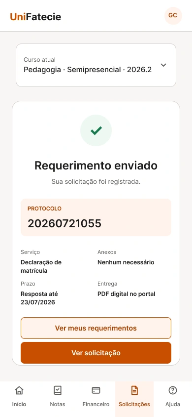
Requests and service completion
The request journey remains consistent across breakpoints, from service discovery to form completion and protocol confirmation.
Expose services directly instead of requiring students to know request categoriesResponsive pair
Desktop · 1440 pxSelect to enlarge
Desktop · 1440 pxSelect to enlarge
Desktop · 1440 pxSelect to enlarge
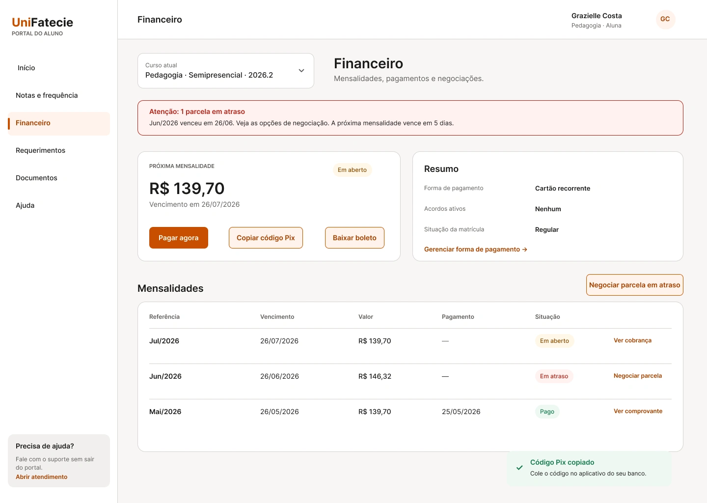
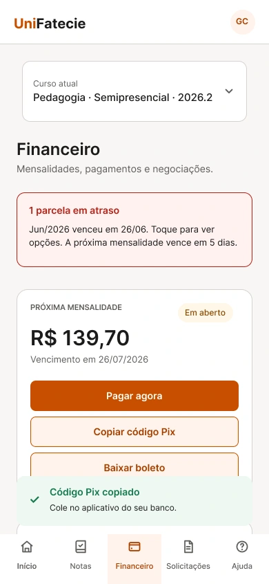
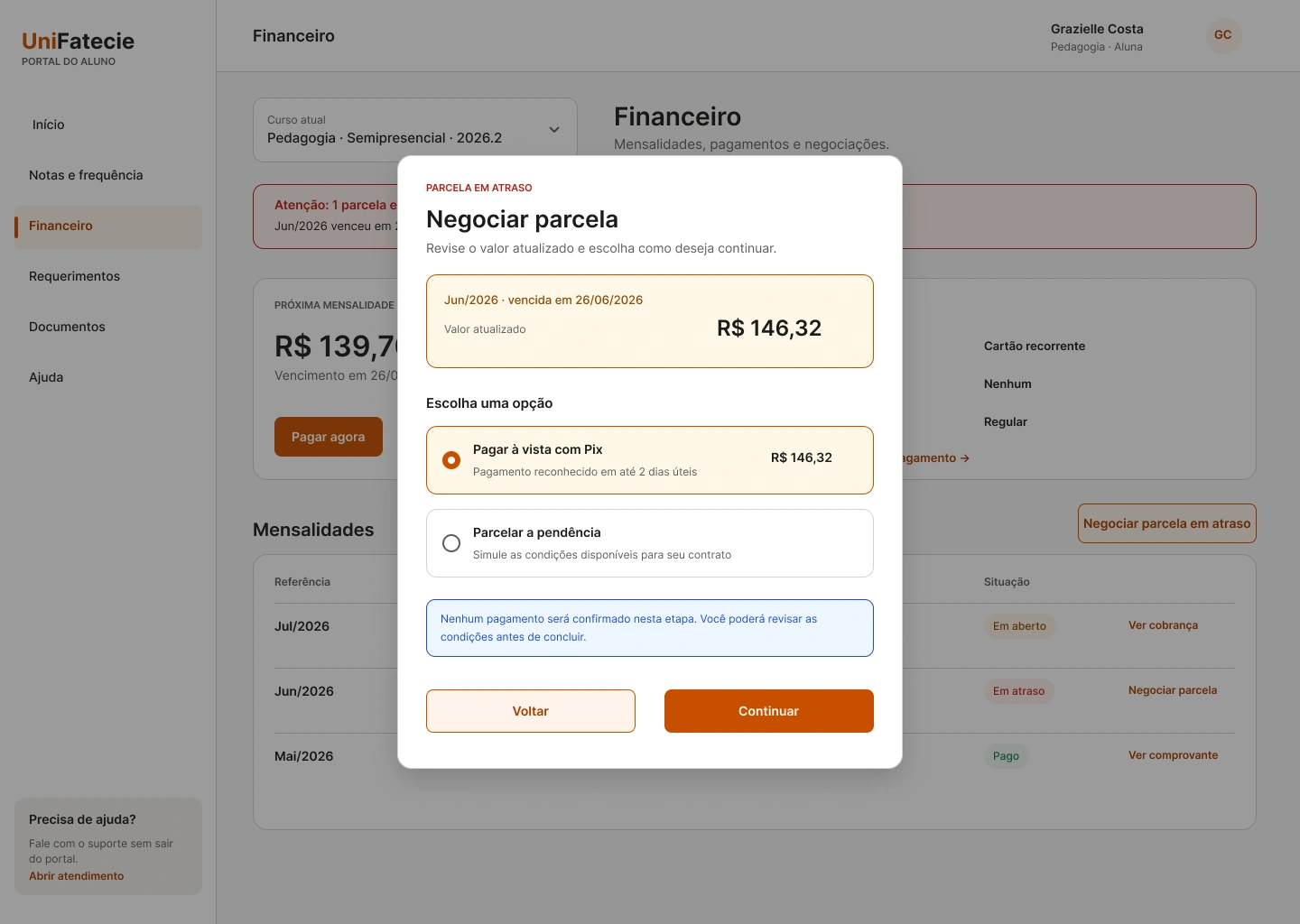
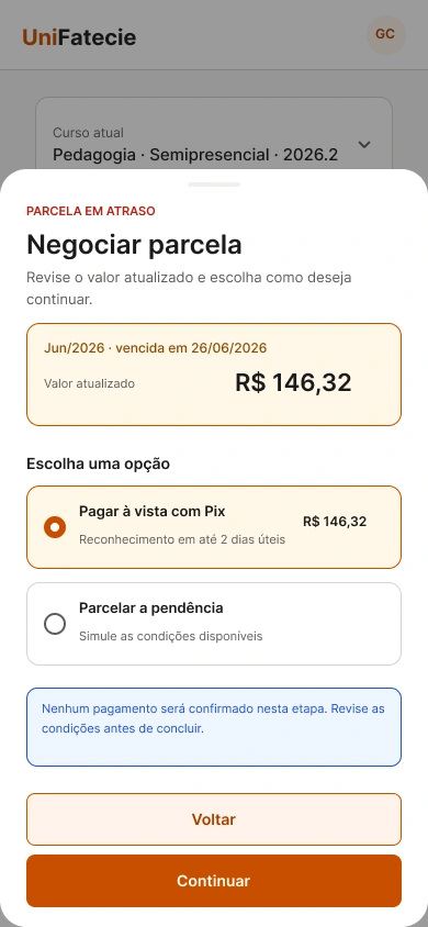
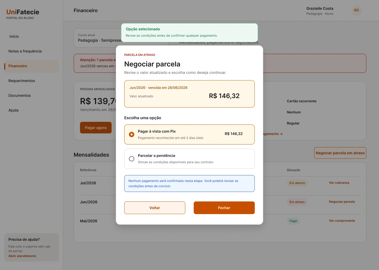
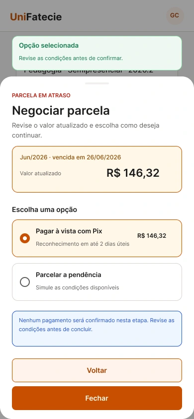
Payment negotiation
Payment feedback and negotiation options adapt without changing the meaning, status hierarchy, or next action.
Confirm the Pix action immediately without interrupting the payment contextResponsive pair
Desktop · 1440 pxSelect to enlarge
Desktop · 1440 pxSelect to enlarge
Desktop · 1440 pxSelect to enlarge
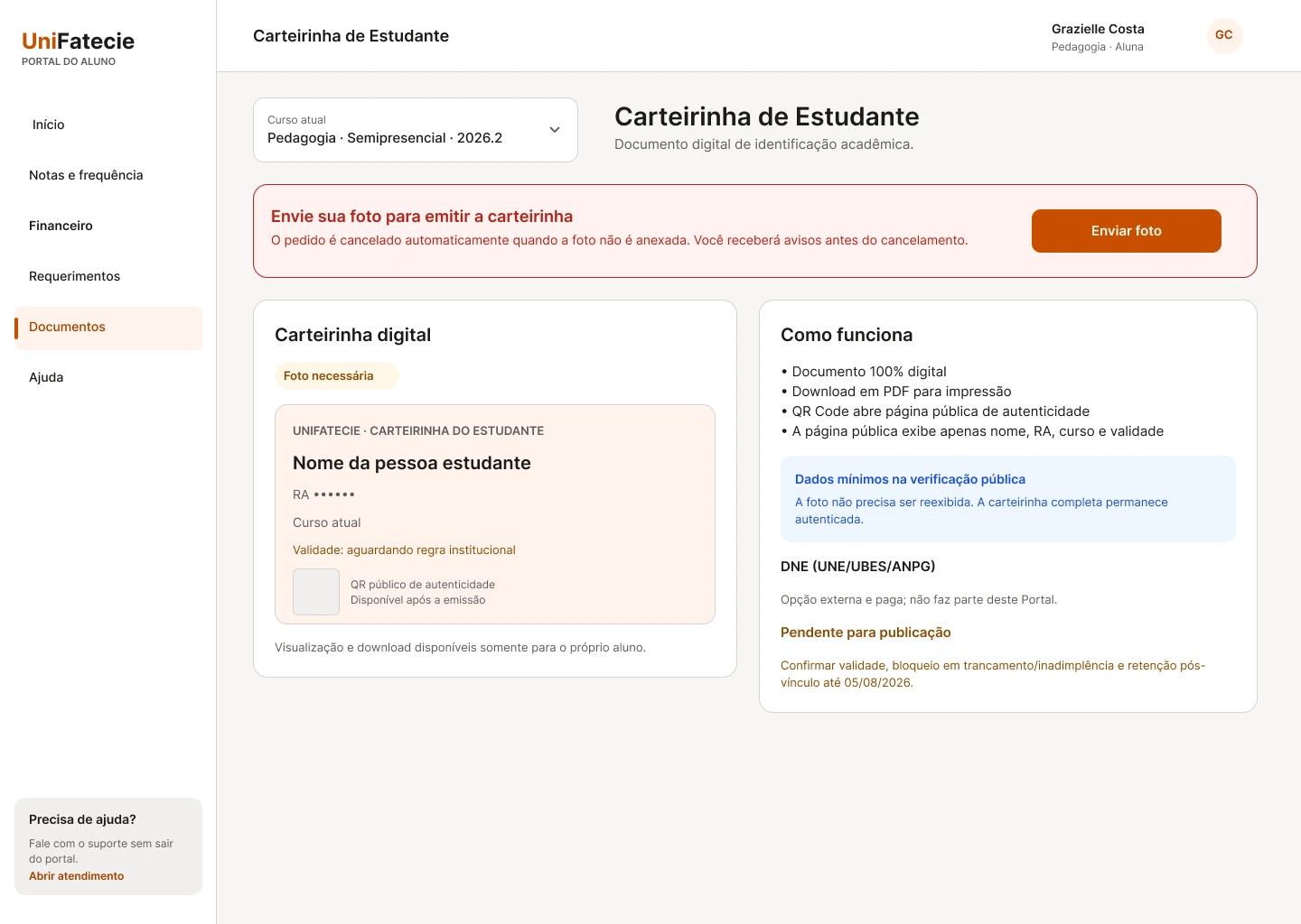
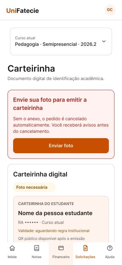
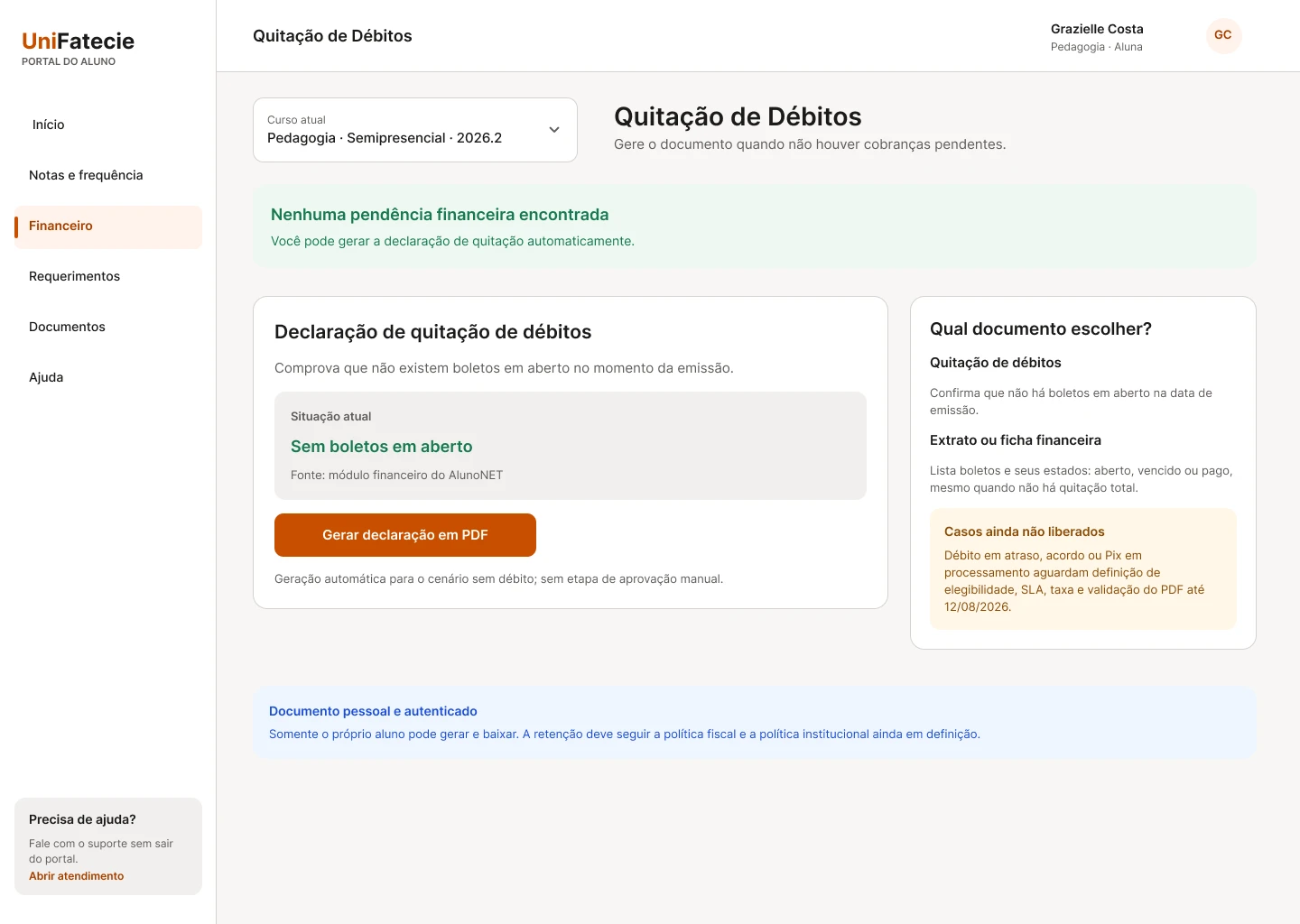
Student services
Student Card, debt settlement, and exam scheduling use explicit requirements, service status, and recovery guidance on both screen sizes.
Turn the P02 failure into a visible service with requirement, status, and actionResponsive pair
Desktop · 1440 pxSelect to enlarge
Desktop · 1440 pxSelect to enlarge
Desktop · 1440 pxSelect to enlarge
Applying shared system foundations inside the prototype
Within the prototype, I defined reusable foundations, component behaviors, content patterns, and feedback states for the proposed onboarding layer. This work demonstrates a system direction for the study. It is not an institutional Design System, a production component library, or evidence that the legacy platforms have been unified.
Foundations
A reusable foundation for consistent student experiences
Semantic hierarchy
Page titles, section headings, supporting text, labels, and status information follow a consistent hierarchy so students can scan dense academic content and identify the next action.
Spacing and layout
A consistent spacing system, responsive grid, and predictable content widths create clearer grouping across onboarding, dashboard, service, and support contexts.
Color and status semantics
Accent, neutral, success, warning, error, and informational treatments are assigned by meaning rather than decoration, with text and icons supporting color-dependent states.
Interaction states
Buttons, links, cards, fields, and navigation items include defined default, hover, focus, active, disabled, loading, and error behaviors.
Content patterns
Task-based labels, short explanations, status messages, and recovery instructions use plain language before institutional terminology.
Responsive behavior
Navigation, cards, checklists, forms, and contextual messages adapt across viewport sizes while preserving hierarchy and task priority.
Reusable components
Components supporting the redesigned journey
→Primary and secondary navigation
→Onboarding progress and checklist items
→Status badges and academic-state indicators
→Service and subject cards
→Buttons, links, and external-destination actions
→Form fields, labels, validation, and helper text
→Transition modal for external platforms
→Loading, empty, unavailable, warning, error, and success states
→Support-routing cards and contextual guidance
→Responsive tables and structured academic information
Accessibility considerations
Designing for clearer perception, interaction, and recovery
01
Readable hierarchy and text sizing
The proposal avoids relying on very small text for essential information and uses clear heading relationships, line length, spacing, and contrast to improve scanning and comprehension.
02
Keyboard focus and visible interaction states
Interactive elements require visible focus treatment and logical navigation order so actions are not communicated only through hover or pointer interaction.
03
Explicit labels and action names
Icons are paired with accessible names or visible text, while buttons and links describe the action or destination rather than using ambiguous labels.
04
Feedback beyond color
Status, validation, warning, and error messages combine text, semantic structure, and supporting icons so meaning does not depend on color alone.
05
Form guidance and recovery
Fields include persistent labels, contextual instructions, specific validation messages, and guidance for correcting incomplete or invalid information.
06
Dense data and table usability
Academic and financial information should preserve row and column relationships, provide meaningful headings, support smaller screens, and avoid icon-only actions without context.
07
Motion and transition awareness
Animations are used to support orientation rather than delay tasks, and the interface should respect reduced-motion preferences.
08
External destination clarity
Links that open another platform or tab communicate the destination and expected behavior before the transition occurs.
Evaluation limitation
Scope of the accessibility review
Accessibility considerations were based on a designer-led visual and interaction review of the available interfaces and prototype. The study did not include a formal WCAG conformance audit, code-level accessibility testing, assistive-technology testing, or validation with disabled students.
Usability testing and iteration
From a failed route to two validated entry points
The broader usability study established that the redesigned flows were understandable, but a targeted mobile test exposed a specific findability problem in the Student Card journey. Instead of averaging that failure into the overall score, I isolated the route, changed the information architecture, and revalidated each entry point separately.
8
Moderated participants
EAD and semipresential students across mobile and desktop contexts.
95.8%
Direct task success
Forty-six of 48 attempts were completed without moderator help.
81.9
Average SUS
The six-task prototype study exceeded the target of 75.
6/6
Tasks approved
All defined usability tasks met the final gate after iteration.
The turning point
Treating one failed path as a design signal
01
Observed failure
P02 entered Requests, opened “New request,” and could not find the Student Card in 15 seconds. The session ended with SEQ 2.
02
Design response
I exposed Student Card as a visible service in Requests, added the “Photo required” state and “Upload photo” action, and preserved a prominent Home entry point.
03
Controlled revalidation
The Home and Requests routes were tested separately. A neutral Home variant prevented the Student Card shortcut from revealing the answer before the secondary path was evaluated.
Final mobile revalidation
Two entry points, validated separately
Entry point
Starting state
Sessions
Direct
Avg. time
Avg. SEQ
Path A · Home
Dashboard with Student Card entry
6
6/6 · 100%
6.0 s
7.0 / 7
Path B · Requests
Neutral Home, no Student Card shortcut
5
5/5 · 100%
6.4 s
6.6 / 7
Usability gate · APPROVED
Across the final version, all 11 sessions reached the Student Card directly, with a combined average time of 6.2 seconds and an average SEQ of 6.8. Every participant identified the required photo and understood the automatic-cancellation rule. No additional usability test is required for this task.
Publication · NO-GO
GO for design and usability. Publication remains NO-GO until institutional rules, security, RBAC, LGPD, retention, implementation, and production QA are resolved.
Validation and next steps
Closing the design gate while keeping implementation risk visible
The defined prototype flows passed the design and usability gate after moderated testing, iteration, and targeted revalidation. That evidence supports handoff of the design direction, but it does not authorize institutional publication. Technical, legal, security, accessibility, and operational blockers remain explicit.
Completed reviews
What has already been reviewed
Six-task moderated usability study
Eight students completed 48 task attempts across mobile, desktop, and alternating-device contexts. All six tasks met the final gate, with 95.8% direct success and an average SUS score of 81.9.
Critical-flow revalidation
Five participants revalidated official grades, the next monthly payment, and an overdue installment after iteration. All 15 attempts were direct, with an average SEQ of 6.9.
Student Card route revalidation
The Home and Requests entry points were tested separately. All 11 final sessions were direct, and every participant understood the photo requirement and automatic-cancellation rule.
Institutional rule review
Student Services, Academic Secretariat, Finance, Pole Coordination, and IT challenged the prototype with real operating rules. I revised grade synchronization windows, overdue-payment states, and the Student Card photo and cancellation flow, while keeping unresolved access, security, and ownership questions outside the release gate.
Pending validation
What still needs to be tested and confirmed
01
Security and data-governance review
Define RBAC, data exposure, consent, retention, audit trails, privacy responsibilities, and LGPD safeguards for each institutional flow.
02
Technical feasibility review
Review authentication, deep links, session behavior, platform ownership, data availability, and integration constraints with engineering and system administrators.
03
Production rule and SLA confirmation
Convert the reviewed prototype rules into approved production requirements, owners, exception handling, synchronization SLAs, and support procedures.
04
Formal accessibility and production QA
Test keyboard navigation, screen readers, semantic structure, zoom, responsive tables, form errors, reduced motion, browsers, devices, and production data states.
05
Pilot and instrumentation
Define a limited rollout, analytics events, support monitoring, feedback collection, and comparison criteria before broader implementation.
Proposed measurement signals
What could be measured after implementation
These signals are proposed evaluation criteria, not measured project outcomes.
First-class access completion
Percentage of newly enrolled students who successfully reach their first available subject through the onboarding journey.
Time to first subject
Time between account activation and successful access to the student’s first class.
Onboarding completion
Percentage of students who complete the essential checklist steps.
Cross-platform transition success
Percentage of external transitions completed without authentication, navigation, or recovery failure.
Support dependency
Volume of onboarding-related contacts involving access, grades, finance, platform selection, and service routing.
Task comprehension
Ability to identify where to complete essential academic tasks without prior knowledge of internal platform names.
Outcomes and current status
Documenting validated design outcomes without implying production impact
The project established and tested a redesign direction for the student journey, supported by research evidence, a task-based architecture, reusable interaction patterns, and a responsive high-fidelity prototype. The outcomes below separate measured prototype performance from production performance, which cannot be claimed before implementation.
Project deliverables
What the project produced
01
Cross-platform ecosystem and journey map
A documented view of the public and authenticated experience across the institutional website, Student Portal, Moodle / AVA, AlunoNet / WAEWeb, and Inova Carreira.
02
Task-based information architecture
A proposed structure organized around Classes, Grades, Finance, Requests, Documents, Help, and All services rather than internal platform names.
03
End-to-end onboarding direction
A primary journey connecting enrollment confirmation, account activation, first-week guidance, essential services, and access to the first class.
04
High-fidelity product experience
Responsive high-fidelity flows covering onboarding, grades and attendance, finance, requests, Student Card, support, transitions, and contextual states.
05
Coded interactive prototype
A responsive prototype built with React, TypeScript, Tailwind CSS, and Vite to demonstrate the proposed flows and interaction behavior.
06
Shared interaction and feedback foundation
Reusable navigation, checklist, form, transition, support, empty-state, loading, warning, error, and success patterns for greater consistency.
07
Accessibility recommendations
Documented recommendations covering hierarchy, text sizing, visible focus, explicit labels, feedback beyond color, forms, dense data, motion, and external destinations.
08
Research and validation repository
A consolidated record of moderated sessions, task metrics, SUS and SEQ, issue severity, iterations, final gates, and institutional blockers.
Current project status
What is complete, pending, and not yet measured
Design direction
Completed and documented across the case study, architecture, flows, interface patterns, and prototype.
Prototype
High-fidelity coded prototype completed within the defined portfolio project scope.
Stakeholder review
Service rules and prototype states were reviewed with the relevant academic, financial, student-service, pole, and IT teams, without a claim of formal release approval.
Student validation
Approved for the defined prototype flows after moderated testing and revalidation. This result does not replace a production pilot.
Technical review
Pending. Authentication, integrations, data availability, ownership, and implementation constraints still require engineering review.
Accessibility validation
Pending. The project has not undergone a formal WCAG conformance audit or assistive-technology testing.
Implementation
Not implemented in UniFatecie’s production environment.
Production outcomes
Like this project
Posted Aug 9, 2026
Redesigned a fragmented student journey, reaching 95.8% direct task success and SUS 81.9 while keeping production risks explicit.
Likes
0
Views
3