Adluna: Productivity Platform UI/UX Design
Project Overview
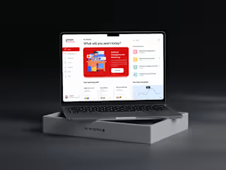
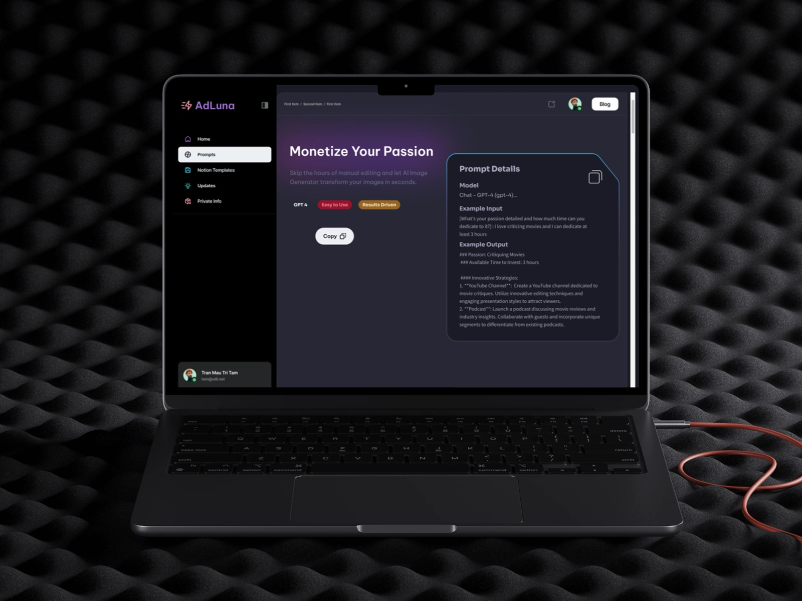
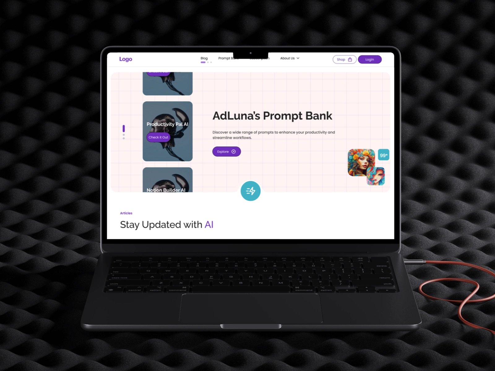
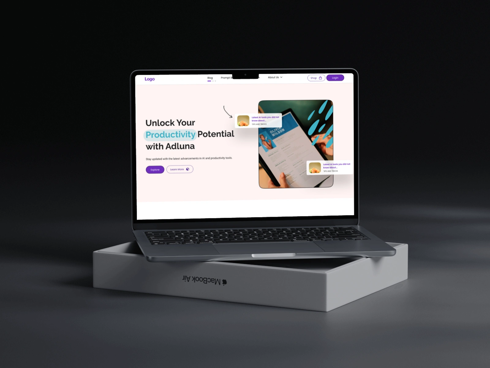
Adluna is an innovative productivity platform leveraging artificial intelligence to provide users with tailored prompts, premium resources, and the latest AI insights. This project focused on creating a clean, intuitive, and visually engaging website that offers specialized AI prompts, facilitates premium content purchases, and curates industry updates all in one seamless user experience.
Live Prototype (Dark Mode)
The Challenge
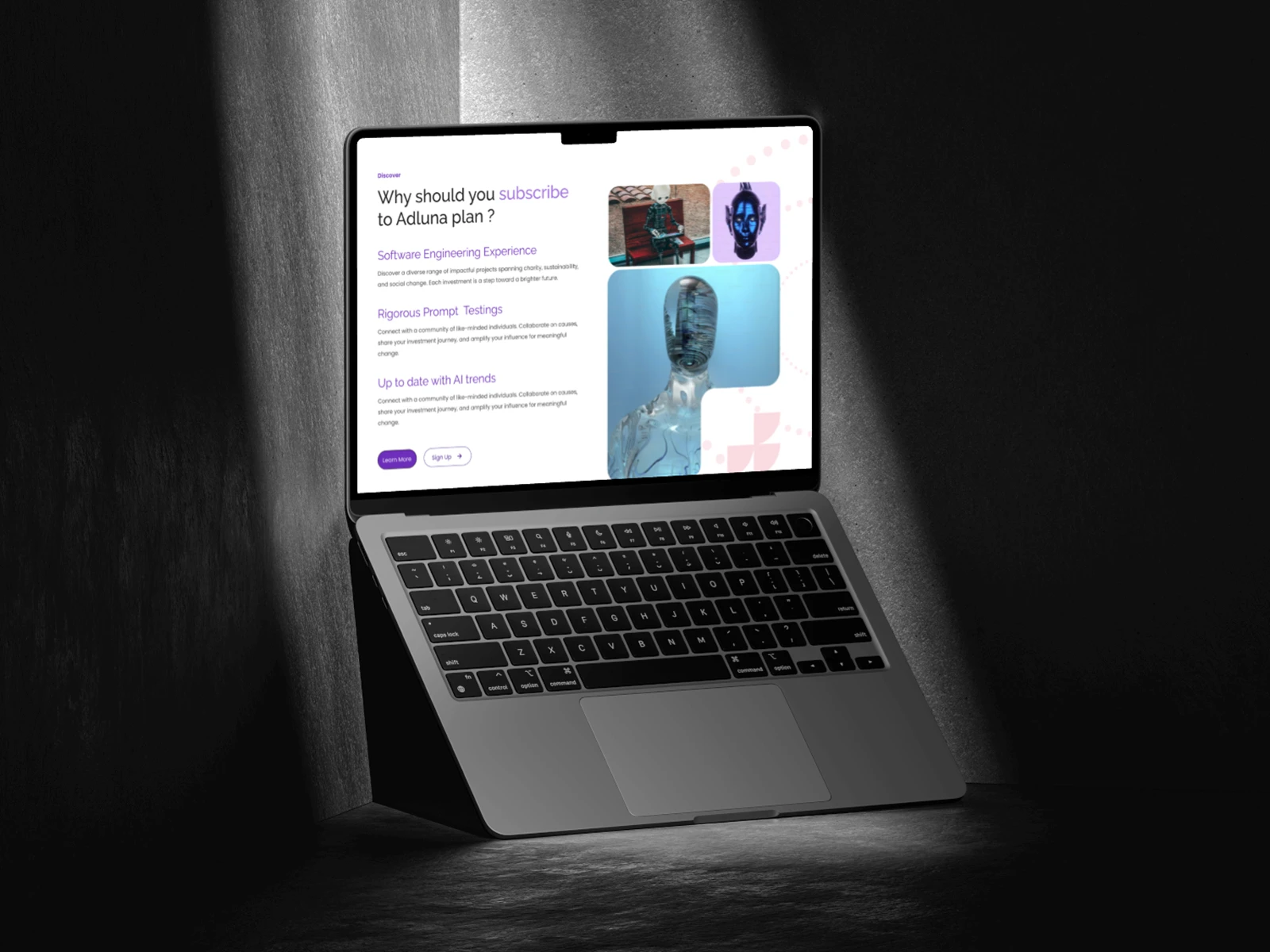
With AI tools on the rise, many users struggle to find prompts tailored to their exact needs and often lack the guidance to use them effectively. Fragmented resources for reliable AI information add to the confusion. Adluna aimed to unify these elements by offering premium AI prompts, valuable industry insights, and a user-centric subscription model on a single, integrated platform.
My Approach & Solution
I crafted a sleek, accessible UI/UX that prioritized straightforward navigation and personalized user interactions. This included:
Tailored Prompt Library: A focused catalog of specialized AI prompts, organized by category for quick discovery.
Seamless E-commerce Integration: Streamlined checkout flows for purchasing AI products without friction.
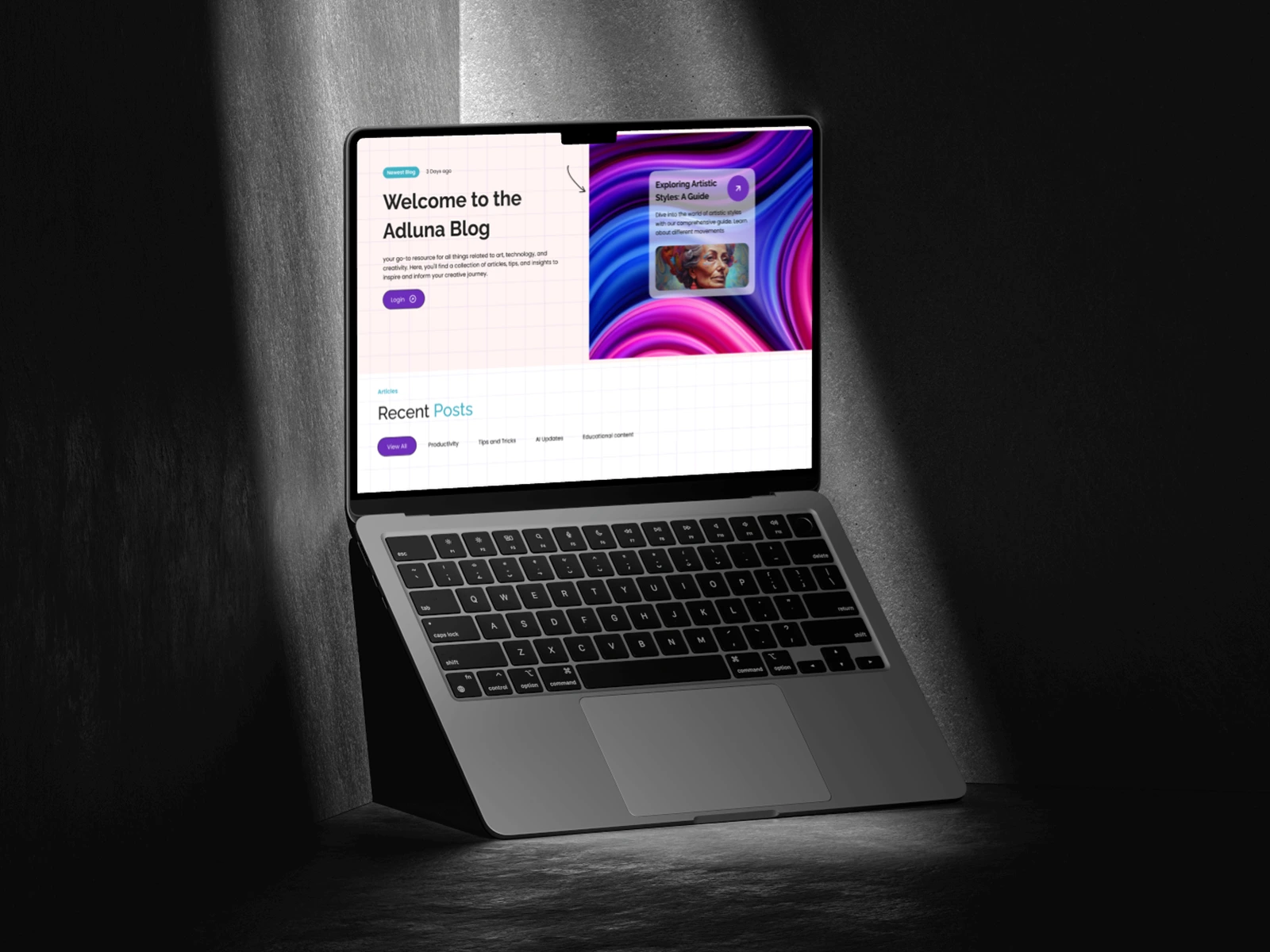
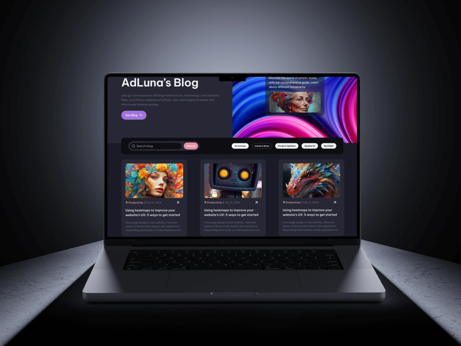
Rich Content Hub: A visually engaging blog covering best practices, industry news, and real-world use cases.
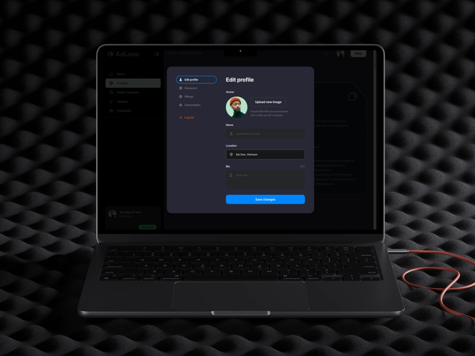
User Accounts & Subscription Management: Personalized profiles enabling easy access to premium resources and subscription details.
Design Process
Research & Consultation: I collaborated closely with Adluna’s team to pinpoint user needs and map out key functionalities. User persona development and competitor analysis guided the overall direction.
Wireframing & Prototyping: After refining the initial structure, I used Figma to create high-fidelity prototypes, iterating on user feedback for a polished final design.
Design Stack & Tools
Design: Figma for wireframes, prototypes, and cohesive UI/UX design.
Branding: Incorporated Adluna’s distinctive color palette and visuals to maintain a consistent brand experience.
Impact
Adluna’s revamped platform significantly boosted user engagement, providing effortless access to premium AI prompts while spotlighting the latest AI trends. This intuitive design approach streamlined the purchasing process and supported subscription growth, ultimately reinforcing Adluna’s position as a go-to destination for AI-driven productivity.
Snapshots

Like this project
Posted May 14, 2024
This project focused on creating a clean, intuitive, and visually engaging website that offers specialized AI prompts, facilitates premium content purchases.
Likes
1
Views
15
Timeline
Jun 7, 2024 - Aug 23, 2024


