Redesign of TechTogether Event Page
TechTogether is the nation's largest initiative to address gender inequities in the hackathon community, supporting over 10,000 hackers. As a UX Designer, I was tasked to re-design their event web page for the 2021 - 2022 season. I worked directly with my client, TechTogether's director and internal board of organizers, who wanted to make it easier for their hackers (target demogaphic) to navigate the page through a redesign of their event page. Throughout the span of the month, communication mainly took place through Slack, with weekly Zoom calls during deadline days, where I presented progress and got feedback.
Problems
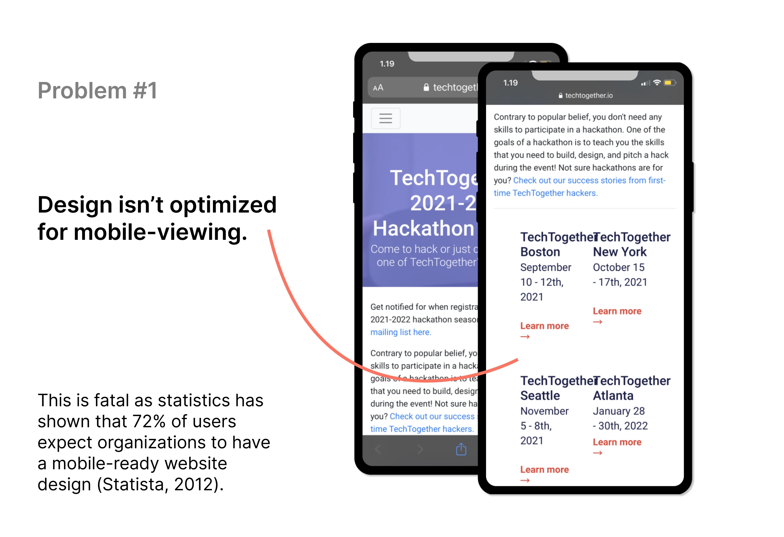
Problem 1: Design isn't optimized for mobile viewing. This is fatal as statistics has shown that 72% of users expect organizations to have a mobile-ready website design (Statista, 2012).
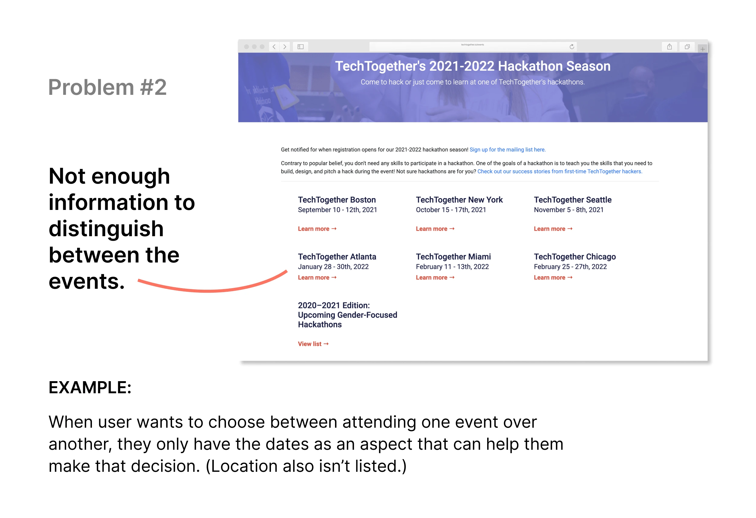
Problem 2: Not enough information to distinguish between the events. Example: When user wants to choose between attending one event over another, they only have the dates as an aspect that can help them make that decision. (Location also isn't listed.)
Clarify
For this re-design, it was important for me to clarify why it was being requested in the first place, so I spent some time interviewing the client. I also wanted to get an idea of how the targeted users themselves (site visitors, within the right demographic) perceived the site. By approaching the project with this framework, I better understood how a re-design can better fulfill my stakeholder's goal. Some design constraints were also set when it came to the use of colors and fonts as TechTogether had a previously established brand guideline they wanted me to follow appropriately.
Research
Competitive analysis: identified other reliable hackathon event pages, and made comparison(s) on the types of information they displayed, how they were displayed, etc. in a table. Took screenshots and annotated them as needed for reference.
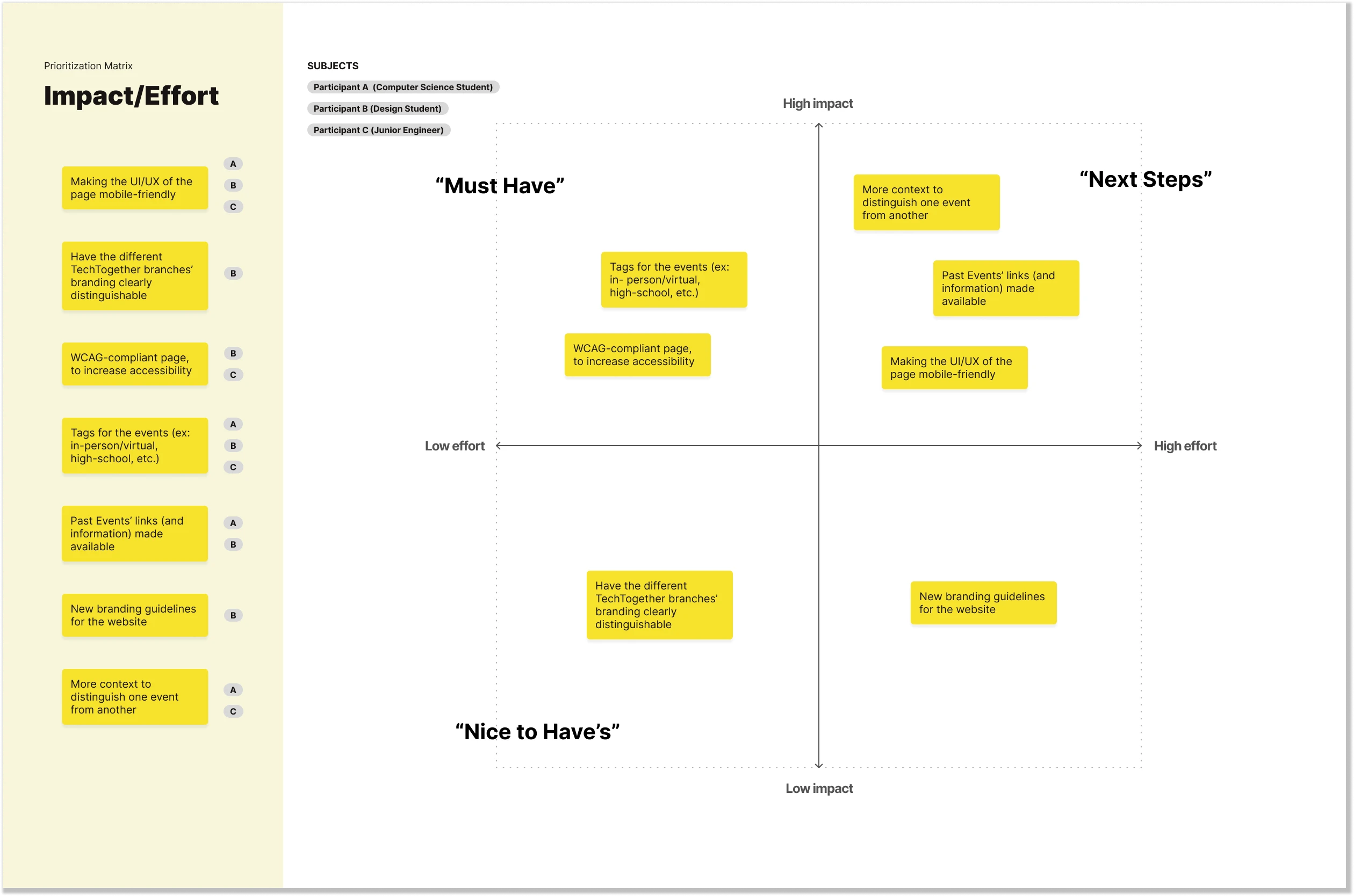
Interviews (Qualitative): gathered user comments and feedback based on the layout used previously. Synthesized user feedback into features/design improvements and scaled them within an Impact/Effort prioritization matrix.
Secondary research (Quantitative): gathered external data for validation.
Identify issues/pain points: analyzed old design based on competitive analysis, user feedback from the interviews' (on the Impact/Effort prioritization matrix), and secondary research. Annotated elements to work on specifically and why.
1. Competitive analysis
Comparing hackathon websites with high traffic rates with the use of UberSuggest, I narrowed down other site pages within the industry like the Major Hacking League (MLH)'s event page and DevPost's event page.
2. Interviews
Due to time constraints, I collected qualitative data through a few short interviews with 3 individuals who fell under TechTogether's target demographics. I observed their live reaction as they navigated the event page, and then asked for opinions after. The following Prioritization Matrix encapsulates tasks derived from the comments from each participant.
3. Secondary research
Quantitative data is a valuable asset when making decisions and speaking with stakeholders.
4. Identify issues/pain points
Based on findings from the other phases, the event page redesign was centered around being accessible, mobile-friendly, and easy to read.
Ideate
Displayed below is the chosen wireframe out of the 4 wireframe variations created. After the presentation, the stakeholders communicated that the navigation bar, banner, and footer should not be redesigned to stay consistent with the other current site pages for brand consistency.
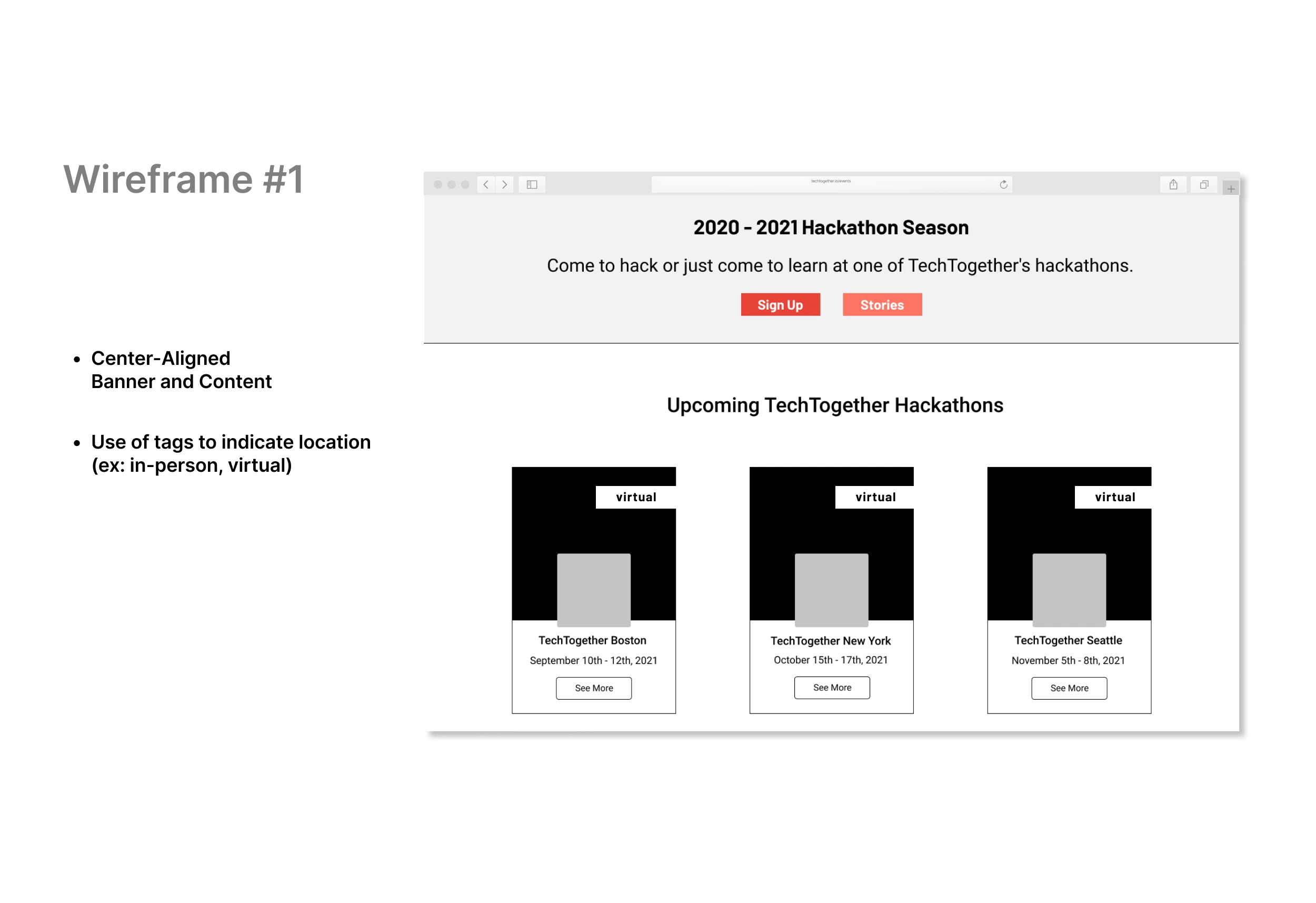
Wireframe 1: Center-aligned, Banner, and Content. Use of tags to indicate location (ex: in-person, virtual).
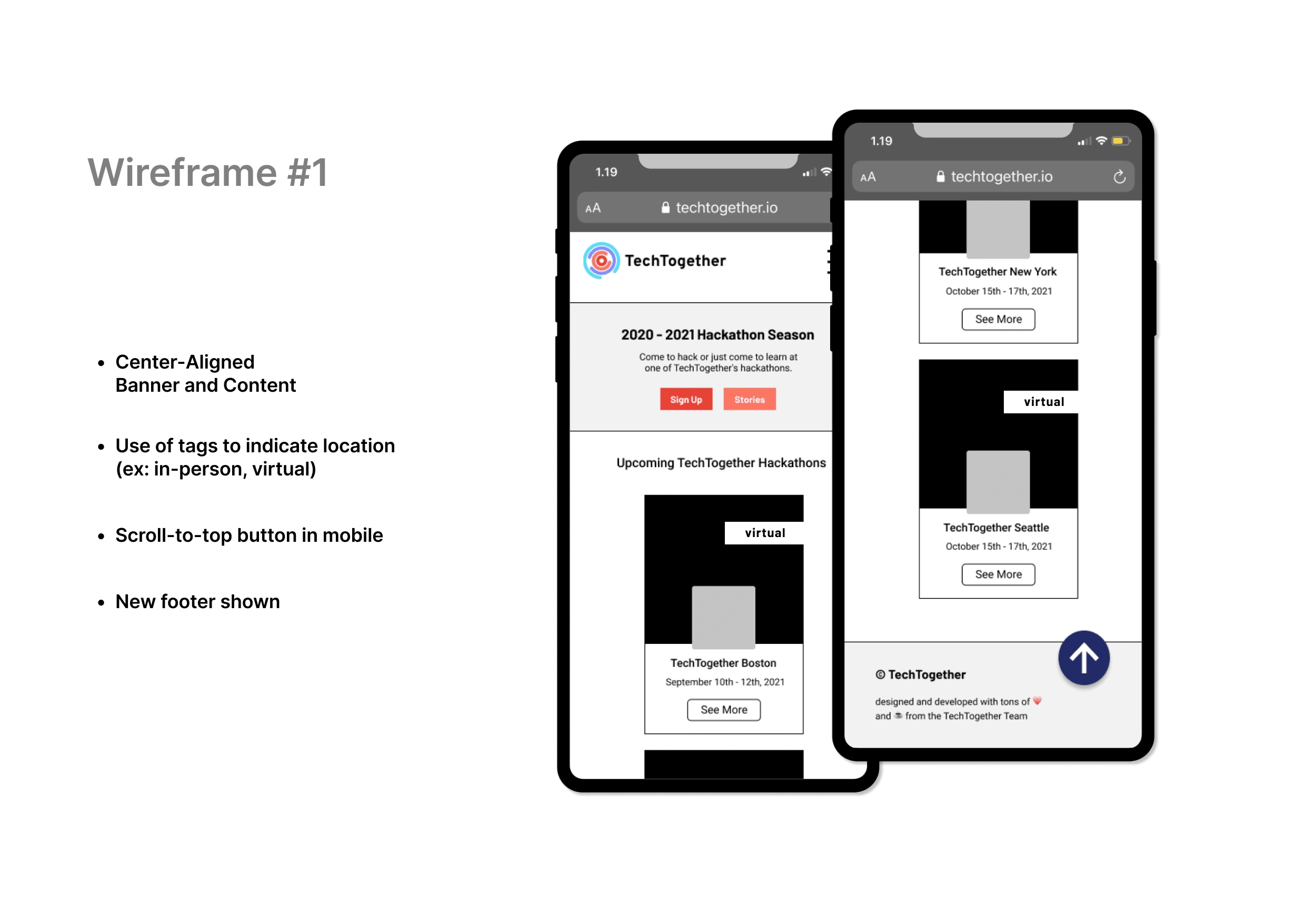
Wireframe 1: Center-aligned, Banner, and Content. Use of tags to indicate location (ex: in-person, virtual). Scroll-to-top button in mobile. New footer shown.
Hi-Fidelity Design
The early Hi-Fidelity prototype(s) were made according to TechTogether branding guidelines, linked here. Main components listed below:
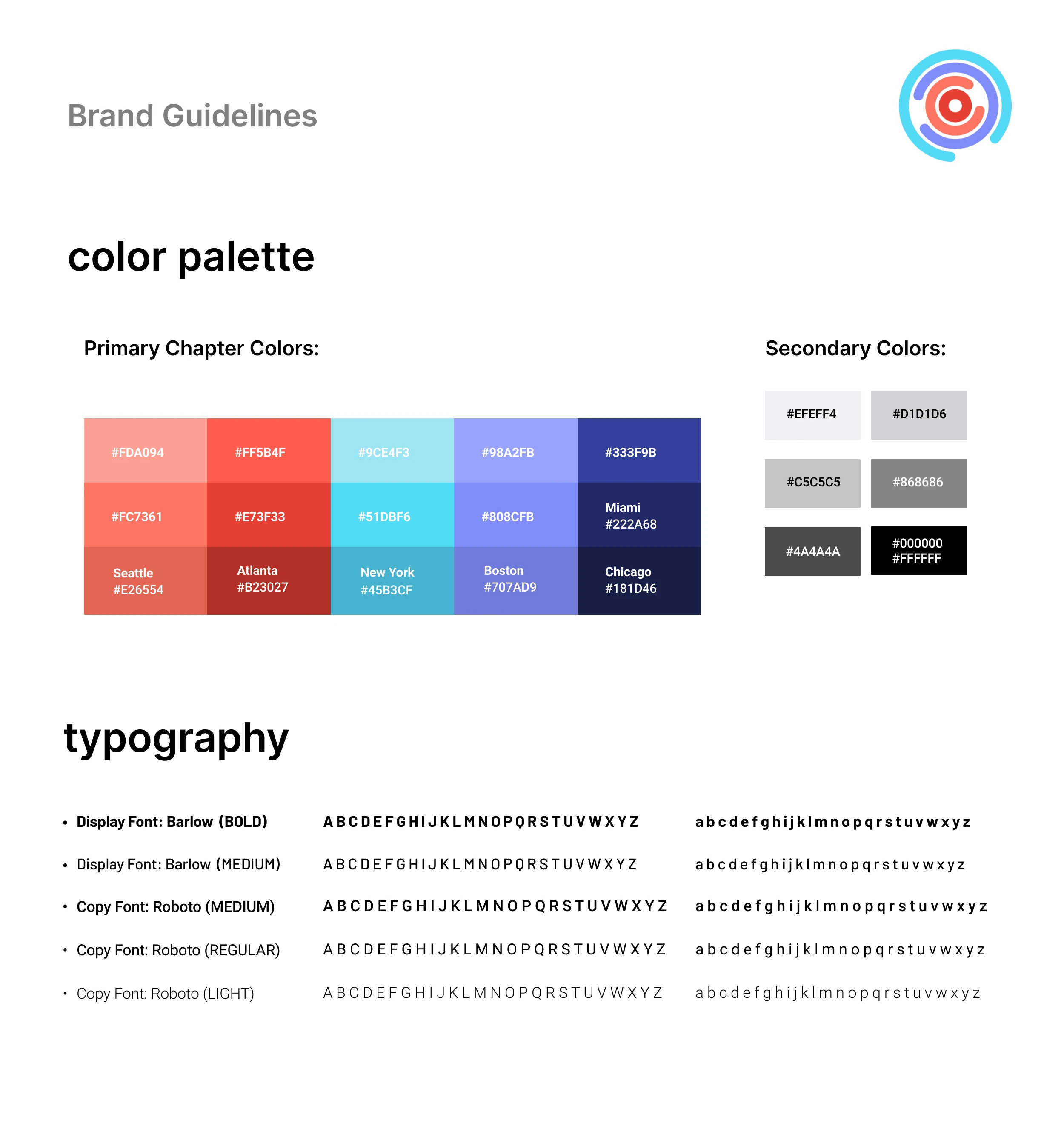
Main components from TechTogether's Branding Guidelines.
Impact
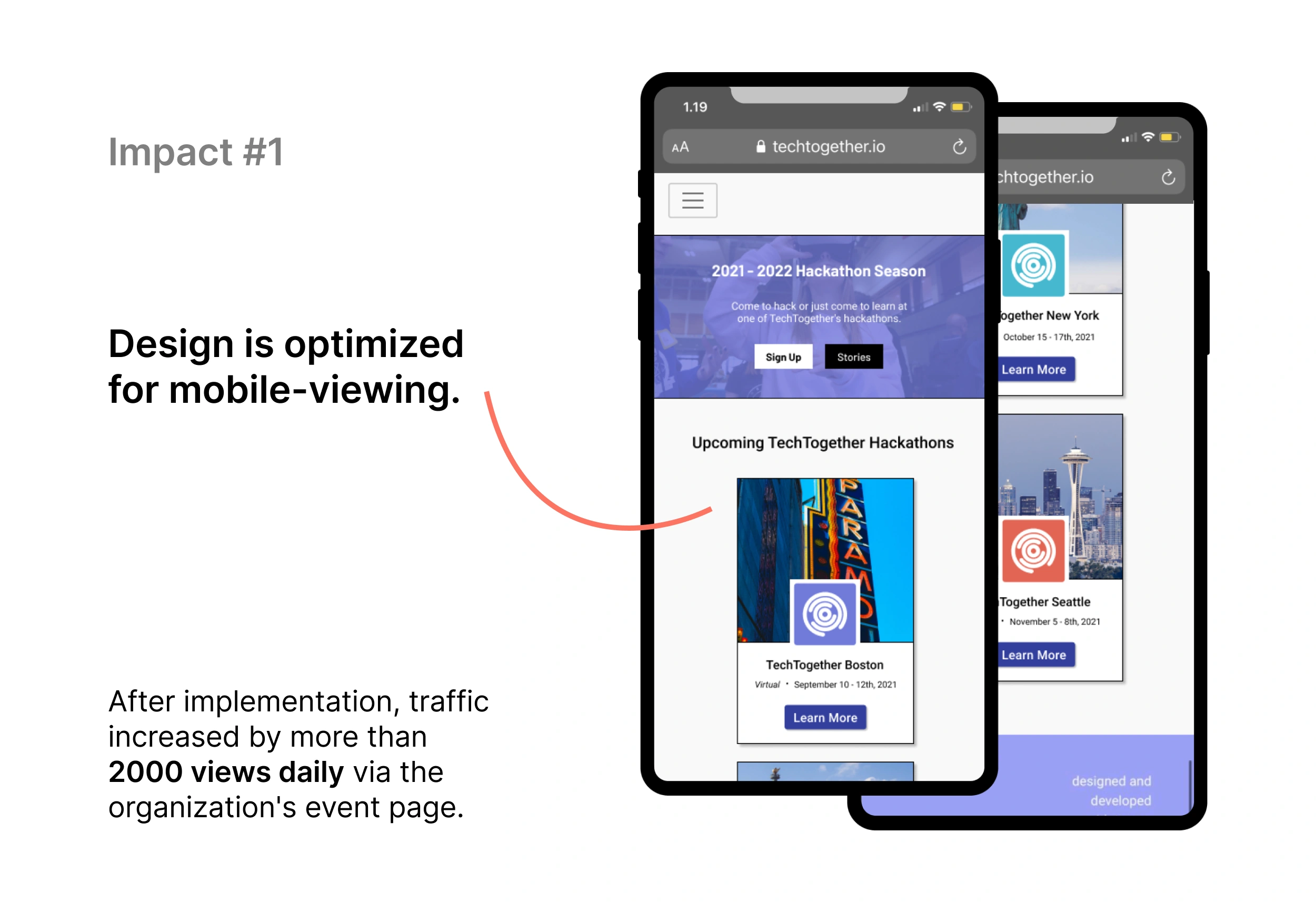
Impact 1: Design is optimized for mobile-viewing. After implementation, traffic increased by more than 2000 views daily via the organization's event page.
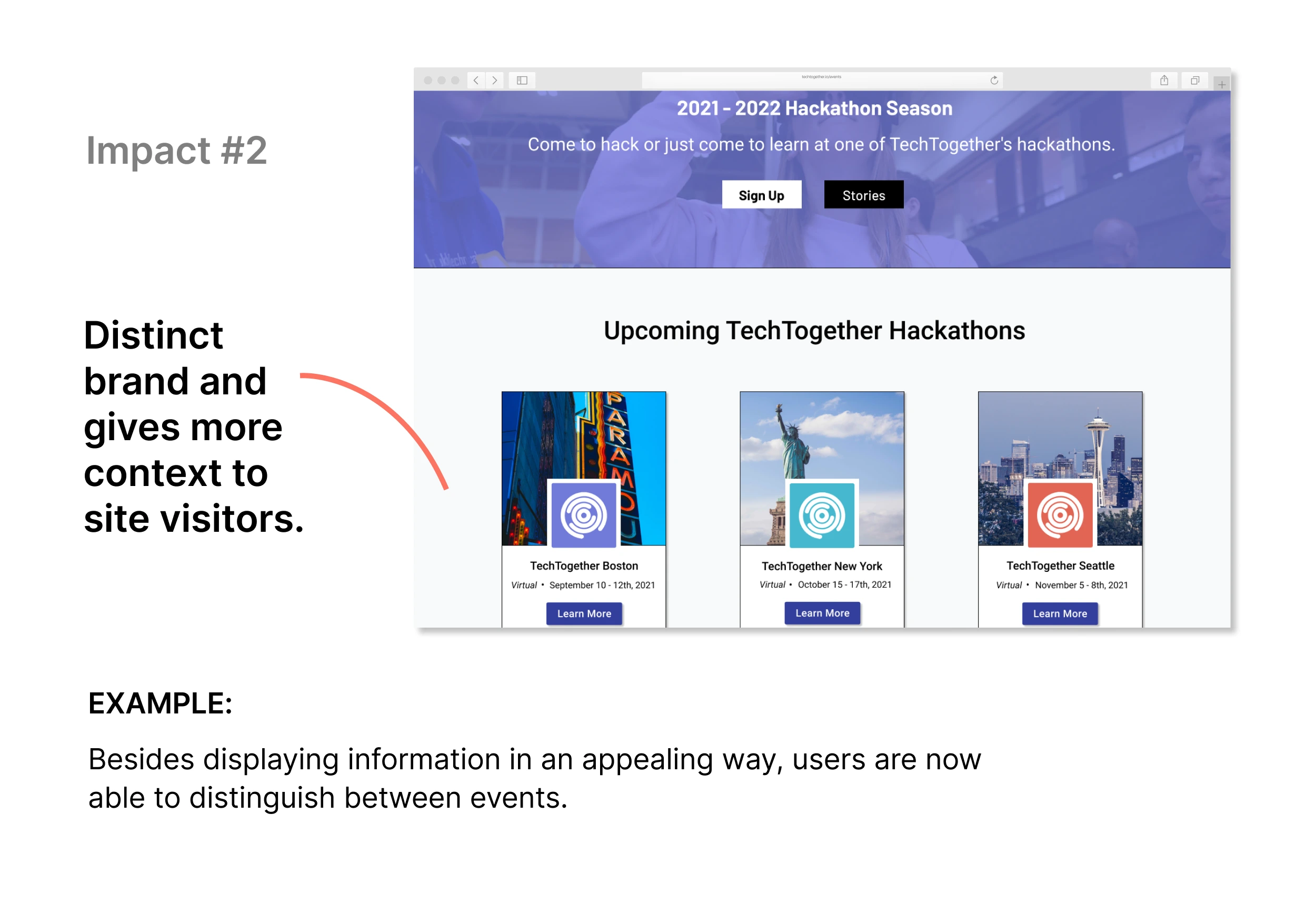
Impact 2: Distinct brand separation and more details gives more context to site visitors. Example: Besides displaying information in an appealing way, users are not able to guide their decisions through in-depth details.
Lessons Learned
Realistically, implementation may cause design changes to occur.
Conducting user research and using the appropriate methods within time constraints (I only had a week to draft the first wireframes).
How to communicate more effectively with stakeholders - specifically, to ask more clarifying questions in the beginning of the design process.
What I would Do Differently
Ideally would like more involvement in product implementation stages too, to ensure those better user experiences are translated to the final product outcome (dependent on stakeholders).
Looking back, I felt hesitant asking for documentation, but now I've learned that its an important part of the research process, even if its messy or to be kept confidential.
Like this project
Posted May 24, 2023
TechTogether is the nation's largest initiative to address gender inequities in the hackathon community, supporting over 10,000 hackers.
Likes
0
Views
4
Clients

TechTogether


