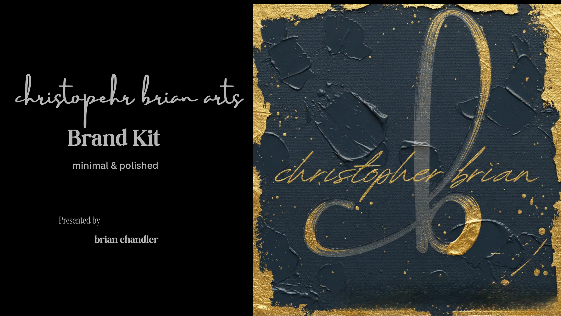
Christopher Brian Arts: Brand Kit & Visual Identity
Christopher Chandler
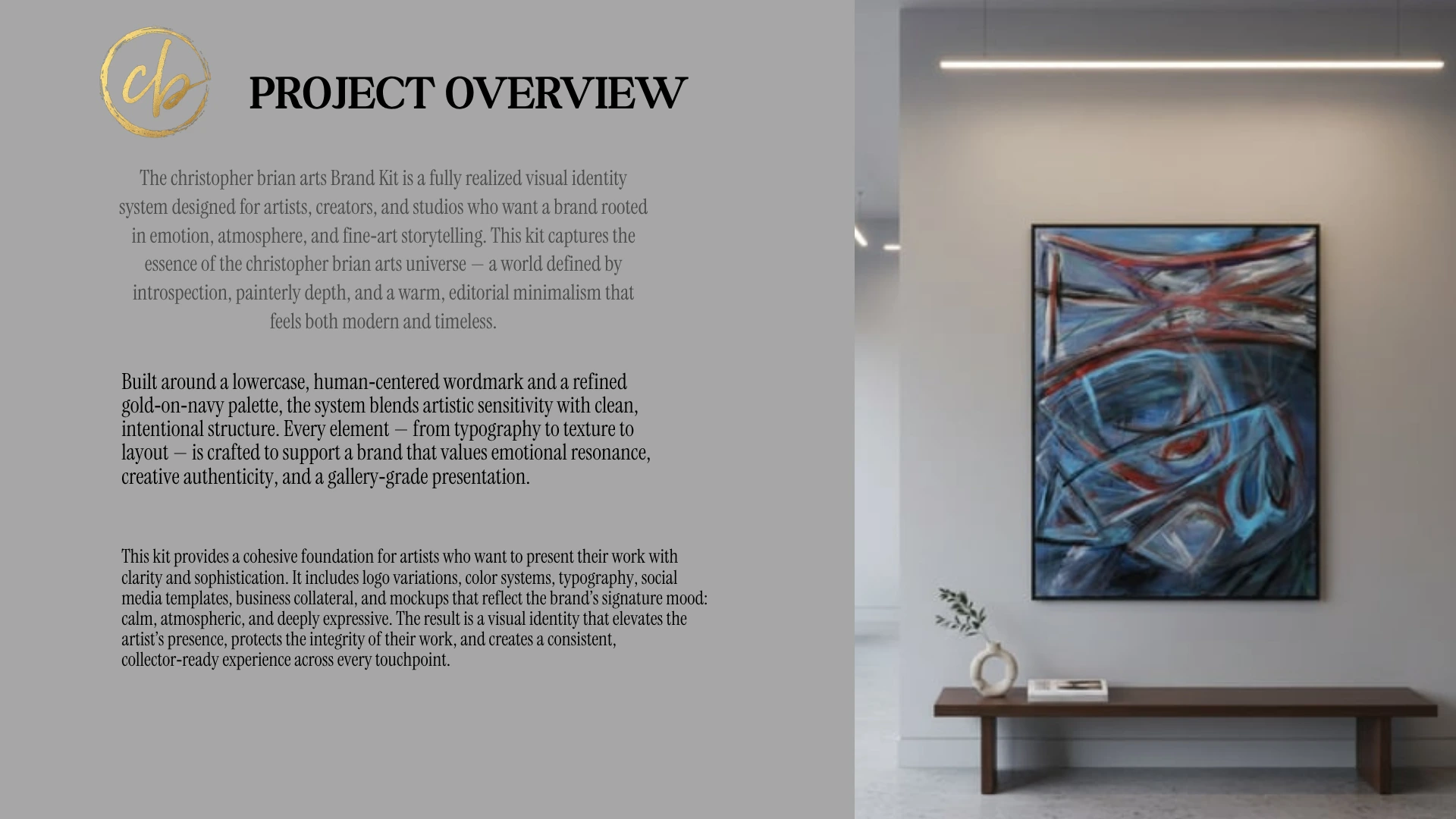
Project Overview
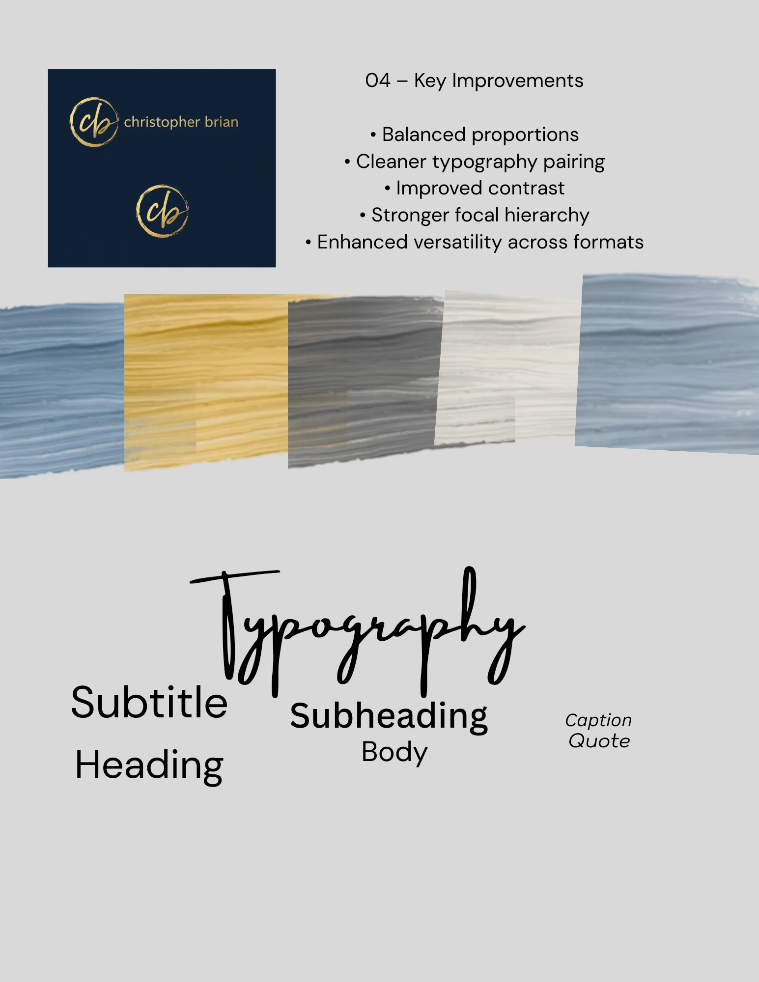
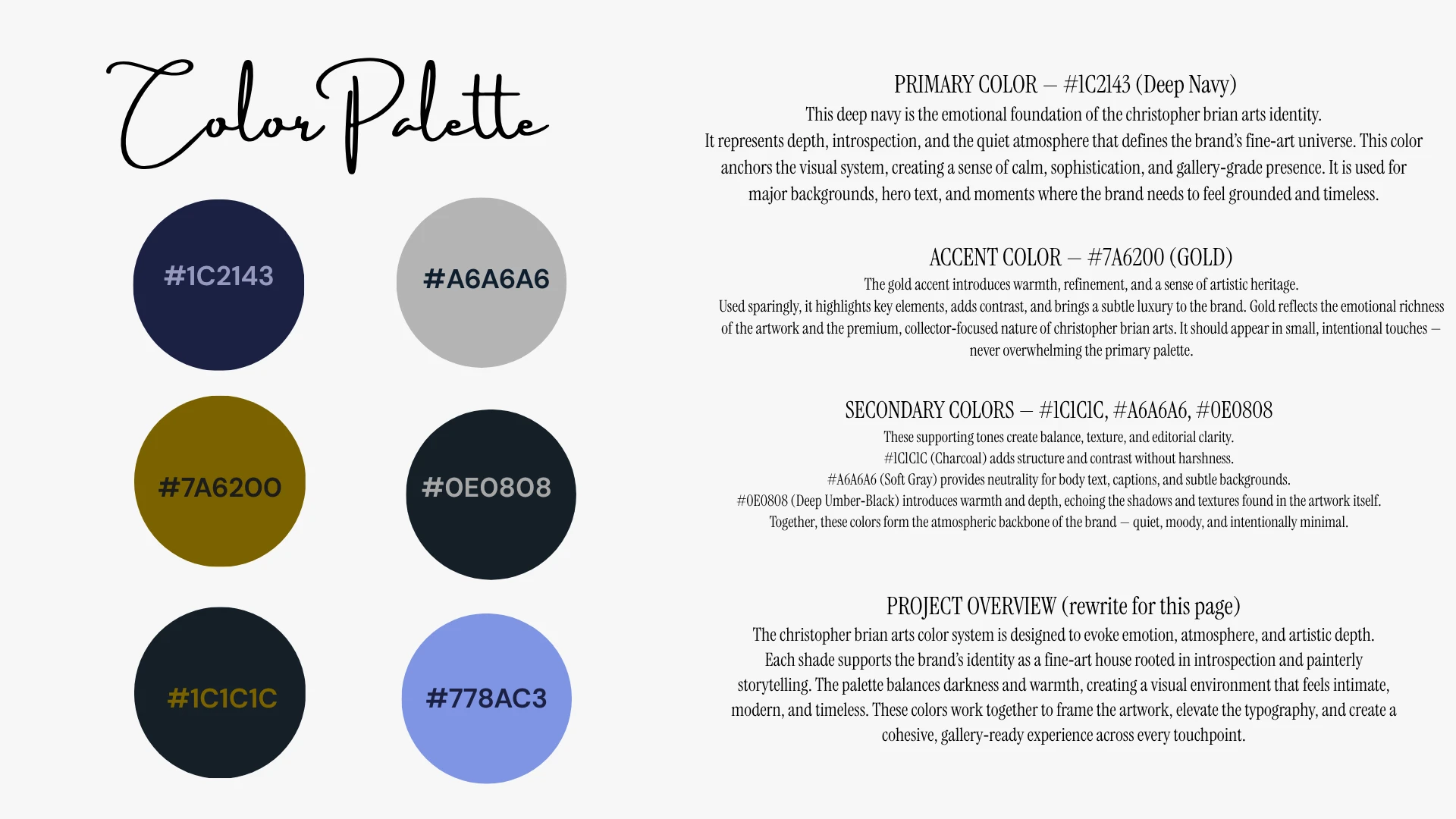
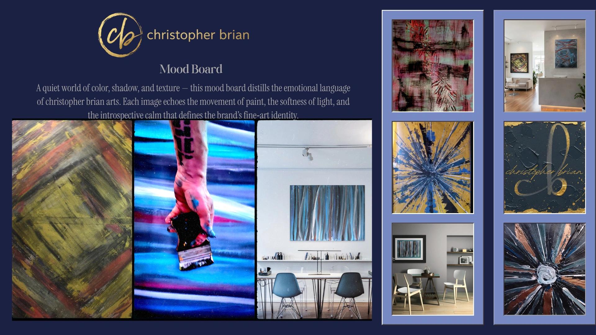
The Christopher Brian Arts color system is designed to evoke emotion, atmosphere, and artistic depth. Each shade supports the brand's identity as a fine-art house rooted in introspection and painterly storytelling. The palette balances darkness and warmth, creating a visual environment that feels intimate, modern, and timeless. These colors work together to frame the artwork, elevate the typography, and create a cohesive, gallery-ready experience across every touchpoint.
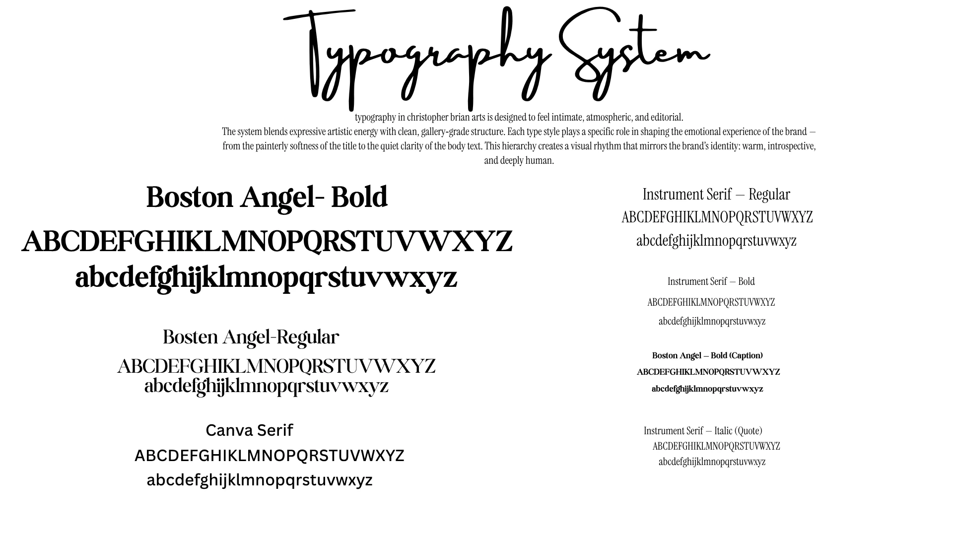
Typography in Christopher Brian Arts is designed to feel intimate, atmospheric, and editorial. The system blends expressive artistic energy with clean, gallery-grade structure. Each type style plays a specific role in shaping the emotional experience of the brand, from the painterly softness of the title to the quiet clarity of the body text. This hierarchy creates a visual rhythm that mirrors the brand's identity: warm, introspective, and deeply human.
Brand kit overview
The System
Brand identity system
Typography and color palette
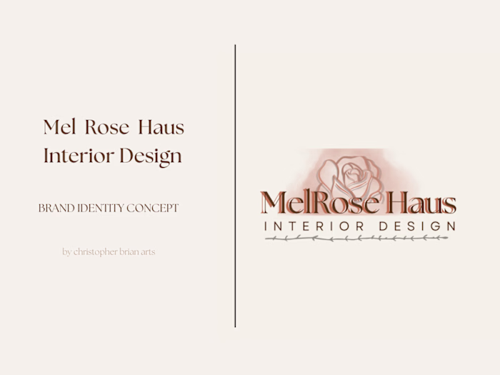
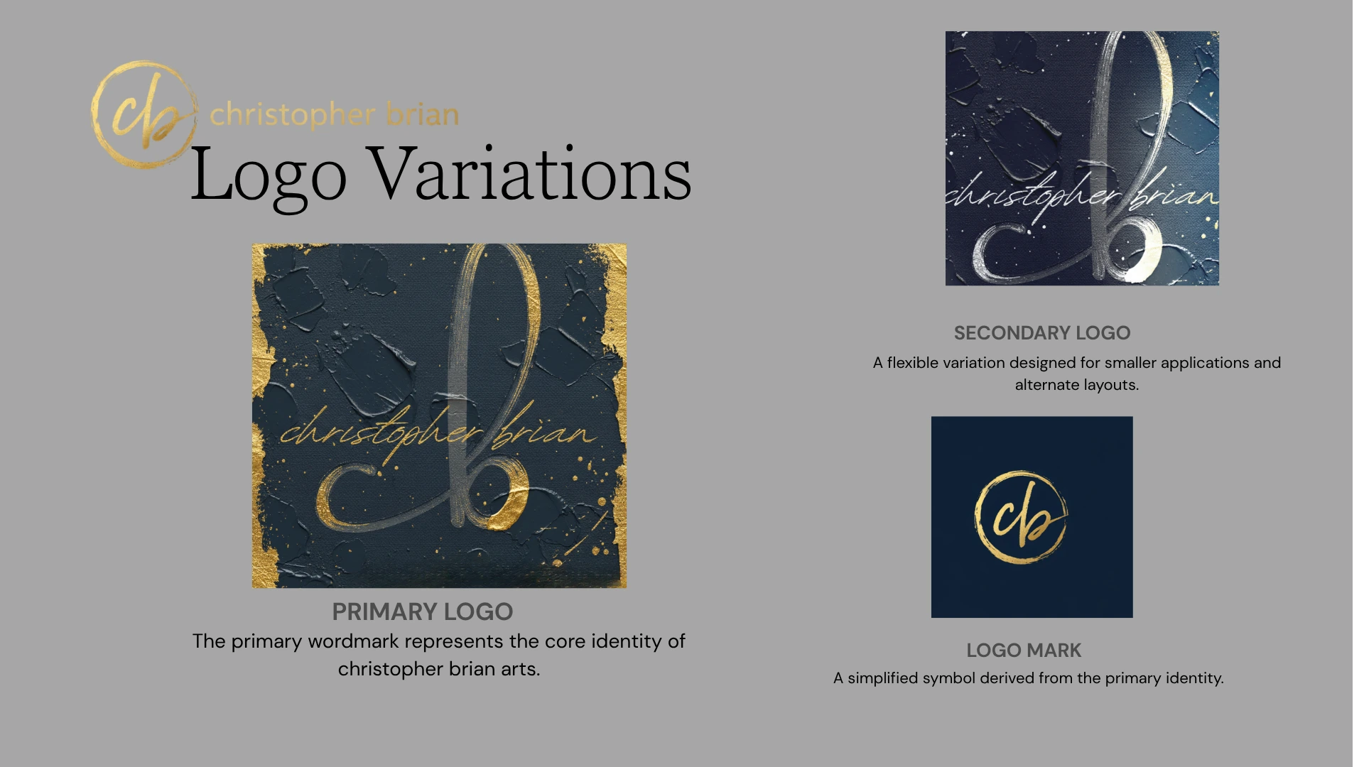
Logo variations and applications
Collateral & Applications
Business collateral
Social media templates
Brand mockups
The Result
The result is a visual identity that elevates the artist's presence, protects the integrity of their work, and creates a consistent, collector-ready experience across every touchpoint.
Final brand presentation
Like this project
Posted Jun 13, 2026
A fully realized visual identity system built around emotion, atmosphere, and fine-art storytelling. Includes logo variations, color systems, typography, social templates, business collateral, and gallery-grade mockups.
Likes
0
Views
3
Timeline
Nov 1, 2025 - Nov 2, 2025