Mel Rose Haus: Brand Identity & Business Cards
Christopher Chandler
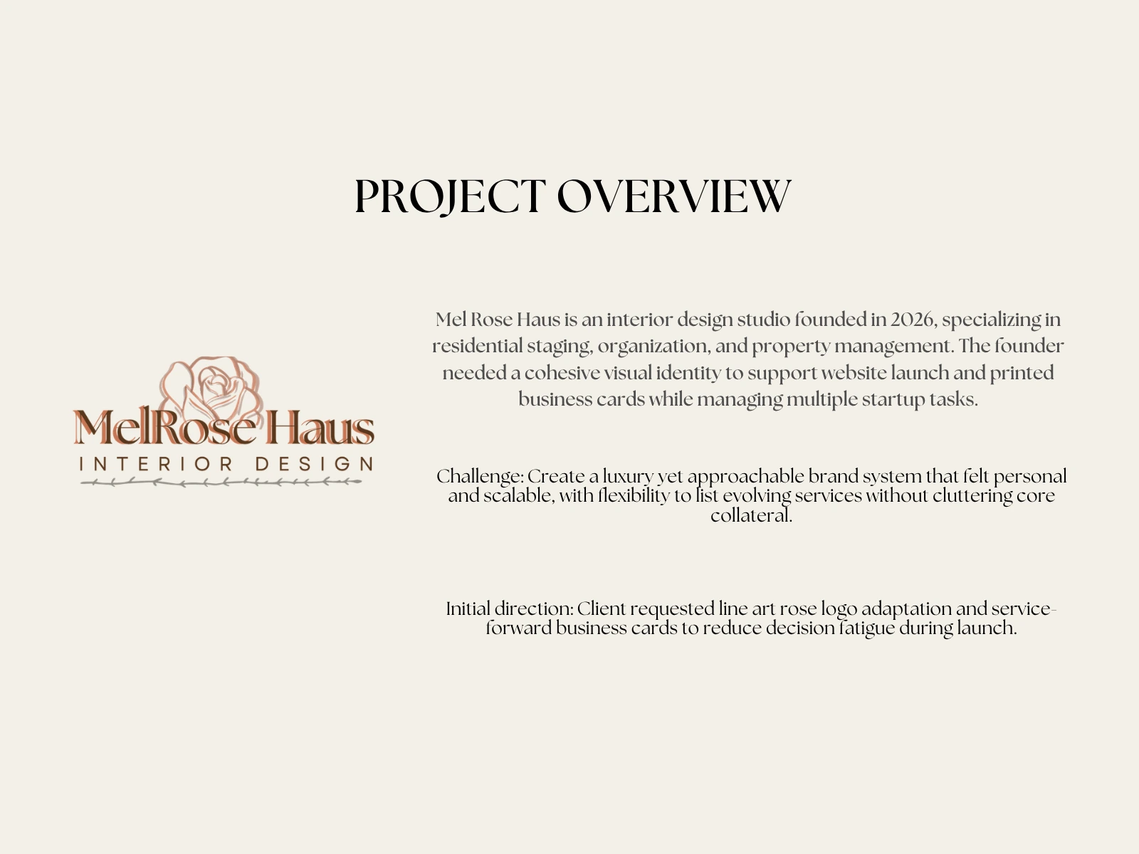
The Client
Mel Rose Haus is an interior design studio founded in 2026, specializing in residential staging, organization, and property management. The founder needed a cohesive visual identity to support a website launch and printed business cards while managing multiple startup tasks simultaneously.
Initial direction: Line art rose logo adaptation and service-forward business cards to reduce decision fatigue during launch.
The challenge: Create a luxury yet approachable brand system that felt personal and scalable, with flexibility to list evolving services without cluttering core collateral.
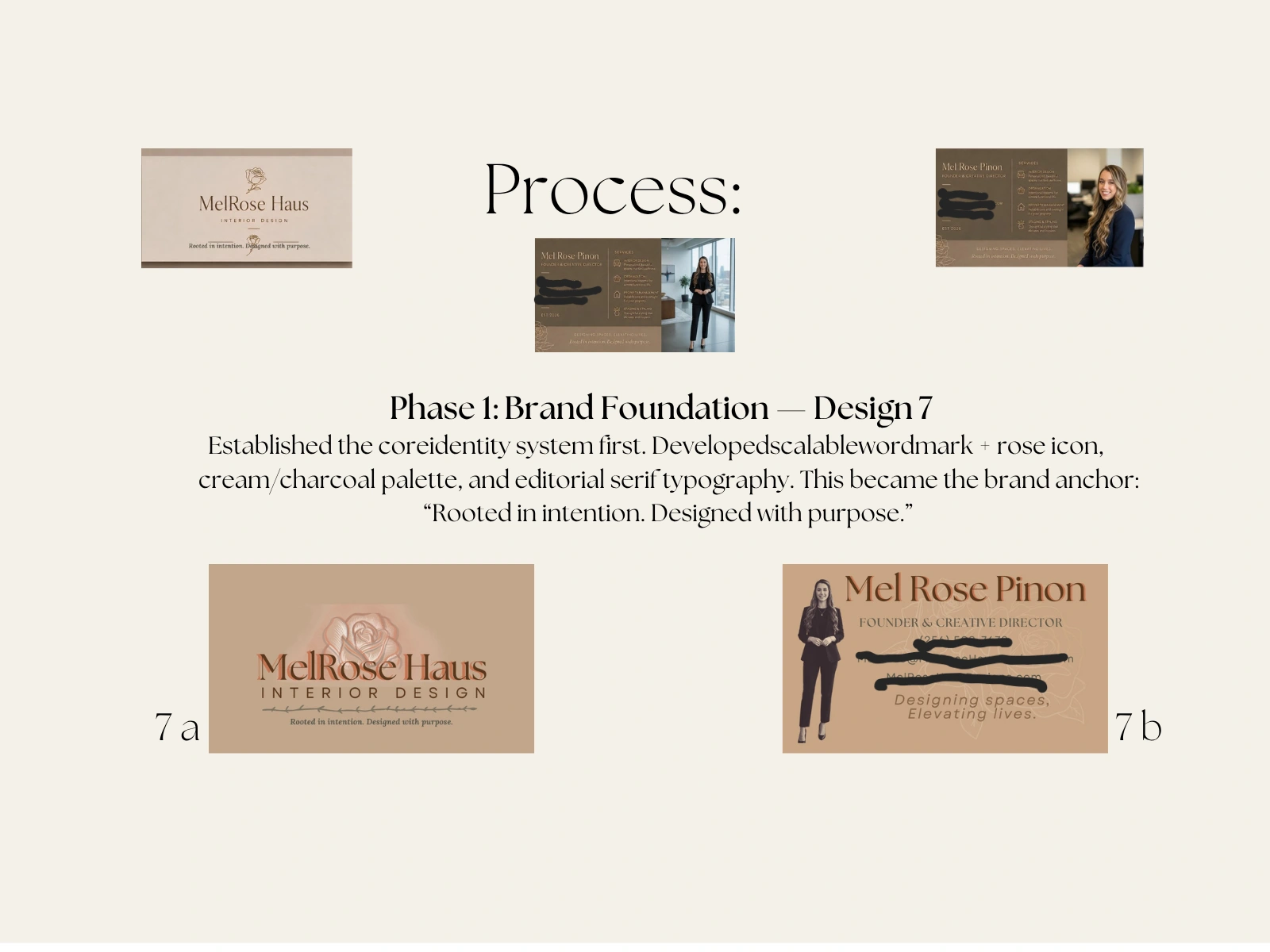
Phase 1: Brand Foundation
Brand foundation and core identity system
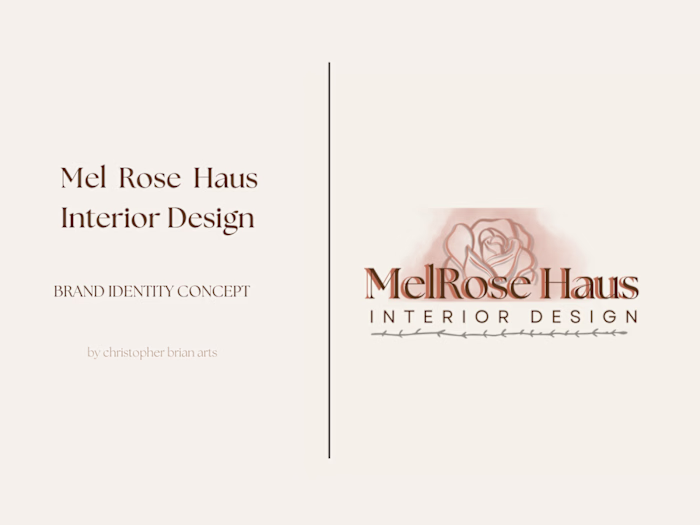
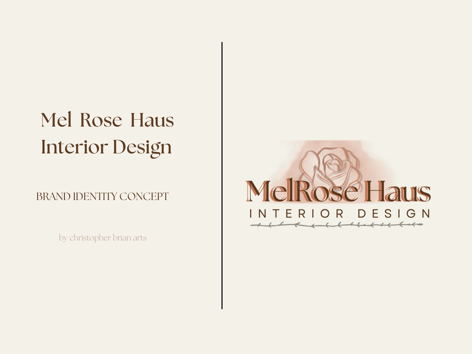
Established the core identity system first. Developed a scalable wordmark paired with a rose icon, a cream/charcoal palette, and editorial serif typography. This became the brand anchor: "Rooted in intention. Designed with purpose."
Phase 2: Client-Driven Exploration
Design exploration and variations
Translated client feedback into 5 strategic variations:
Hierarchy testing: Icons vs. text for services list
Color psychology: Taupe, black, cream, greige, charcoal to test market positioning
Photo vs. logo: Explored personal vs. scalable brand presence
Rose execution: Refined line art versions that maintained elegance at small sizes
Variation concepts
Color and layout exploration
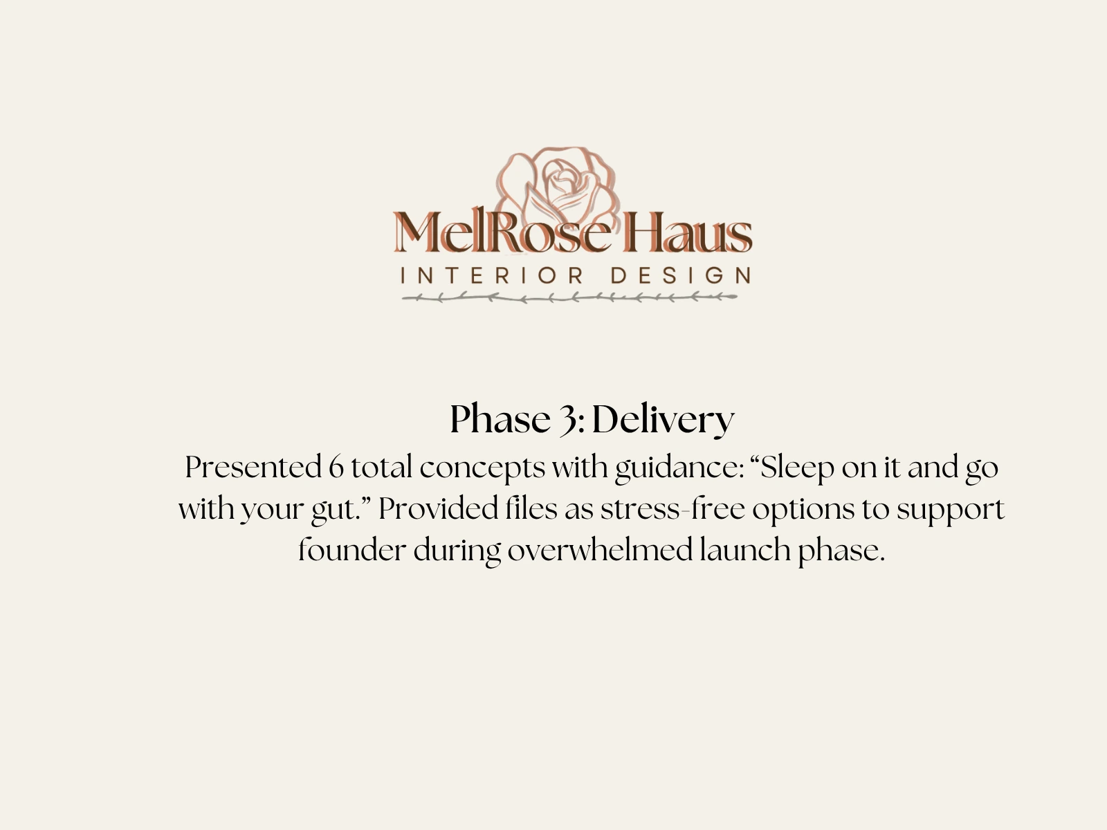
Phase 3: Delivery
Final business card concepts
Presented 6 total concepts with guidance: "Sleep on it and go with your gut." Provided files as stress-free options to support the founder during an overwhelmed launch phase.
Final card designs
The System
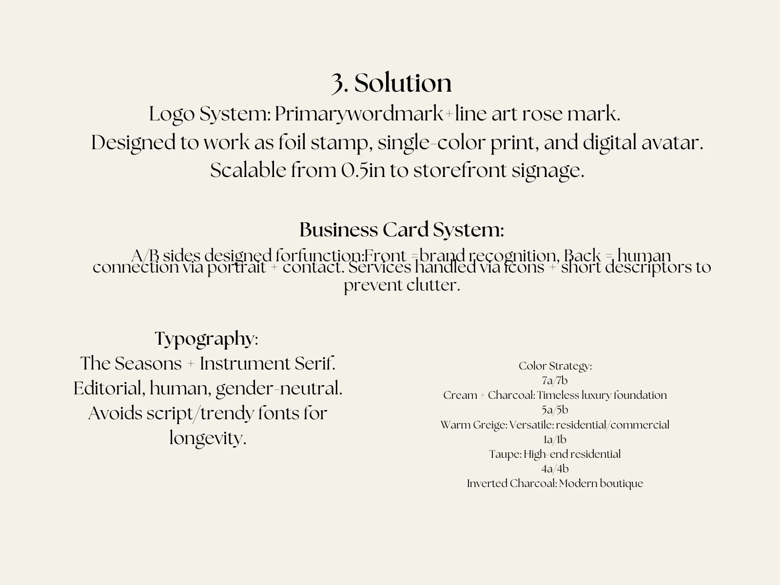
Typography: The Seasons + Instrument Serif. Editorial, human, gender-neutral. Avoids script and trendy fonts for longevity.
Business Card System: A/B sides designed for function. Front = brand recognition. Back = human connection via portrait + contact. Services handled via icons and short descriptors to prevent clutter.
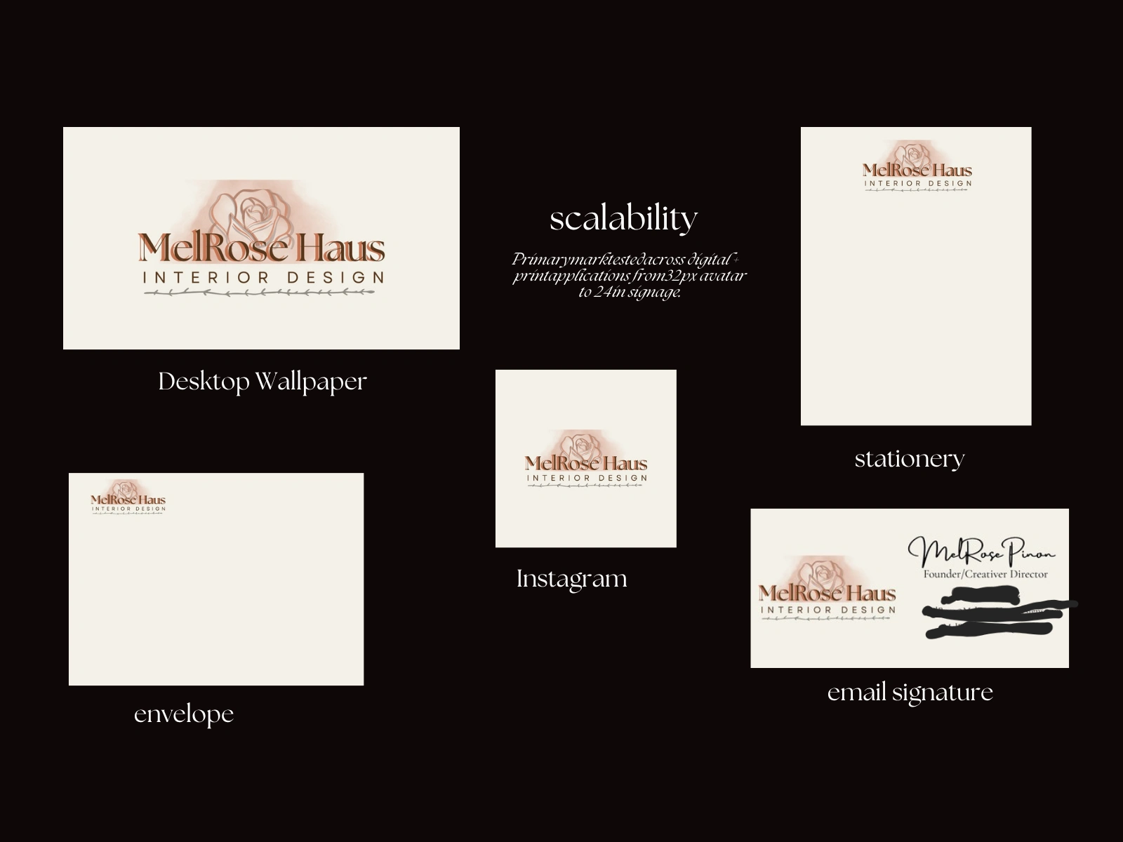
Logo System: Primary wordmark + line art rose mark. Designed to work as foil stamp, single-color print, and digital avatar. Scalable from 0.5" to storefront signage.
Final brand identity system
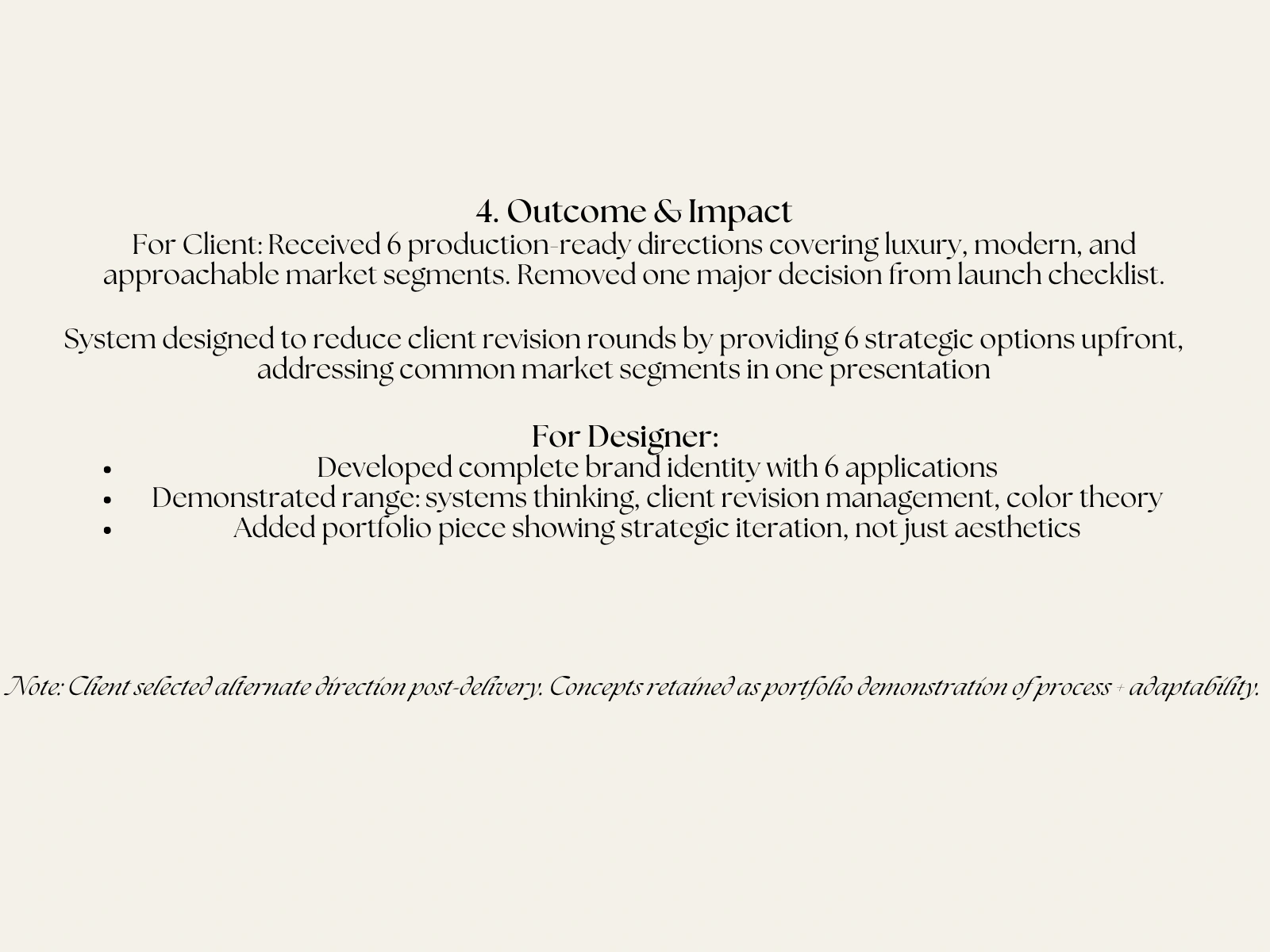
Outcome & Impact
For the client: Received 6 production-ready directions covering luxury, modern, and approachable market segments. Removed one major decision from the launch checklist. The system was designed to reduce client revision rounds by providing 6 strategic options upfront, addressing common market segments in one presentation.
For the designer: Developed a complete brand identity with 6 applications. Demonstrated range across systems thinking, client revision management, and color theory. Added a portfolio piece showing strategic iteration, not just aesthetics.
Note: Client selected an alternate direction post-delivery. Concepts retained as portfolio demonstration of process and adaptability.
Like this project
Posted Jun 13, 2026
Brand identity and business card system for Mel Rose Haus, an interior design studio specializing in residential staging, organization, and property management.
Likes
0
Views
3
Timeline
May 15, 2026 - May 31, 2026