Jump Start
CLIENT: JUMP START | YEAR: 2024 | DELIVERABLE: BRANDING
Basketball Academy, Jump Start!
| ABOUT CLIENT:
Logo design process for a basketball academy called ‘Jump Start’. This academy focus on the young basketball players who want to achieve their full potential and want to play on bigger platforms.

| LOGICAL THINKING BEHIND BRANDING:
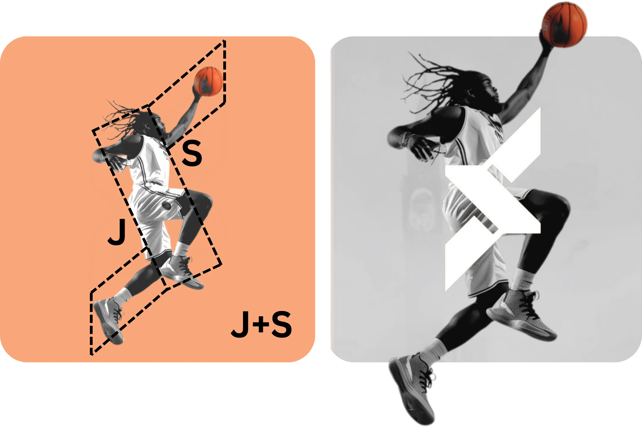
Logo mark was the main focus element. The client wanted to logo mark to be meaningful and something related to “Jump Start”.
Firstly, I finalised the inspiration image and then analysed if some logo shape can be traced.
The final logo was the combination of the alphabets “J+S” + “traced shape”.

Color Palette & Brand Pattern
| DELIVERABLES:
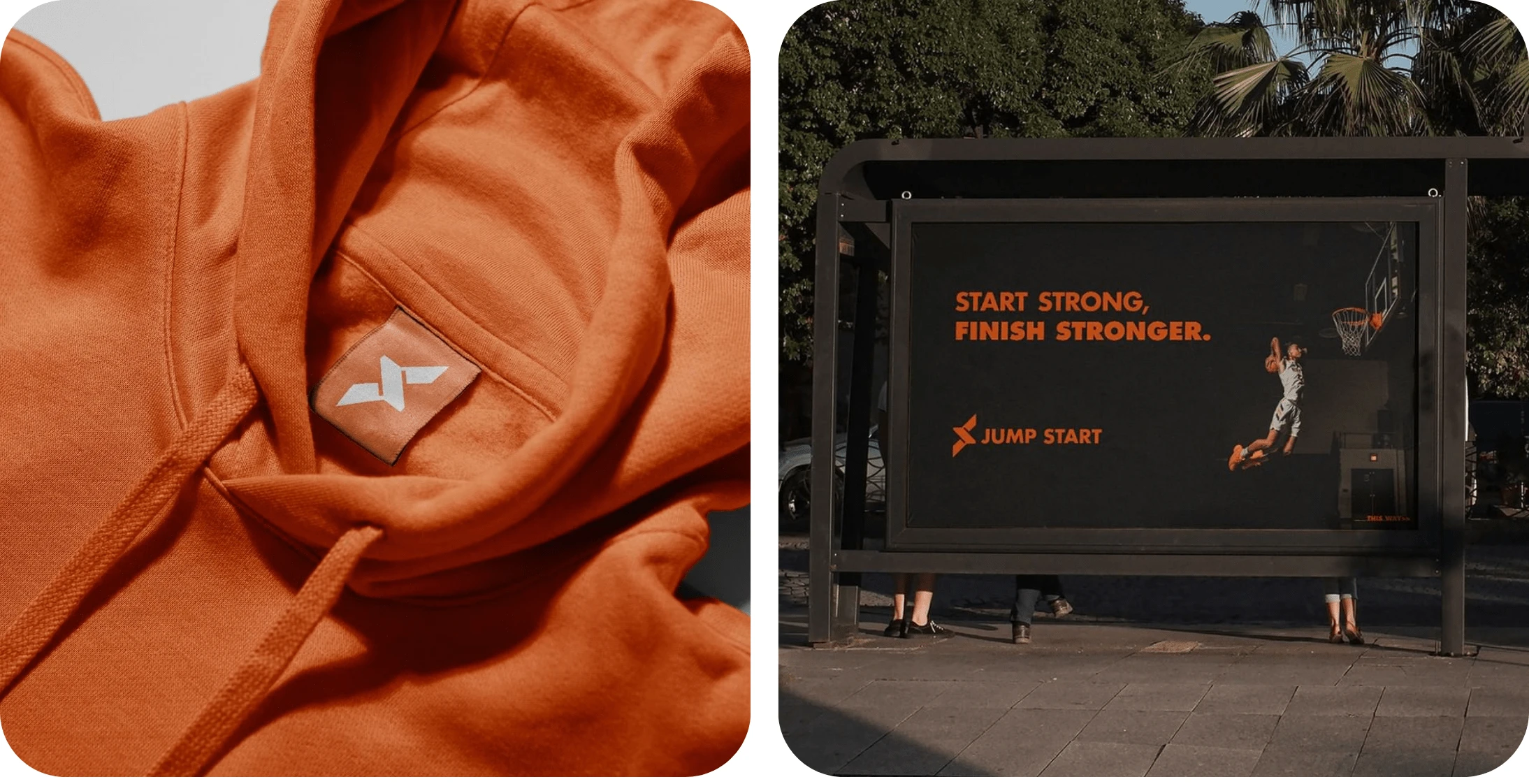
⚫ Brand Identity kit
⚫ Marketing collaterals
Like this project
0
Posted May 30, 2024
Basketball Academy ‘Jump Start’. DELIVERABLES: | Brand Identity kit | Marketing collaterals


