OnBoard by MVSI - Graphic Design Services
Project Summary
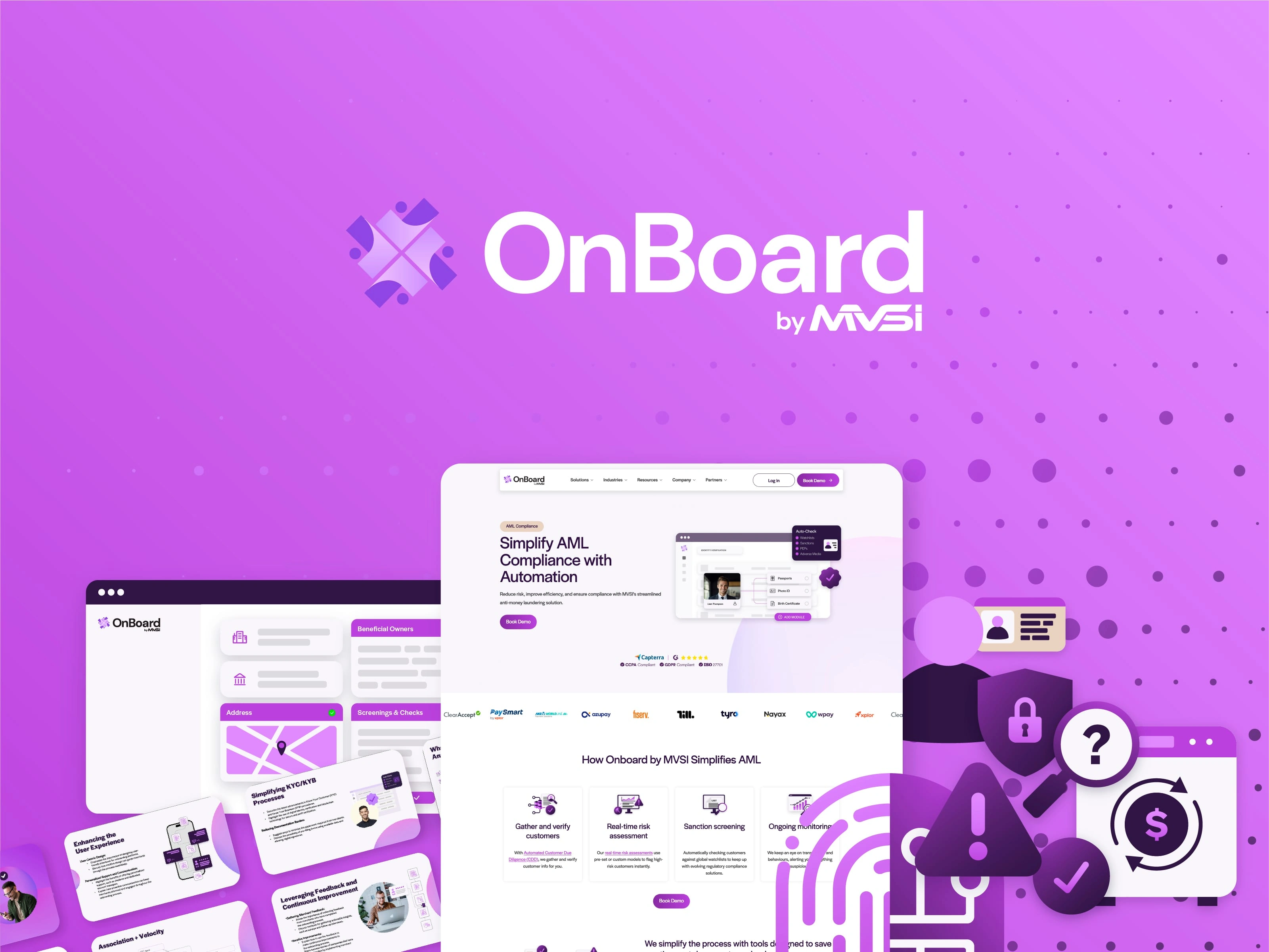
OnBoard is a modern finance onboarding solution created by MVSI. To keep up with the market, they needed to create modern, captivating graphics based on their website's existing visual identity.
Icon Style Development
I worked closely with the head of marketing to create new graphics and standardize them. While working on this project, the need for a new and unique icon set emerged.
Together, we developed a new style and a huge icon set covering all of their needs as a fintech company.
They wanted simple with character and a bit of a friendly feel to them, not oversimplified, outlined icons as they had had until then. I achieve this by making colorful icons based on the OnBoard brand colors and giving them layering with some shadows, to give the feeling of flexibility. The style that was developed was a total success.
While I was on this project, I met various other requirements such as print design, infographics and more.
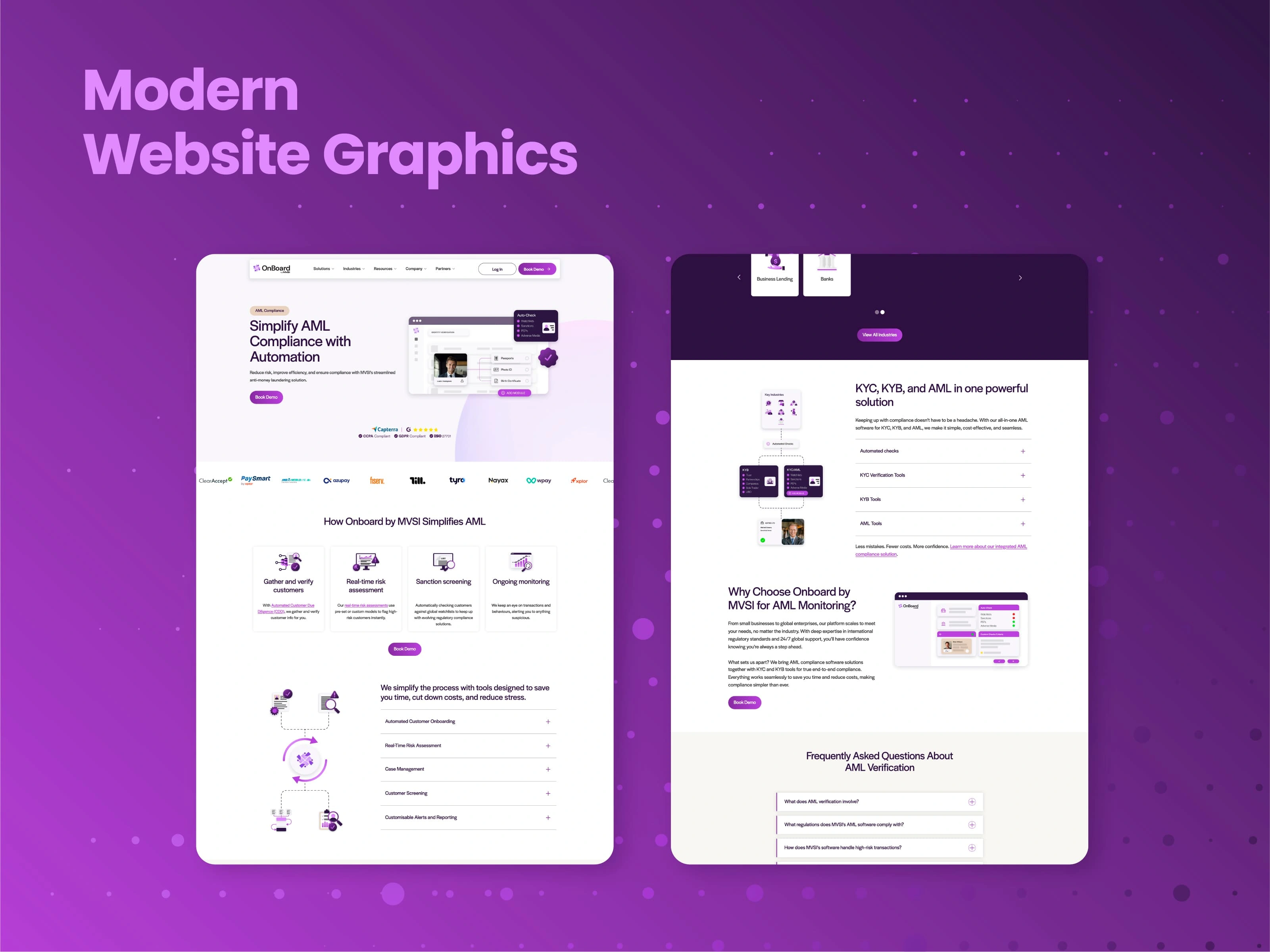
Website Graphics
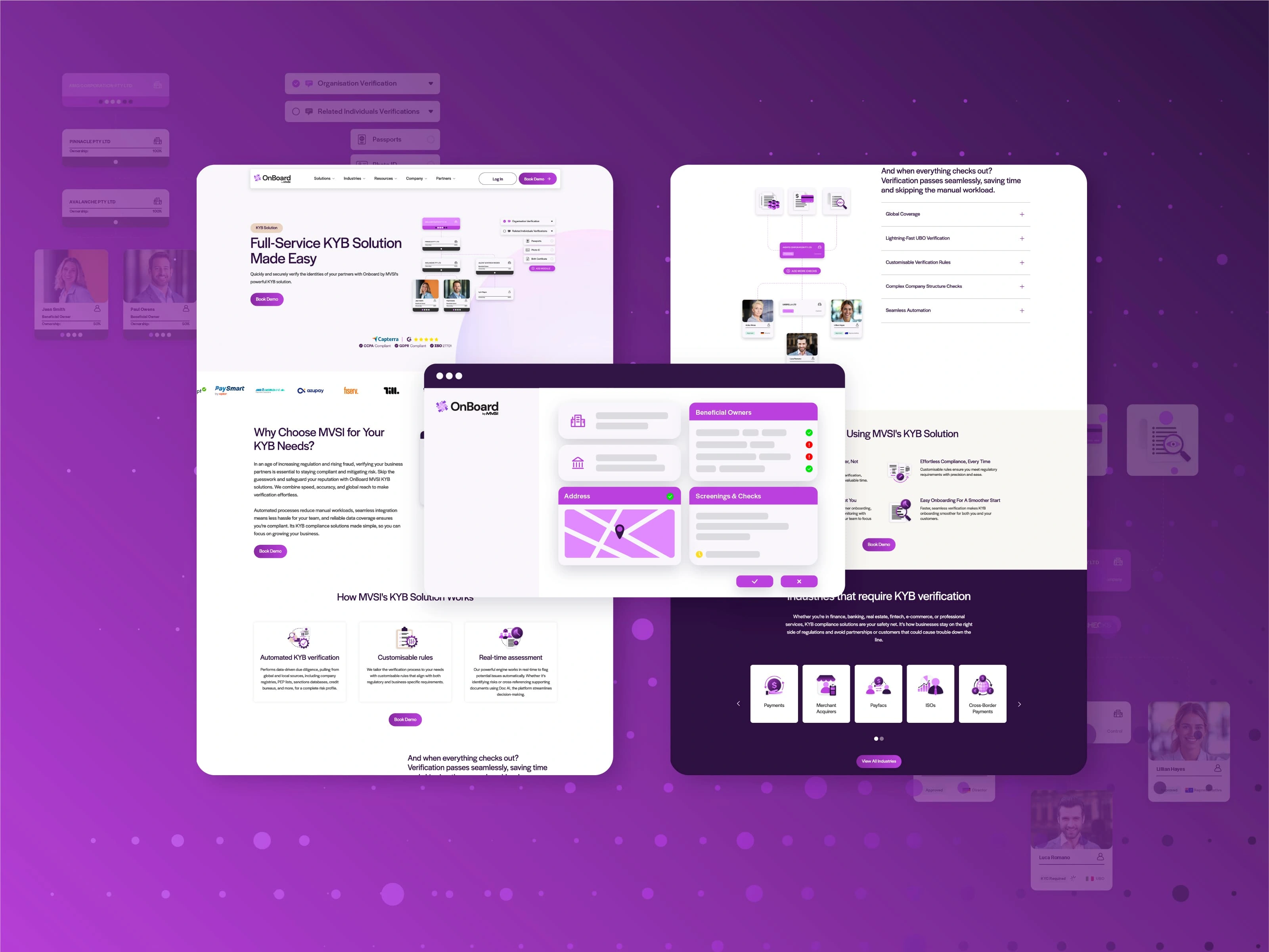
Website Graphics
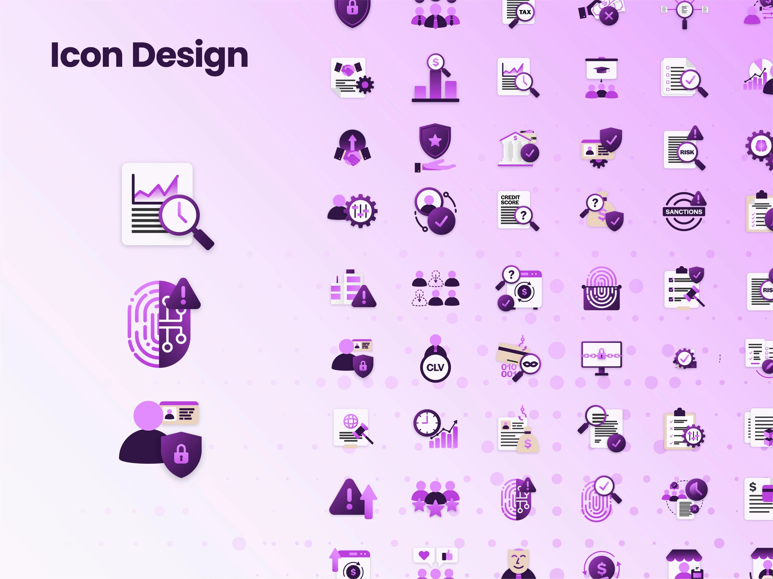
Icon Set
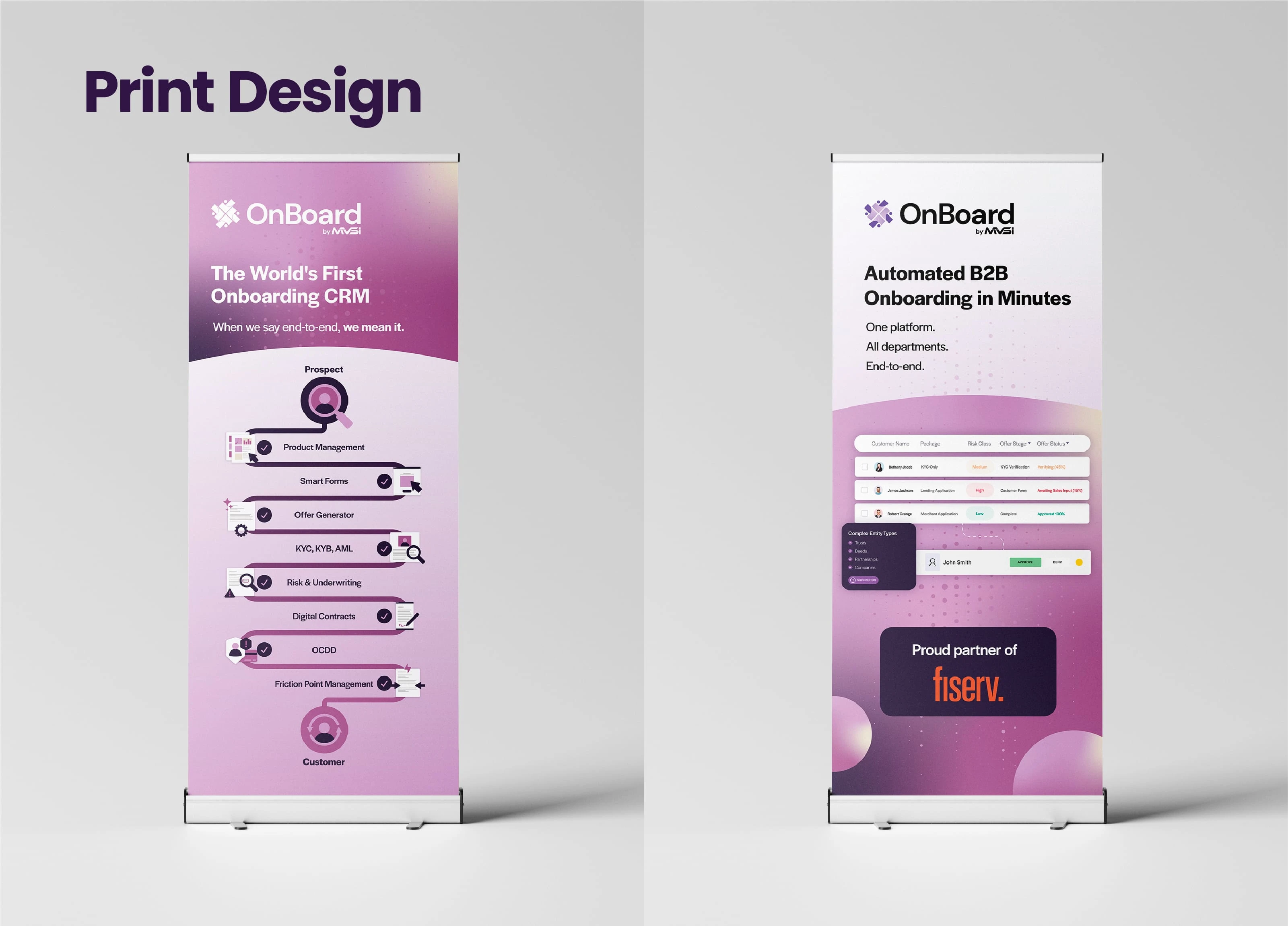
Rollup Banners
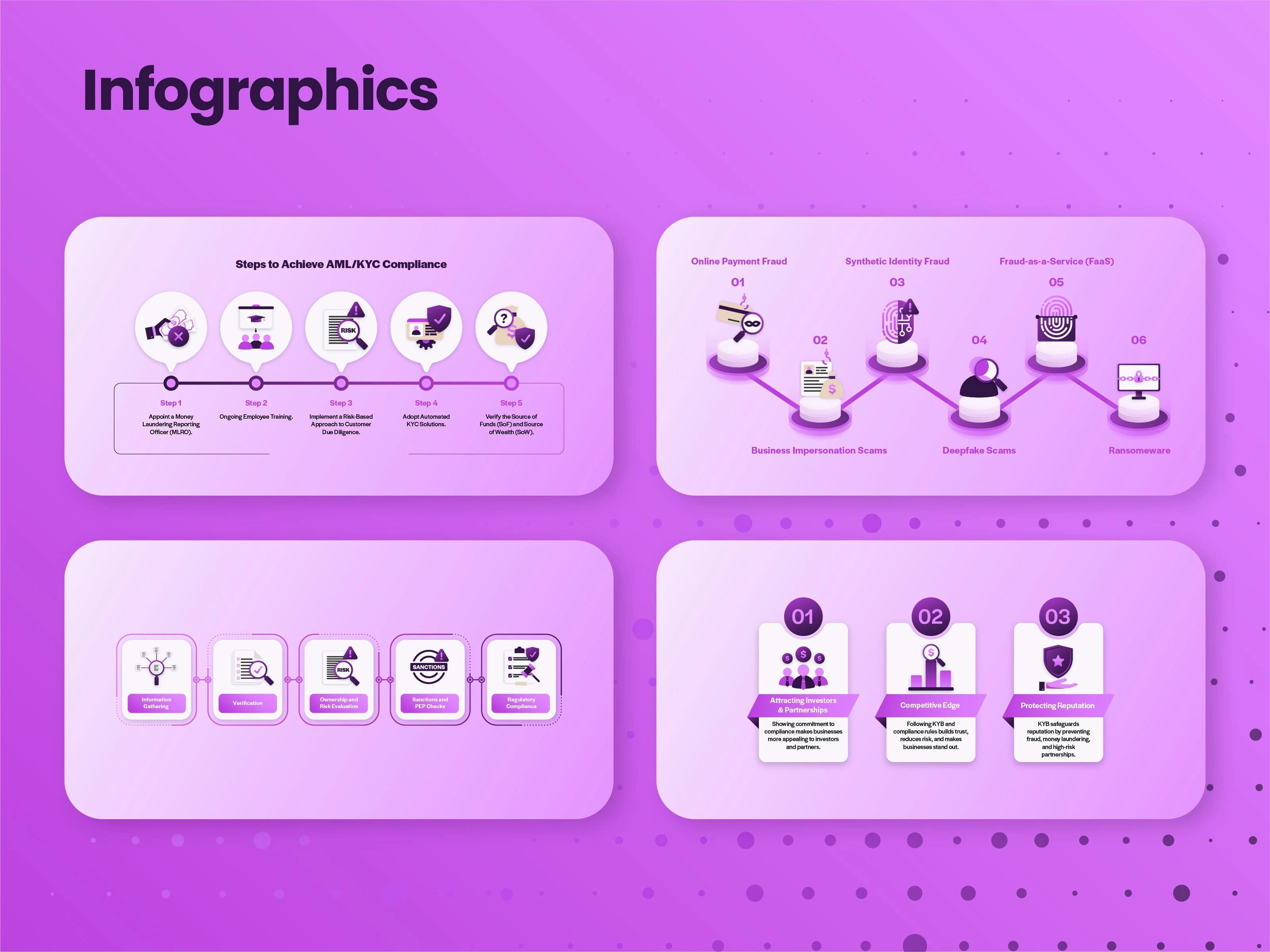
Infographics
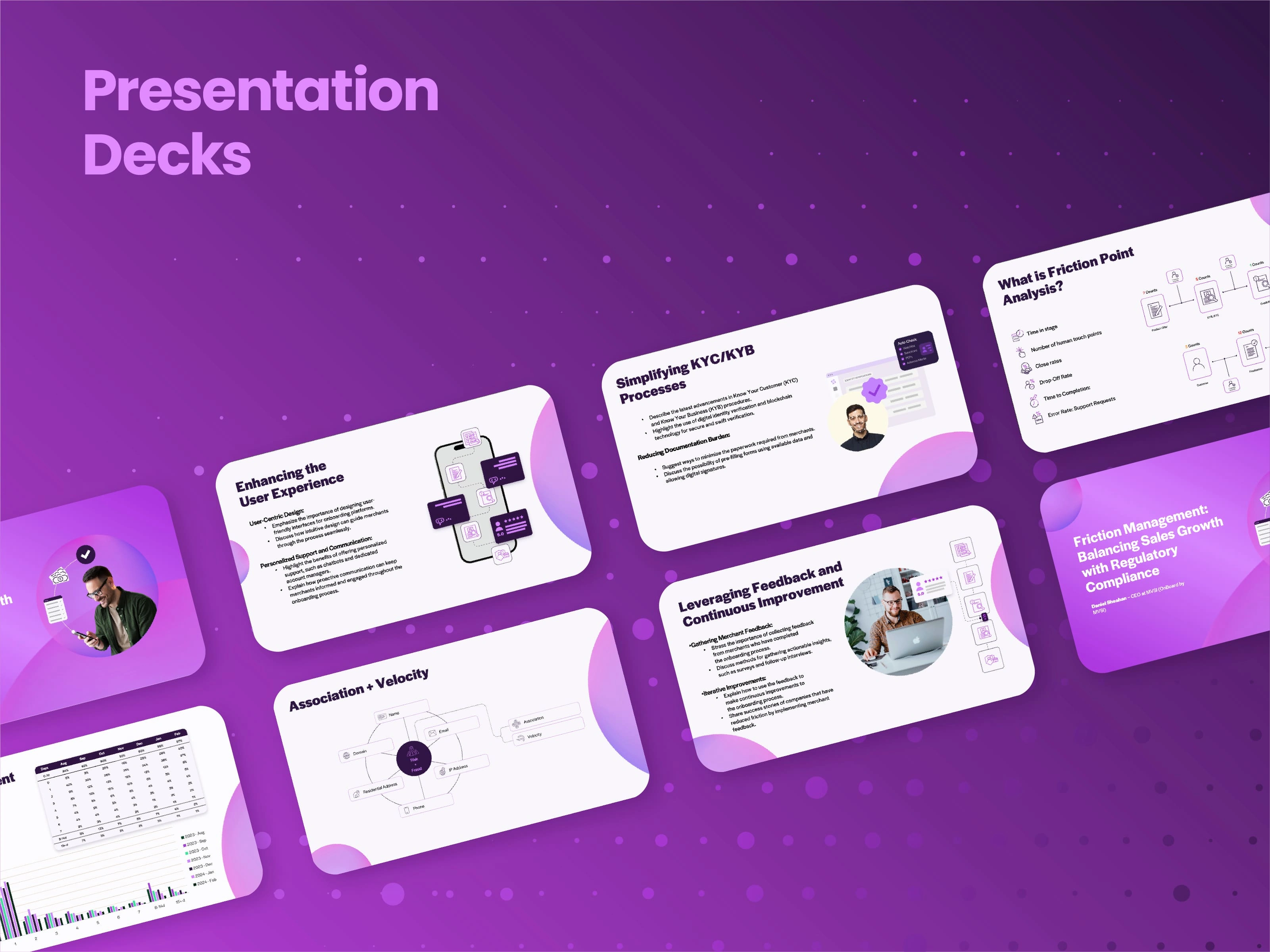
Presentation Decks
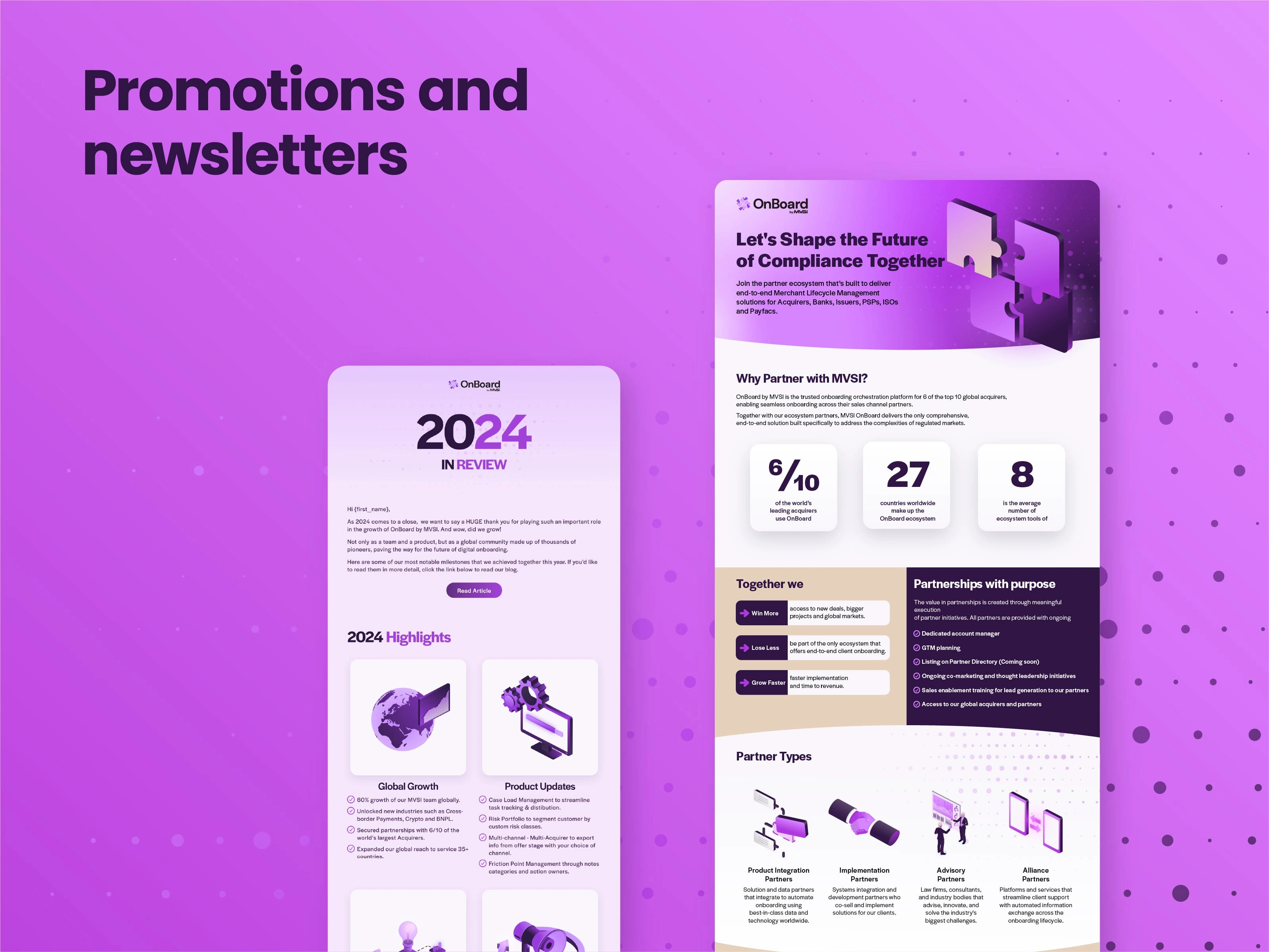
Promotions
Like this project
Posted Apr 2, 2025
OnBoard is a modern finance onboarding solution. They needed modern, captivating graphics based on their website's existing visual identity.
Likes
1
Views
19
Timeline
Nov 28, 2024 - Feb 28, 2025

