SURCO | Bar & Restaurant Brand Identity

Flávia Jackeline


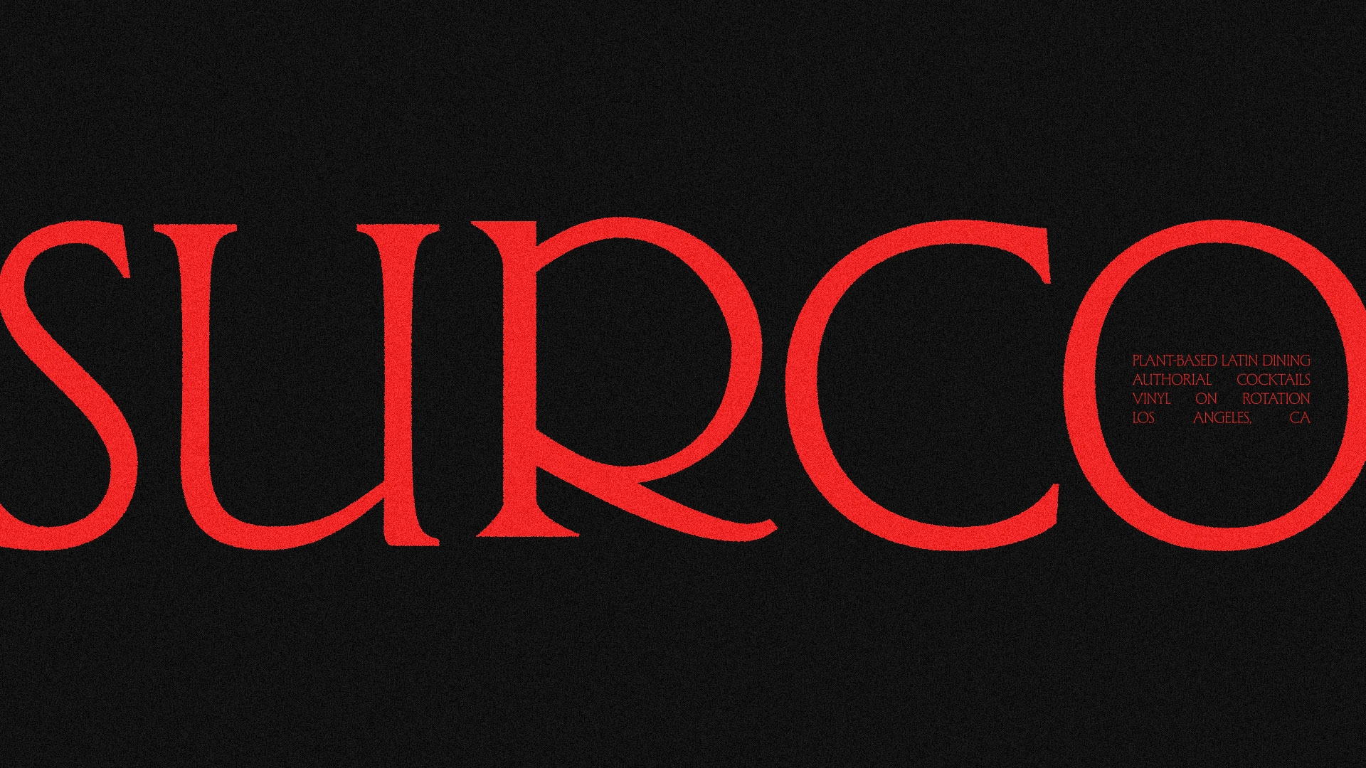
SURCO
Brand identity for a listening restaurant in Los Angeles.
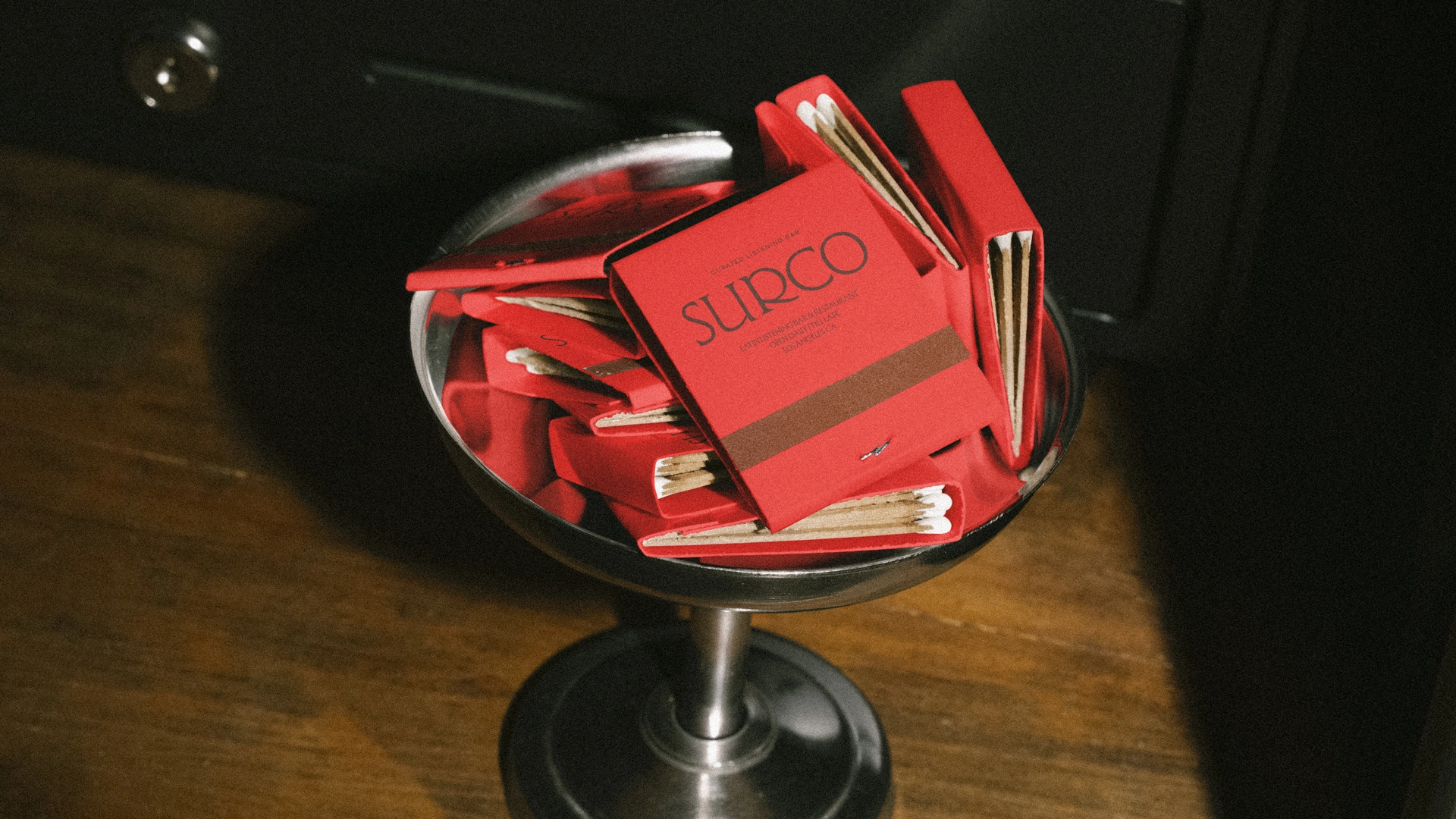
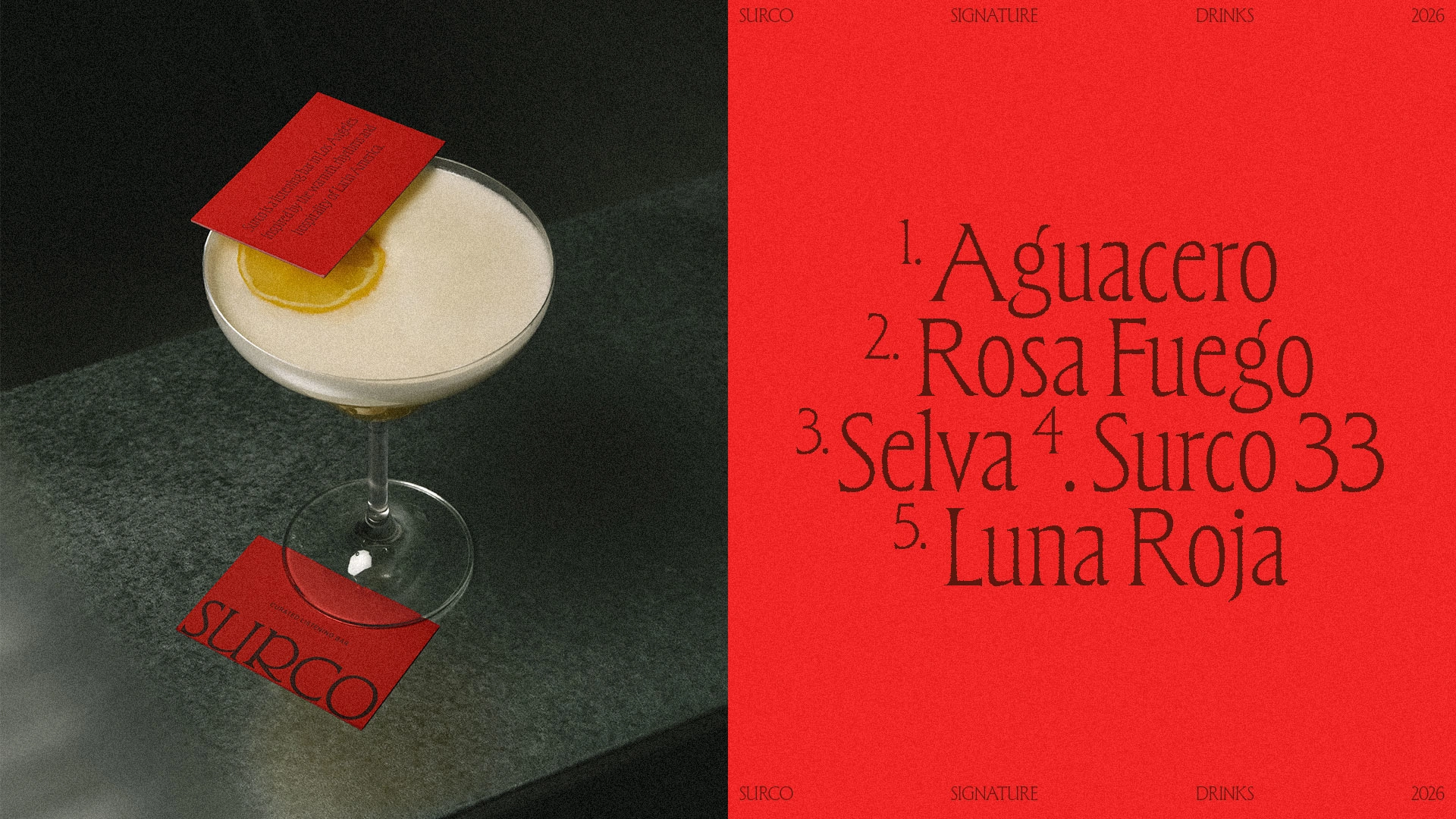
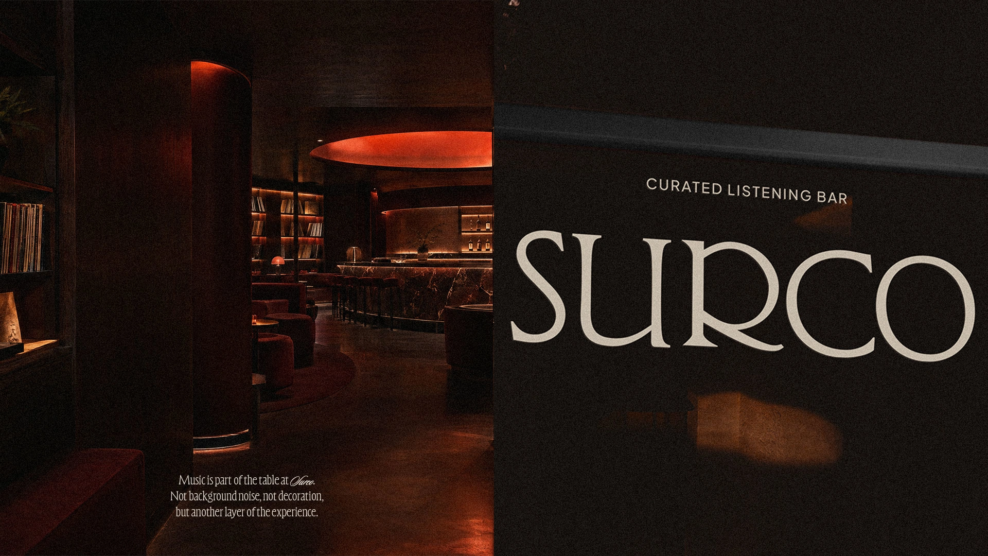
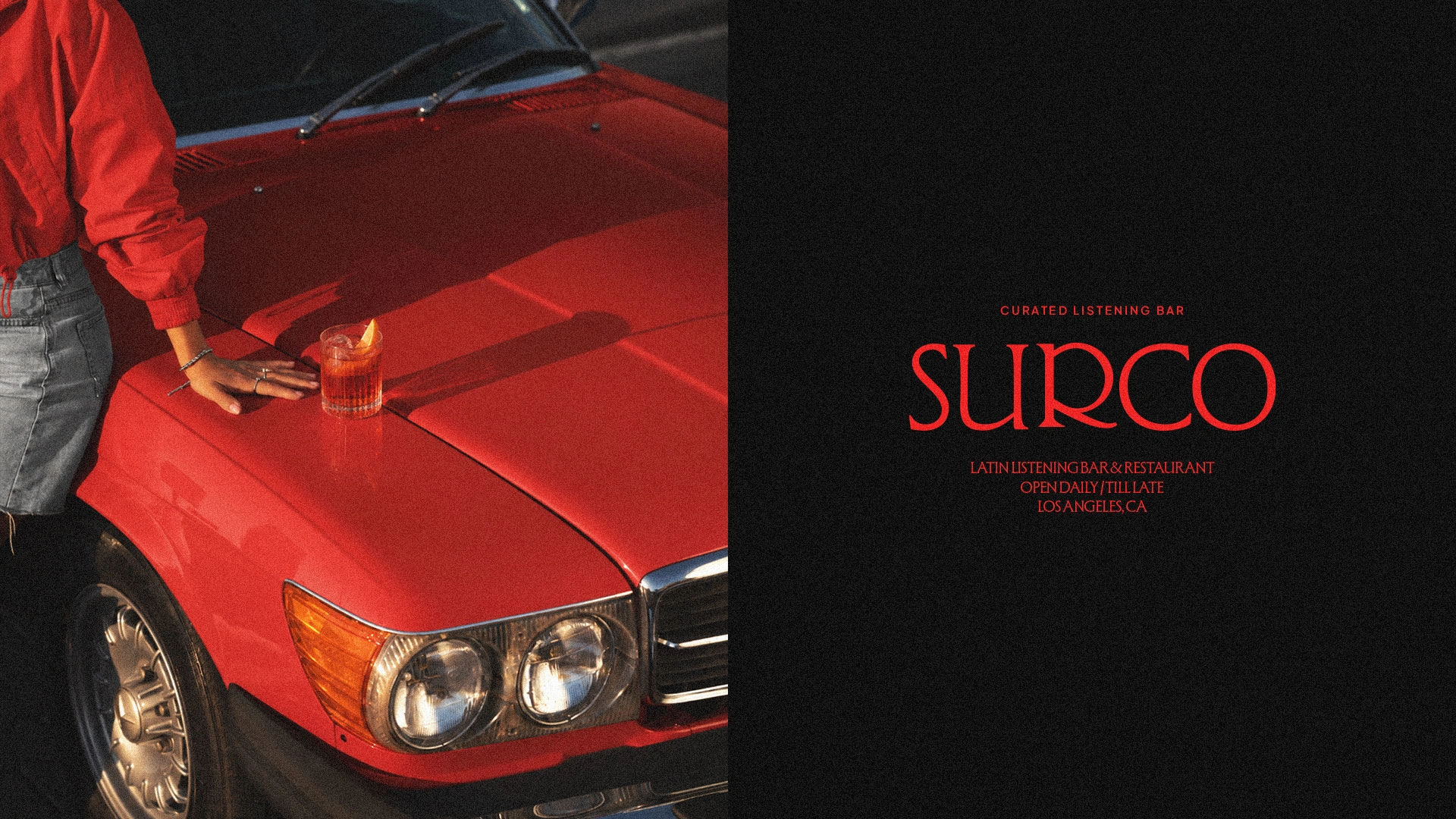
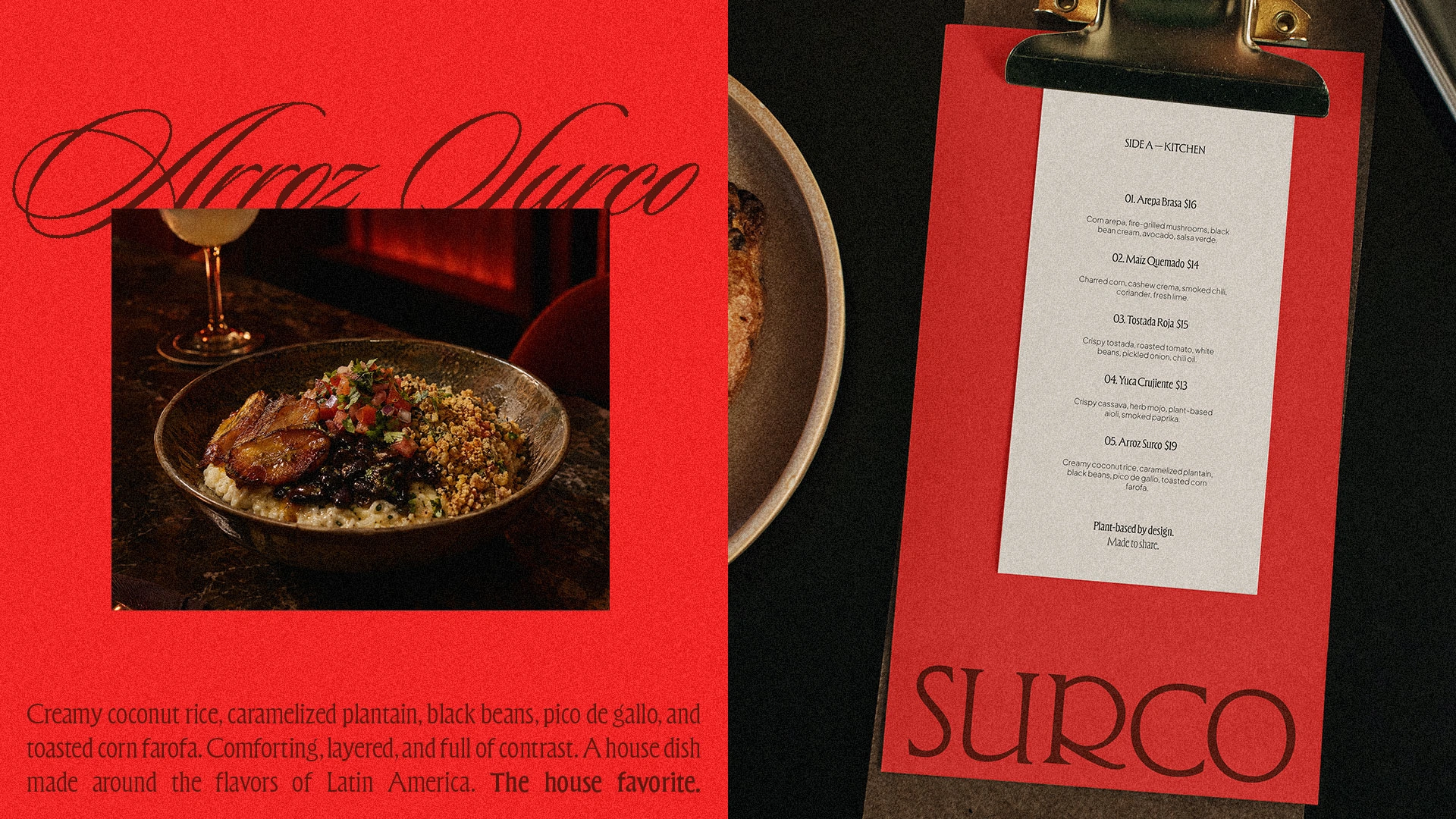
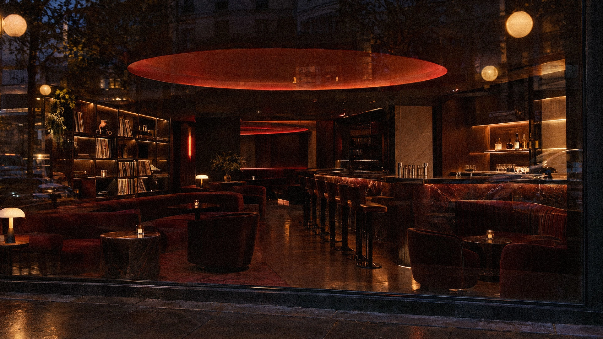
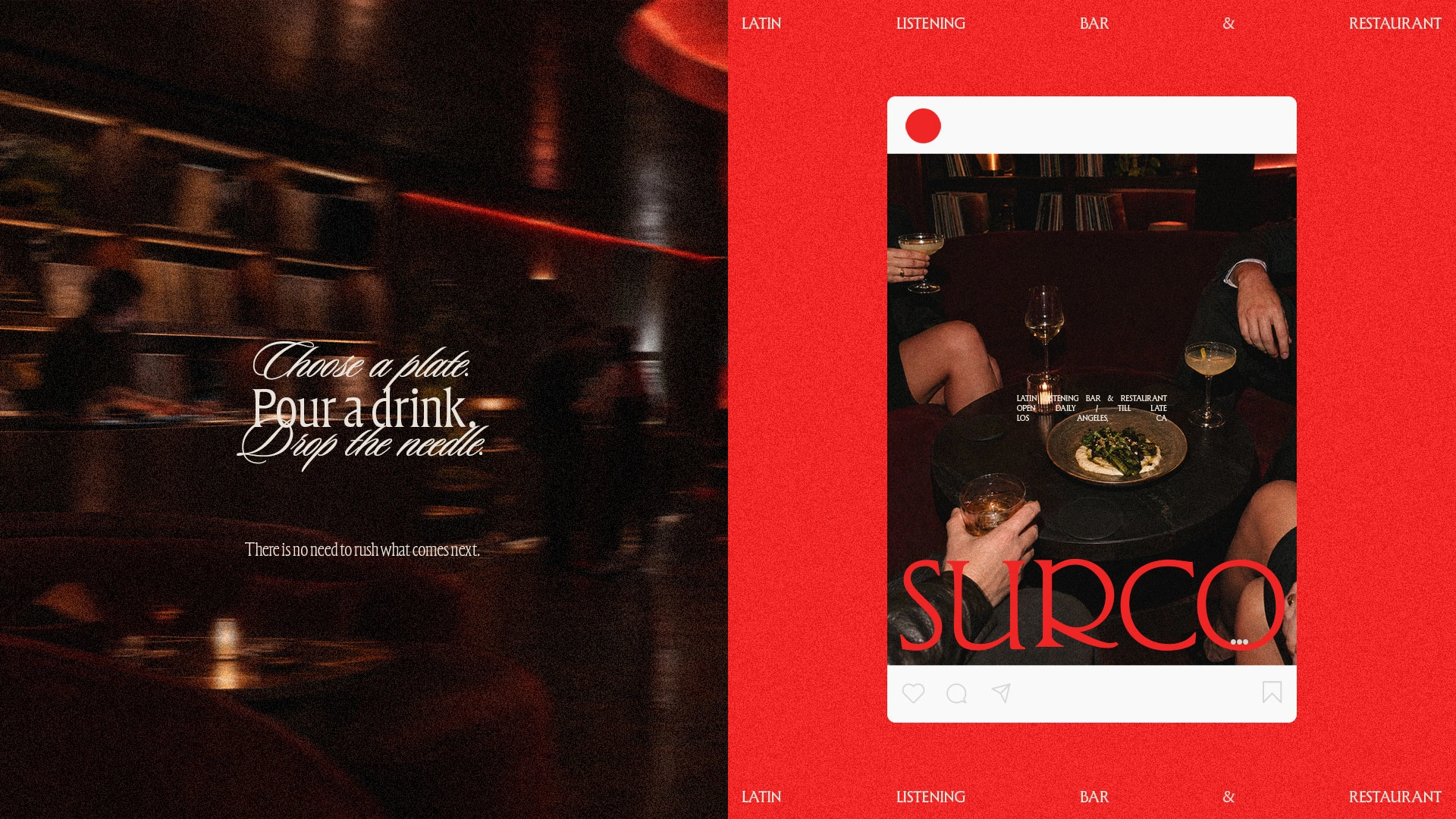
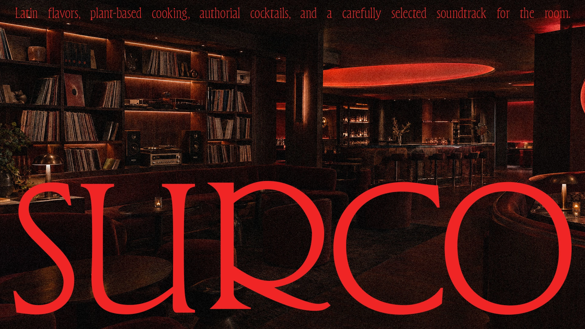
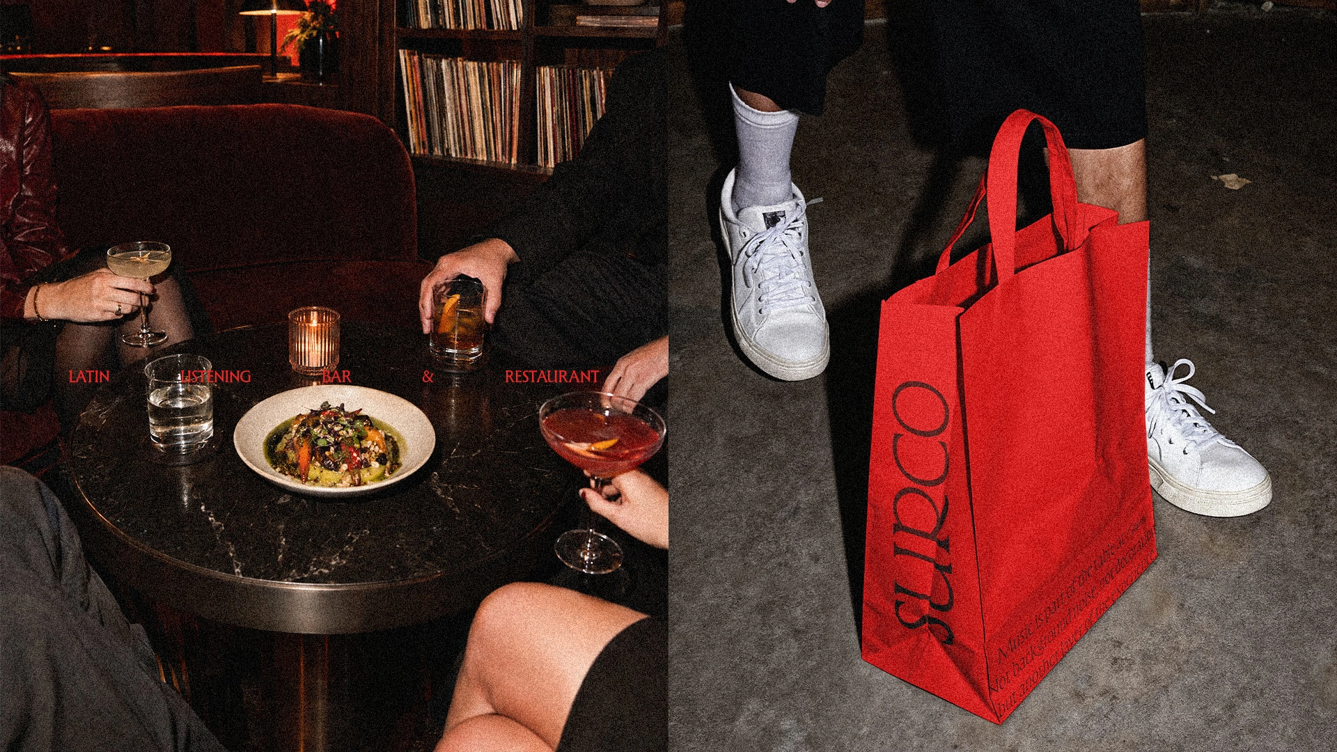
SURCO is a plant-based Latin restaurant and listening bar built around food, cocktails and vinyl. Its name comes from surco, the Spanish word for the groove of a record. This became the central idea for the identity and for the restaurant itself: a continuous line between the kitchen, the bar and the music. The menu is divided into two sides. Side A presents the kitchen; Side B, the cocktails. Vinyl is part of the space and its programming, with records selected throughout the evening.
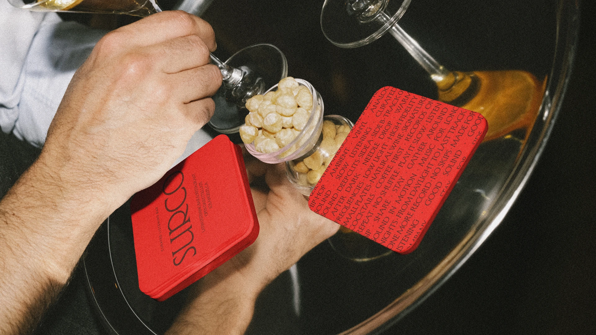
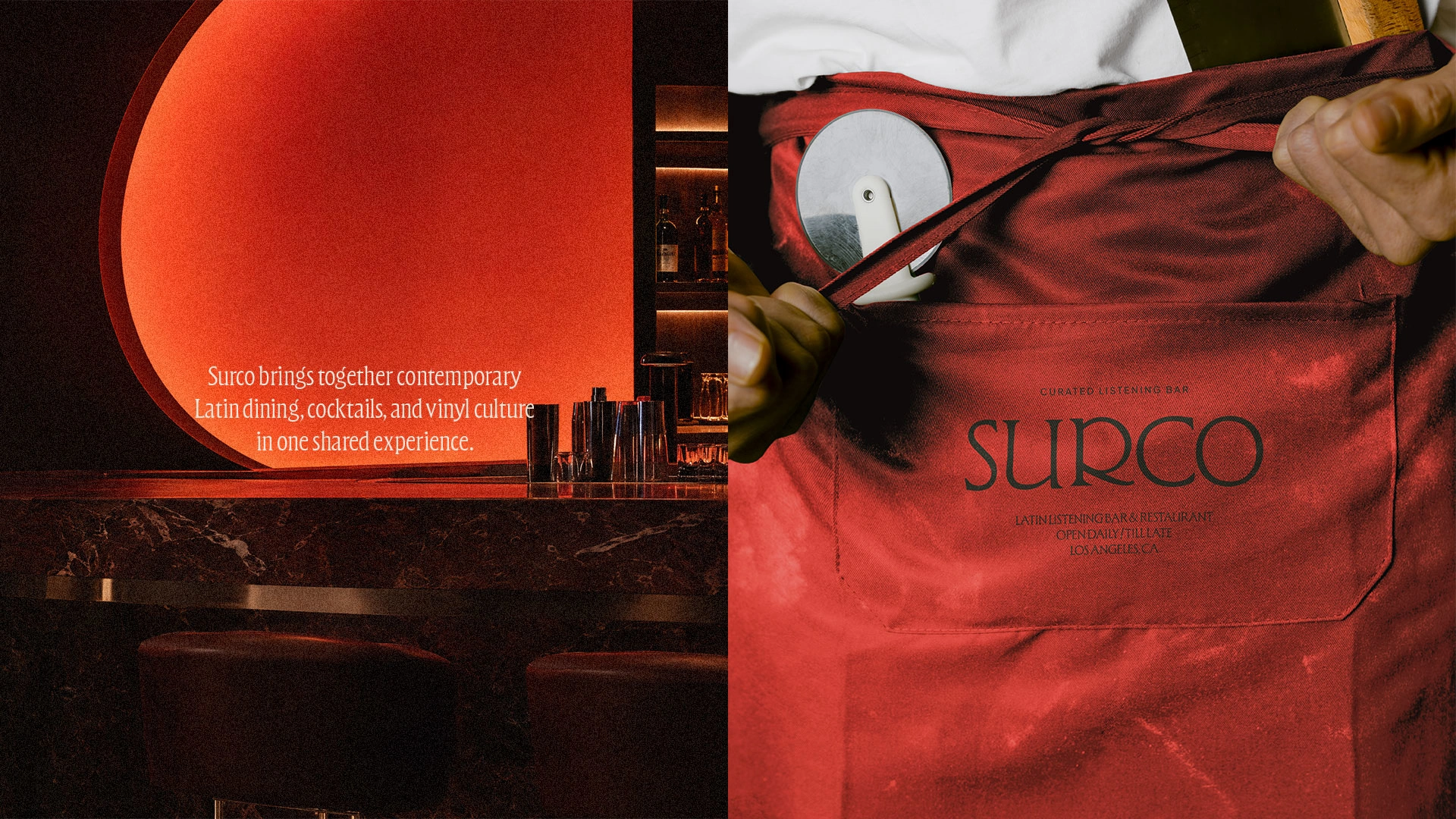
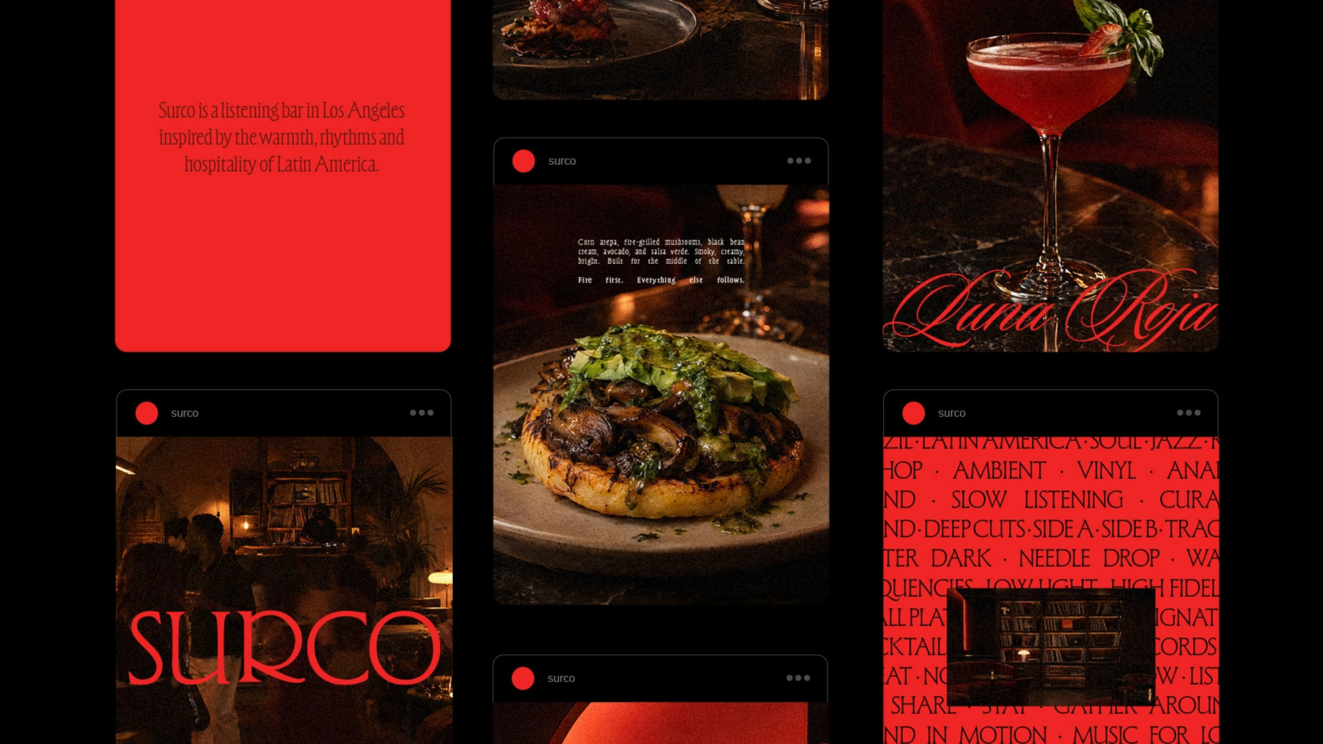
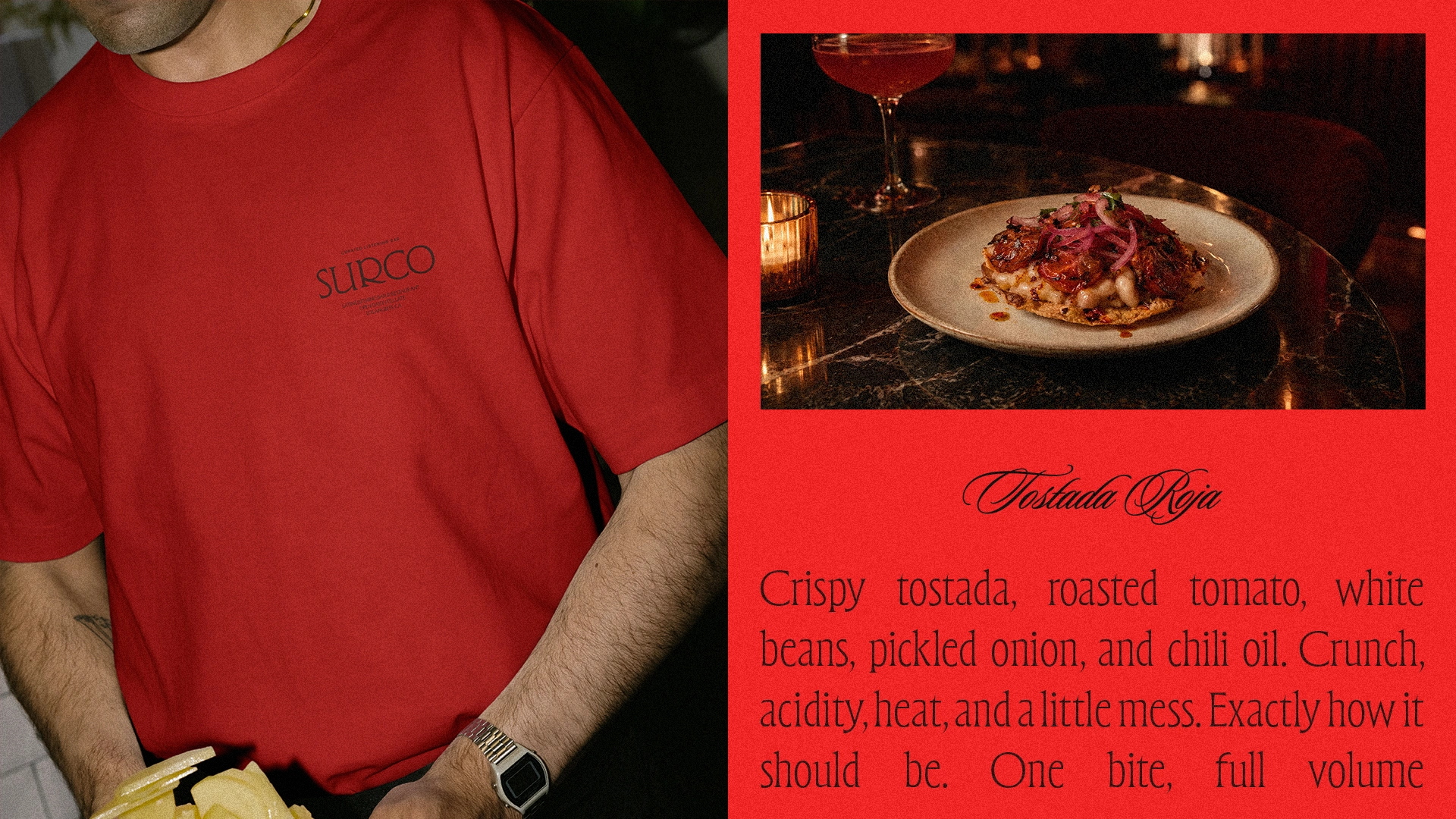
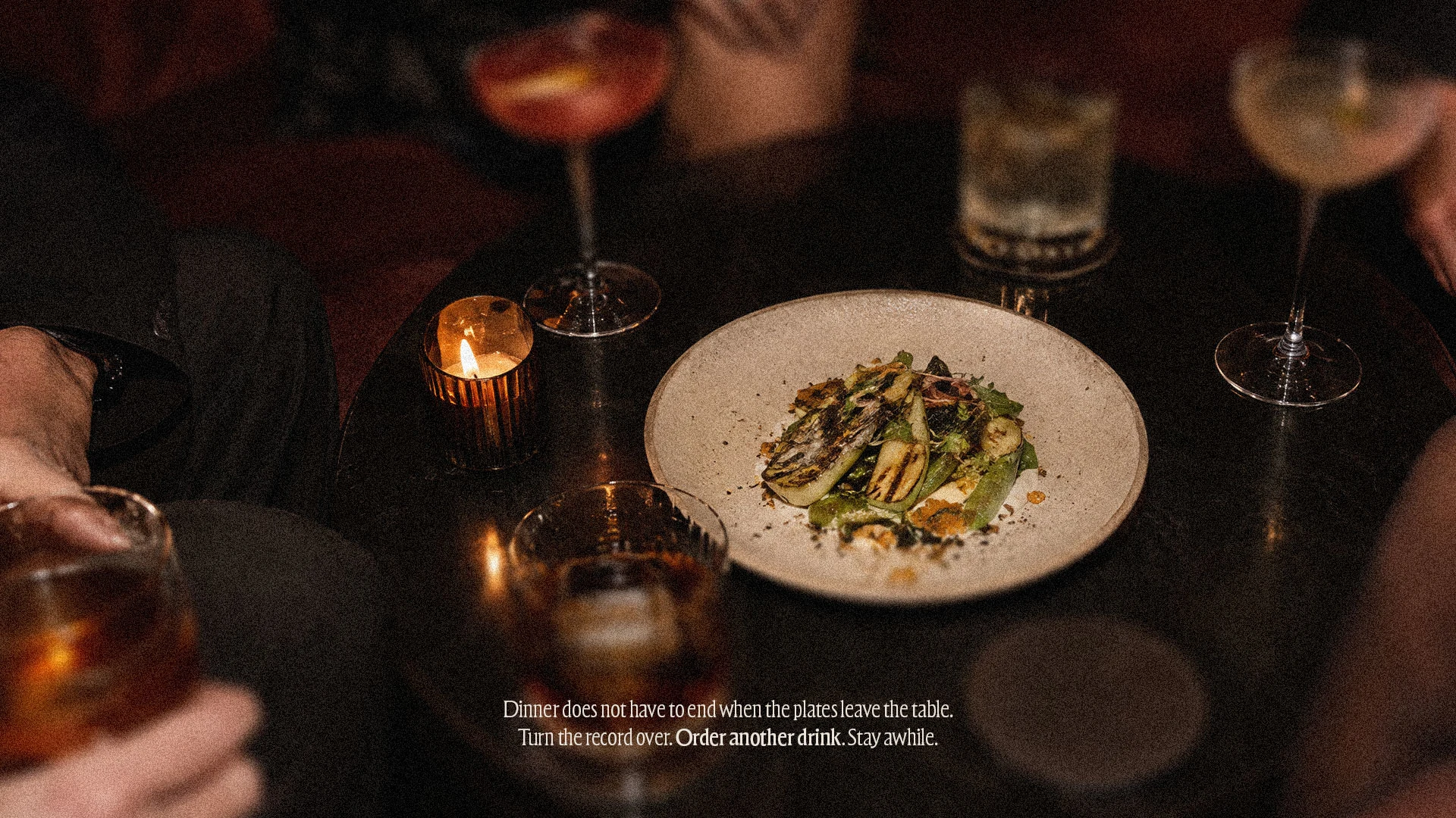
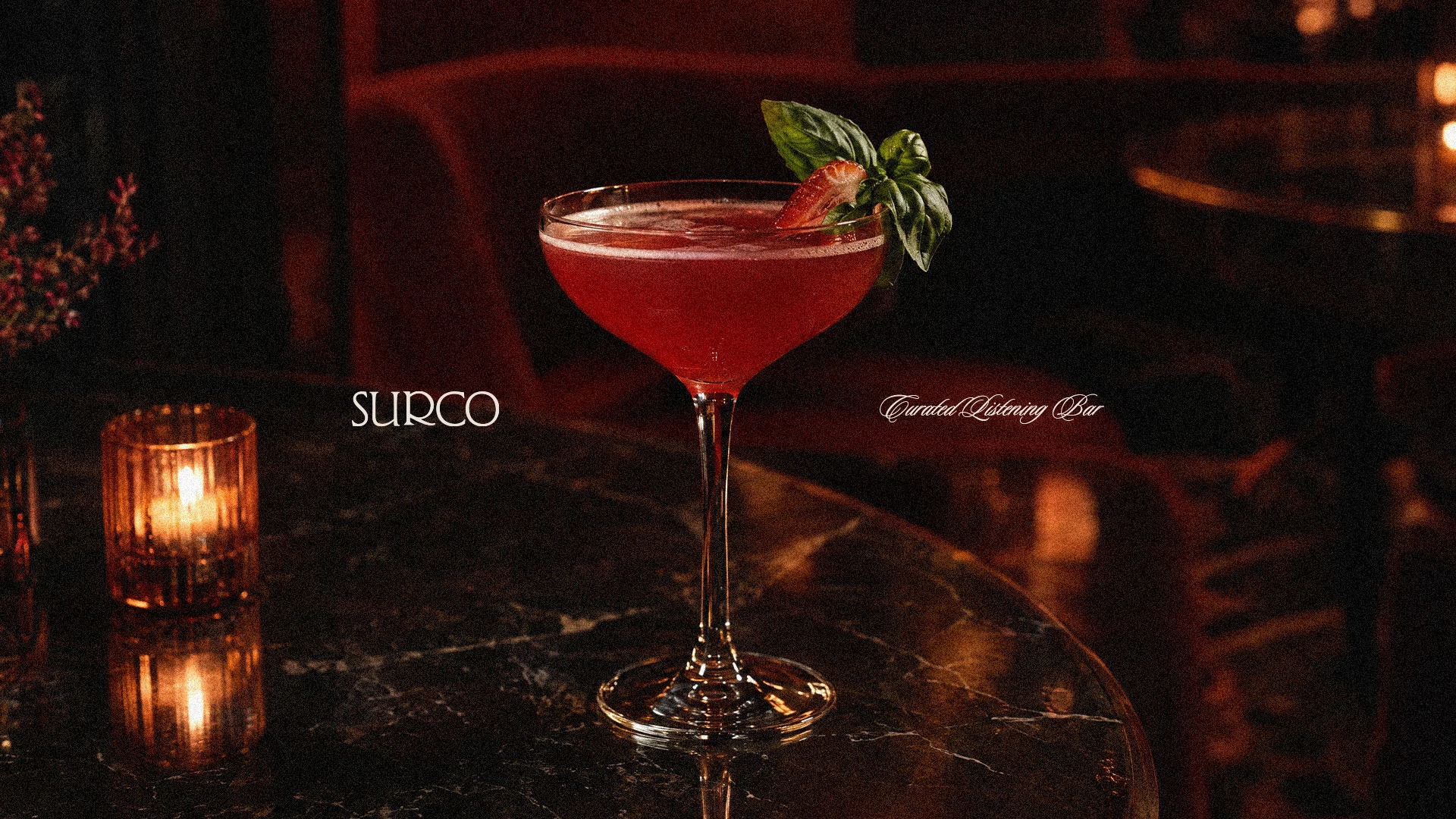
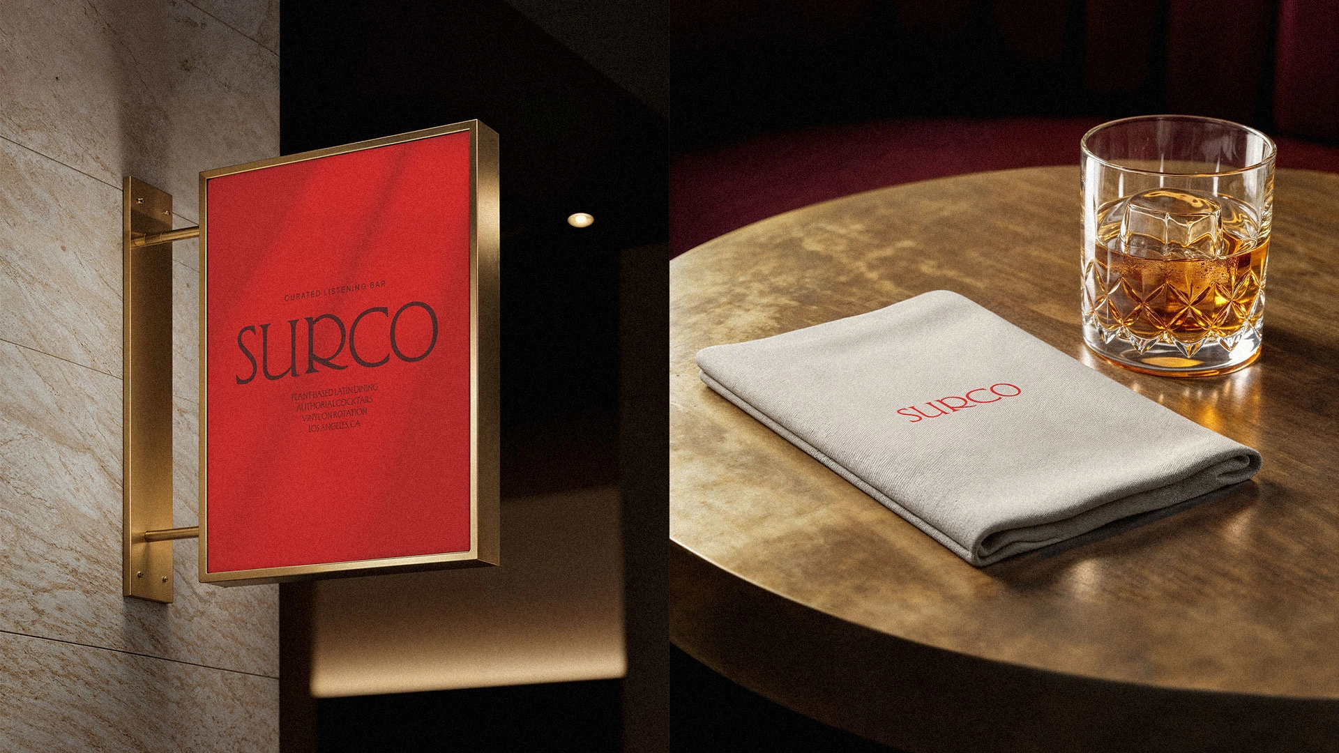
The identity uses a custom typographic approach with an intentionally narrow, expressive character. Large-scale typography is paired with compact information, creating contrast across menus, signage and printed matter. A limited palette of red and black gives the system a direct visual language, while grain, low-light photography and tightly cropped compositions introduce a more tactile quality. The system extends across the restaurant, from menus and cocktail cards to uniforms, signage, posters and record-related material.
SURCO
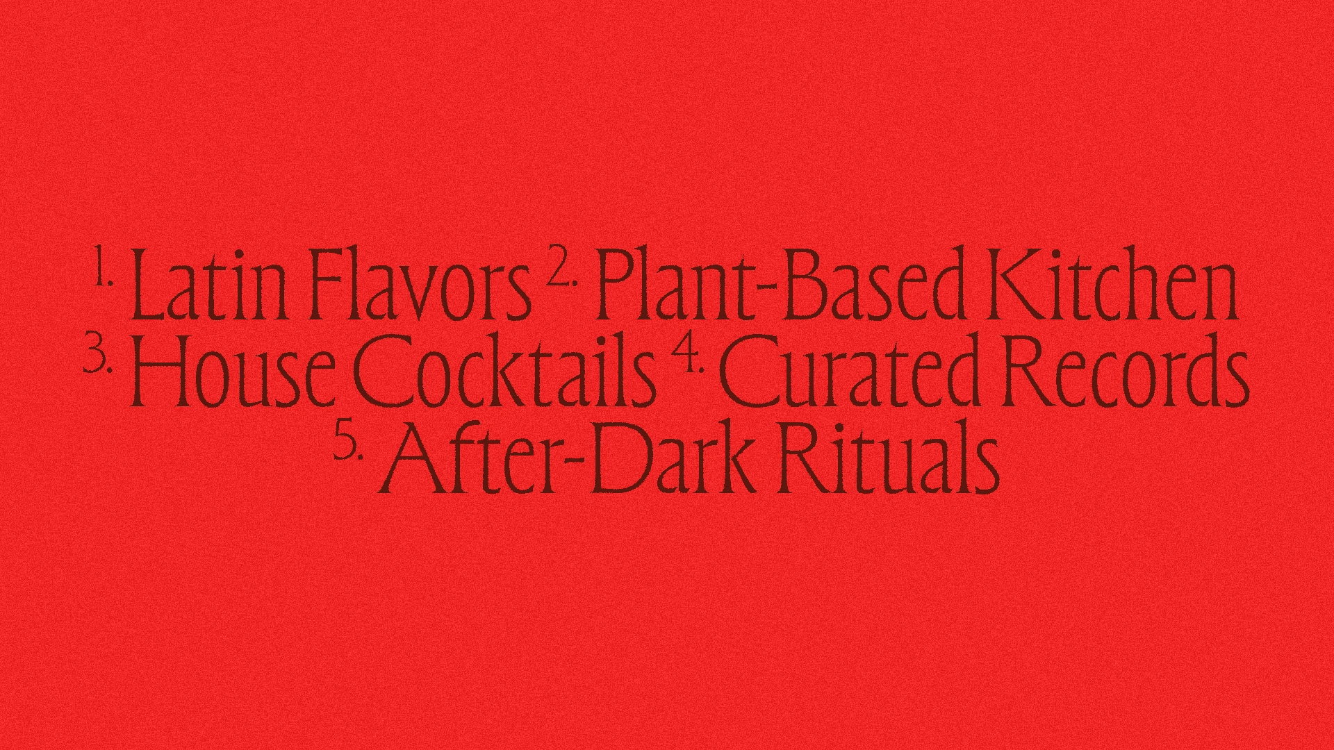
Latin flavors. Plant-based kitchen. House cocktails. Curated records.
Los Angeles, California.
Like this project
Posted Sep 12, 2026
Brand identity for SURCO, a Latin bar and restaurant in Los Angeles blending food, cocktails, vinyl records and a vibrant nightlife atmosphere.