
afloat started as an experiment. As a designer, I wanted to see what Claude is really capable of, and how fast I could build my own working tool with it. I started with something simple and personal: a recovery tracker.
The experiment worked. In a couple of days I went from an idea to a live app with accounts, three themes, stats and a home screen widget, without writing code by hand.
afloat is a calm web app for people recovering from compulsive eating: a day counter on a quiet sea that slowly fills with hand-drawn boats. It's completely free, so you can try it live https://www.afloat.website/ . I hope it's useful to you.
Tools: Claude (chat + Claude Code), Figma for a few reference mockups, Higgsfield, GitHub, Scriptable. Stack: Supabase + Vercel
The problem
Quit-tracker apps are built around a streak: one slip and the counter drops to zero. For eating-disorder recovery that's the wrong focus.
The trend matters more than one day. Days without an episode count, but so does frequency: are episodes getting rarer over weeks and months?
No scolding for today. A single hard day shouldn't erase the progress or make you feel like you failed.
I wanted a tracker that counts the days, shows the bigger picture, and stays kind on the hard days.
The concept
Instead of a cold number, progress becomes a picture that grows. The screen is a quiet moonlit sea, and every week you stay afloat a little boat appears on it.
1 week = a small boat. 4 weeks = the small boats merge into one big ship.
The boat of the current week is a pencil sketch that draws itself day by day, so progress is visible every day.
After a relapse the fleet isn't lost: it sails into the Harbor, a history of past streaks.
Two more worlds with the same logic: a field where lambs grow into sheep, and a meadow of flowers and bumblebees.
Web interface
Process: designing with Claude
I worked as the art director and product owner
Claude was my builder. Each round was the same loop: collect references, describe what I want in a detailed prompt, look at the result, give precise feedback.
My workflow: chat for prompts, Claude Code for building
To save tokens, I split the work in two:
Claude chat as a prompt writer. I dictated my thoughts and dropped in references and screenshots, and the chat turned them into one big, very detailed prompt per round.
Claude Code as the builder. I pasted that prompt into Claude Code, which made all the changes at once in the project. Fewer, bigger, well-prepared requests meant fewer back-and-forth corrections, fewer tokens used, and faster results. The whole journey felt less like coding and more like art direction, and it was a very creative and fun one.
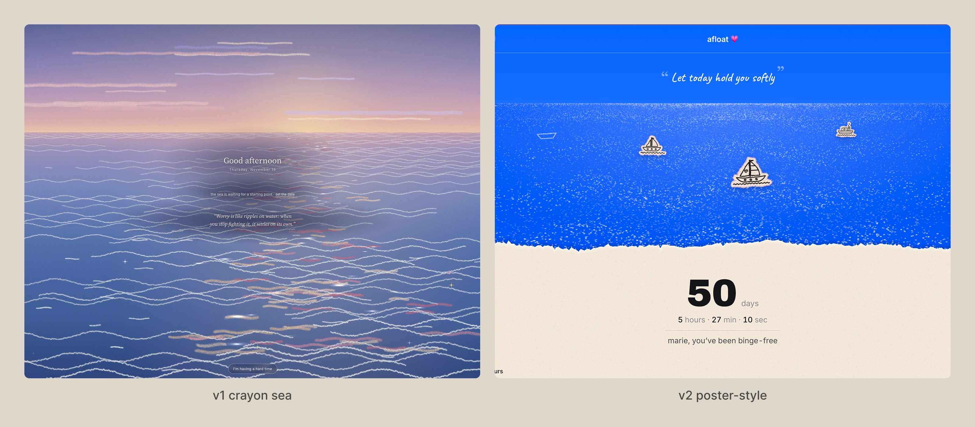
First / final result after iterating ui with Claude
Design decisions
Poster layout. About three quarters of the screen is the sea, one quarter is a light paper panel. The art can be calm and rich, and the numbers stay perfectly readable.

Mood board
Type: Archivo Black for the big number, Inter for everything functional, a handwritten font for the daily quote.
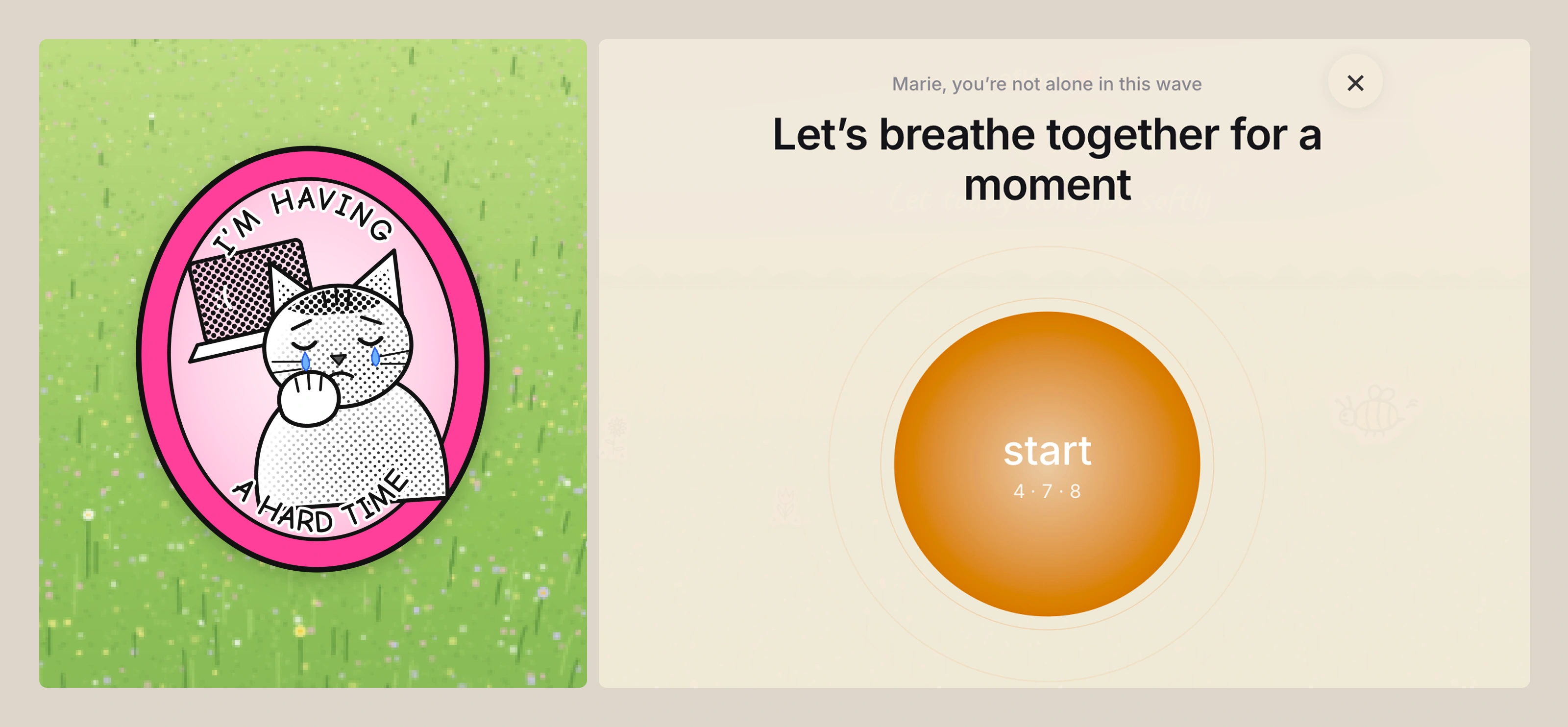
Palette: Cobalt and ultramarine, cream paper, white light on the water. One bright accent, pink, for kindness: insights and the hard-time sticker.
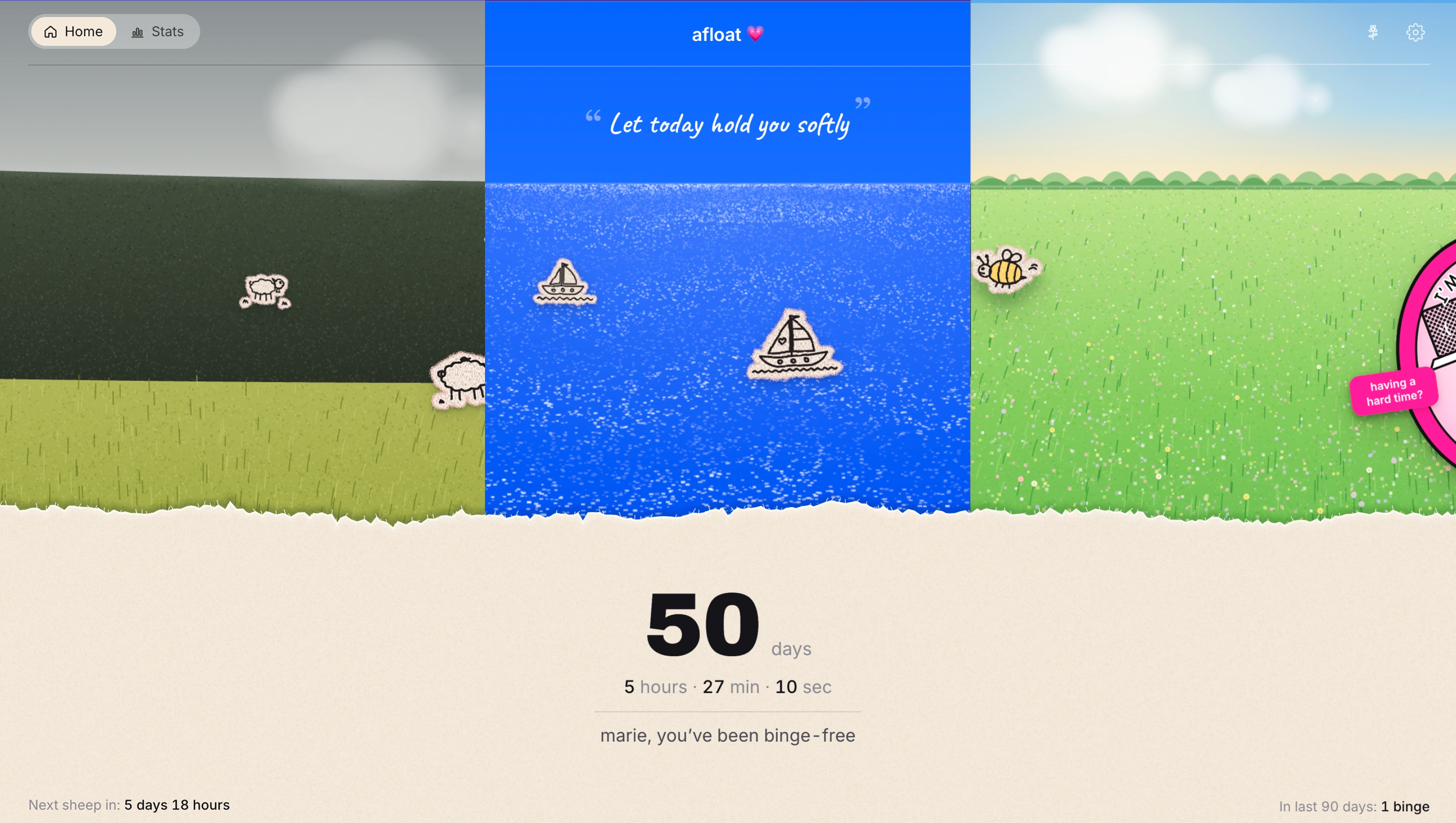
User can switch the themes of the interface
User experience through the year
Statistics without guilt. Stats show patterns ("Wednesday mornings are harder") to help plan care, never scores.
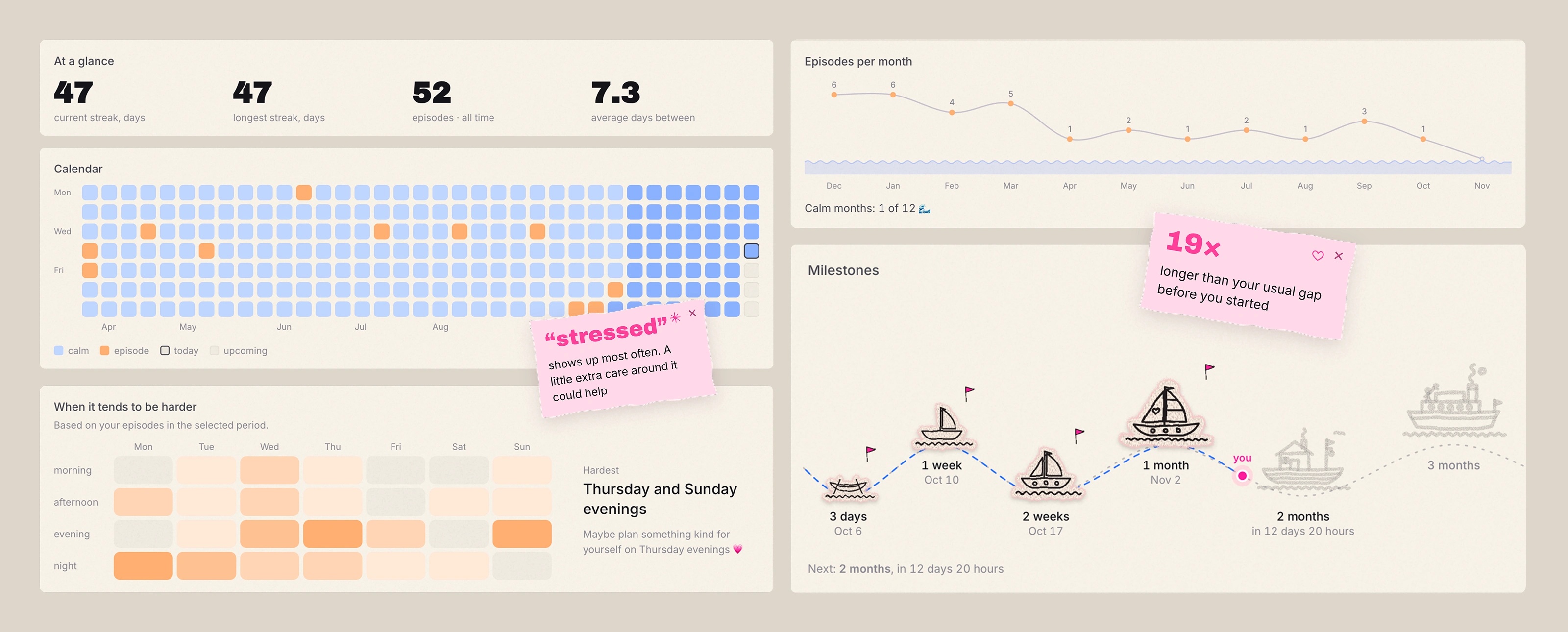
Dashboard
Stickers over icons. Boats, sheep, flowers, the cat: naive line drawings on fabric cut-outs. Imperfect on purpose, it lowers the pressure.
Building it without code
I didn't write code by hand. My job was to design, decide and describe precisely; Claude wrote the code and walked me through every setup step.
Claude: Turning ideas and references into prompts, writing the app, debugging from screenshots
Claude Code: Working directly in the GitHub repo: changes go to a branch, I check a preview, then merge
Figma: Layout mockup as the source of truth
Higgsfield: Generating the background sea illustration
GitHub: Project files and full history of versions
Vercel: Free hosting; every merge publishes the site in about a minute
Supabase: Accounts, email sign-in and the database, protected so each user sees only their own data
Scriptable: The iOS home screen widget
Outcome and what's next
The experiment worked: in a couple of days, bug fixing included, afloat went from an idea to a live, free app with accounts, three themes, stats and a widget. I use it daily myself.
What I learned:
AI makes building fast, but taste and decisions are still the designer's job. The quality came from references, mockups and precise feedback.
A sensitive topic shapes every detail: wording, color of an episode, where the reset button lives, privacy.
0 likes · 2 views · Nov 19, 2026
afloat — a free, calm web app for people recovering from compulsive eating. Instead of a harsh streak counter, progress is a quiet moonlit sea that slowly fills


