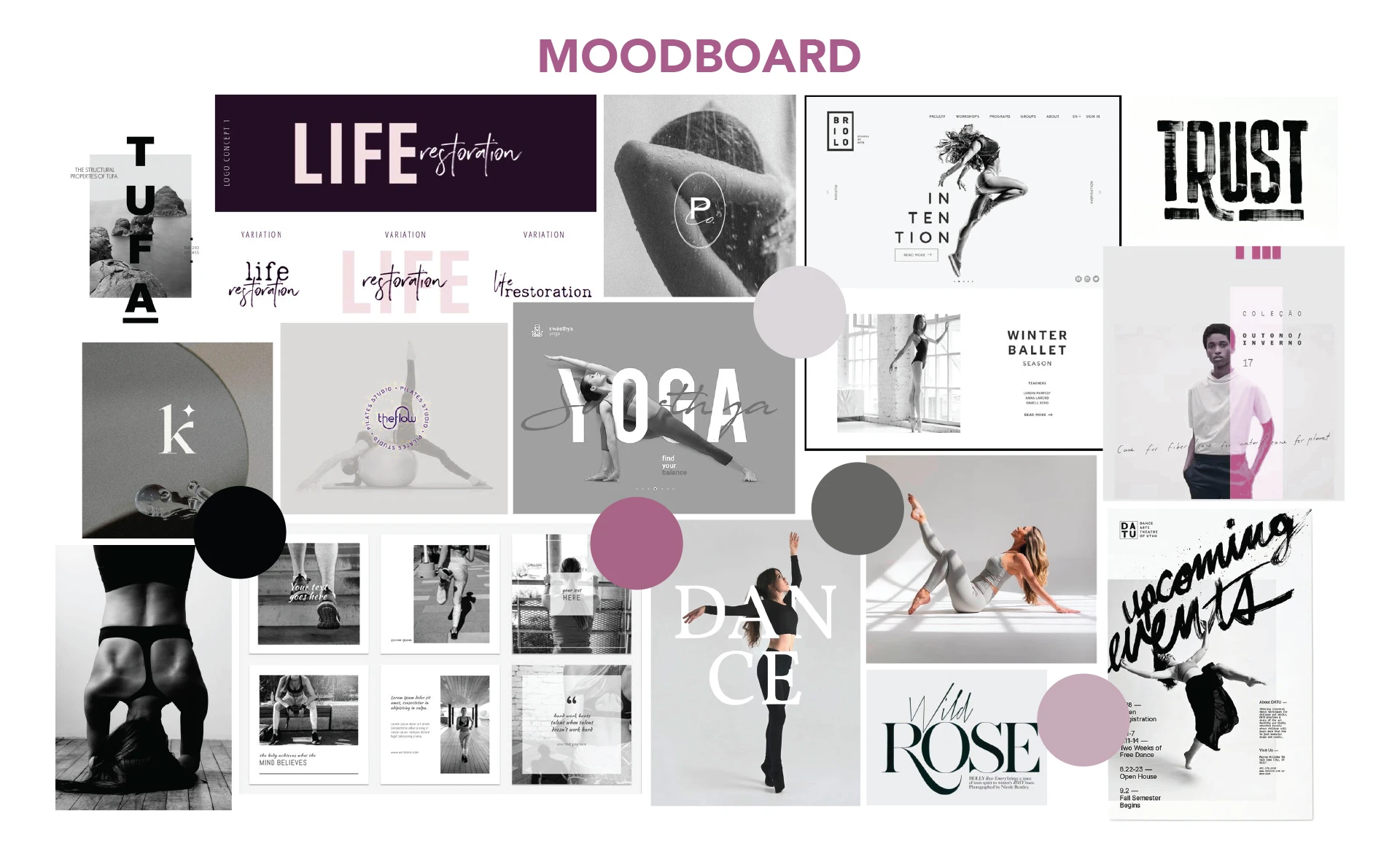
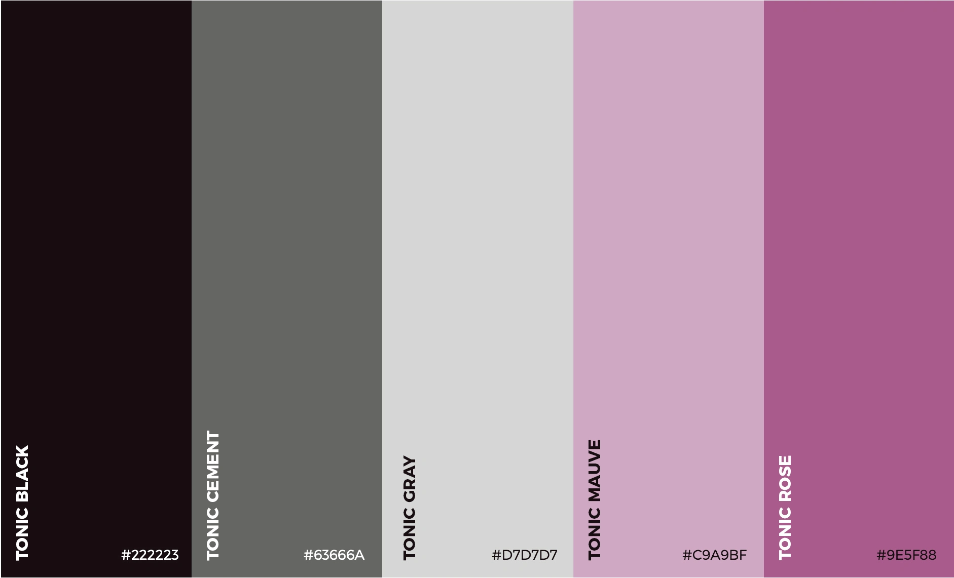
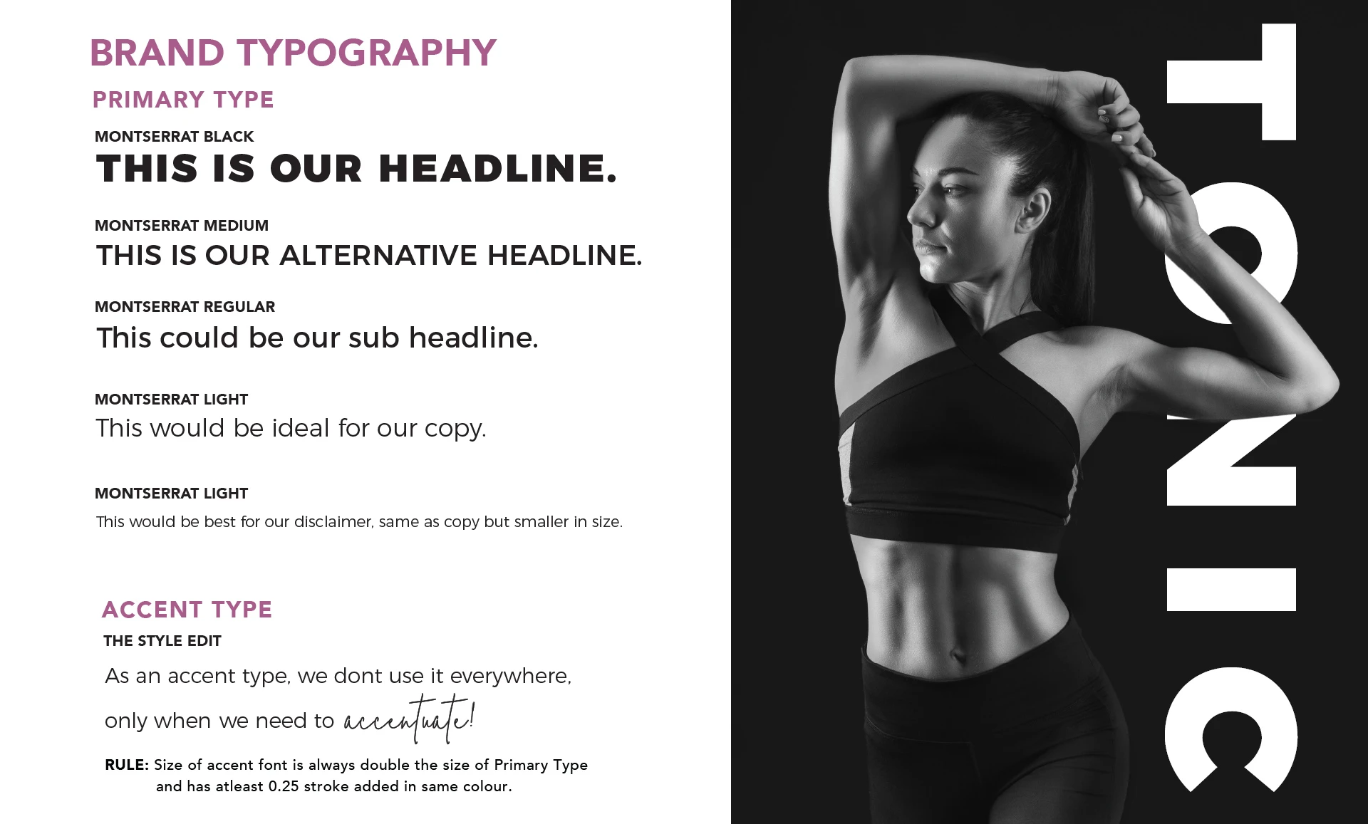
Tonic Method

Meld We Are


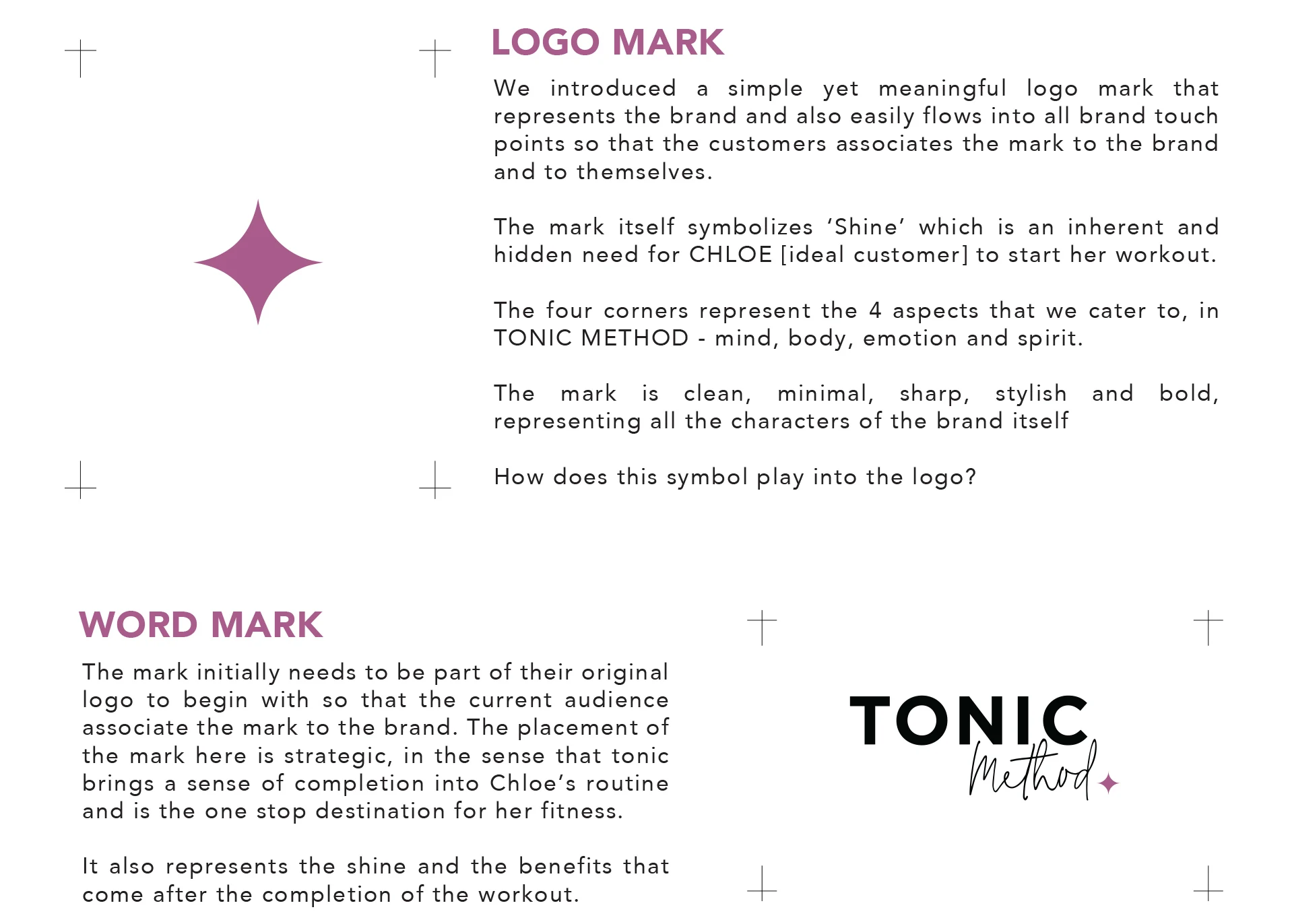
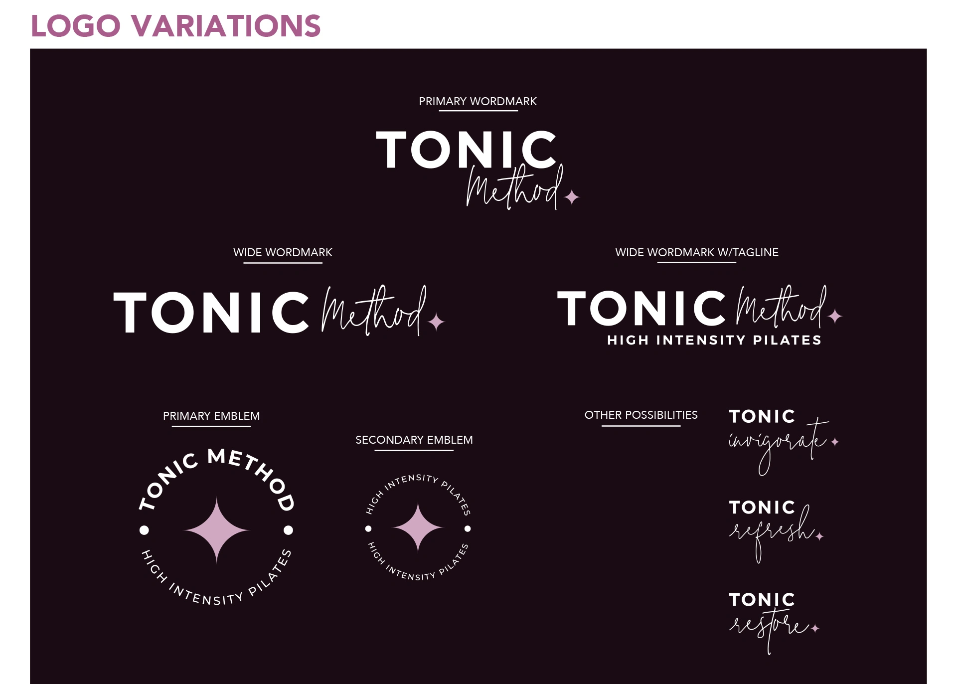
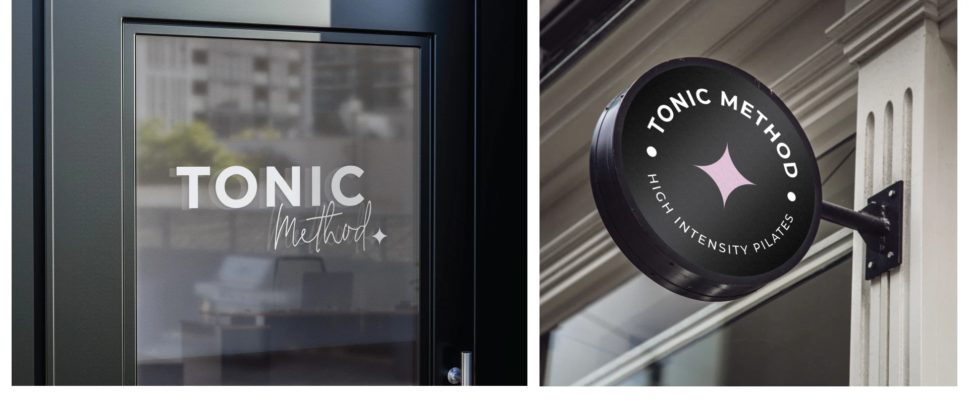
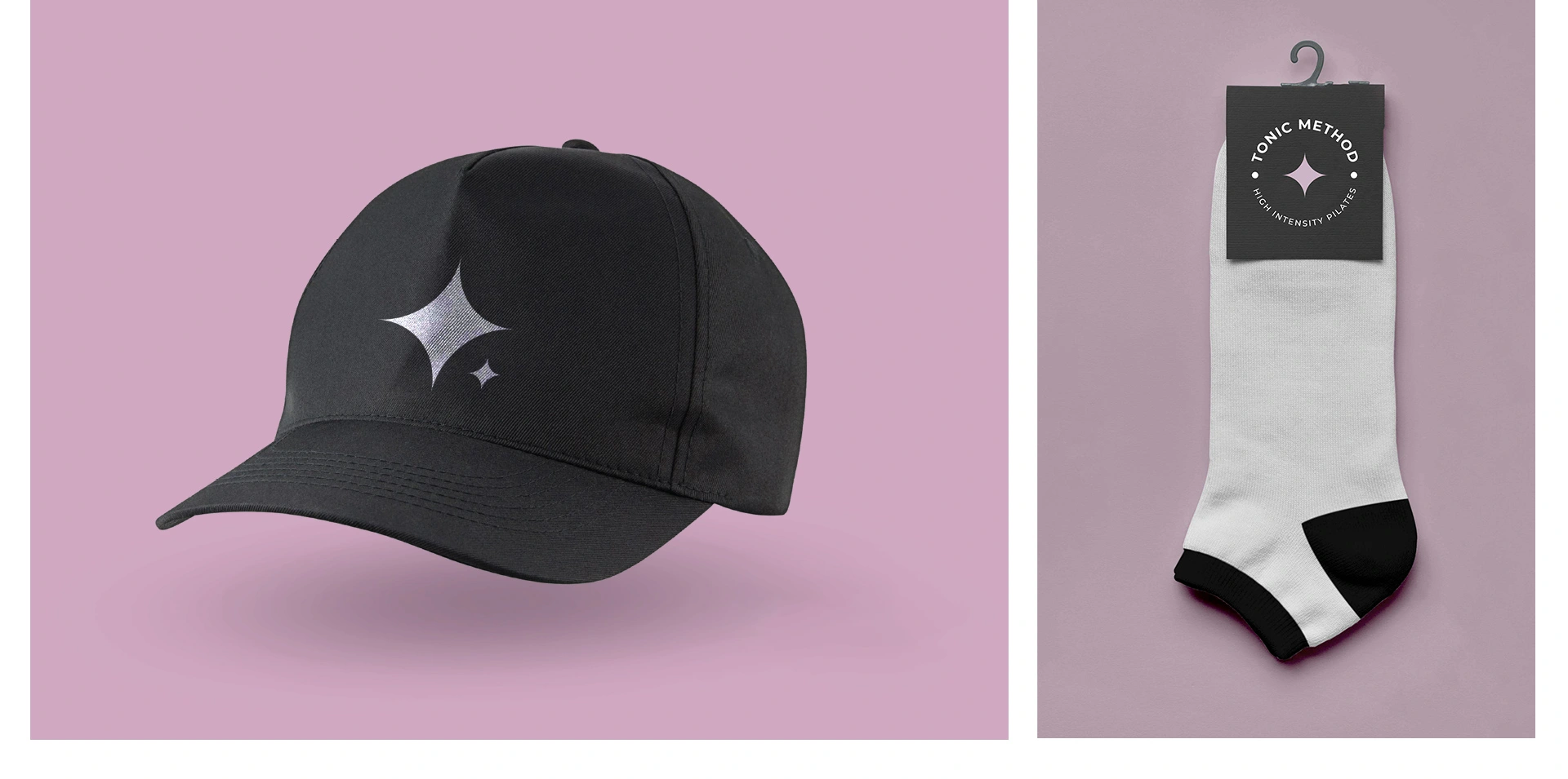
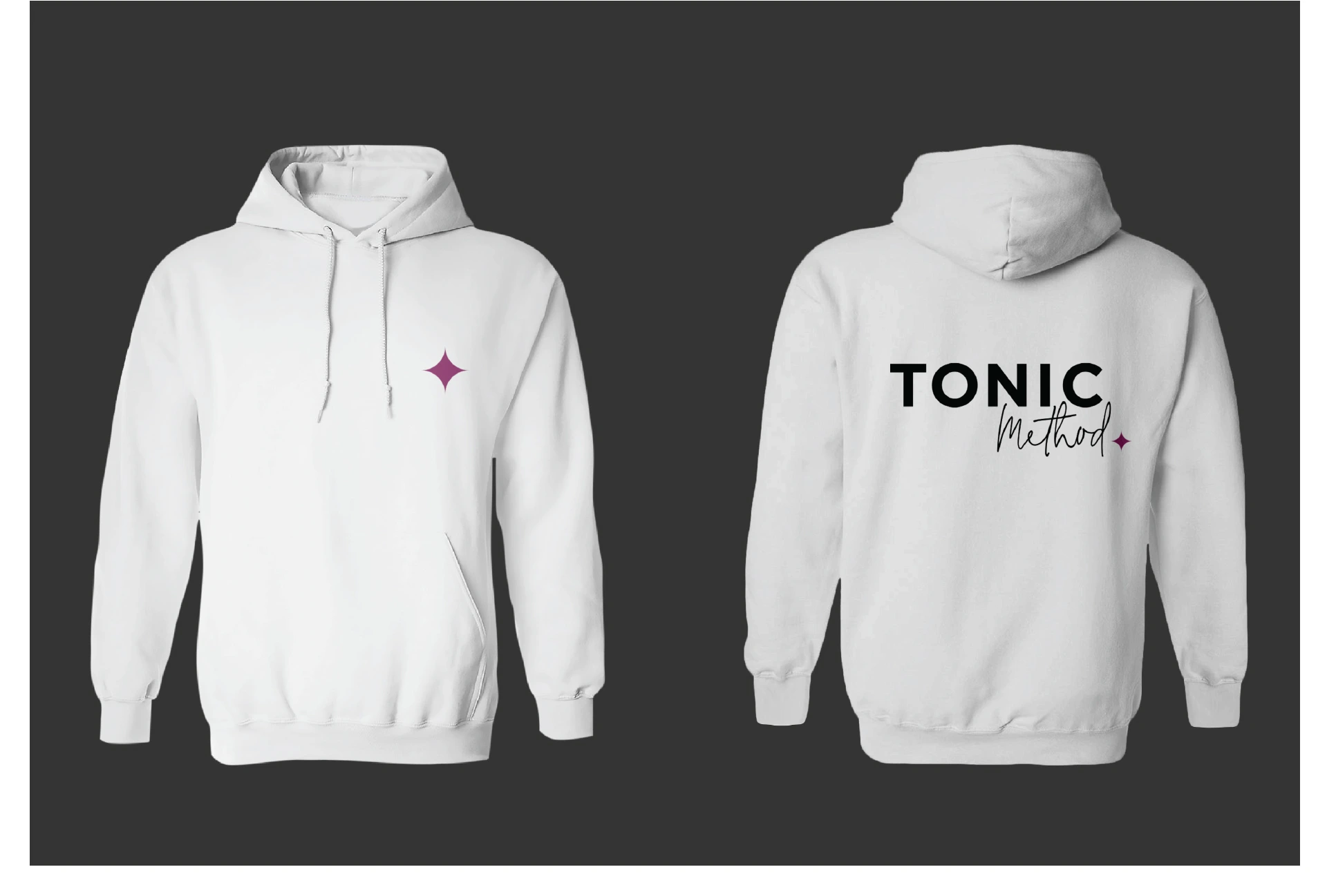
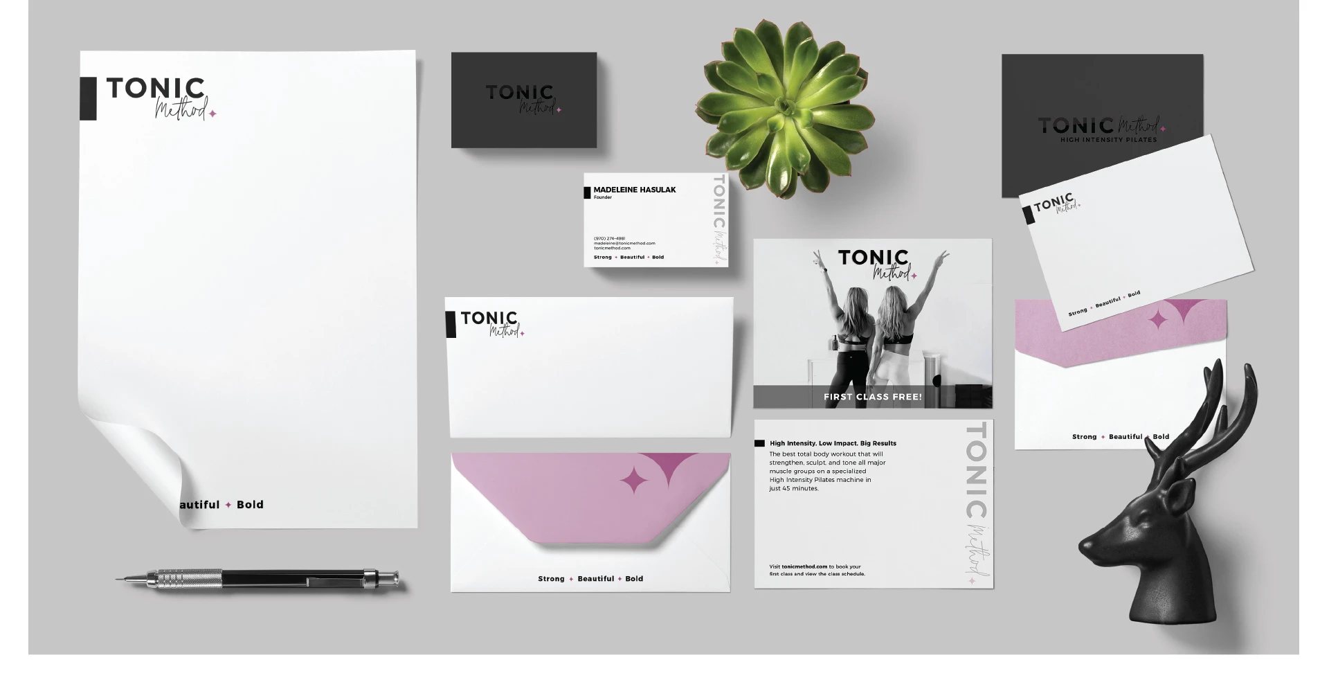
We introduced a simple yet meaningful logo mark that represents the brand and also easily flows into all brand touch points so that the customers associates the mark to the brand and to themselves.
The mark itself symbolizes 'Shine' which is an inherent and hidden need for CHLOE [ideal customer] to start her workout.
The four corners represent the 4 aspects that we cater to, in TONIC METHOD - mind, body, emotion and spirit.
The mark is clean, minimal, sharp, stylish and bold, representing all the characters of the brand itself
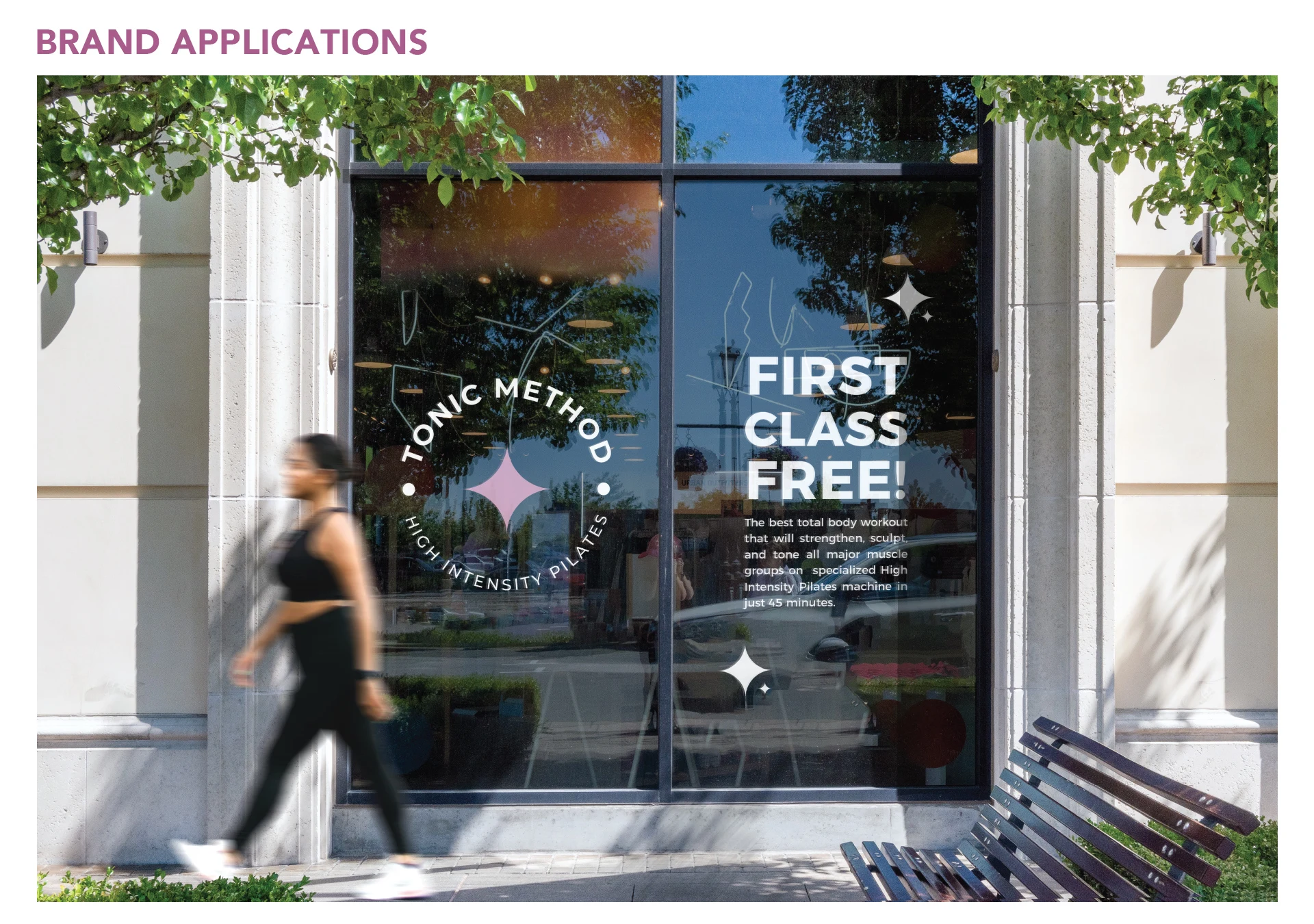
How does this symbol play into the logo?
The mark initially needs to be part of their original logo to begin with so that the current audience associate the mark to the brand. The placement of the mark here is strategic, in the sense that tonic brings a sense of completion into Chloe's routine and is the one stop destination for her fitness.
It also represents the shine and the benefits that come after the completion of the workout.
Like this project
0
Posted Apr 3, 2025
Tonic Method: High intensity pilates with passion and a twist. A streamlined brand identity, print and social media design, in collaboration with Jayshree
Likes
0
Views
0
Timeline
Aug 3, 2023 - Ongoing
Clients
Tonic Method


125 KPH | Brand Identity

Torri Living | Brand Identity & Website

What the Burger | Brand Design & Packaging Design

Studio Sculpt Brand Identity