Startup Landing Page Design
Boluwatife Delight
Startup Landing Page Design
Designed a minimal, conversion-focused landing page for a tech startup launching their product to early adopters.
The Challenge
The startup needed a single page that could clearly explain their product, build credibility with zero brand recognition, and drive waitlist signups before their full launch.
My Approach
Messaging Strategy: Worked with the founder to distill the product's value into a clear, scannable narrative
Wireframing: Structured the page in Figma with above-the-fold clarity: headline, subheadline, CTA, and product visual
Visual Design: Minimal aesthetic with generous whitespace, modern typography, and subtle animations
Development: Built in Framer with responsive breakpoints and optimized for fast loading
SEO: Configured meta tags, Open Graph data, and heading structure for organic discovery
Key Features
Clear hero section with value proposition and email capture form above the fold
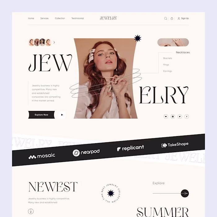
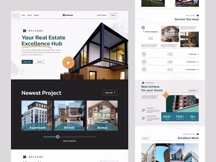
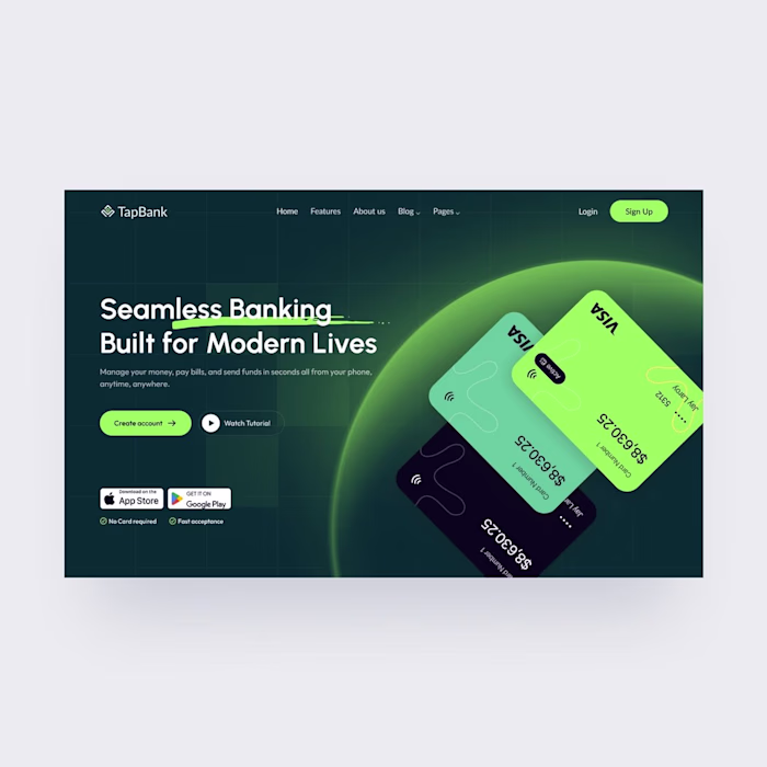
Product screenshot or demo section showing the interface in action
Three-column feature breakdown with icons and benefit-driven descriptions
Social proof section (early testimonials, press mentions, or user count)
FAQ section addressing early-adopter concerns
Sticky CTA that follows the user as they scroll
Fully responsive across all devices with mobile-first approach
Results
A clean, professional landing page that gives the startup instant credibility and converts curious visitors into waitlist signups.
Tools: Figma, Framer
Platform: Framer
Industry: Technology, Startups, SaaS
Services: Landing Page Design, Web Design, UI Design, Startup Website, Conversion Optimization
Like this project
Posted Nov 6, 2025
A modern landing page designed in Framer for a startup. Minimal layout with strong visual hierarchy, optimized for conversions and fast load times across all devices.
Likes
0
Views
2
Timeline
Sep 1, 2025 - Sep 20, 2025