Air Canada Booking Flow Redesign
Jetsetter Designs
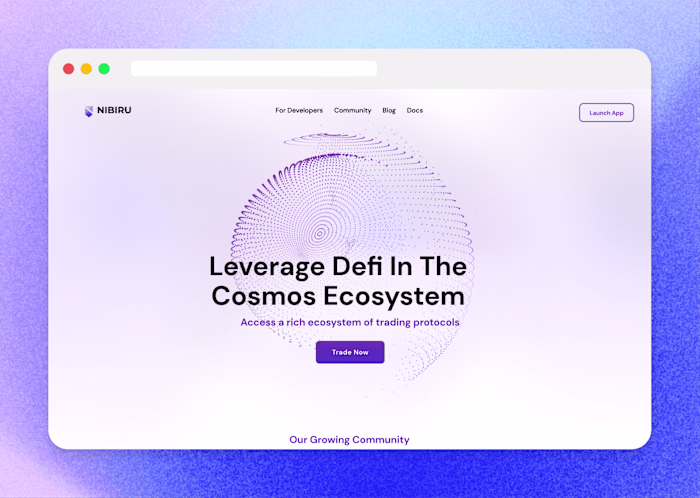
AIR CANADA
48 million users. Tight deadlines to optimize how they book flights.
Role
Digital Product Designer.
Research, strategy, visual design, and design system
Duration
2 Months
2024
Team
16 designers (incl me)
Product Managers
Engineering (50+ full-stack)
Industry
Aviation
The Problem
Air Canada's designs were not optimized for collaboration. Nothing was interactive. And the team needed to move.
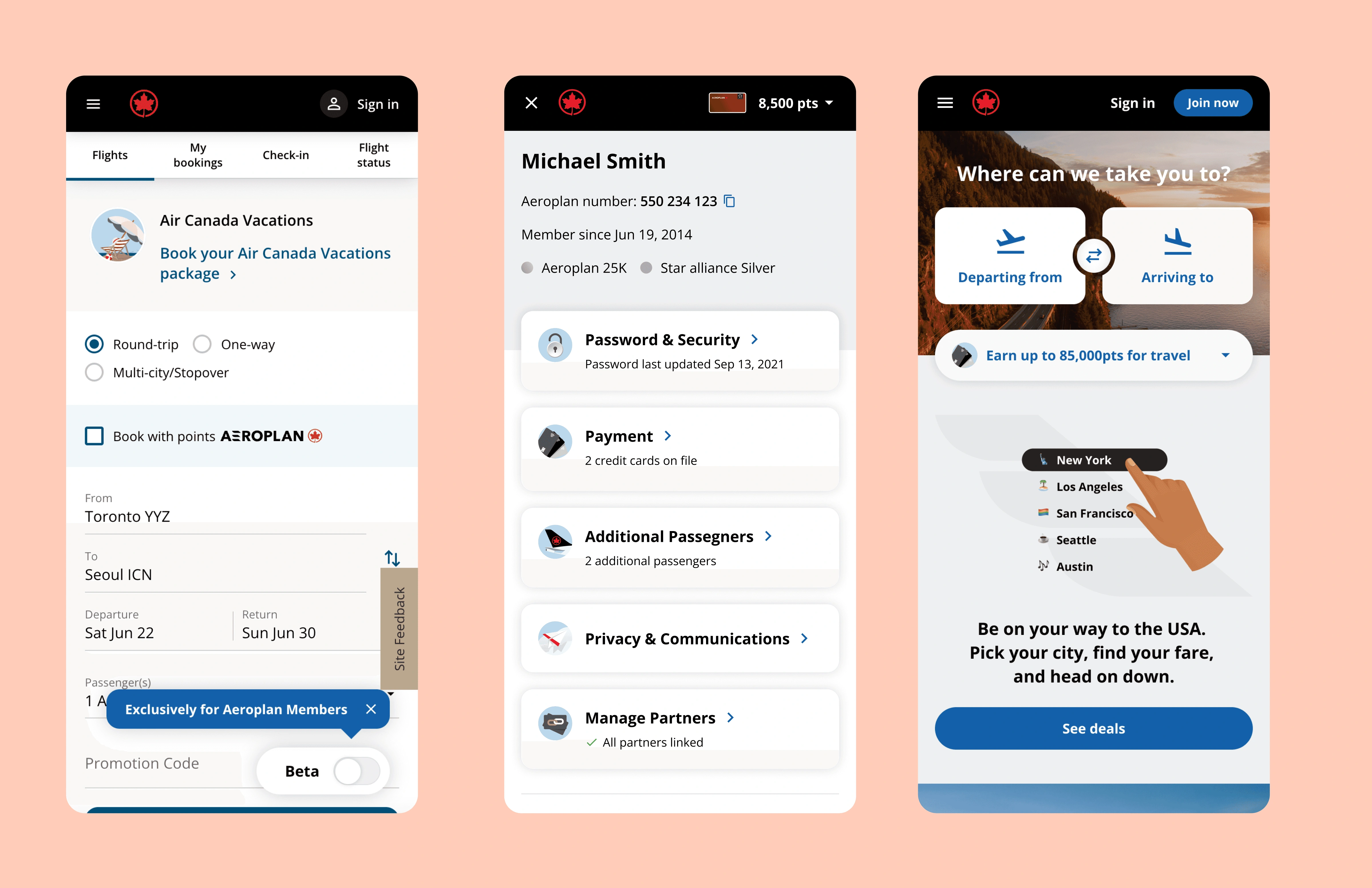
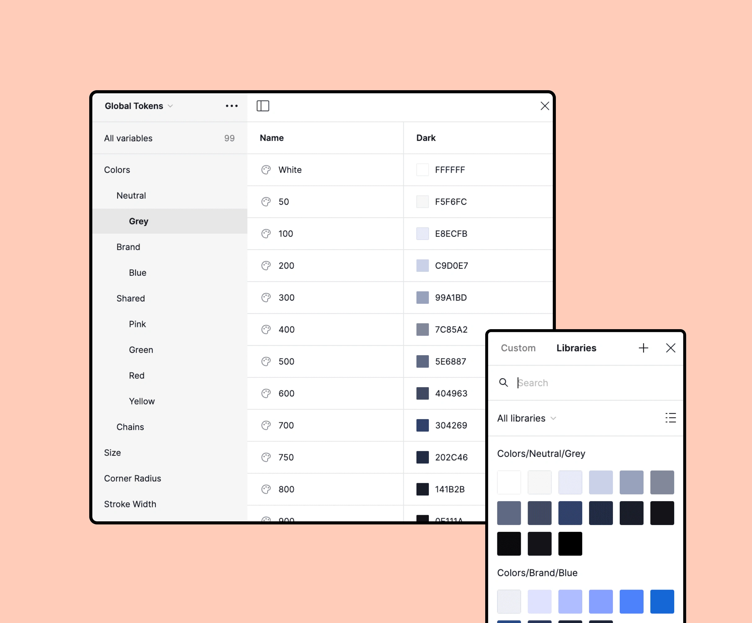
Air Canada's design team had built the entire booking experience in Sketch, an outdated tool. My task was to spearhead a design system, flows & develop initial screens in Figma to help align stakeholders, product teams, test flows, or hand off to engineering with confidence. The booking and shopping flow search, select, seat, pay is the heartbeat of the product. 48 million people use it. It needed to be in Figma and it needed to be better than what existed.
Outcome
I rebuilt the entire booking and shopping flow from the ground up.
The booking flow covers every touchpoint from flight search through to payment confirmation. I rebuilt each screen in Figma with updated component structure, alignment with the design system team's standards, and modern layout conventions. Every screen that went in came out cleaner than what existed in Sketch.
Everything was in Sketch. Nothing was interactive. And the team needed to move.
Air Canada's design team had built the entire booking experience in Sketch, a tool that doesn't support the kind of interactive prototyping modern product teams need to align stakeholders, test flows, or hand off to engineering with confidence.
Strategy
Migrate the foundation and modernize everything that deserved to be better.
I treated the migration as a design audit rebuilding with current interaction patterns and industry conventions where the old approach had aged.
I rebuilt each screen in Figma with an updated component structure, alignment with the design system team's standards, and modern layout conventions. Every screen that went in came out cleaner than what existed in Sketch.
Phase 1 : Rebuild
I didn't just rebuild what was there. I updated it to reflect how people actually shop for flights today.
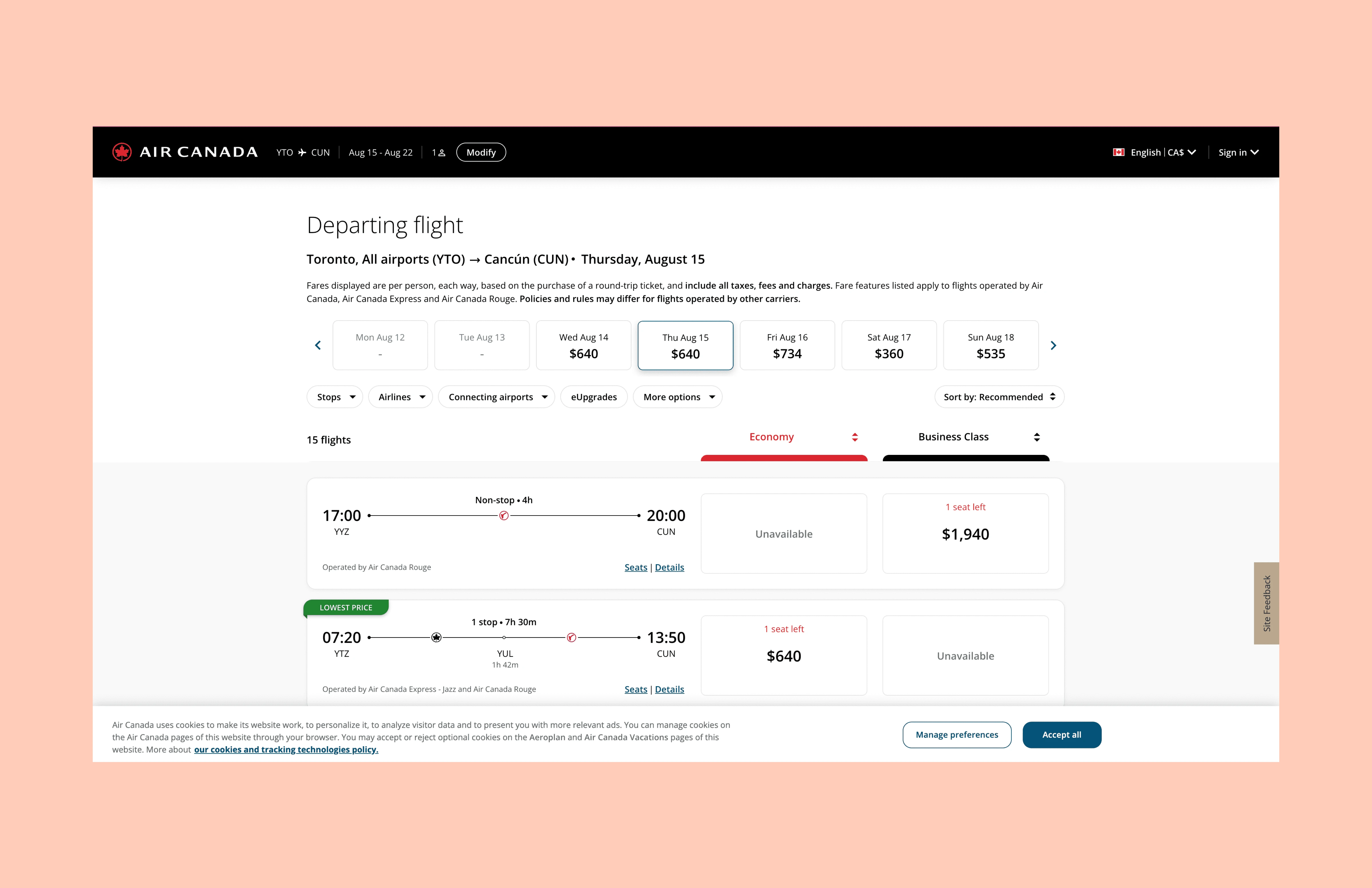
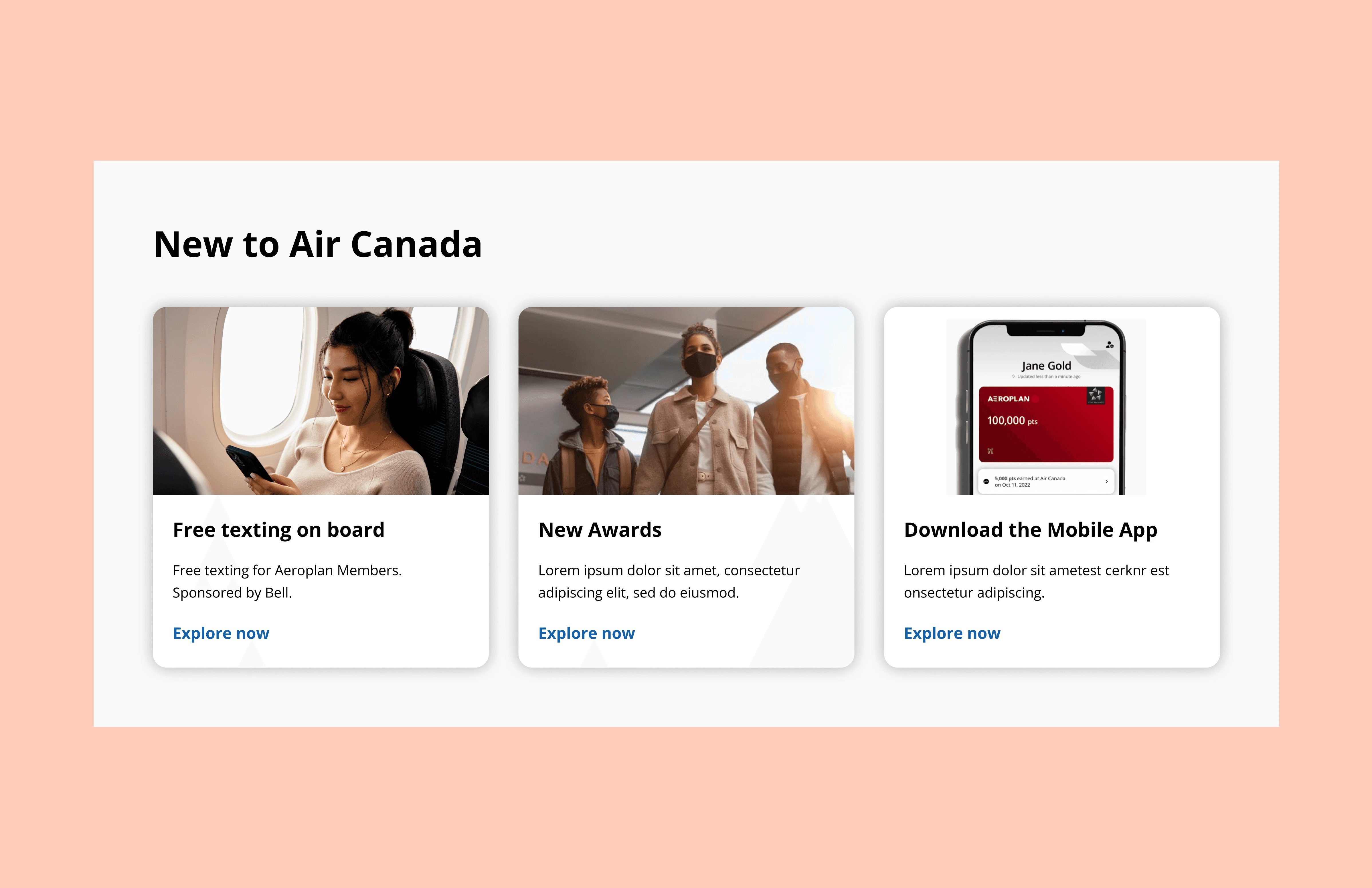
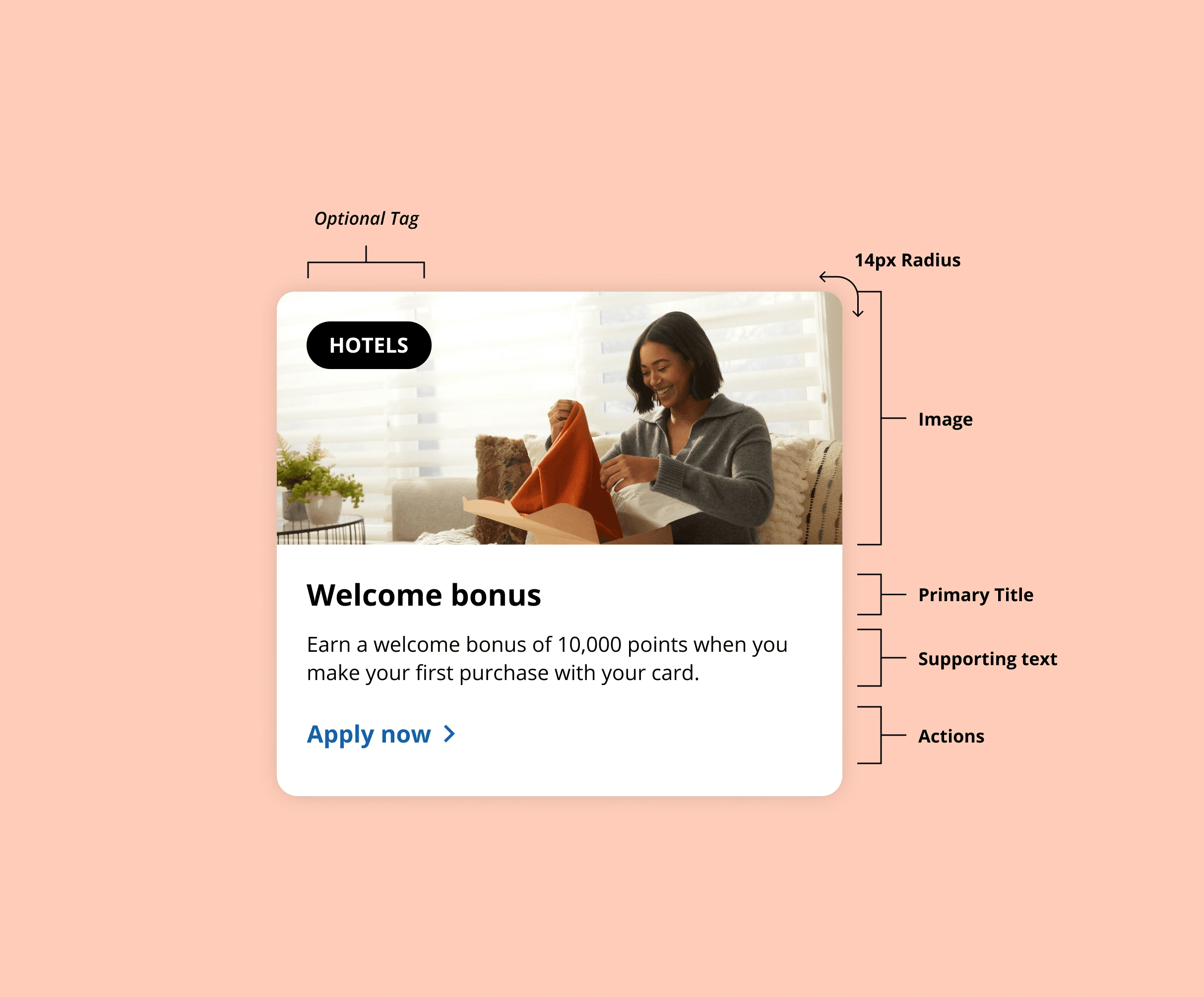
During the rebuild I applied current industry patterns clearer fare tier comparison, improved visual hierarchy in search results, more legible state design for the seat map. Every update was cross-referenced with Air Canada's design system to stay on brand.
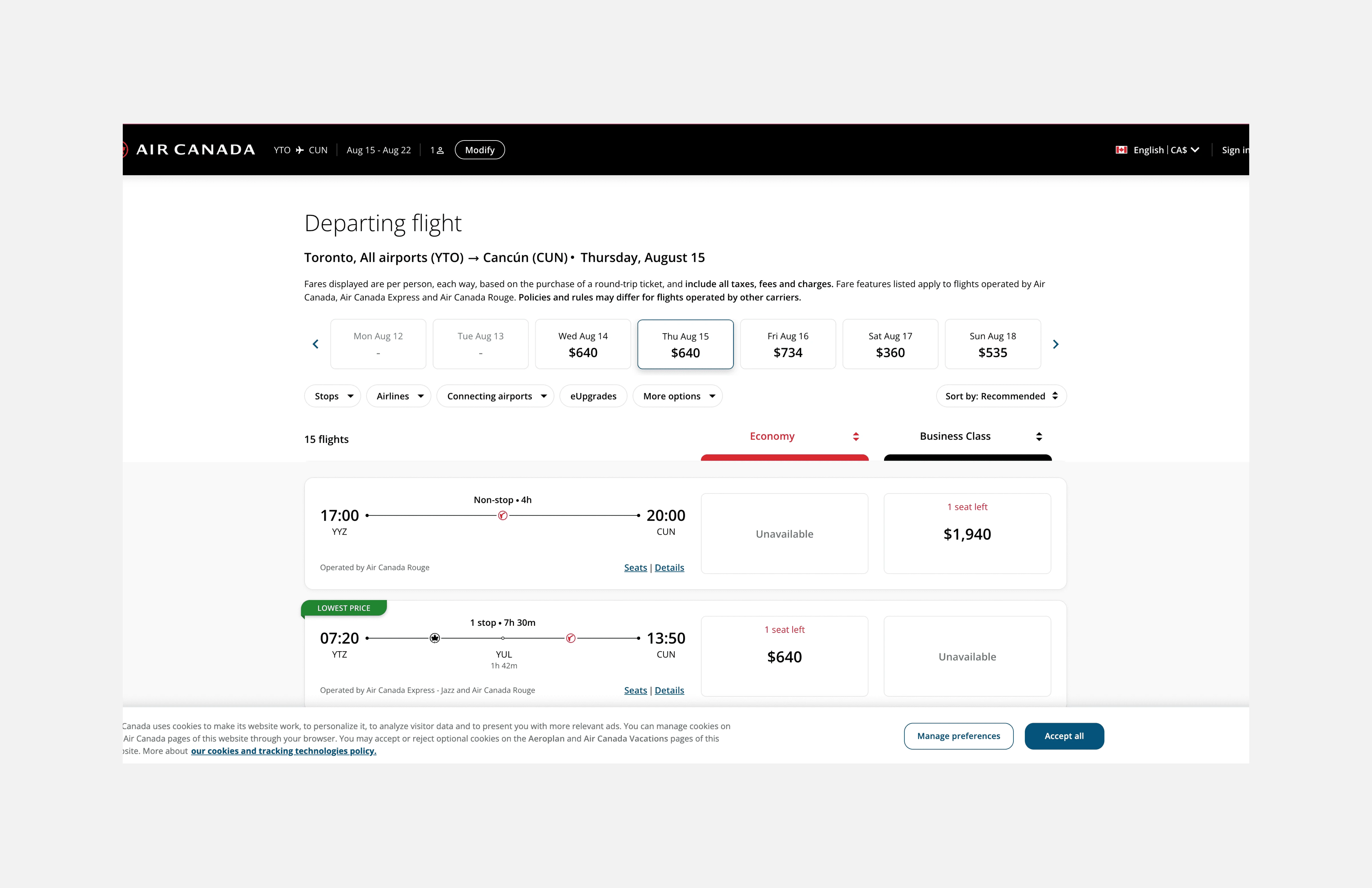
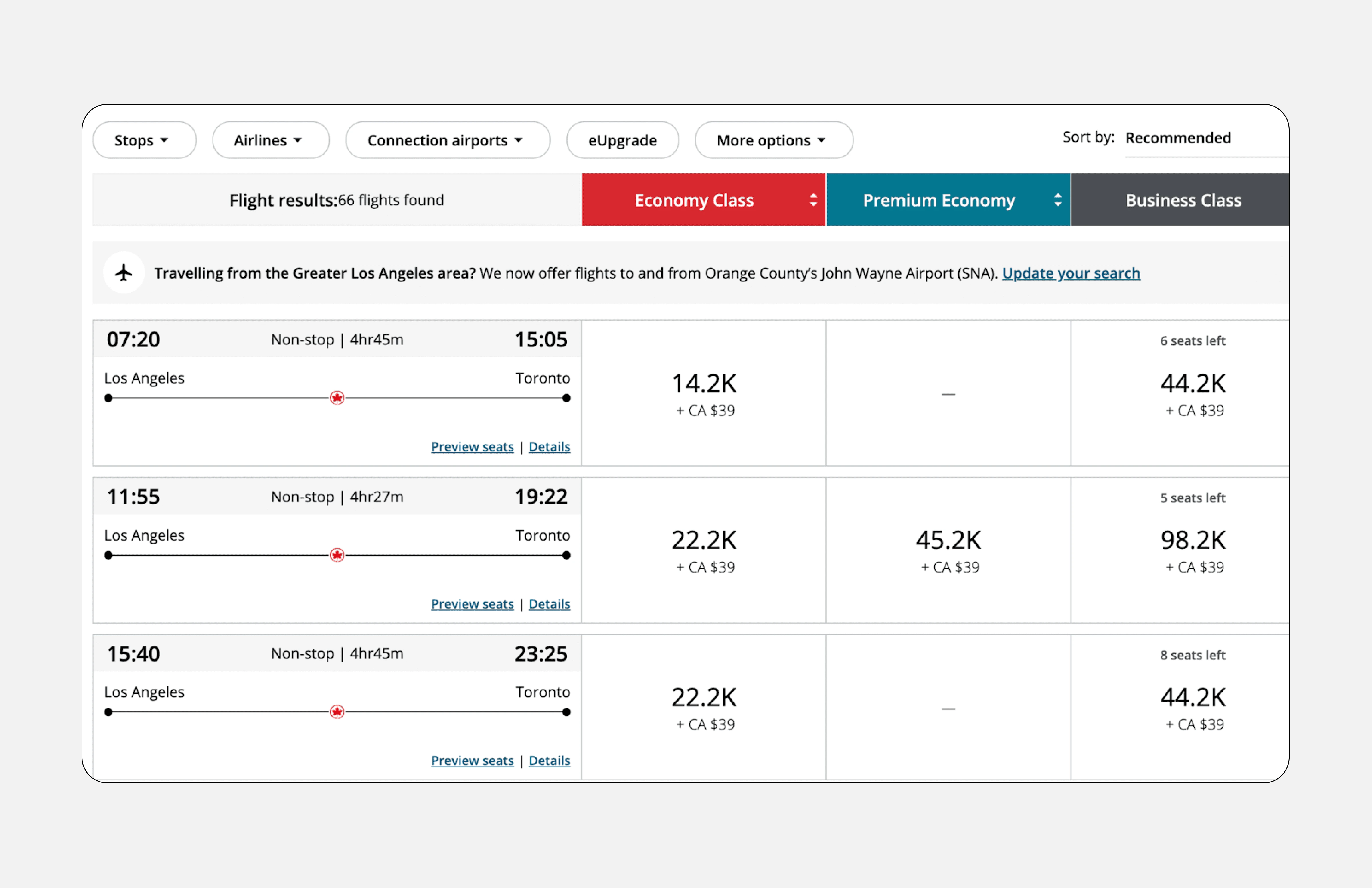
Before
After
Enhancing the user experience by:
Defined economy and business class section
Adding "lowest price" tag
Opportunity for users to share feedback
Adding price calendar (allows users to compare prices based on date)
Like this project
Posted Jun 6, 2026
Redesigned Air Canada's booking flow for improved user experience and collaboration.
Likes
0
Views
1