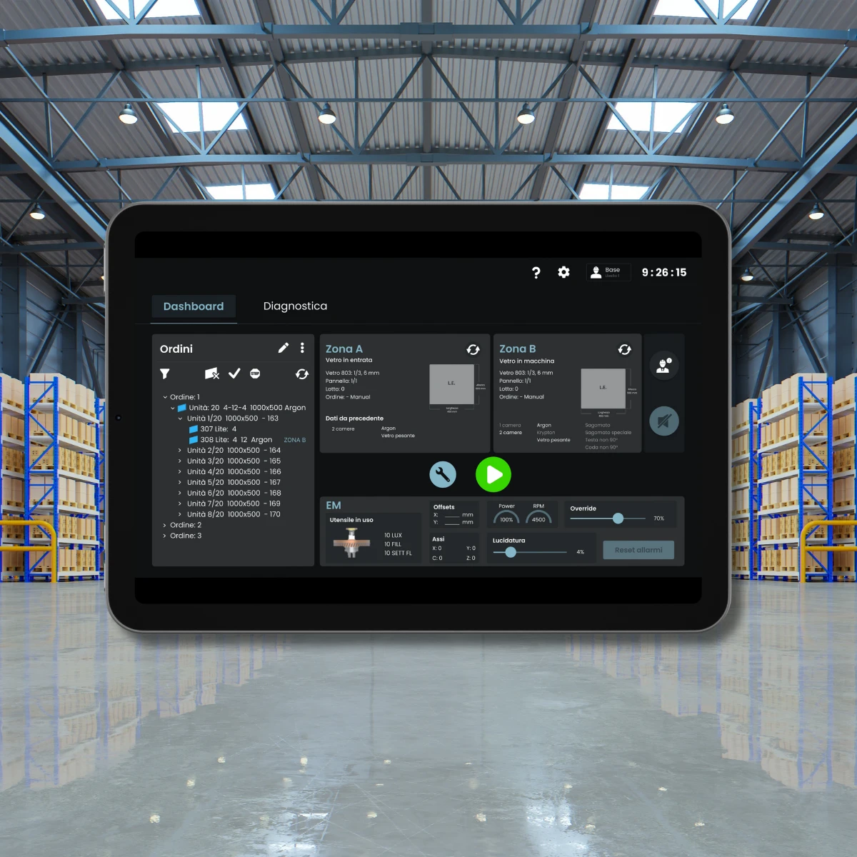
Human Machine Interface in Industrial glass edging process
Work flow
This project was managed through a Google Design Sprint. The process ended with a presentation of the job done to the client.
Preview
In an environment where operators need to work with heavy industry, panic does not help at all. Machinery can present problems and it is important to identify them immediately to prevent the entire industrial process from blocking, leading to an unnecessary waste of time and material. The company I worked for asked to find a way to make the error screens more explicable to resume the industrial process quickly when, for example, the glass loaded is the wrong one or it breaks. The machines can be commanded by using an HMI.
These machines can be used by highly specialized operators and new employees both. Because of this, the goal was to simplify the interface so that everybody can learn how to use it and, above all, to focus on the efficiency of the work process: a trivial mistake cannot block it completely and everybody needs to know how to solve them. The main problems lacked obvious system visibility, and lack of help to our users into recognize, diagnose, and recover from errors.
Research & Evaluation
After some interviews to the real users of this HMI, an evaluation based on heuristics and contextual inquiries, the problems were many:
overcrowding of datas in the interface;
some sections are difficult to find;
lots of steps for doing some actions;
Furthermore, this HMI is placed in a very noisy environment that can leads to a worsening of a dangerous situation and to a more difficult problem solving.
Design
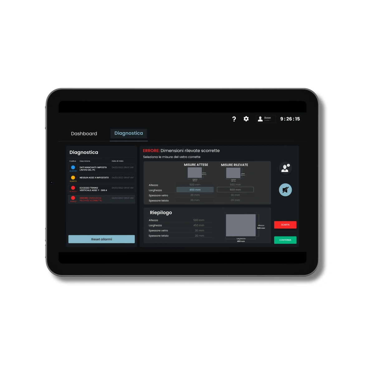
Regarding the Home page, during the thinking aloud it is observed that operators send real glances at the screen, do not stare at it, therefore the content of this section has been managed in a way they could find the information quickly. The screen is divided into two tabs: dashboard and diagnostics. Furthermore, it is given more visibility and priority to the diagnostic (now it has its own section) because users have complained about it.
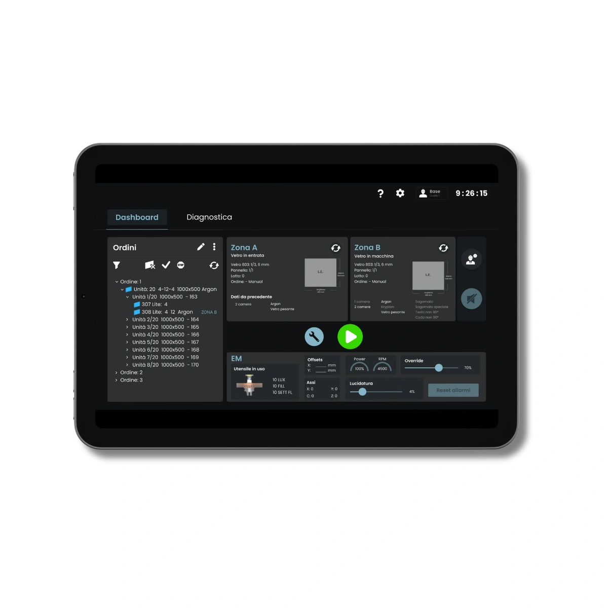
This proposal tries to notify the user in a more evident way that an error has occurred and immediately afterward we suggest how to solve it clearly. We have also given a hierarchy (within the dashboard/interface) to the data and buttons. You will notice that in this solution the goals was also not to add further steps and not to deviate too much from the pre-existing solution but only to simplify the interaction.
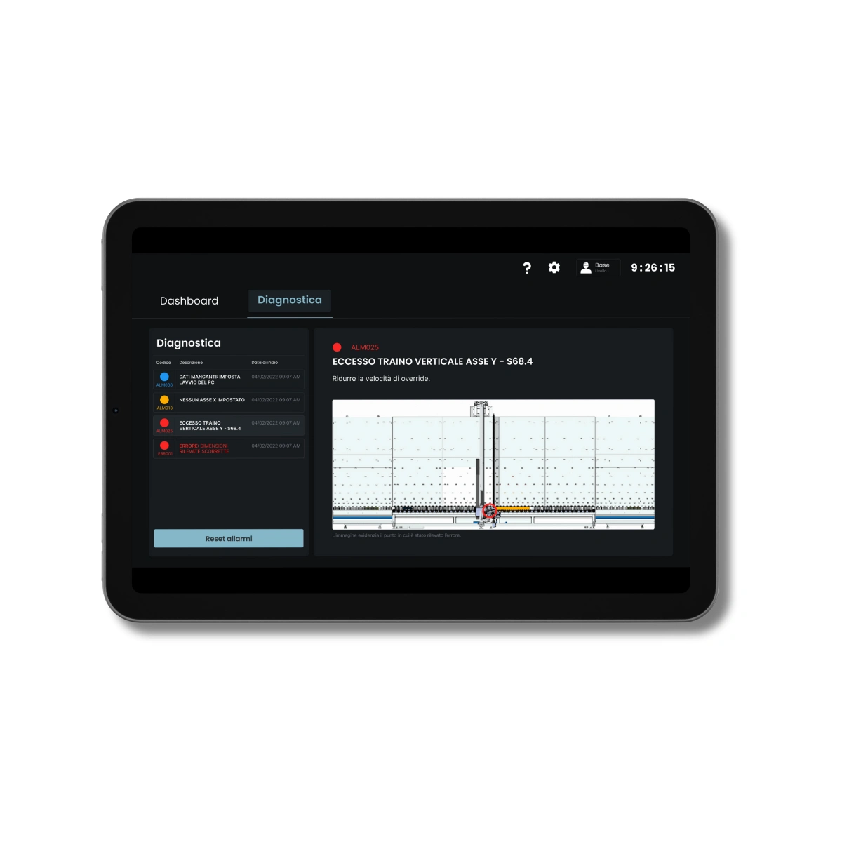
The final step is to make understandable why an error is occured. Tapping on the error will open an alert with every information needed (based on users' feedback). Every quick action is displayed on the right, in order to make them easier to tap to the operators.
Feedback
This project was a success! The client was very satisfied with the outcome and decided to continue this User Experience study, creating a team dedicated to that in the company. From my point of view, I have learned a lot, that was such an amazing experience under every aspect: talk with the client, carry on user research and evaluation of the actual interface, design following gathered data.
Like this project
Posted Jun 18, 2024
HMI Redesign


