High-Impact Fintech Wesbite that Converts

Danijela Drcelic


Client overview
A fast-growing fintech startup approached me with a clear mission: redesign their marketing website to better reflect their cutting-edge technology and dramatically improve conversion rates. Although the company had a strong product offering in the financial automation space, its existing website felt generic and failed to communicate its unique value to potential enterprise clients. They needed a bold, modern, and conversion-focused design that could scale with their rapid growth.
The challenge
The client’s old website presented several pain points that were hurting their marketing and sales efforts:
Lack of Visual Identity: The design was too templated and failed to differentiate the brand in a highly competitive fintech landscape.
Low Conversion Rates: Visitors weren’t engaging with CTAs, and drop-off rates were high on pricing and product overview pages.
Outdated UX Patterns: Navigation was inconsistent and didn’t support the buyer journey, especially for enterprise customers.
Static and Lifeless Presentation: The absence of motion and interactivity made the product feel less dynamic and innovative than it truly was.
Poor Mobile Performance: Mobile responsiveness was limited, alienating a segment of decision-makers browsing on the go.
My role
Brought in as the lead product designer, I was responsible for:
Running stakeholder workshops to align the redesign with business goals
Creating a high-conversion website architecture tailored for fintech buyers
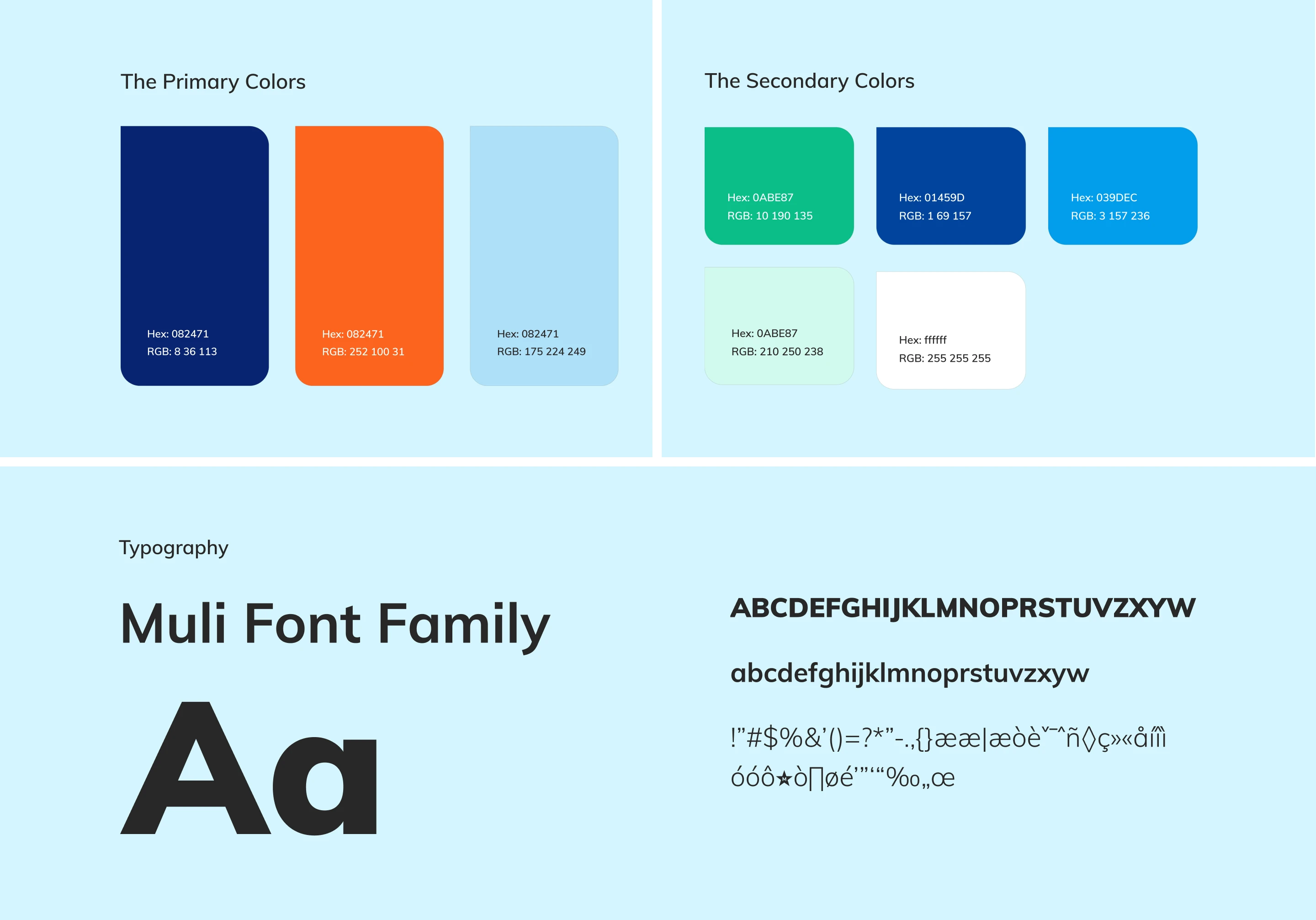
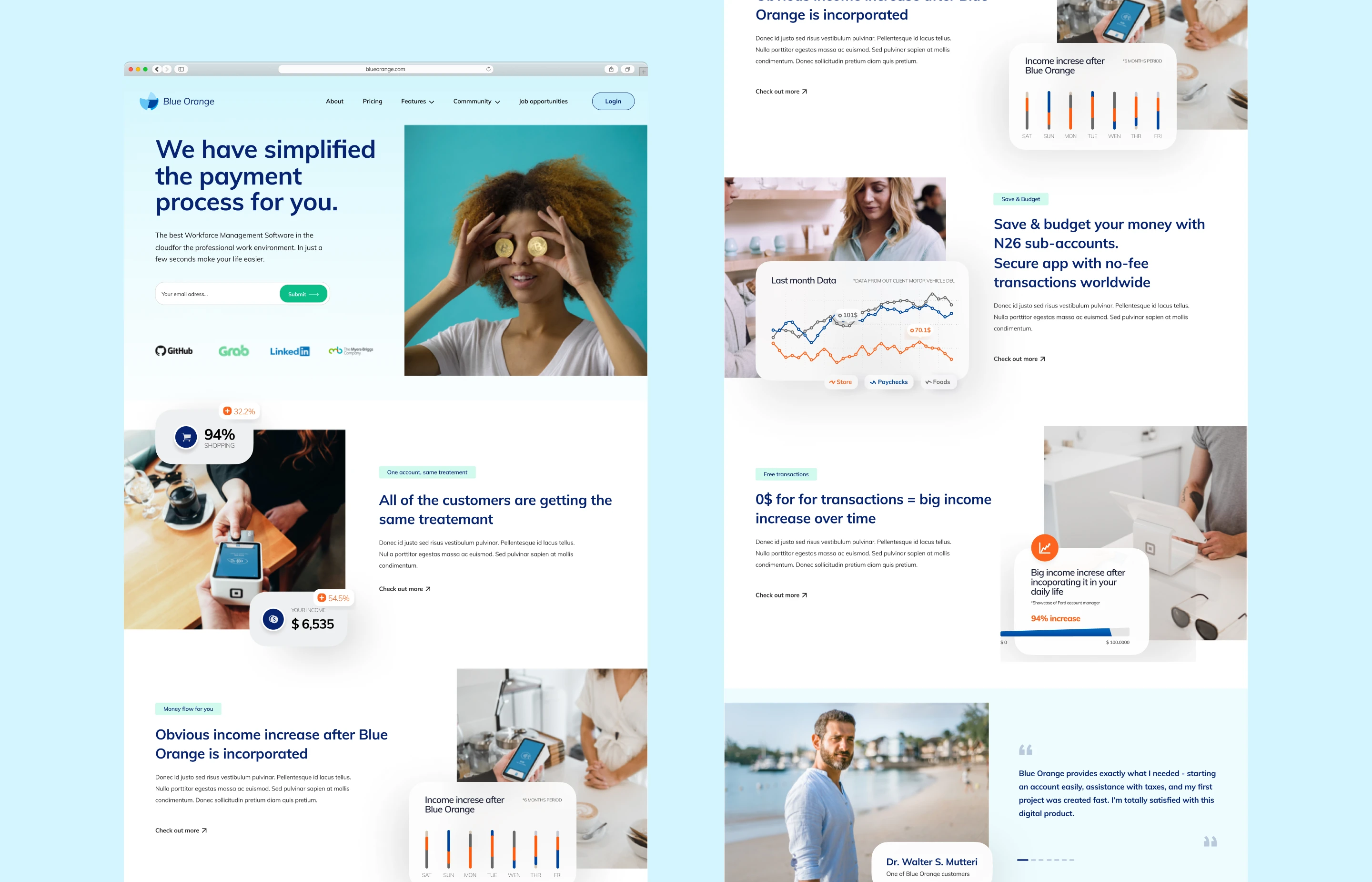
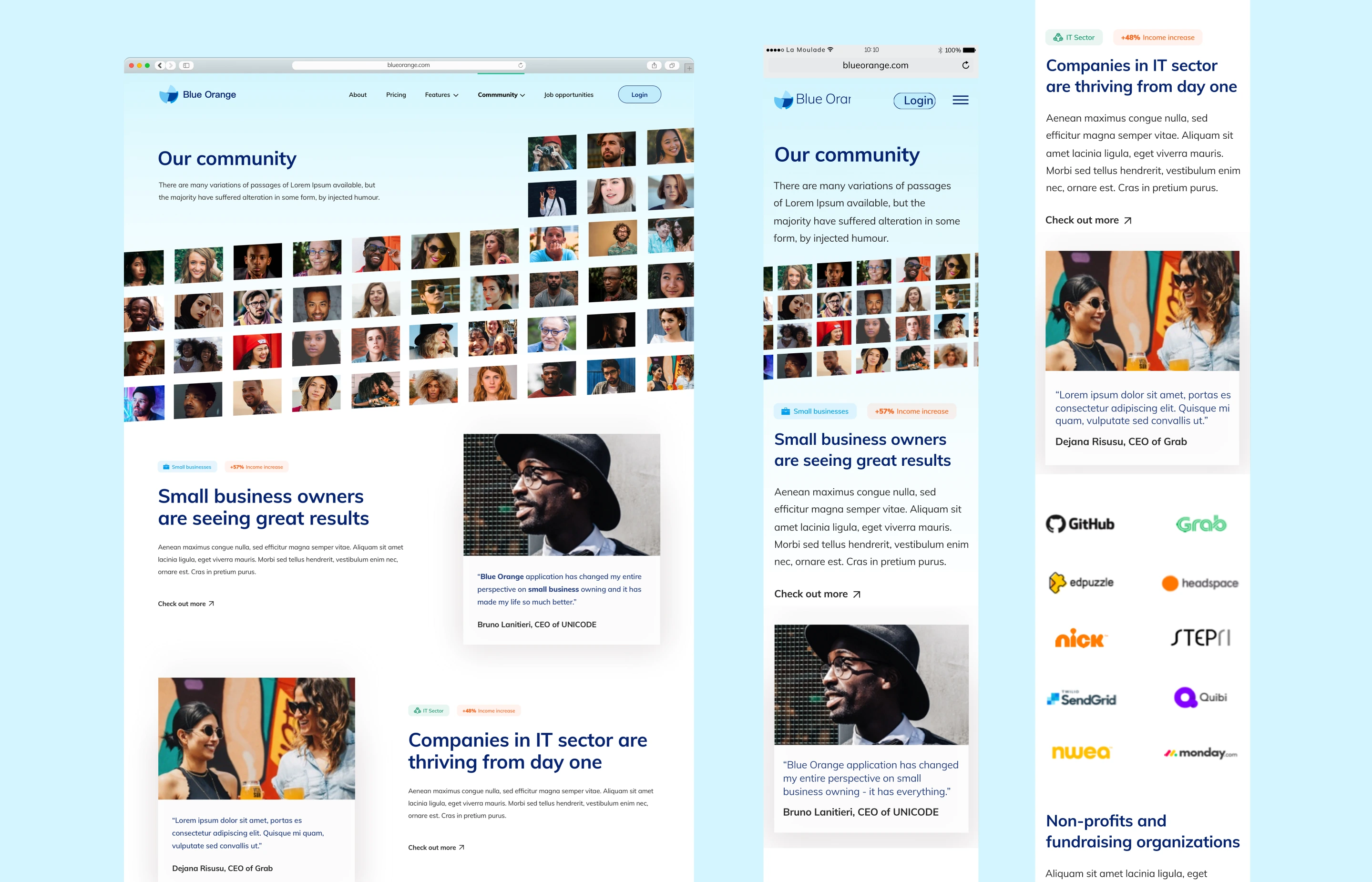
Designing a modern visual identity with light blue accents that communicated trust, innovation, and clarity
Using Figma to craft modular, scalable components for future growth
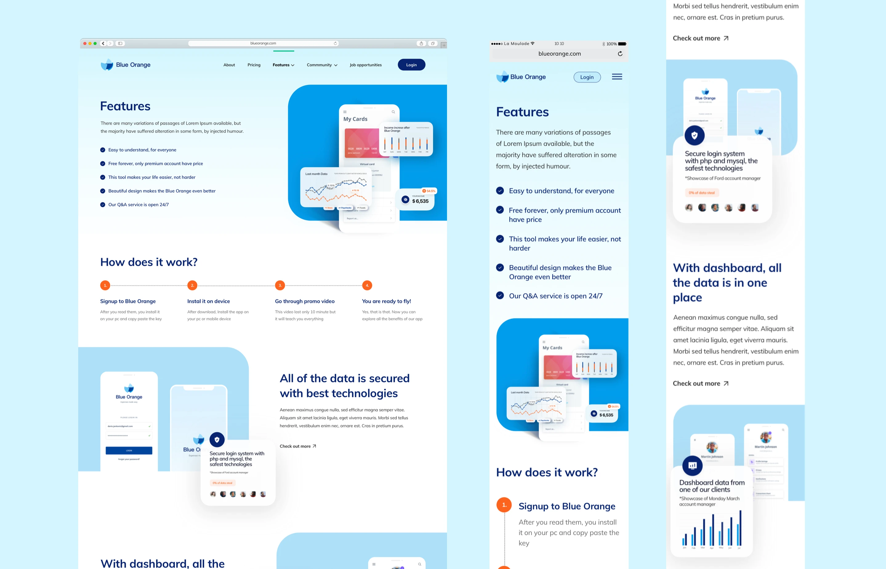
Integrating subtle Jitter animations to add interactivity, guide user focus, and increase engagement
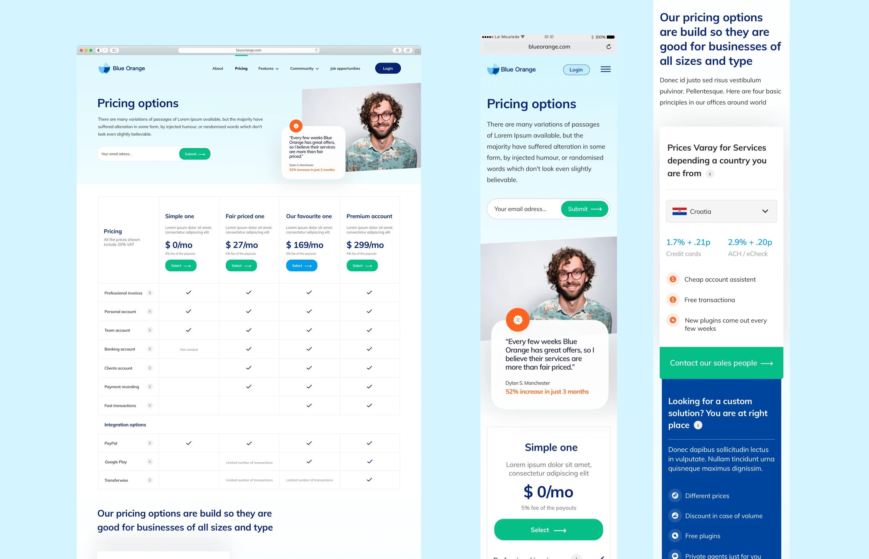
Crafting high-converting landing pages for product, pricing, and demo booking
Supporting the development team with responsive specs and animation guidance
The process
The redesign was approached in iterative sprints, balancing speed with strategic refinement:
1. Research & Strategy
I conducted a competitive audit of modern fintech brands and analyzed analytics data to pinpoint where users were dropping off. I also mapped the customer journey from first visit to demo booking to identify the most critical interaction points.
2. UX Architecture
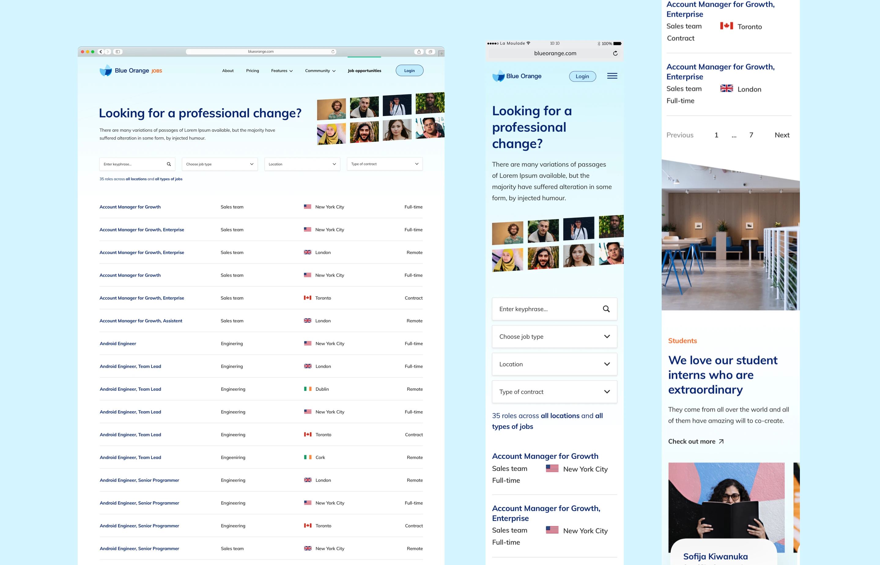
I restructured the site’s navigation and page flow to reduce friction and guide users toward high-value actions—like “Book a Demo” and “Start Free Trial.” The new architecture supported both quick scanning and in-depth exploration.
3. Visual Design & Prototyping
The visual system was built around a light blue core palette, paired with clean typography and generous whitespace to convey calm confidence. I used Jitter for lightweight animations—like animated icons, hover states, and scroll-triggered transitions—to add personality and polish.
4. Design System in Figma
I built a robust component library in Figma, enabling the team to create new pages quickly while maintaining design consistency. Variants and auto-layouts were used extensively for flexibility and responsiveness.
5. QA & Launch
I worked alongside developers to ensure smooth implementation of animations, responsiveness, and performance optimization, especially on mobile.
Results & impact
+96% increase in conversion rate on the homepage within two months
-62% drop in bounce rate on key landing pages
+78% improvement in mobile engagement metrics
Multiple positive mentions on LinkedIn from fintech insiders praising the new look
Streamlined lead qualification process, with more users arriving pre-educated via better site content and flow
Client testimonial
“We knew we had a great product, but our website didn’t reflect that—until Danijela stepped in. She nailed the balance between clean fintech aesthetic and a highly persuasive user journey. The animations, flow, and overall vibe now truly match our brand. Most importantly, we’re seeing the results in our pipeline.”
Key learnings
In the fintech space, credibility and clarity are the currency of trust. This project reinforced how thoughtful UX, clean design, and subtle interactivity can transform a site from a static brochure into a powerful growth engine. By focusing on both form and function, we created a digital presence that now works as hard as the product itself.
Like this project
Posted Apr 29, 2025
Boosted conversions by 35% with a sleek, trust-focused fintech landing page - optimized for clarity, speed, and mobile-first engagement.