Salkku Whistleblower
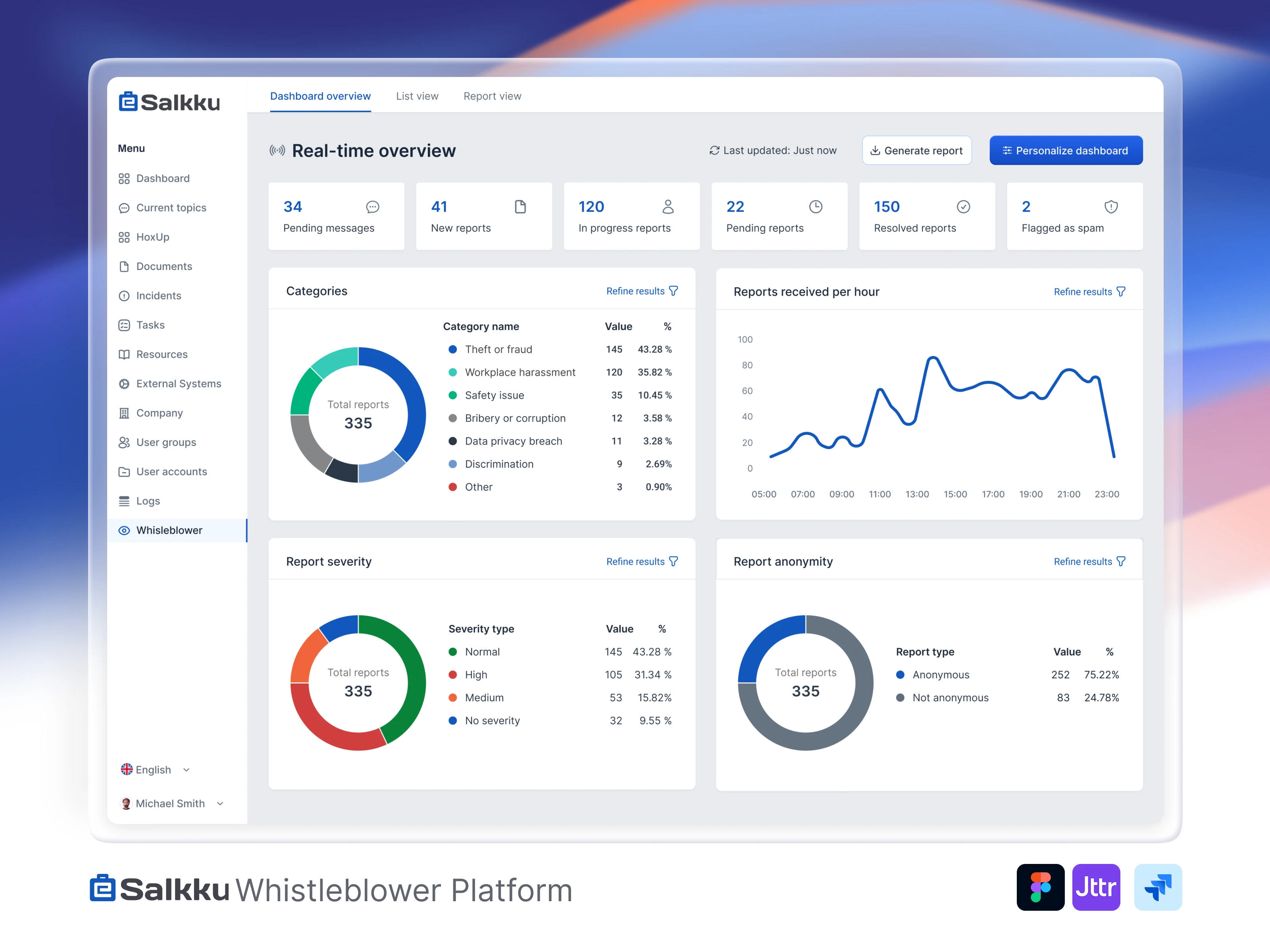
Whistleblower Platform: Transforming Reporting Through Strategic UX Redesign
Client Overview
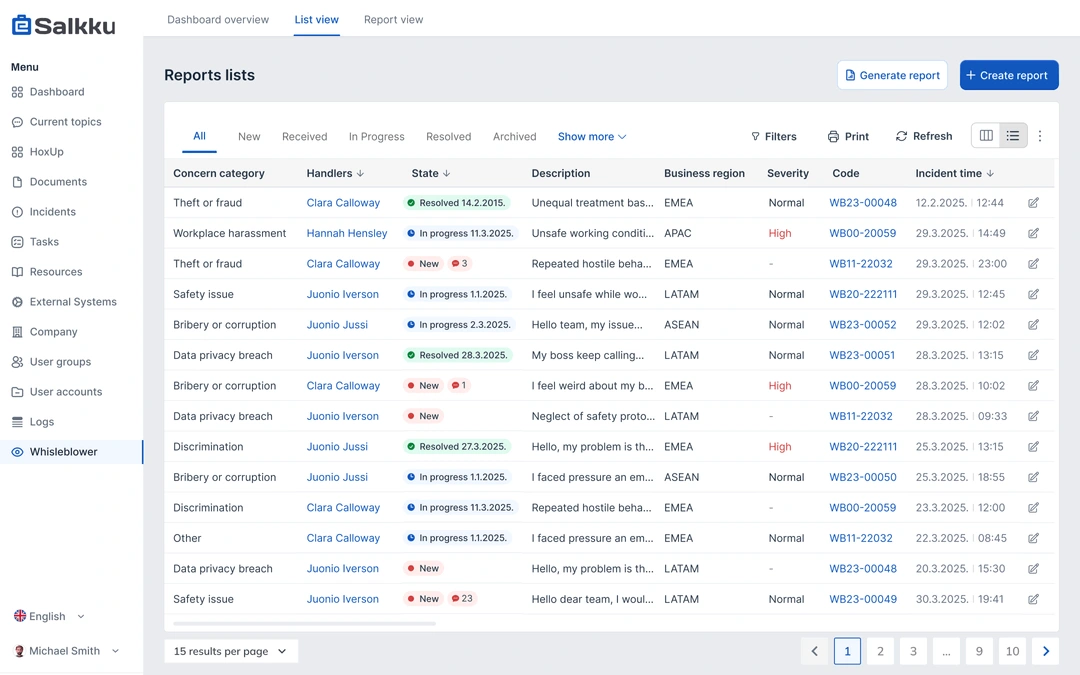
This client is a compliance-focused platform designed to facilitate secure and anonymous whistleblower reporting, particularly for clients in highly regulated sectors such as banking, finance, and government. While the product offered essential compliance capabilities, its clunky user experience and convoluted information architecture had become a major roadblock to growth. After initial domestic success, the company hit a plateau, struggling to gain traction in international markets. That’s when they approached me to help revamp their digital product and drive sales through UX improvements.
The Challenge
When I began working with Salkku Whistleblower, they faced several critical issues:
Growth plateau: Despite a strong product, they struggled to expand beyond the Finnish market
Cluttered information architecture: Complex navigation made the platform difficult to use, especially for new users
Poor feature discovery: Key functionality was hidden beneath layers of confusing menus
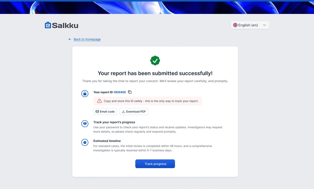
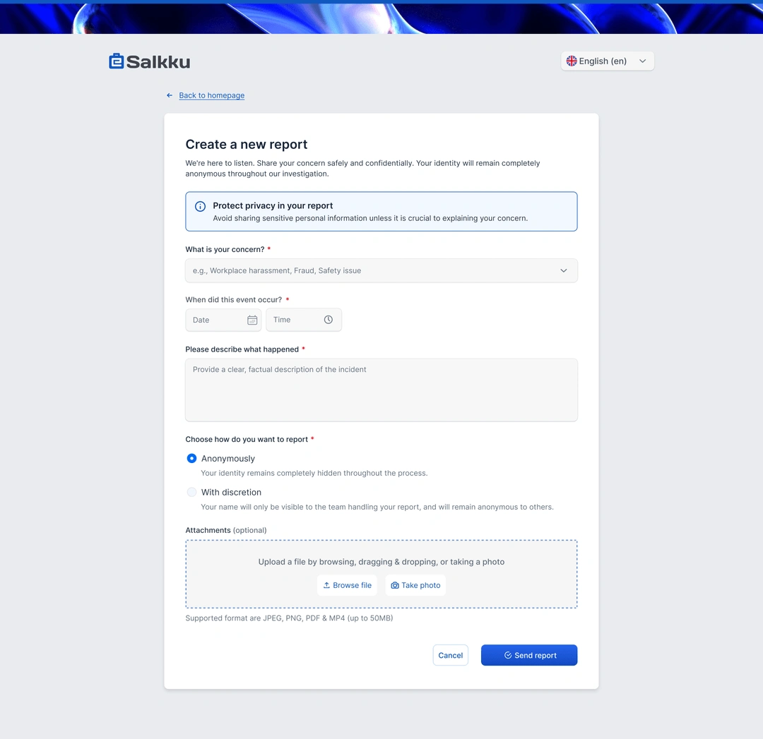
Complex reporting process: High friction in the whistleblower reporting flow discouraged submissions
High support burden: The support team was overwhelmed with basic usability questions
Conversion difficulties: The sales team struggled to demonstrate value during product demos
My Role
As the UX/UI lead and researcher on this project, I:
Conducted comprehensive user research, including interviews with internal teams and existing users
Performed Nielsen Norman heuristic evaluations to identify usability issues
Created detailed user personas and empathy maps for both whistleblowers and case investigators
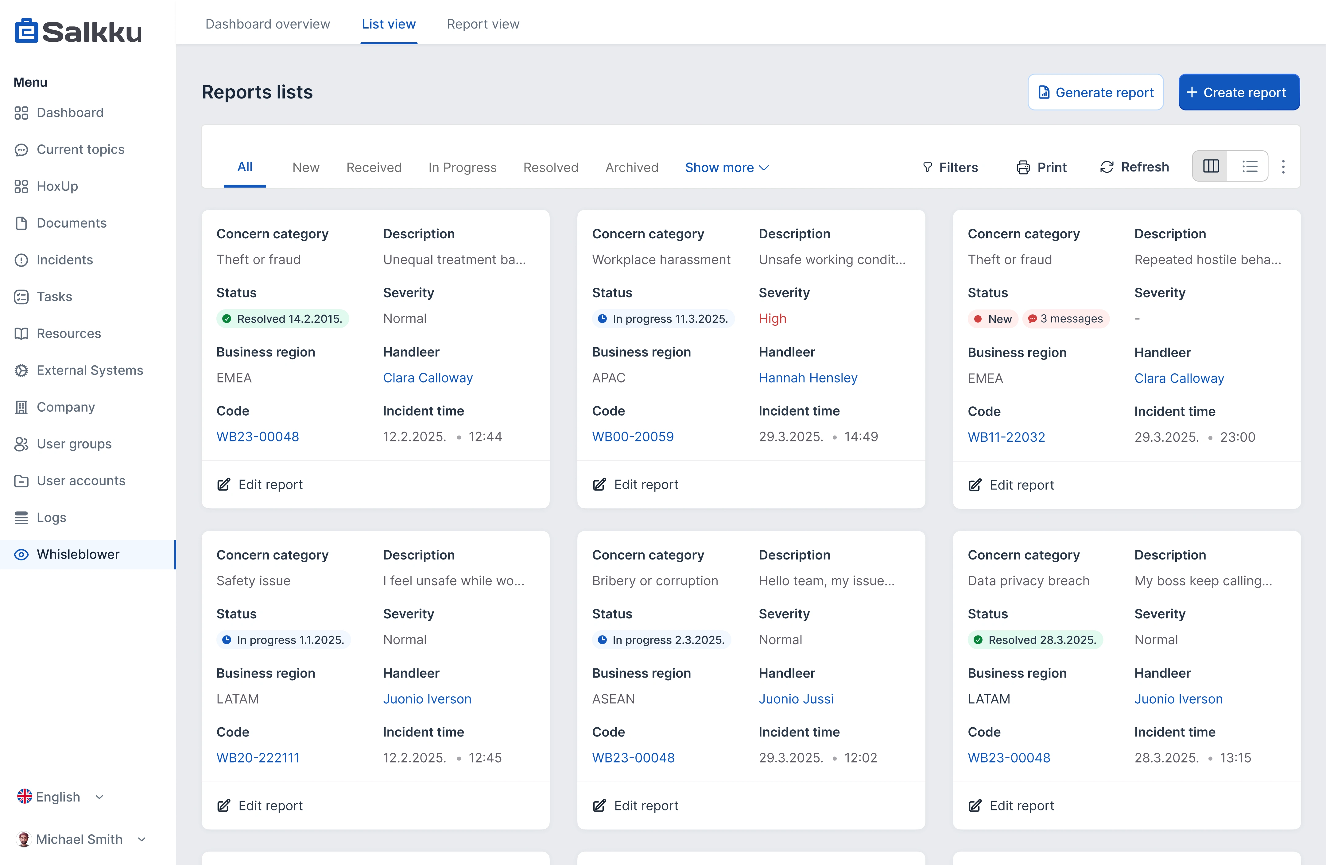
Redesigned the platform's information architecture and navigation system
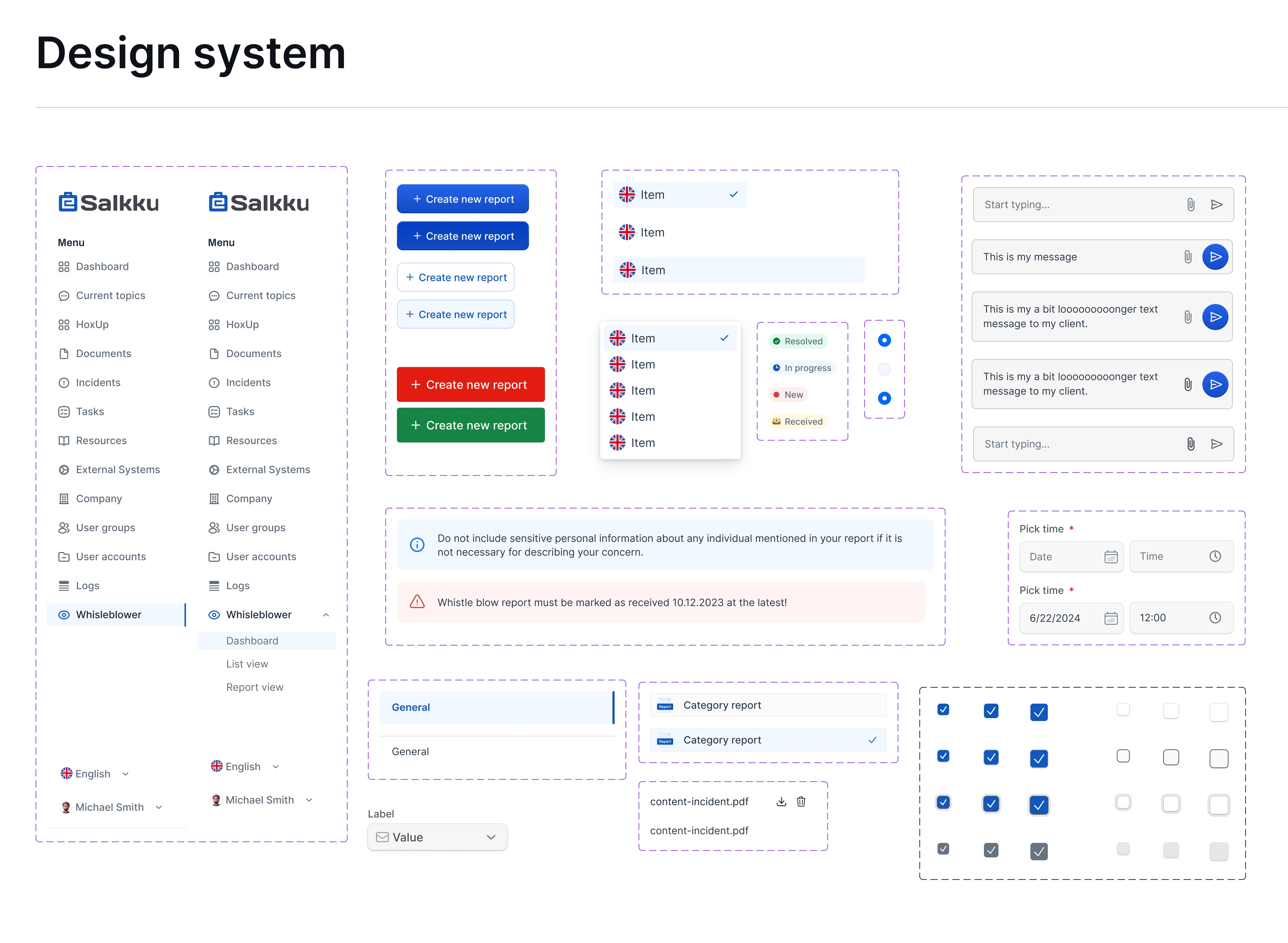
Developed a modern, trustworthy design system with a focus on accessibility
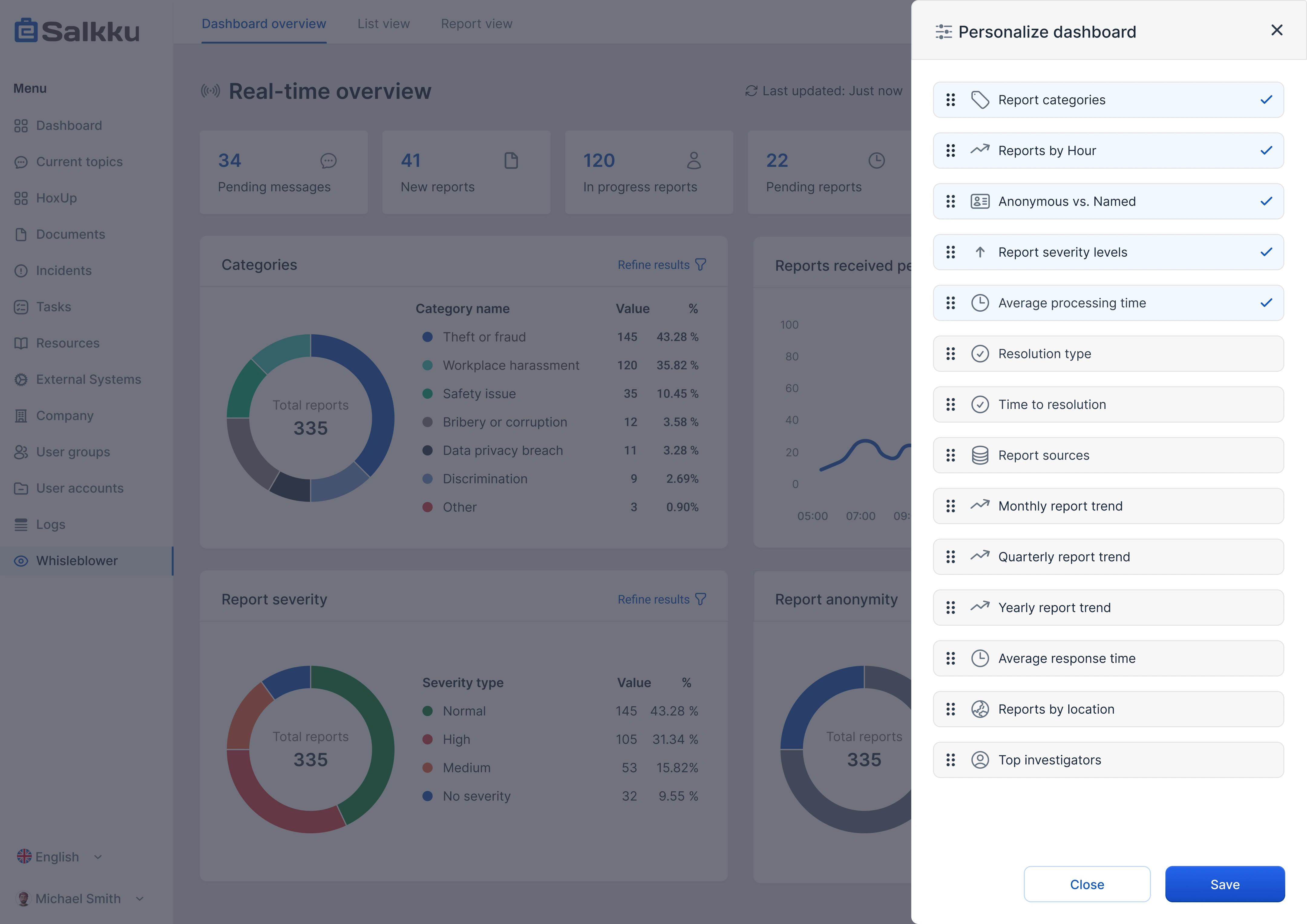
Designed high-fidelity screens that streamlined key user journeys
Validated solutions through usability testing and prototype validation
The Process
The redesign followed a methodical, research-driven approach over four months:
Discovery & research: I conducted 10 internal interviews across departments (sales, QA, product management) and gathered insights from existing users to identify pain points and opportunities.
User modeling: I created detailed personas and empathy maps to ensure design decisions were anchored in real user needs rather than assumptions.
Heuristic evaluation: I performed a Nielsen Norman heuristic evaluation of the existing interface, documenting specific usability issues with clear references to established usability principles.
Problem prioritization: I categorized issues into "Crucial" (interface complexity, technical terminology barriers, inconsistent UX, reporting difficulties, performance issues) and "Other" (accessibility, anonymity concerns, integration limitations, onboarding, error guidance).
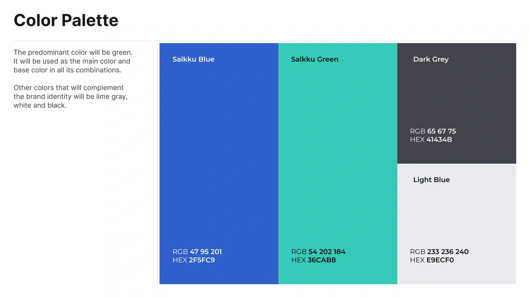
Design system: I created a cohesive design system featuring a modern, trustworthy aesthetic with a blue-dominant color palette, ensuring consistency while providing developers with reusable components.
Iterative Design: I redesigned the information architecture and key user flows, focusing on simplifying the reporting process and making features more discoverable.
Validation & refinement: I tested prototypes with users and stakeholders, refining the solution based on feedback before implementation.
Results & impact
The redesign delivered substantial business impact across multiple metrics:
27% increase in reports submitted as users found the system more intuitive and trustworthy
35% reduction in support tickets due to improved usability and clearer error guidance
2x faster time to value for new users through streamlined onboarding
20% improvement in feature discovery, leading to better utilization of the platform
18% increase in direct sales conversions as the sales team could more effectively demonstrate value
Key learnings
This project demonstrated how deeply UX impacts business outcomes, particularly in specialized B2B software where usability is often overlooked. By focusing on the emotional aspects of whistleblowing - specifically the need for trust, anonymity, and simplicity- a solution was created that not only improved metrics but fundamentally changed how users perceived the brand. The project also highlighted the value of thorough research and testing when redesigning complex systems, ensuring that changes were based on evidence rather than assumptions.
Like this project
Posted Apr 9, 2025
Redesigned the platform to improve usability, simplify navigation, and support sales goals. +27% report submissions -35% support tickets +18% sales conversions
Likes
5
Views
6
Timeline
Jun 10, 2024 - Sep 9, 2024


