Built with Framer
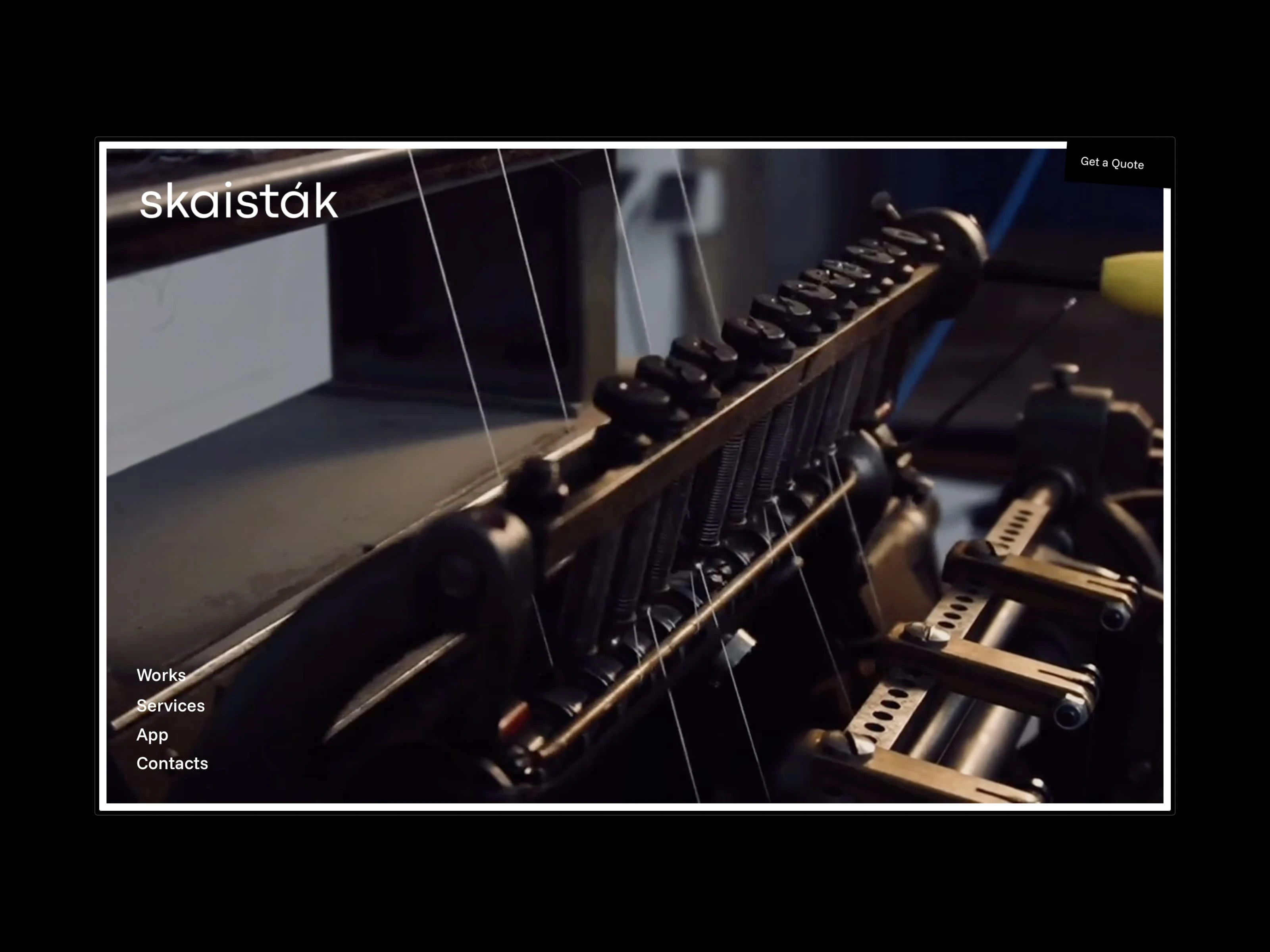
Minimal Website Design for Skaistāk Print Shop

Client: Skaistāk, a local print shop in Latvia
Goal: Build a clean, confident site that reflects the quality of their craft and presents selected work in a thoughtful way
Skaistāk is a well-established print shop. They weren’t looking to pitch or over-explain—just needed a solid website that quietly matched the care and precision they bring to their work.
I designed a minimal layout in Framer with a gallery-like structure. The goal was to keep everything light, editorial, and visual. Content is sparse, but intentional. Each element earns its place.
Services presented without noise
Instead of going with a typical services grid, we used a single, conversational paragraph. It casually lists what they do, without breaking the visual flow or adding unnecessary emphasis.
The idea was to show range without sounding like a checklist.
CMS-powered with smart structure
The site runs on two interconnected CMS collections—one for services and one for works.
Service pages include a short description and a list of related projects.
Work pages link back to their corresponding service.
Portfolio section features simple, seamless navigation across all works.
This keeps everything dynamic and easy to browse.
Final result
The site feels calm and precise, like Skaistāk’s print work. It’s minimal, visual, and designed to last. A simple system that works in the background while letting the work speak.
Like this project
Posted Jun 10, 2025
Minimal portfolio site for a local print studio, designed to quietly showcase their work and full service range.
Likes
18
Views
156

