Nara Mental Wellness App Landing Page — Design + Dev
Oladipupo Ayoola
Scope: UI Design · Web Design · Front-End Development
Tools: Figma · Next.js · Framer Motion
About the brand
Nara is a mental wellness app on a mission to close the mental health gap for the Black community in America. The platform connects users to licensed therapists in under two minutes, backed by a network of over 250 therapists, and wraps that access in a full suite of daily wellness tools: mood check-ins, gratitude journaling, AI-assisted therapy support, and guided meditation.
The founder, Perez, built Nara from lived experience. Arriving in the US at 18, facing deportation, becoming a father, and falling into depression with no family around, therapy changed the course of his life. That story is the soul of the brand, and the website needed to carry it.
The brief
Design and build a landing page for Nara's client audience: everyday people looking for accessible, affordable mental health support. The page needed to drive app downloads and sign-ups while speaking to an audience that might be arriving in a vulnerable state.
The challenge was not just making something that looked good. It was making something that felt safe, and then converting that feeling into action.
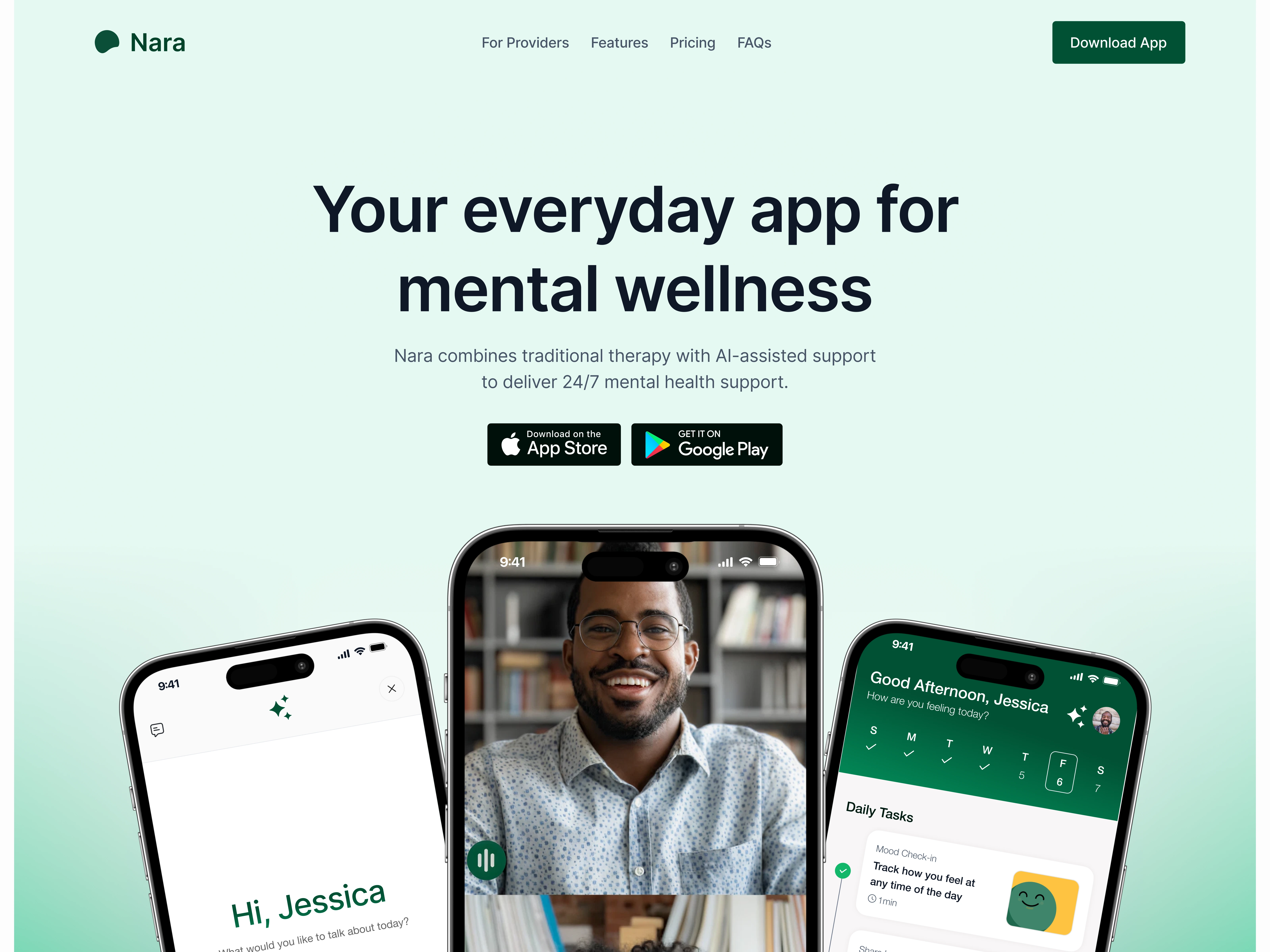
Hero section — earning trust before saying anything else
The first thing a person sees sets the entire tone of the interaction. For a mental wellness product, that moment carries real weight. Someone arriving at this page might be struggling. They do not need to be dazzled; they need to feel like they are in the right place.
The headline — "Your everyday app for mental wellness" — was kept deliberately plain. No jargon, no exaggerated claims, no corporate wellness speak. Just a clear, honest statement of what Nara is.
For the background, I used a soft mint-to-white gradient. Green is widely associated with calm, growth, and health, and at this intensity it feels gentle rather than clinical. I then placed three app mockups in the hero showing real, recognisable screens: an AI chat session, a video therapy call, and a self-care dashboard with daily tasks. A new visitor can look at those three phones and immediately understand what the product actually is without reading a single word of copy.
The App Store and Google Play buttons sit directly below the headline. For a mobile app, the download is the conversion goal, so they live in the first thing the user sees, not buried further down the page.
Features
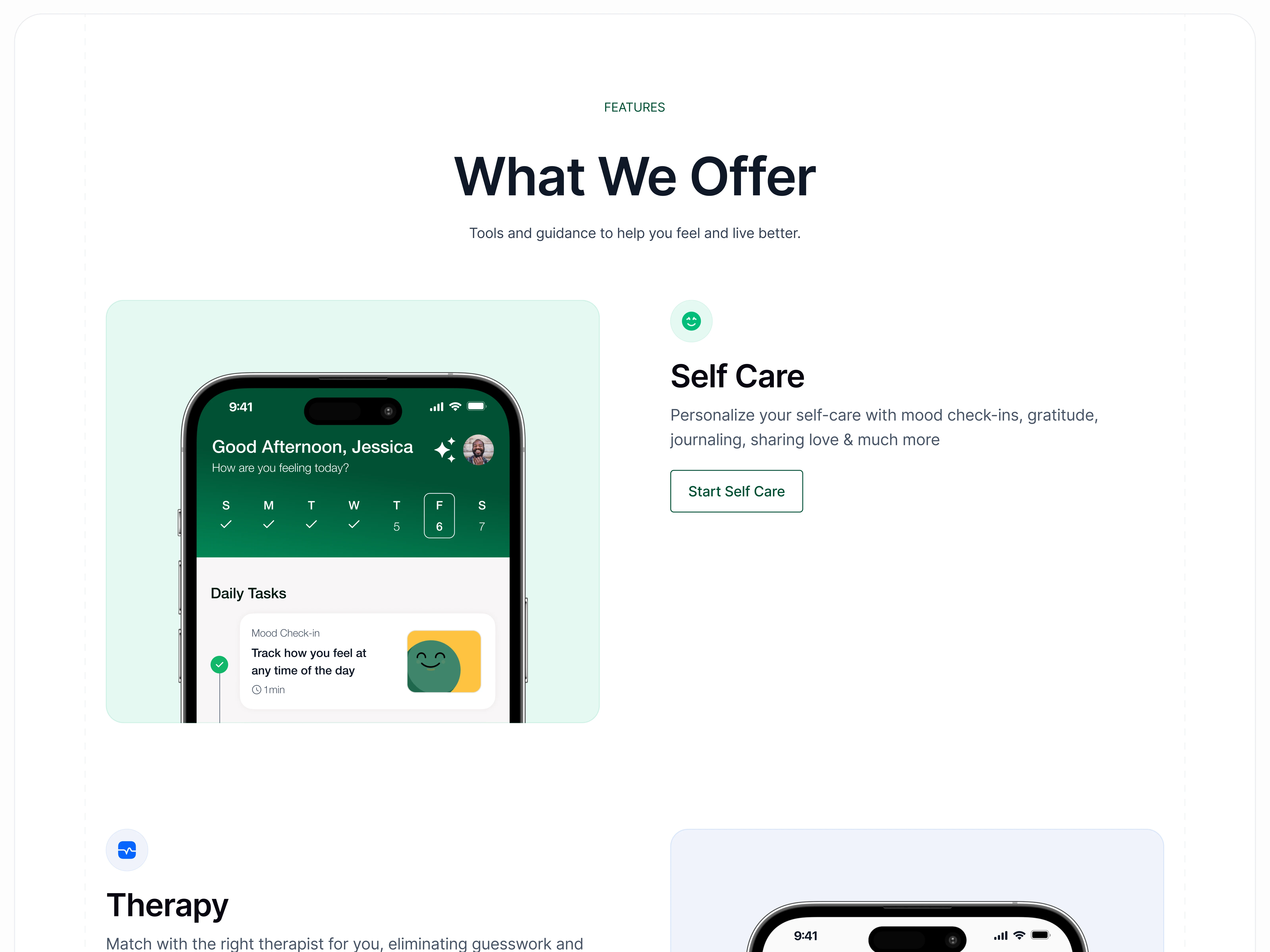
Features section — showing the full product without overwhelming
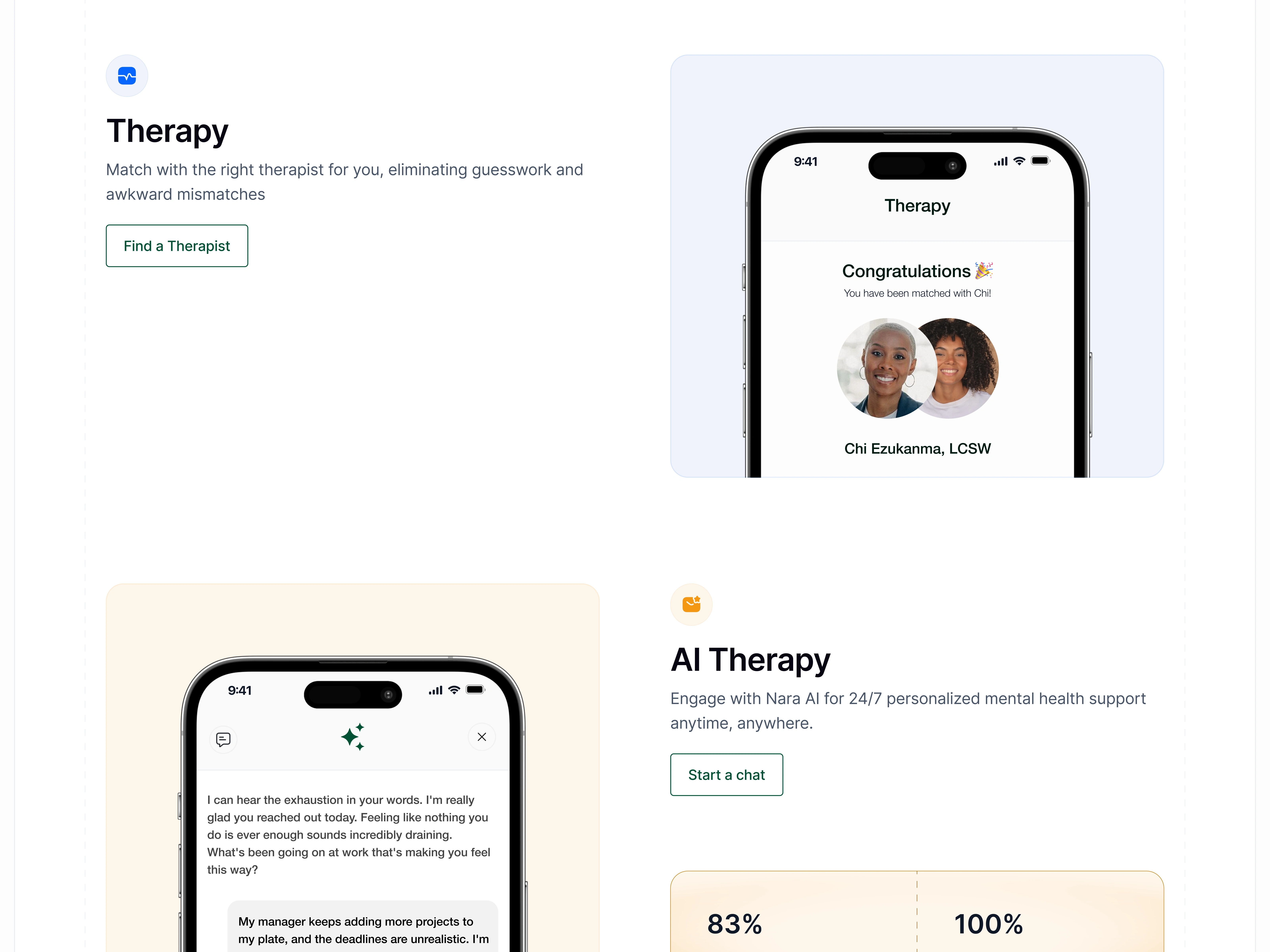
Nara is not one thing. It offers self-care tools, human therapy, AI therapy, and guided meditation. Presenting all four clearly without the page becoming a feature dump required a deliberate layout decision.
I gave each feature its own section in a staggered, alternating layout: mockup on one side, copy on the other, then they swap for the next feature. This rhythm gives each pillar its own moment and creates a natural reading flow as the user scrolls. It also prevents the page from feeling like a brochure with a long list of bullet points competing for attention.
I wrote the copy for each feature around the benefit rather than the mechanics. Self Care is framed as something that helps you personalise your wellbeing every day. Therapy is about finding the right match without guesswork. Each description speaks to what the user gains, not what the product does.
I also placed two metrics inside the AI Therapy section: 83% of users feel better after their first chat, and the platform is 100% accurate in detecting high-risk cases. Numbers like these do significant work on a page like this. They give a hesitant user something concrete to hold onto, and they signal that Nara is not just a lifestyle app but a clinically serious product.
Testimonials
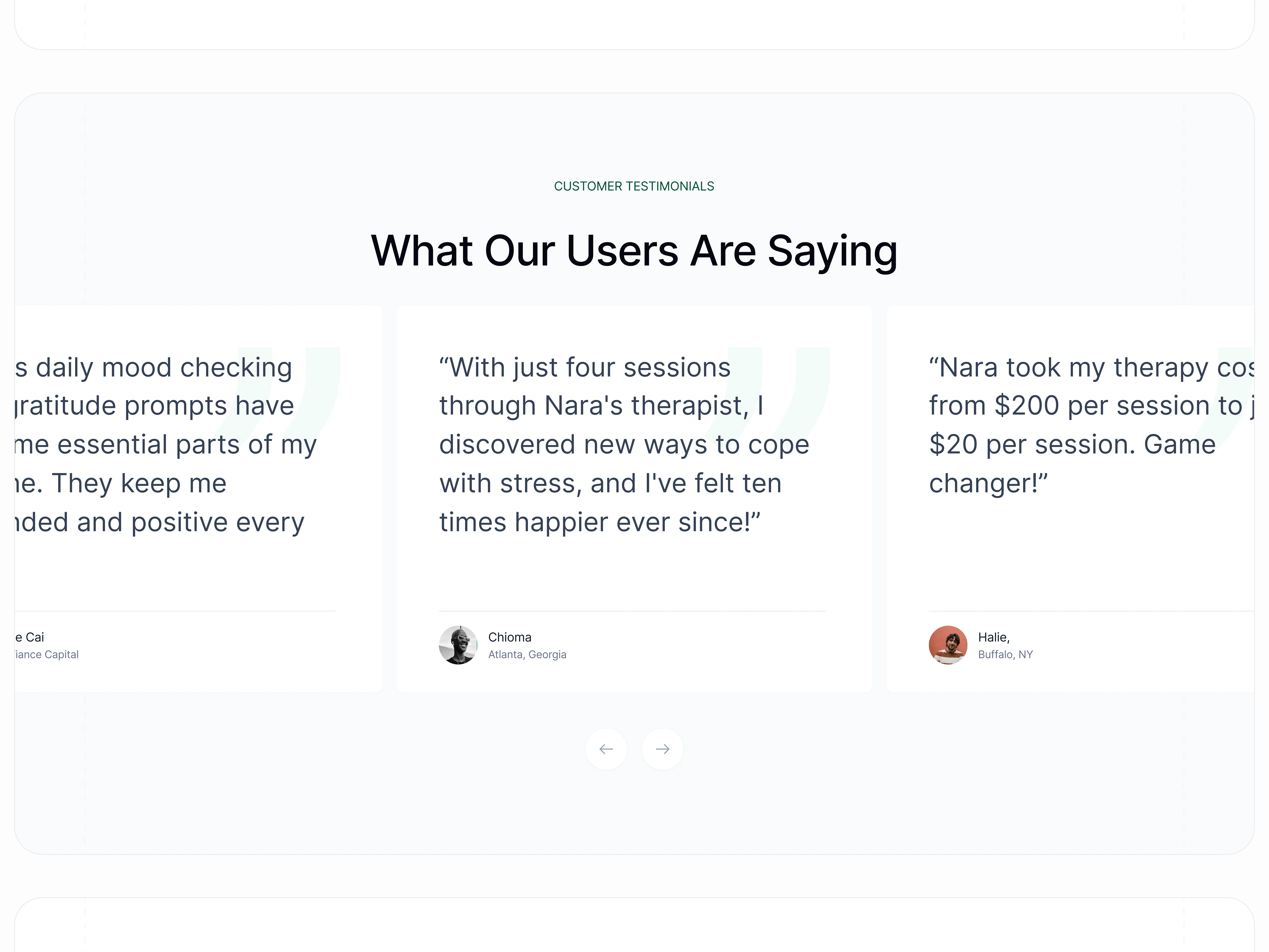
Testimonials — specific stories, not polished praise
The testimonials section is often where landing pages lose their credibility. Generic quotes like "This app changed my life!" tell a potential user almost nothing. Nara's testimonials were designed around specificity.
Each quote references a real, measurable outcome. One user went from paying $200 per therapy session to $20. Another found and booked a therapist within 24 hours. A third describes a shift in their daily mindset that now feels habitual. These are outcomes a new visitor can picture for themselves, which is exactly the point.
The quotes are displayed in a horizontally scrolling carousel. This does two things: it keeps the section visually clean and avoids a crowded grid, and it signals volume — there are more stories here than the ones currently on screen.
I also placed the founder's personal story further down the page, between the Pricing section and the FAQ. It is the most emotionally resonant piece of content on the site, and I positioned it there intentionally. By that point in the scroll, the user has already understood what the product does. Reading why it exists, in Perez's own words, lands completely differently at that moment than it would have at the top of the page.
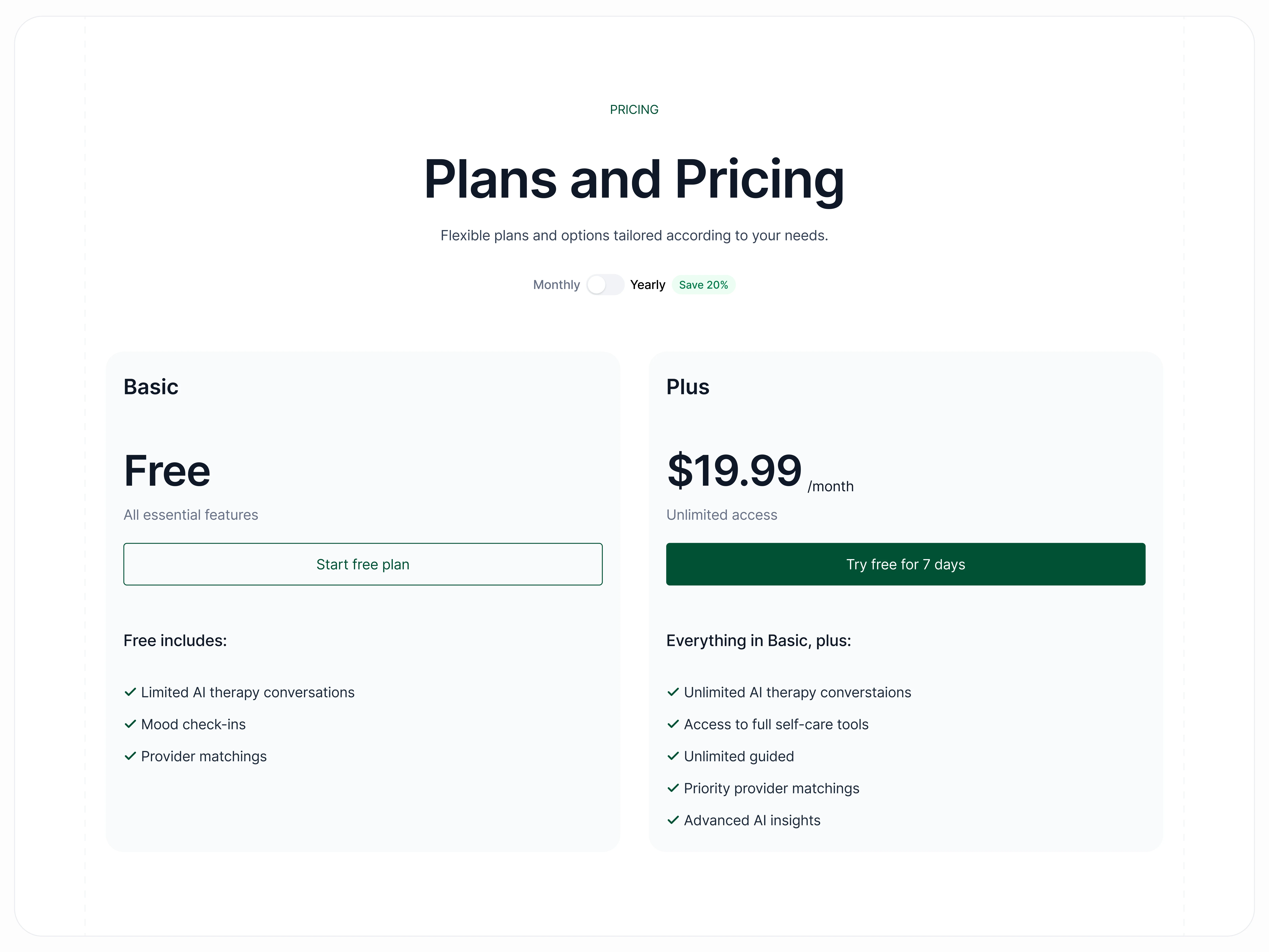
Pricing
Pricing section — removing the barrier before they even feel it
Mental healthcare in America has a well-documented affordability problem. Nara's target audience knows this intimately. The pricing section was designed with that context in mind.
The Free tier is listed first and given equal visual weight to the paid tier. This is a deliberate choice. When affordability is a known barrier for your audience, leading with "you can start for free" is not just a marketing tactic — it is the right thing to do, and users sense the difference.
The Plus tier at $19.99 per month is positioned as the natural progression once a user has experienced the product, not as the real product with a free "lite" version gatekeeping it. A monthly/yearly toggle lets price-sensitive users find the option that works for them without having to ask.
The layout is clean and comparison-friendly, with feature lists written in plain language — no asterisks, no fine print designed to confuse.
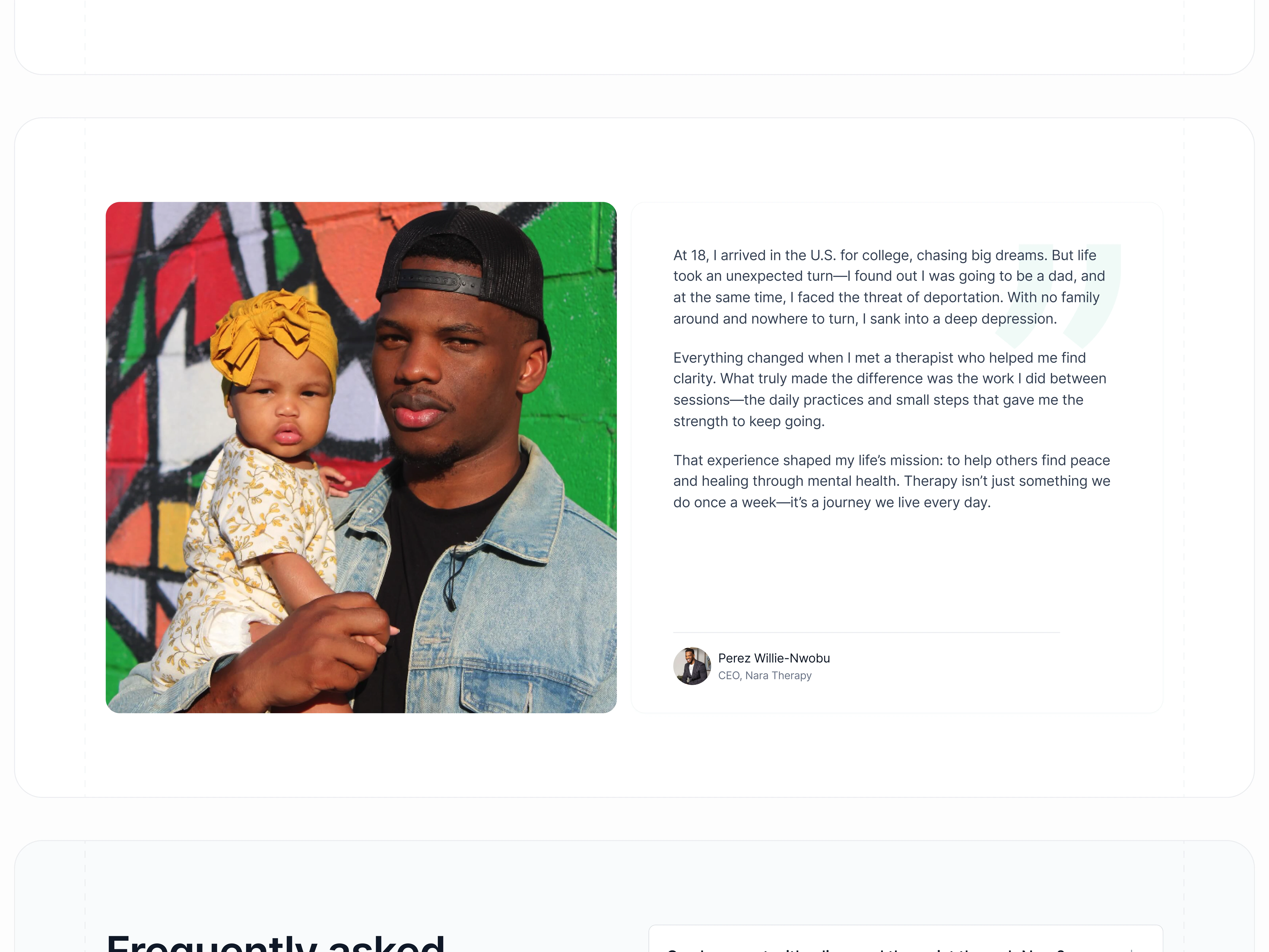
Founder's story
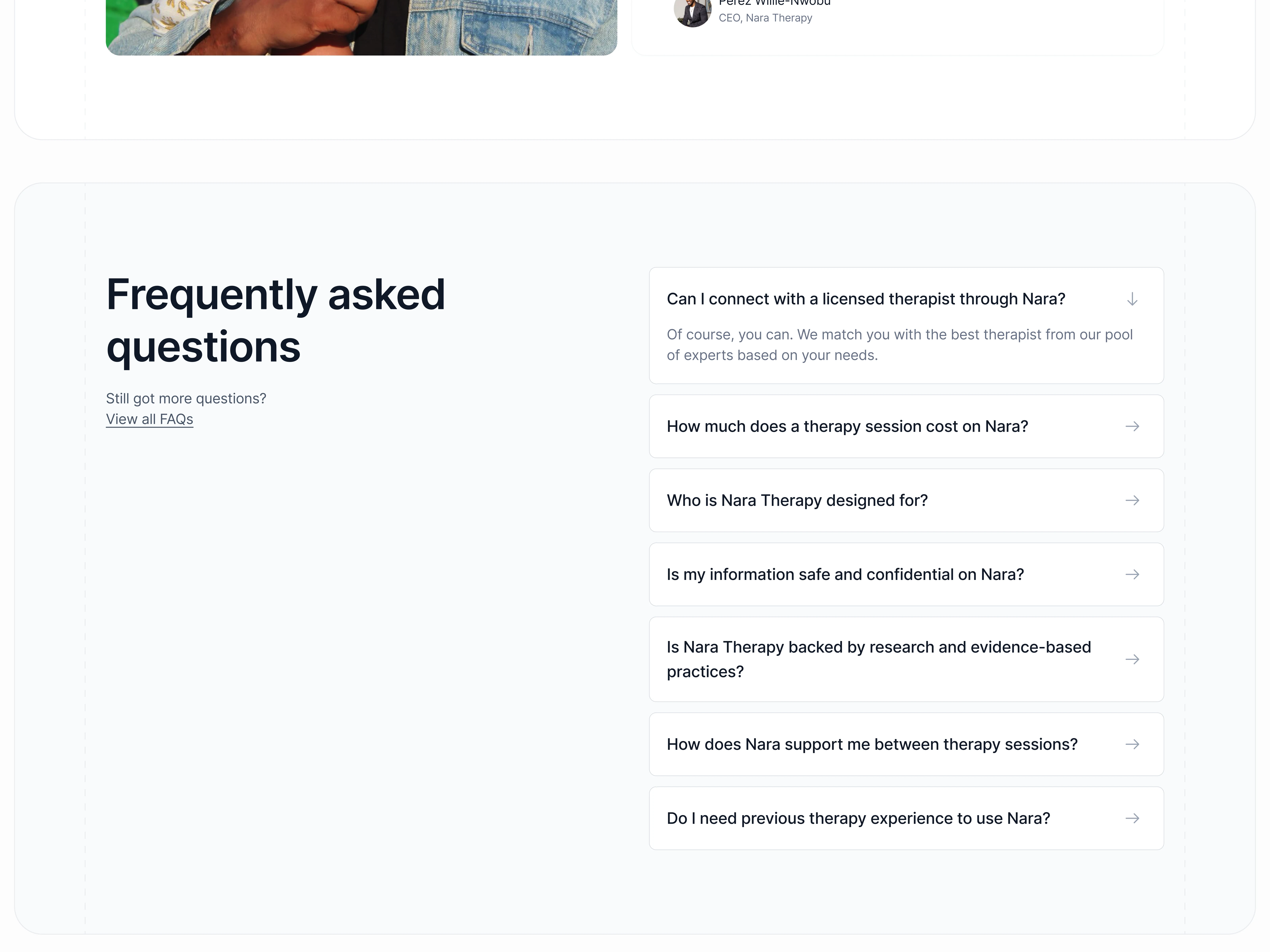
Frequently asked questions
From design to pixel-perfect production
I designed the page in Figma and then built it myself in Next.js. The design was not handed off to a developer to interpret — I took it from concept to live production code, which meant the final result reflects the original vision exactly. The site is fully responsive across all screen sizes and performs cleanly on mobile, which matters significantly for a product whose primary goal is getting people to download a mobile app.
I handled all the scroll animations and section transitions using Framer Motion, adding motion that feels intentional without being distracting. The site is fully responsive across screen sizes, which matters significantly for a product whose primary goal is to get people to download a mobile app. You can see the live build here.
What the page needed to do — and does
A landing page for a mental wellness app is a specific kind of design problem. The audience is not browsing casually. Many of them arrive having already decided they need help; what the page has to do is convince them that Nara is the right help, and that taking the next step is easy and safe.
Every decision I made on this page, from the colour to the headline to the layout of the features, the placement of the testimonials and the pricing structure, was made in service of that single goal. The result is a page that feels considered, human, and trustworthy. Which is precisely what the product it represents needed.
Like this project
Posted Feb 24, 2026
Designed and developed a landing page for Nara to drive app downloads and sign-ups.