BibleDojo UX Design Project
Polly Lal

Objective
Gamify an online platform that trains and builds skill mastery so users can independently and accurately analyze biblical text on their own, while making it fun and engaging for high schoolers and above.
Overview
Basil Tech is a non-profit specializing in product development for faith-based organizations, focusing on technology-driven Bible engagement.
BibleDojo by Basil Tech makes graduate-level biblical literacy accessible through hands-on skill application and engaging learning experiences.
Project Team
I led UX design, collaborating with visual designer and illustrator to shape the core experience. Worked cross-functionally with CTO, animator, and engineers to align product strategy, business goals, and technical execution.
Problem
Intimidating
Graduate-level seminary material intimidates many users, but provides valuable textual analytical skills for deeper biblical insights.
Information Transfer
Current LMS approaches use talking head information transfer with minimal hands-on skill development. Most users without graduate training cannot independently analyze biblical passages.
Building Confidence
Building biblical analysis confidence requires practice and targeted feedback. Users often abandon efforts when learning feels too difficult.
Objective
How might we…
Make graduate-level knowledge accessible to non-seminary users seeking deeper biblical insights?
Build a learning system focused on hands-on analytical skills, not just information transfer?
Reframe trusted material into clearly structured, adaptable content that helps users overcome learning obstacles?
Core Vision
Create a fun and engaging online Bible education platform that empowers high schoolers and beyond to independently and accurately analyze biblical texts through a gamified ecosystem fostering skill mastery and deep learning.
BEFORE & AFTER
Before: Training only
After: Gamified training ecosystem
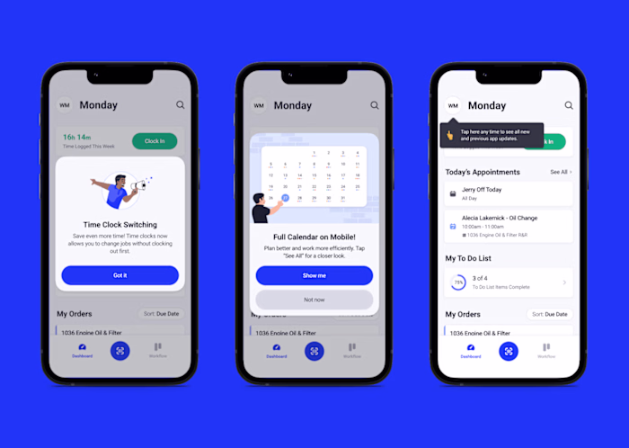
Note: This case study focuses on desktop web, though designs were developed simultaneously for mobile and desktop.
Approach
From left to right: Discover, Define, and Develop triple diamond process framework
User Research
Distributed survey to 80 existing Scripture Labs subscribers focused on learning preferences, hands-on analytical skills importance, biblical education tools, and favorite learning experiences.
Users currently rely on various tools: Bible Project videos, alternate translations, reference books, sermons, and study groups. Current platforms focus on information transfer over hands-on skills development, even fun ones emphasize passive learning. Strong demand exists for interactive, hands-on learning tools.
Developed two main personas from user research to focus our efforts:
Validation Research
30-minute 1:1 sessions observing users completing initial training on desktop and mobile without guidance.
Key feedback:
Training took too long
Users felt unmotivated halfway through
Unclear progression cues
User Journey
Clear pain points emerged at the halfway point, creating opportunities for targeted improvements in user engagement and motivation.
Design
Design Strategy
Balanced four distinct areas with unique needs and constraints:
1. User Needs: Move from passive consumption to active skill mastery, clear progress visibility, defined learning pathways
2. Learning Experience: Martial arts belt system metaphor, metacognitive framework for informed choices, reward expertise over completion
3. Game Design: Clear milestones and celebrations, comprehensive dashboard view, scalable achievement structure
4. Technology: Mobile-first UI, seamless cross-platform experience, encourage deep learning over rapid consumption
Architecture
Goals: Progressive skill mastery, balanced guidance with exploration, connected skills/belts/genres
Design System
Key considerations: Collectibles vs. parts of whole approach, skill level across multiple genres, belt integration, visual clarity using color
Progress-based visual explorations for skills
Skill badges: Locked, Unlocked, In Progress, Complete
Color schemes denoting different game scopes
Key considerations: Adaptive desktop/mobile layout, clear no belt starting state, circular design implies continuous learning journey
Belt progress explorations: linear and circular models
Final odometer design for belt progress
Key considerations: Multiple states (locked, unlocked, in progress, completed), skills integration in thumbnails, visual emphasis on art for engagement
Design explorations showing relevant skills in training thumbnails
Final training thumbnails: Locked, Unlocked, In Progress, Complete
Genre Thumbnails
Key considerations: Clear separate belt system per genre, distinct color schemes for different worlds, multiple states (no belt, colored belt, coming soon)
Genre thumbnails featuring art and belt progression indicators
Training Cover Pages
Goals: Surface content cohesively like book covers, highlight pedagogical objectives, create intrigue and delight
Key decisions: Use visual cues (blur/grayscale) to gradually reveal content, balance mystery with clarity
Pre-Training wireframes exploring layouts and hierarchy
Pop-up and sidebar designs for referencing belt levels across genres
Belt celebration flow creating moments of delight
Final Pre-Training and Post-Training pages
Genre Pages
Goals: Guide users through complex training/skills/progression system, surface content clearly, make next steps intuitive
Key decisions: Progressively reveal content by belt level, connect training completion to advancement
Information hierarchy explorations for trainings and skill progress
High-fidelity mockups with belt progress and training components
Final Genre page with embedded donation CTA
Skills Page
Initial structure: Skills and Context as separate systems
New structure: Skills and Context as collectibles scoped for game or genre levels
Layout & Information Architecture
Goals: Organize complex skill hierarchy, support discovery and mastery paths, show clear progression, enable fluid exploration
Key decisions: Define core vs. genre-specific skills, balance discovery vs. mastery gameplay, allow for future genre expansion
Initial sketches exploring layouts and summary statistics
Organized skills by game scope with details modal
Mid-fidelity Skills page with different skill representations
Rewards System
Flipped game focus from Skills → Belts → Trainings to Trainings → Belts → Skills
Goals: Create memorable achievements, drive engagement, build accomplishment, support Discovery vs. Mastery play styles
Key decisions: Balance depth with simplicity, cultural sensitivity, technical feasibility
Competitive analysis of fitness and learning apps
Initial sketches applying competitive insights
Reward explorations: medals, statistics, streaks, leaderboards
Medal concept elevating Skills to equal importance with Belts
Final Skills page optimized for breadth and depth gameplay
Goals: Central navigation hub with each genre as unique world, clear next steps with exploration freedom, equal prominence for belts and skills
Key decisions: Establish visual relationship between belts/skills, prevent genre confusion, guide new users through onboarding first
Layout explorations emphasizing Belts/Skills (left) and art (right)
Collaborated with visual designer on language and hierarchy
Dashboard adapts by user state: logged out, logged in, in progress
Solution
Results
Can users effectively analyze biblical text independently using skills learned from BibleDojo?
1:1 unmoderated interviews with new and experienced users. Structure: Survey → Live Bible analysis exercise → Thought process discussion → Performance evaluation using standardized rubric.
Positive: High marks for enjoyment and ease of use, strong skill system engagement, sustained post-signup activity validating gamification, improved biblical knowledge retention
Areas to Improve: 50% of users demonstrated mastery after full progression, some brand confusion around target audience
Overall Impact: Increased scripture comprehension confidence, improved biblical application abilities, shift from surface-level to deep scriptural engagement
Launch Metrics
BibleDojo launched publicly in Dec 2023.
Q1 2024 Results:
36.4% user progression from home to dashboard
19.6-20% introduction completion rate (1 in 5 users completing full intro)
Key insights: Strong retention through intro flow with minimal drop-off, engaging onboarding maintains user interest, more testing needed to identify success factors
Design scalable framework for content growth
Balance engagement and gamification with educational depth
Refine progression mechanics
Simplify complex theological concepts for digestibility
Create intuitive yet engaging progression systems
Community features: discussion boards, leaderboards
Granular reward systems (e.g., coins) to optimize engagement
Expand learning paths with new genres and advanced skills
Lessons Learned
Stay agile
Adaptability was crucial for this 0-to-1 project since everything connects. Changes in one area affect others—the dashboard wasn't initially planned but became necessary as skills/belt progressions developed.
Embrace evolution
Pre/Post-Training pages evolved from hiding content to using blur/grayscale techniques for simpler, more engaging reveals.
Just start
Creating concrete references was essential for stakeholder alignment. Early feedback incorporation was crucial for 0-to-1 success.
Like this project
Posted May 5, 2026
UX design for gamified Bible education platform to enhance user engagement and skill mastery.