Ecotiendita Branding
Overview 🔎
While living abroad, the CEO, Daniela Barcenas, became increasingly aware of the adverse effects of hyper consumerism on the natural environment — landscapes seemingly transformed into seas of plastic. Wanting to make an impactful change in the way we consume, Daniela imagined a marketplace that championed responsible consumerism by only offering sustainable goods.
Overview
Ecotiendita its an e-commerce of plastic-free products that seeks to provide a guarantee of quality while encouraging users to change from everyday habits that are not very friendly to the environment for a more sustainable lifestyle over time.
Problem
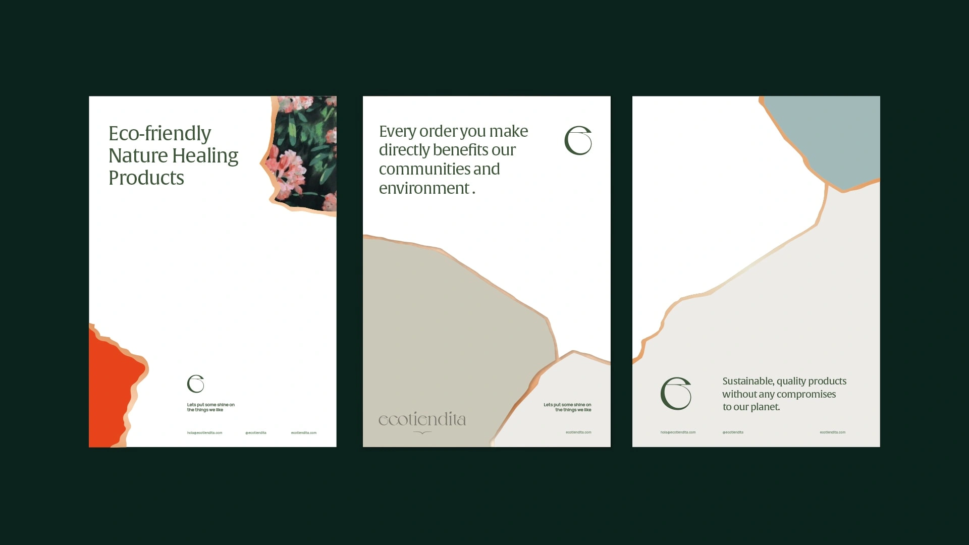
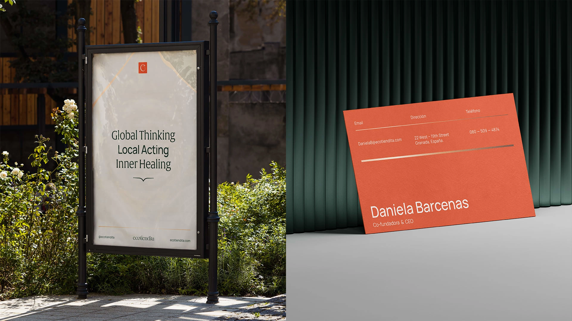
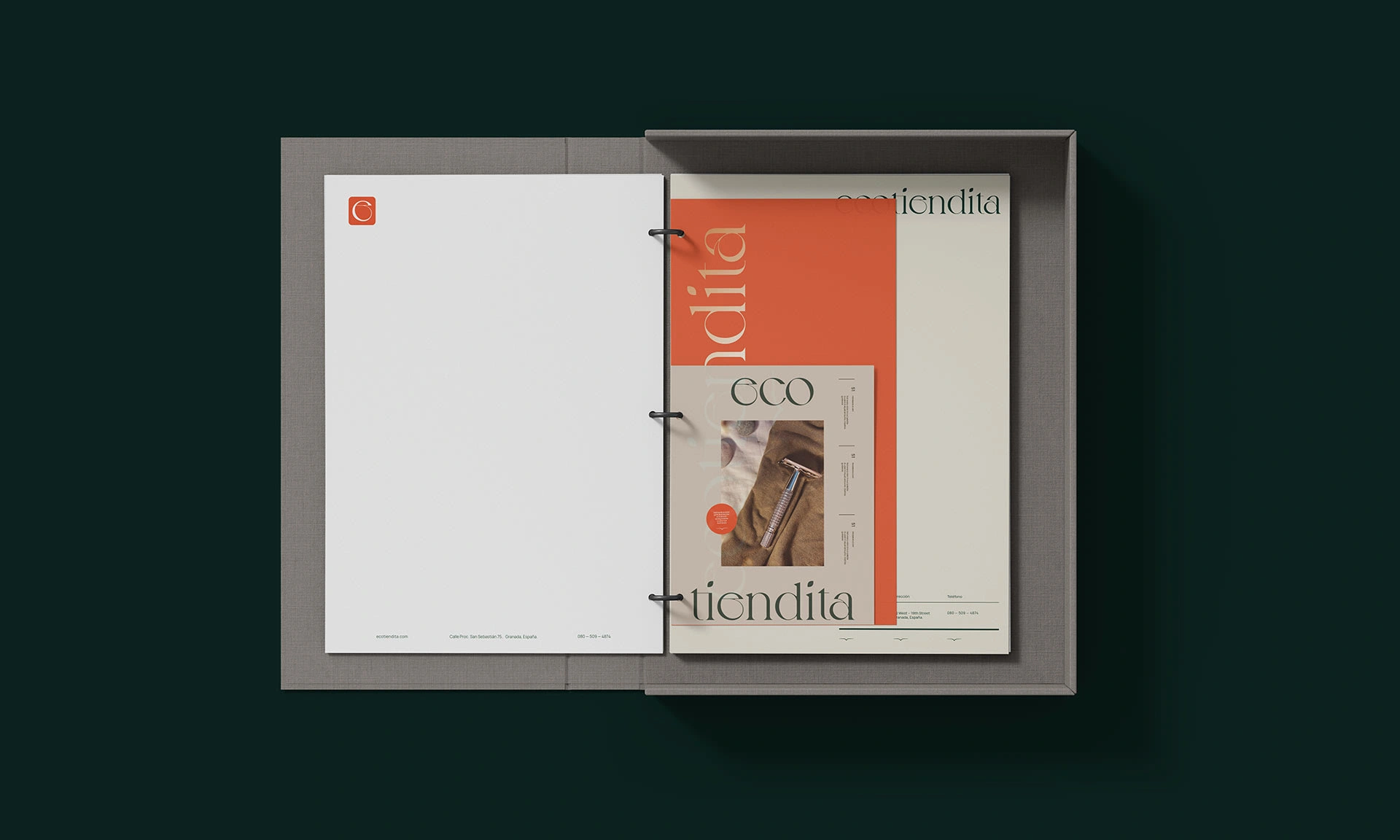
They wanted to convey a clean and elegant image with feminine touches. The main idea consisted of achieving a graphic identity whose concept, shapes and colors represented a sustainable lifestyle, approaching a result that generates a more valuable and quality brand perception.
Solution
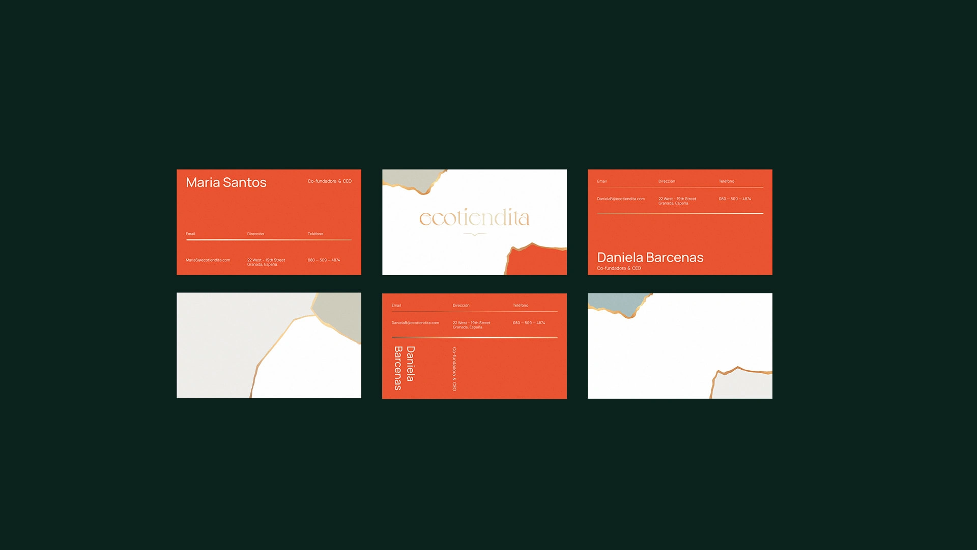
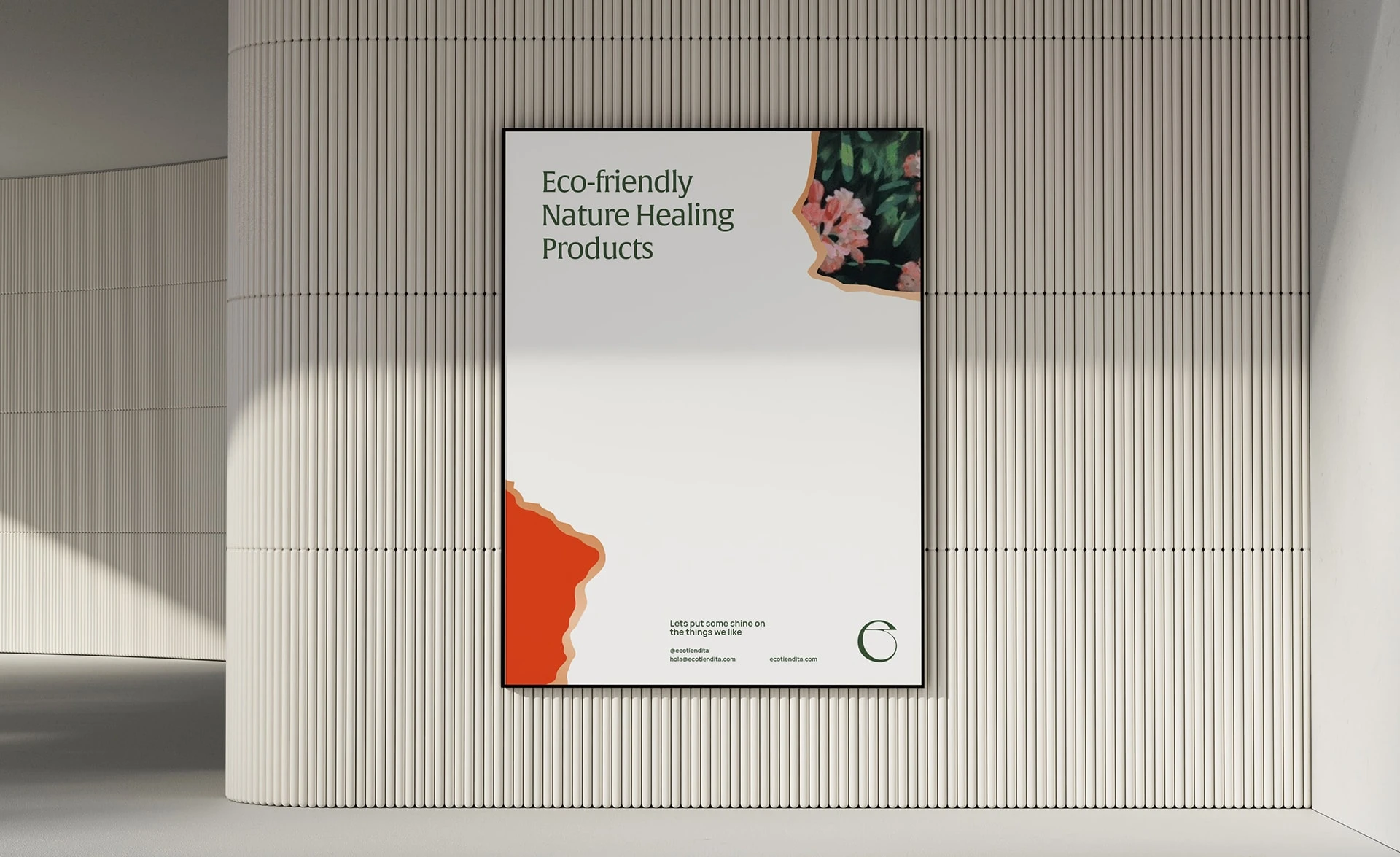
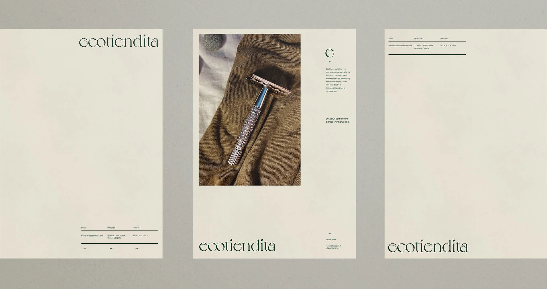
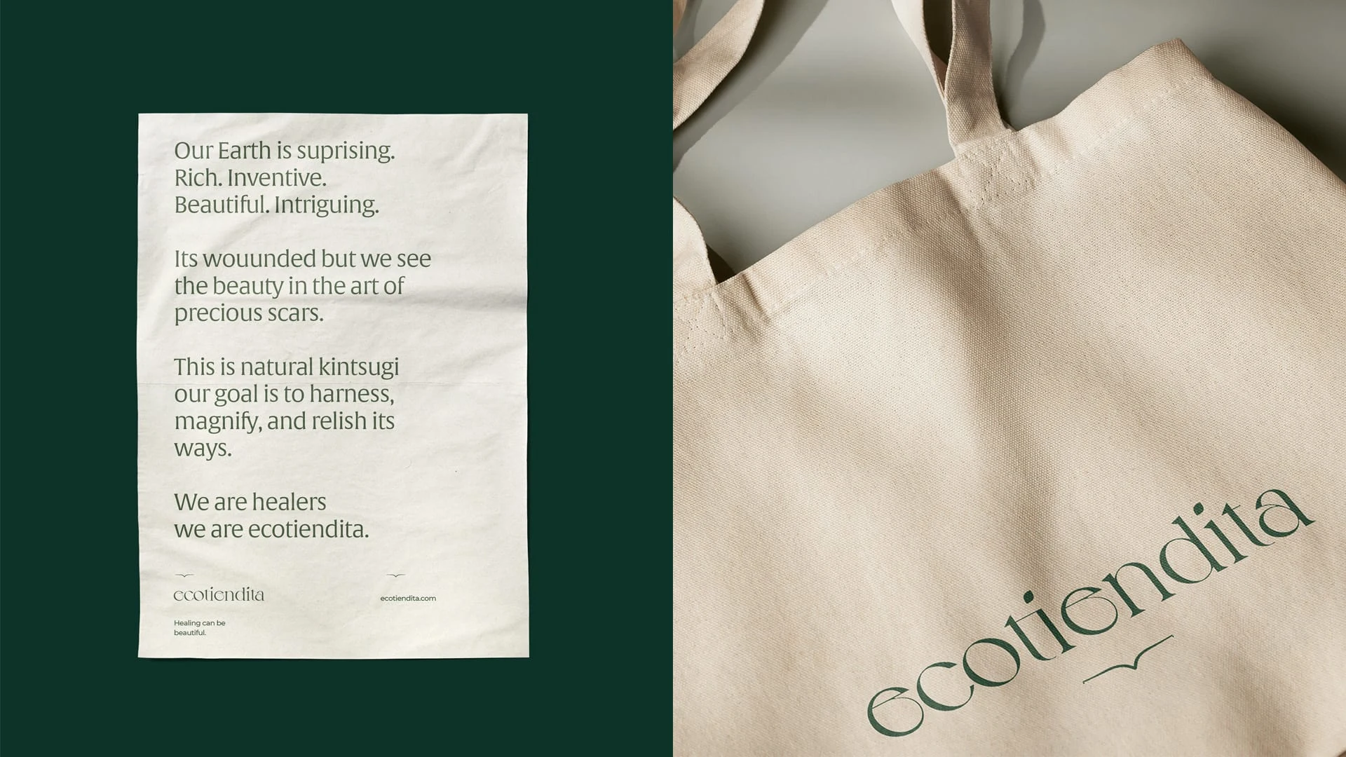
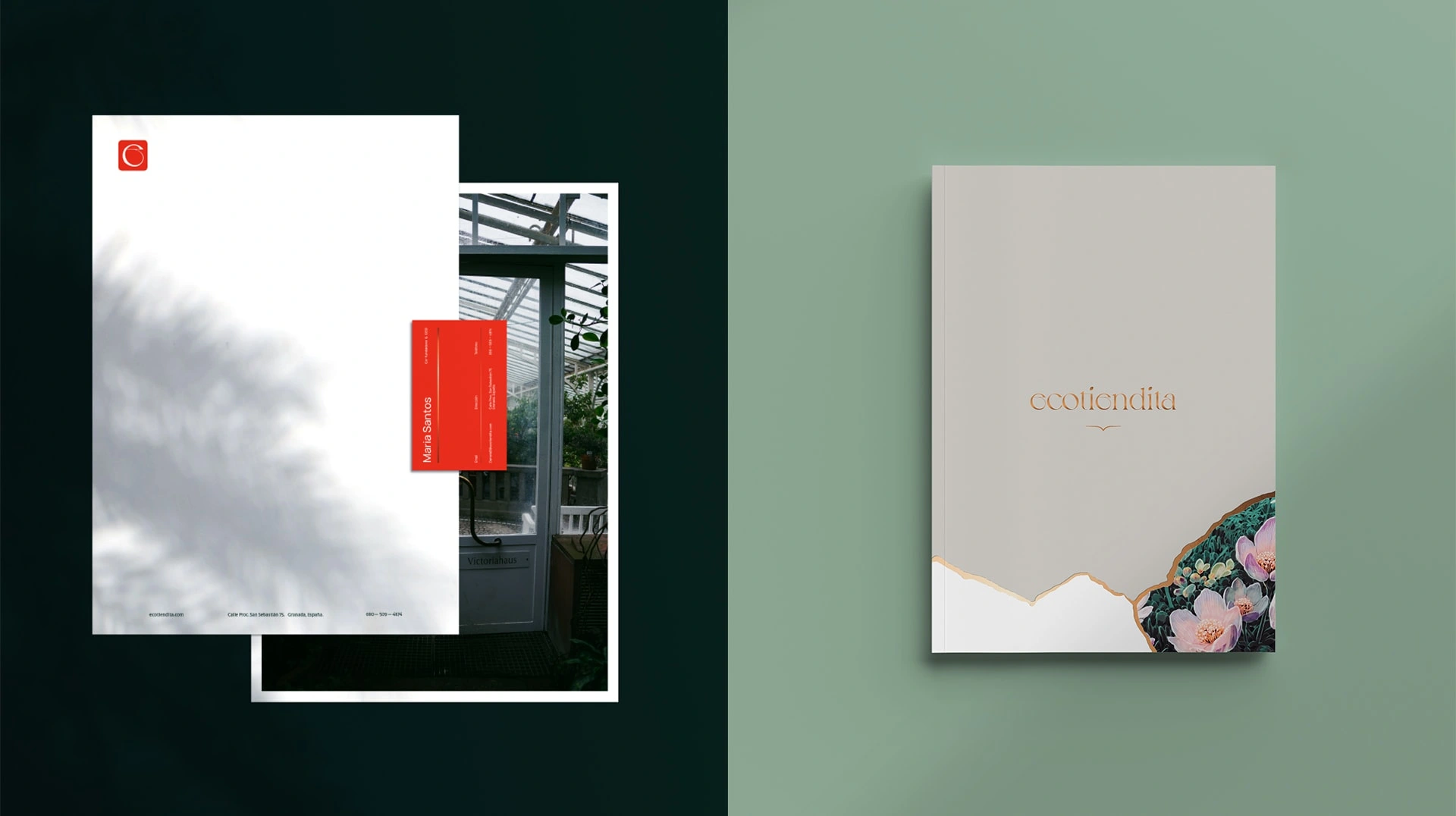
Conceptually, the concept of the "Kingtsugi" was taken to follow the main direction of the branding, this being the graphic representation of sustainability (giving a second chance to a work of art) with the value (which is graphically manifested with gold lines). The colors used convey an image that, although it is directly associated with sustainability thanks to the green, remains within a range of products with high quality, profitability and durability.









Like this project
Posted Sep 23, 2022
Branding for a eco-friendly e-commerce store


