puerto salud

puerto salud was founded by a group of young doctors who wanted to change how medical care feels, not just what it treats. they believed trust begins before diagnosis: in how a space looks, speaks, and welcomes people in.

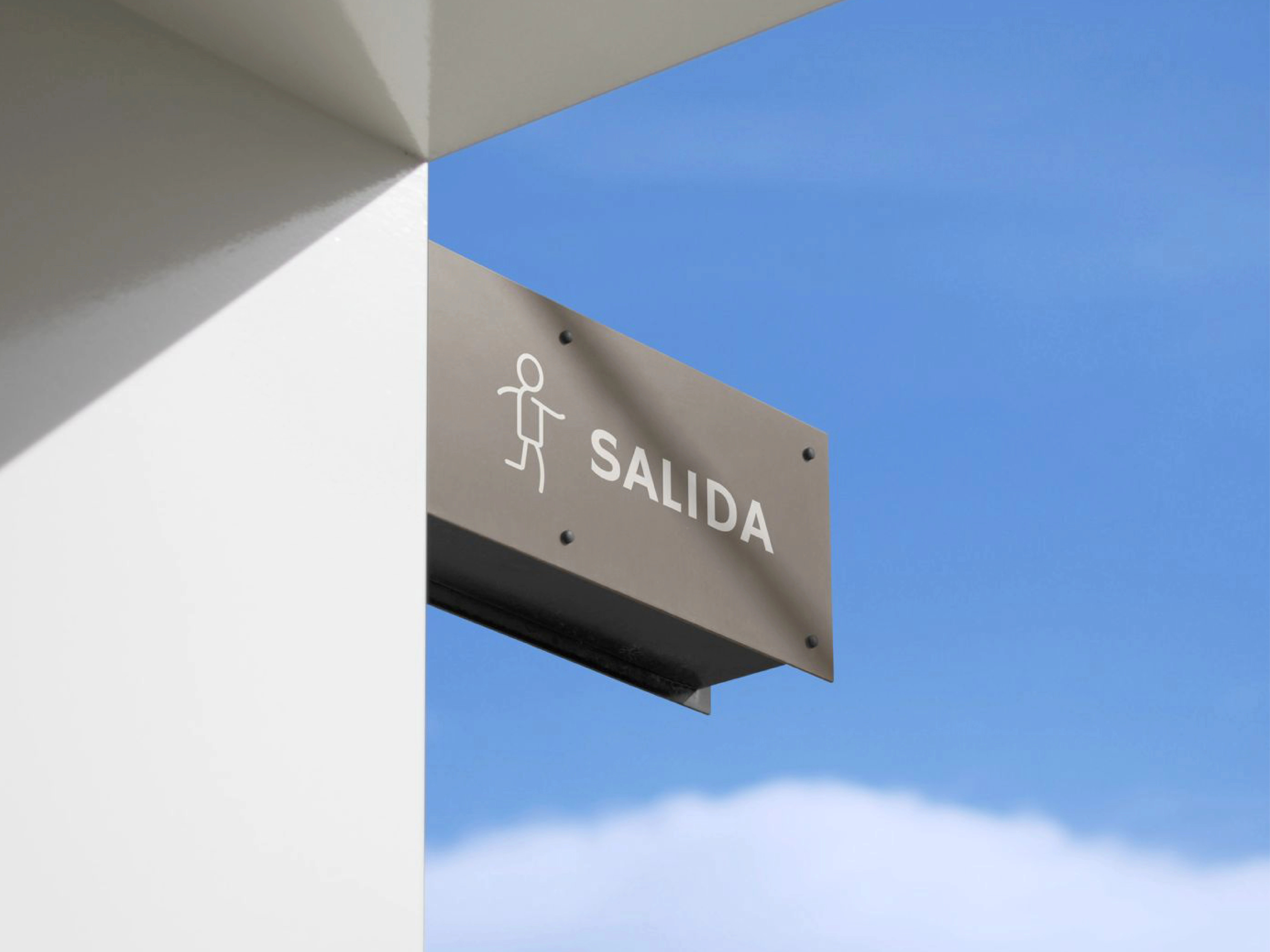
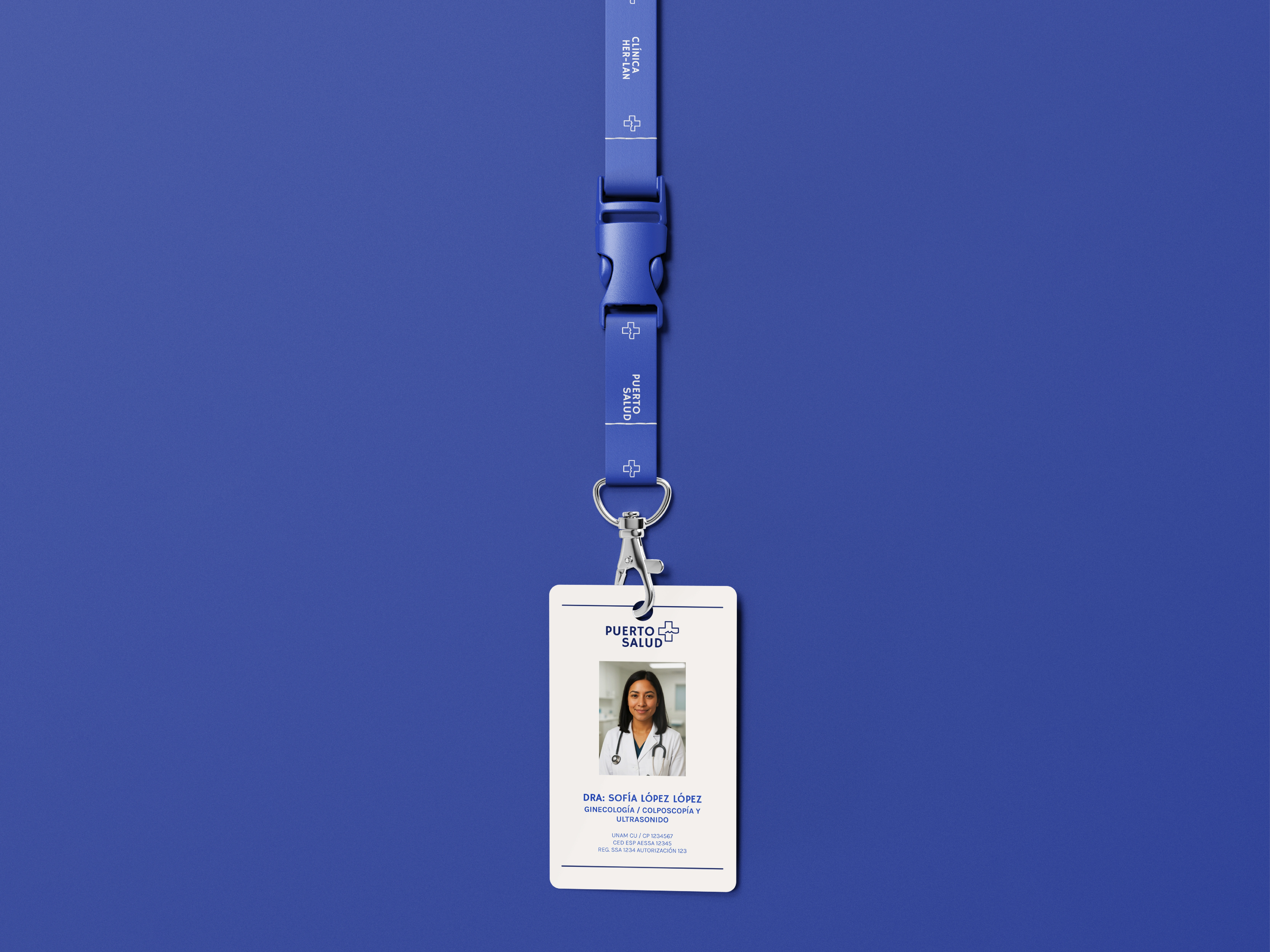
we approached their identity as an invitation to breathe. blue became our anchor, not as a corporate rule, but as a human color: calm, open, and sincere. from there, we built a visual system that balances clarity with warmth. clean typography, simple gestures, and soft contrasts that speak quietly, yet confidently.
our main question throughout was: how does design express care without pretending to heal? the answer lived in restraint. in choosing what not to say. in allowing the brand to listen as much as it informs.

the result is a visual language that mirrors the clinic’s values: young, honest, and human, made to connect with people before they even step inside.


Like this project
Posted Oct 31, 2025
the result is a visual language that mirrors the clinic’s values: young, honest, and human, made to connect with people before they even step inside.

