
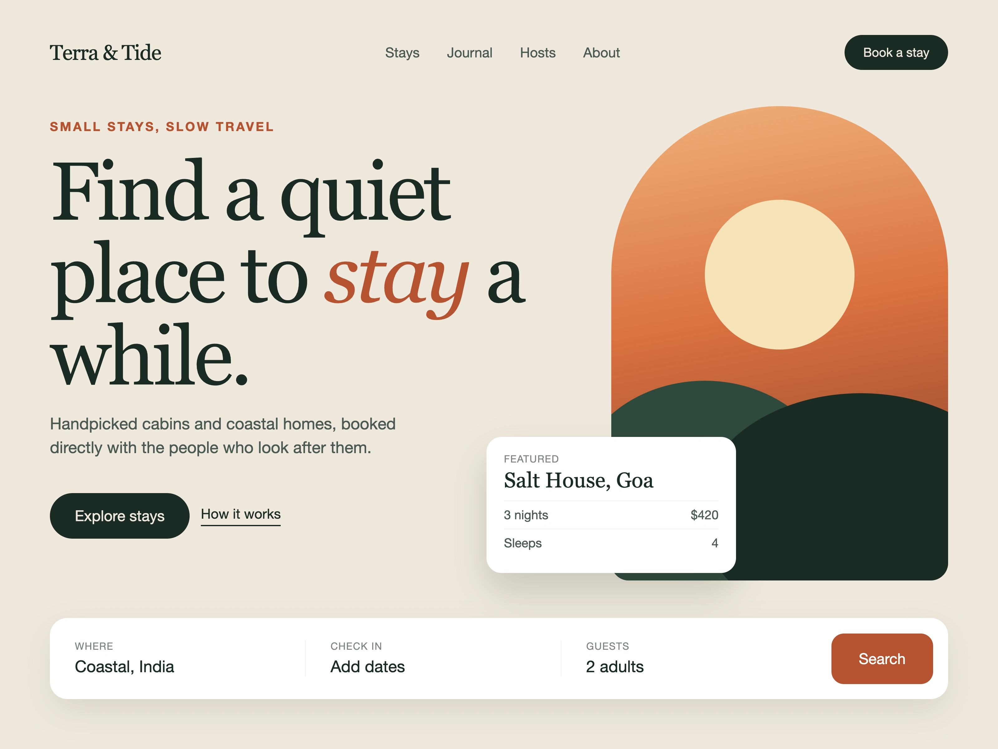
The problem: booking sites for small stays open with a wall of listings, so a guest feels rushed before choosing anything.
The approach: lead with the feeling, then the action. One headline, one image, one search bar.
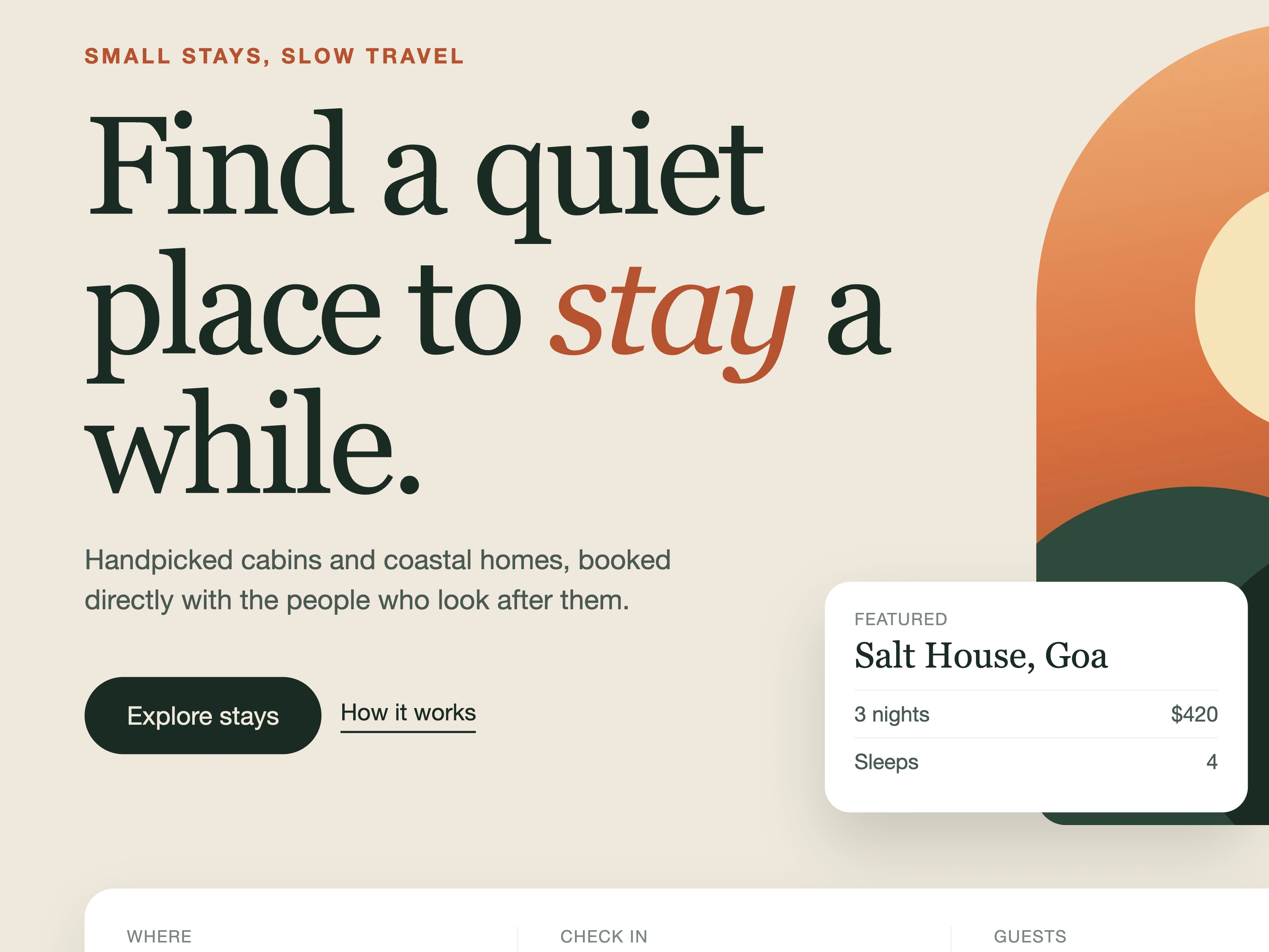
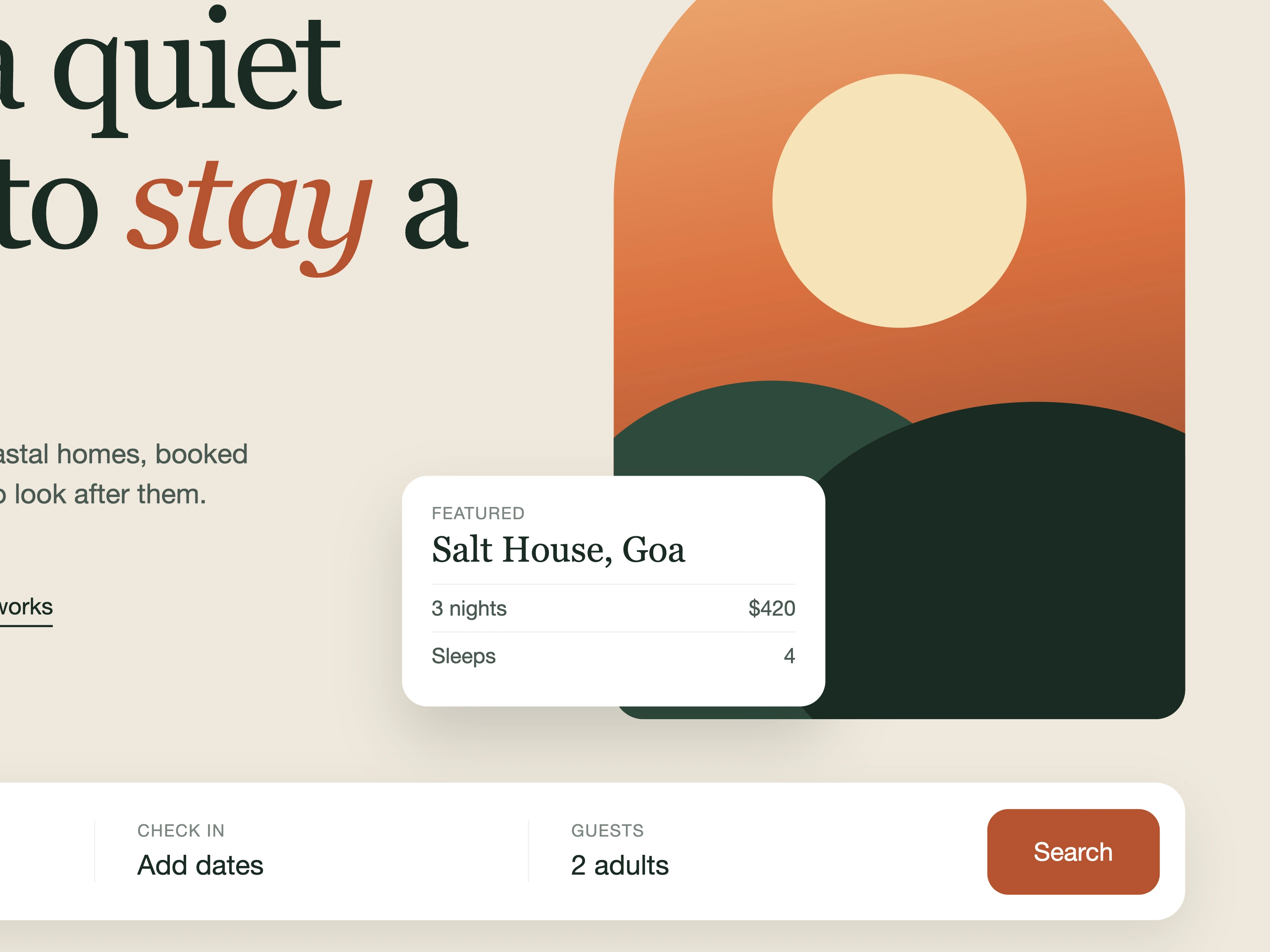
Key decisions: 1) A large serif headline with one italic accent word ("stay") sets a calm tone and gives the eye a single starting point. 2) One arch-shaped illustration in warm sunset colours replaces a photo grid, so the page loads fast and works for any property. 3) The search bar sits at the bottom of the hero, within thumb reach on a phone, so choosing where, when and who takes one glance. 4) A floating featured-stay card shows price and capacity up front, giving a reason to keep scrolling.
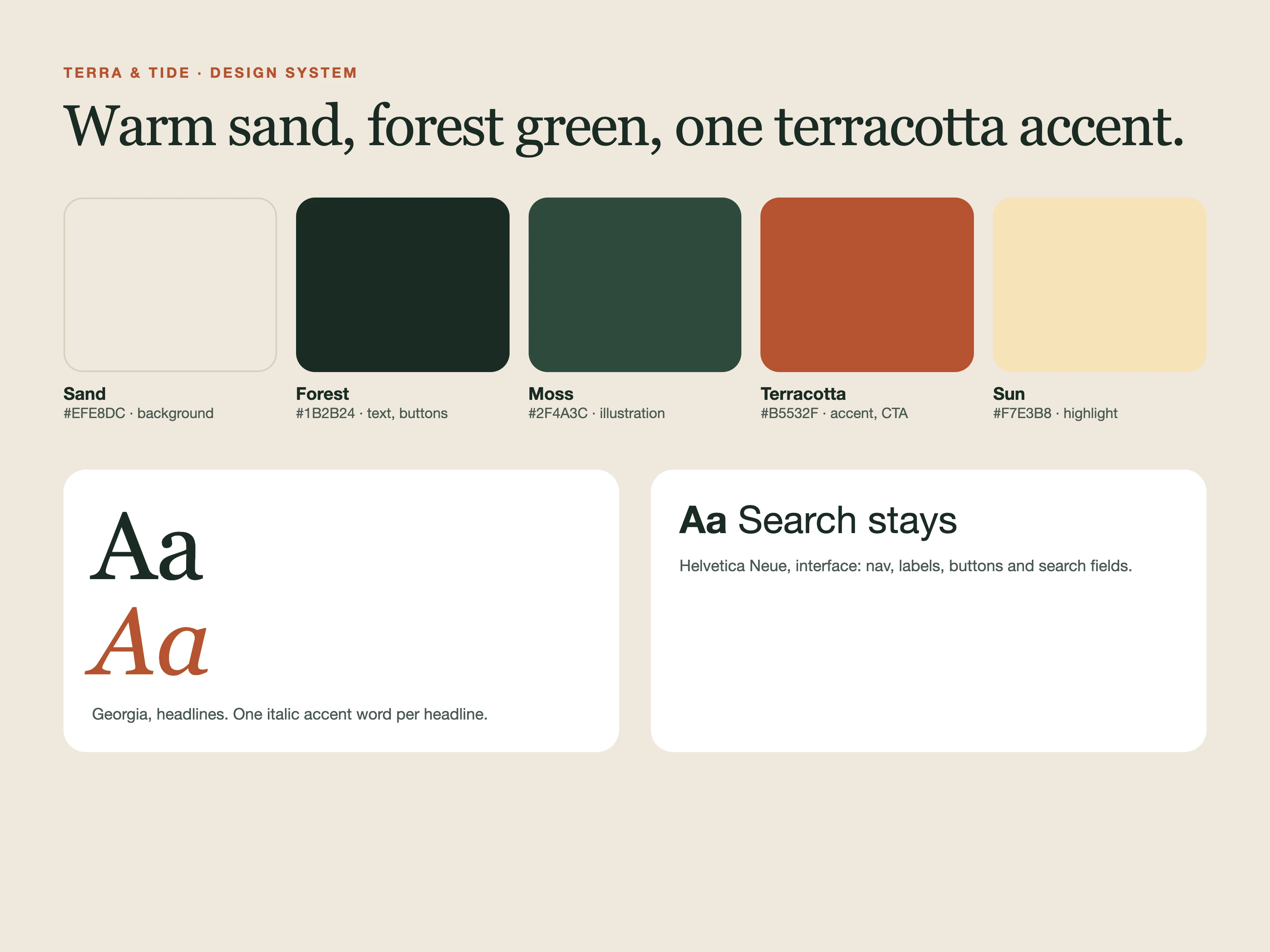
Palette and type: warm sand background, deep forest green text, terracotta accent, serif headline with a clean sans-serif UI. Built to translate to Framer, with variants for the featured card and a sticky search bar on mobile.
Would you keep the search bar in the hero, or push it below the fold?
0 likes · 0 views · Nov 16, 2026
A calm hero section for a slow-travel stays brand: serif headline, one arch illustration, and a thumb-reach search bar. Includes a 12s motion video, full-size s

