UX Redesign : Alchemy's Goerli Faucet
Alchemy's Goerli Faucet UX Redesign
What is Alchemy Goerli Faucet ?
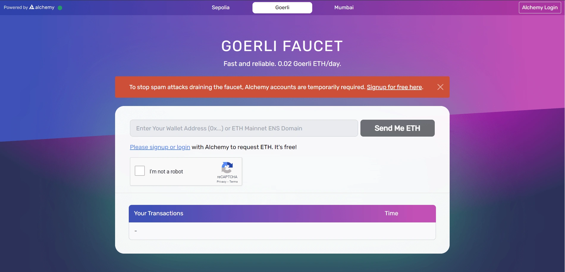
An Ethereum faucet is a developer tool to get testnet Ether (ETH) in order to test and troubleshoot your decentralized application or protocol before going live on Ethereum mainnet, where one must use real Ether. Most faucets require social authentication (e.g. Twitter post or login confirming you are a real human) or place you in a queue to wait for a testnet token through the faucet. The Alchemy Goerli faucet is free, fast, and does not require authentication, though you can optionally login to Alchemy to get an increased drip.You can request 0.05 Goerli ETH every 24h with a free Alchemy account!
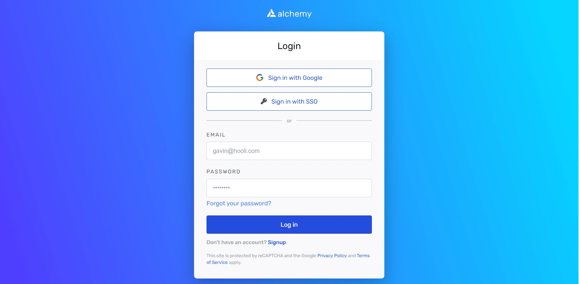
Original Website Designs :
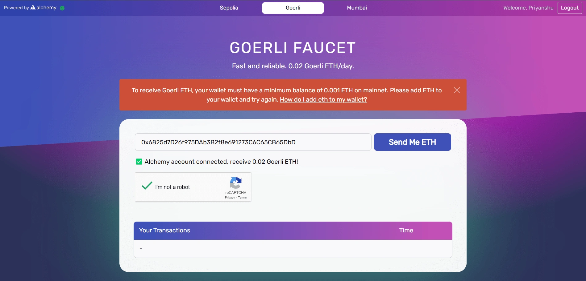
MY IMPRESSION OF IT AS A USER
At first glance I saw that Faucet was not much clear and eye catching due to its poor infrastructure.
APP ANALYSIS
Since I hadn’t already used the website and had no idea about it, I decided to do an in-depth analysis of the website first. I wanted to understand the functionalities, overall architecture, and navigation.
Through the analysis, I identified some clear usability issues and breakpoints. I listed all of them to validate them after my User Research.
My goals for the redesign: To Propose a more engaging and seamless using experience so that users are comfortable using the website for their personal as well as industrial projects.
My personal goals: Enhancing my learning experience by challenging my design decisions and addressing their solutions and also taking the full responsibility of user research and design side.
User Research
1.Conducting User Interview-I started my user research with user interview of the current website with 4 of my friends. They were unknown of this website so I thought that it would be great to involve them as I will be able to get the first experience of users with it. After giving them one day to try the website I listen their problems regarding the website.
The key insights which I found are:
The randomness of website with its color and graphics.
The website was not very entertaining and for many of them the website not seem to grab their trust as a valid or official website.
Absence of homepage where they could know about the work of website and its uses(as they were new to that platform) was also a problem for some of them.
COMPETITIVE ANALYSIS
After going through all the issues and problems I started doing competitive analysis of similar products. The main competitors I found in the market are Autofaucet Dutchycorp, Criptoly, Earnbitmoon, Bithub and Autofaucet. After researching furthermore I reached to some changes which were necessary for the product to compete against its rivals.
IDEATION
Affinity Mapping : I compiled all the feedback, insights, and breakpoints listed above and grouped similar ones. This helped me brainstorm and develop potential ideas and gave a clearer view of what was important to users while keeping the business goals and objectives in mind.
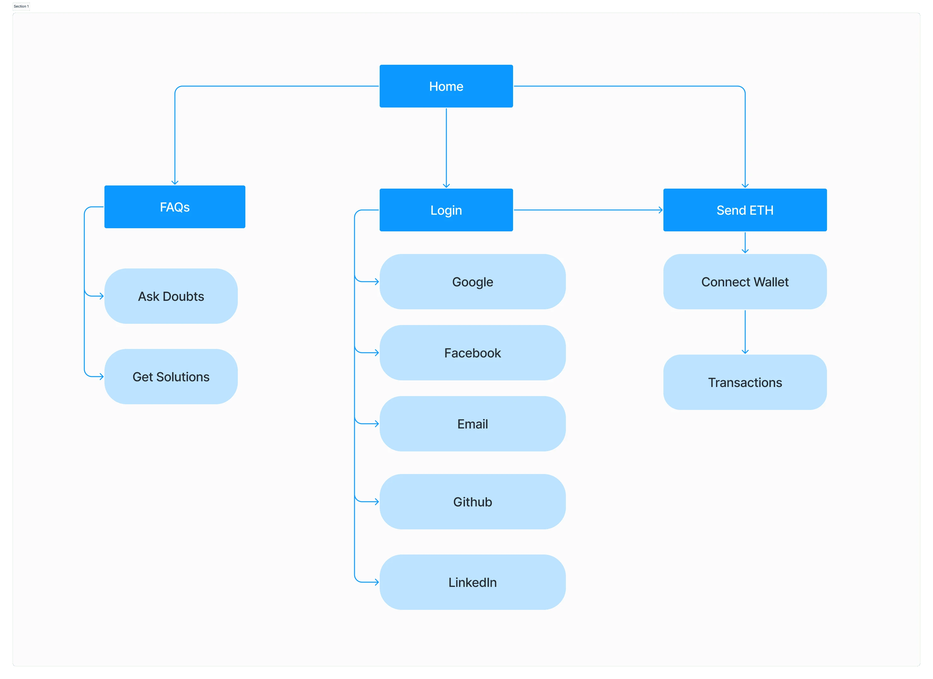
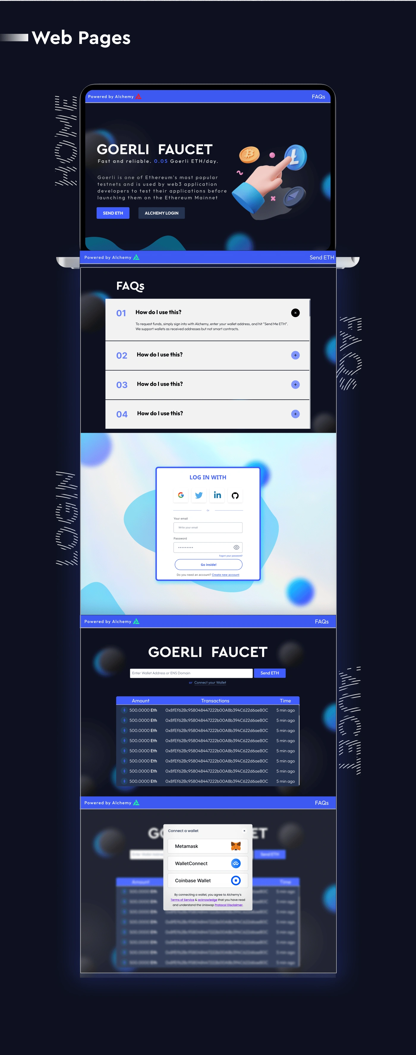
NEW ADD-ONs : 1.)Homepage/Landing page - Initially the users were landing to the final “SENDING ETH” page where after some iterations the users will be directed to the login page which I thought was a little misleading. So combating with this I made a Homepage where user will find the next steps to follow for his/her work and also there I have displayed some information about the project. 2.)Separate FAQ section - Initially the FAQs section was embedded in the main page itself which I found a little bit misleading so for this I shifted the FAQs part to whole new section which can be now accessed from anywhere easily.
User Experience
Faucet was suffering from Design Debt. This is what happens when you run a bunch of experiments and the site is performing well quantitatively, but the experience of using it just isn’t all that great.
The design patterns of the website were inconsistent, navigation flows were a little bit disjointed, and critical parts of the site were end up looking like they were an after-thought (that’s because they were). I refactored the site and scaled my knowledge across the entire design, creating an updated and consistent experience.
Before designing, we dove deeper into research, expanding upon the insights from the current website.
IA(Information Architecture)
The initial website was very compact and minimalist which I thought is good for the users. Keeping the minimalist part of the website I hadn’t made the IA from scratch instead I changed small but important things like landing to homepage then Alchemy login. Then after filling some details we will redirected to the main page. There is a separate section for FAQs for both logged in and logged out users which can accessed with ease.
What’s there in new UI ?
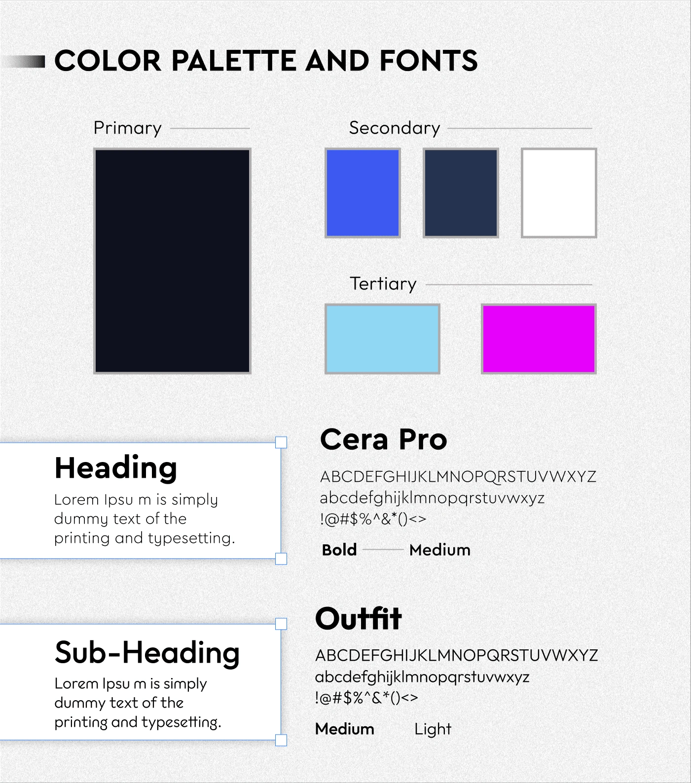
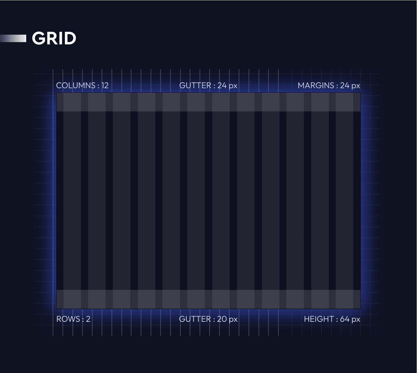
The website initially was very boring looking, crowded, random and not eye catching but with new UI the color scheme and illustrations are very consistent. The fonts, margins, outlines are very modern giving it a metaverse vibe. I have made different gradients, illustrations and cards to align them with the website’s color scheme and style.
WIREFRAMING
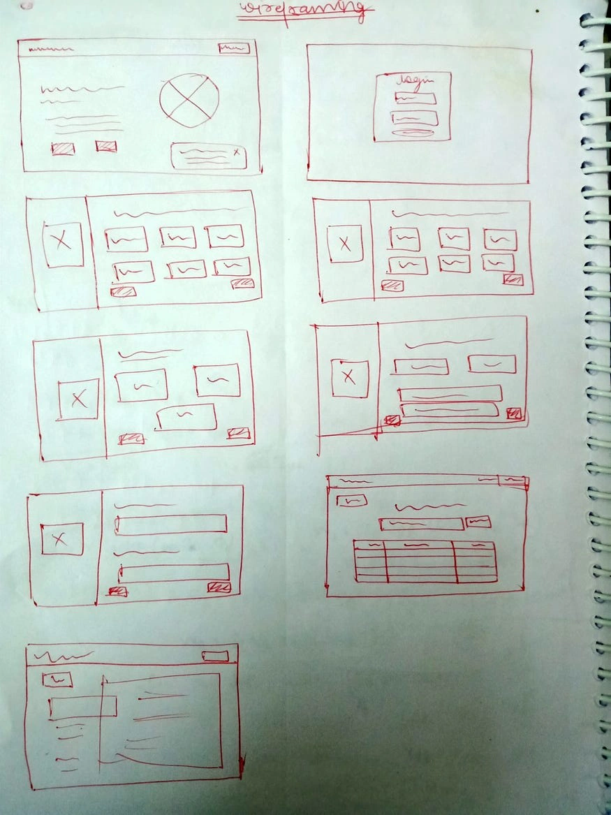
After ideating the solutions and deciding the styles I started making low fiedility wireframes.
And this is what I made after some iterations :
Final UI
My learnings
At first, I was not interested and not having any motivation for this case study as the time when I was doing it was on Diwali(festival of lights) weekends but I gathered my energy and started researching on it as I was aware that this would be the best time to polish my skills and use this time to fullest.
Looking back to the process, the redesigning of this app and the case study gives me the clear idea that how important is consideration of users are while designing any product. It was a very unusual and amazing experience for me to seeing my ideas and design taking shape beautifully.
Like this project
Posted Apr 25, 2023
Redesigned the user experience of testnet faucet website to improve navigation, increase sales and enhance overall customer satisfaction.

