Designing an Intuitive Insurance Quote Dashboard
Overview
Insurance brokers often manage a large volume of quotes daily, requiring quick access to critical information and seamless workflows to serve their customers effectively. My challenge was to design an insurance quote dashboard that would streamline this process, enabling brokers to handle quotes more efficiently while ensuring a user-friendly and accessible interface.
The Goal
The objective was to create a responsive and intuitive dashboard that brokers could use to:
View, filter, and manage customer quotes.
Access quick details for a selected quote.
Dive deeper into a detailed view for comprehensive information.
Adapt seamlessly across desktop and mobile platforms.
Key Challenges
Data Integration: Handling data fed via APIs from different systems.
Content Management: Ensuring flexibility for CMS-managed content.
User Needs: Designing for brokers with diverse technical expertise.
Accessibility: Adhering to WCAG guidelines for an inclusive experience.
Approach
Step 1: Research and User Persona
I created a persona to represent the target user: Emily Thompson, a detail-oriented insurance broker balancing speed and accuracy in managing quotes. This helped guide design decisions to meet user expectations.
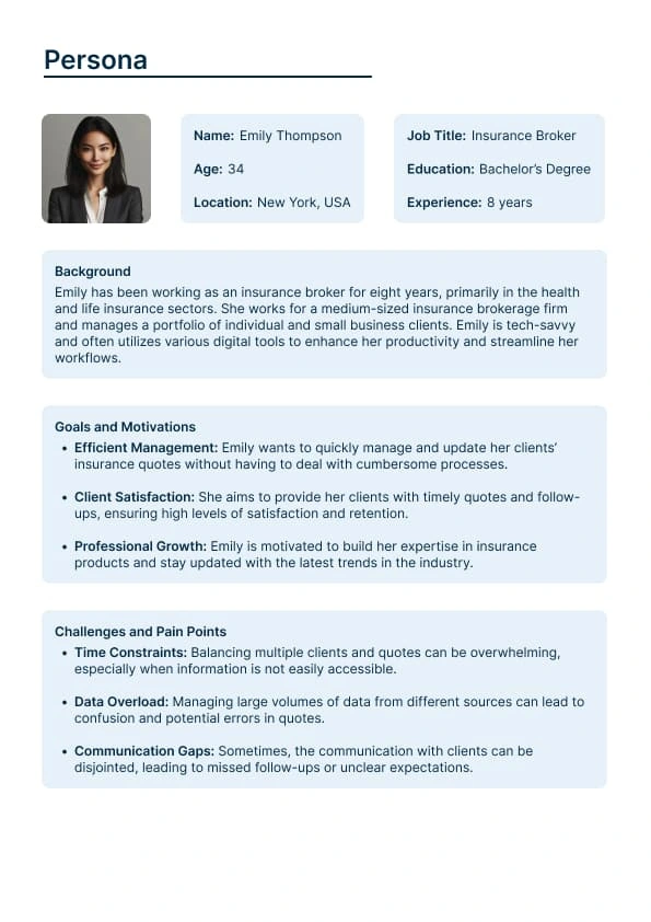
User Persona
Step 2: User Flows
I mapped out user workflows, including the desired path, alternative paths, and error handling, ensuring that each interaction was intuitive.
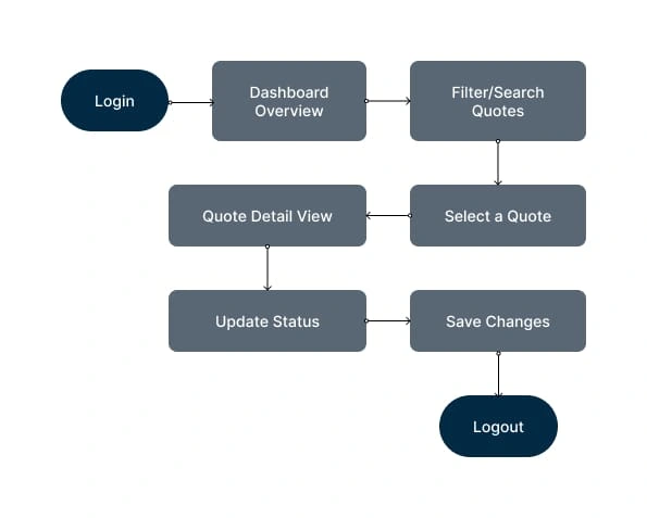
Sample Userflow
Step 3: Wireframes
Low-fidelity wireframes were sketched to visualize the layout and information hierarchy. Key components included:
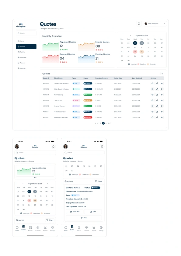
A dashboard with filters and summary metrics.
Quick Details panel for at-a-glance information.
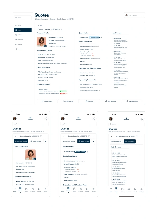
A Detailed View for in-depth data and action buttons.
Step 4: UI Design
Using Figma, I created high-fidelity mockups focusing on clarity, modern aesthetics, and mobile responsiveness. A modular design system was employed for consistency and scalability.
Step 5: Accessibility & Design Tokens
I integrated design tokens for typography, colors, and spacing.
Accessibility features included high-contrast color schemes, keyboard navigation, and readable font sizes.
Final Deliverables
User Flows: Detailed paths showcasing how brokers interact with the system.
Wireframes: Low-fidelity sketches of the dashboard and detailed quote view.
High-Fidelity Mockups: Polished designs demonstrating desktop and mobile versions.
Design Rationale: Comments in Figma explaining usability, layout, and visual hierarchy decisions.
Outcome Highlights
Quick Details Panel: Offers essential information like quote status, premium, and customer details, minimizing time spent navigating.
Detailed View: Comprehensive data with audit trails, document attachments, and action buttons for smooth task execution.
Mobile Optimization: A responsive layout ensuring a seamless experience for brokers on the go.
Accessible Design: WCAG-compliant features make the interface usable for a broader audience.
Learnings and Reflection
This project reinforced the importance of understanding user workflows and balancing functionality with simplicity. By prioritizing user needs and accessibility, the design not only improves efficiency but also enhances user satisfaction.
You can explore the complete design via this figma link:
Like this project
Posted Dec 3, 2024
Designed an intuitive, responsive insurance dashboard for brokers, optimizing workflows, accessibility, and mobile usability for seamless quote management.
Likes
0
Views
141

