The Ultimate Mobitel Self-Care App Makeover – Here’s How we Did
Janakan Mahendrarajah
Introduction
Have you ever felt frustrated trying to use a complicated app, especially on your phone? This case study is about how we completely revamped the Mobitel Self-Care App to make it easier for everyone to use, even if you're not very tech-savvy. The old app was confusing and people stopped using it. We changed that by making it user-friendly and giving people the tools they need to manage their phone plan directly from their phone.
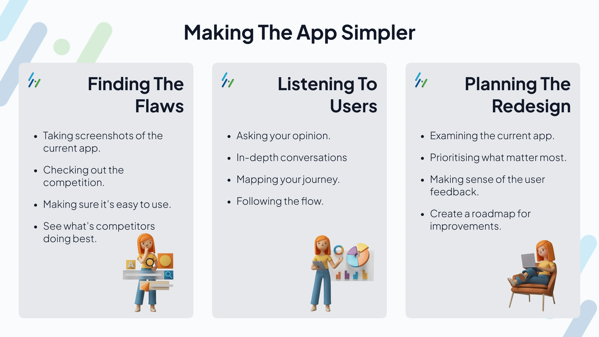
Making the App Simpler
We didn't jump straight into designing. Here's what we did to understand how to make the app better:
We took a close look at the old app and saw what was difficult to use. We also compared it to other similar apps to see what they did well.
We asked 17 people who use the app what they liked and disliked, and we read reviews from the app store to see what common problems people were having. This helped us understand what users were struggling with the most.
We made a list of all the issues we found and decided which parts of the app were most important to fix first.
The Design Process
Designing for Everyone
Once we knew what to improve, we started designing a new app. Here's what we focused on:
Easy to Use: We made sure the layout was clean and simple, with clear buttons and menus.
Finding Things Fast: We created a navigation bar that makes it easy to find the information you need quickly.
Managing Your Account: We made it easy to see your data usage, top up your account, and get help if you need it.
Looking Good: We kept the design modern and sleek, but also focused on making it easy to use.
We created mockups (basically rough drafts) of the app and then turned them into interactive prototypes that people could try out. This helped us get feedback from the people who use the app regularly. We kept making changes based on this feedback until we had a final design that was easy to use for everyone.
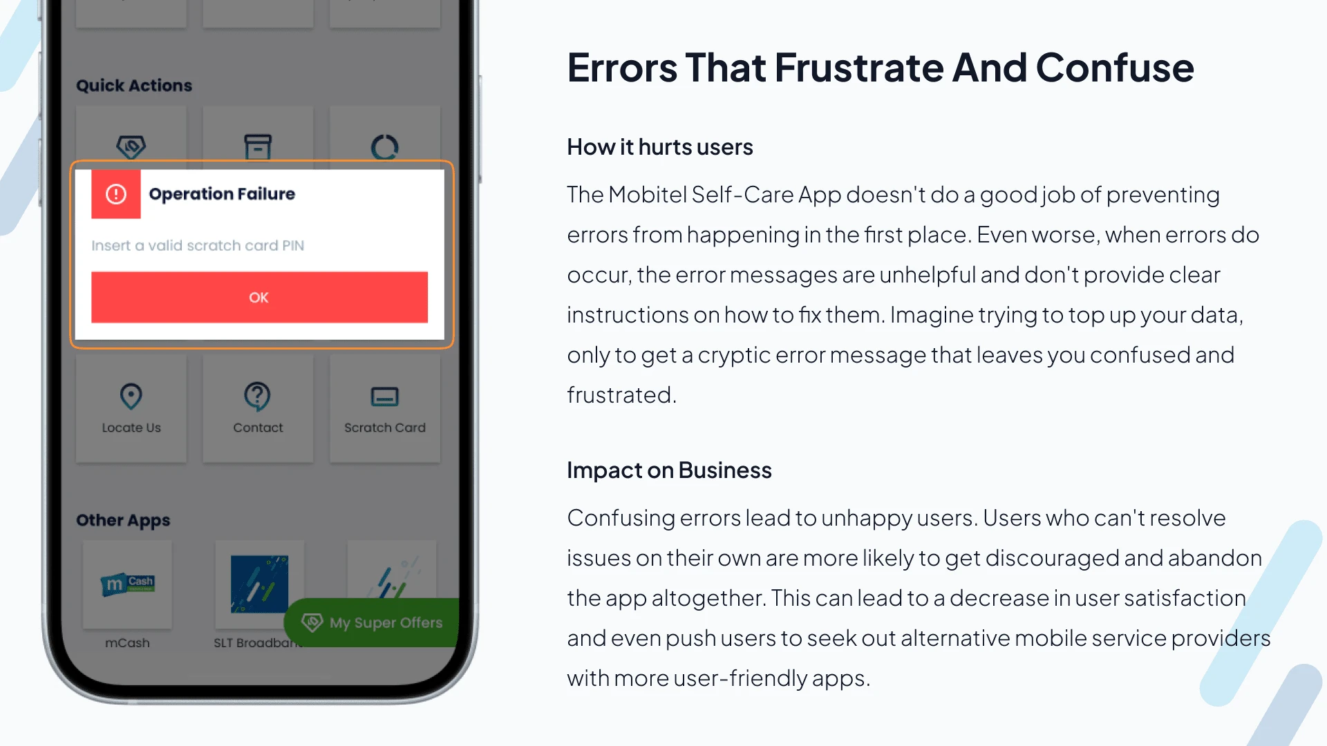
Finding the Flaws
We looked closely at the old Mobitel Self-Care app to see what was making it hard to use. We checked things like:
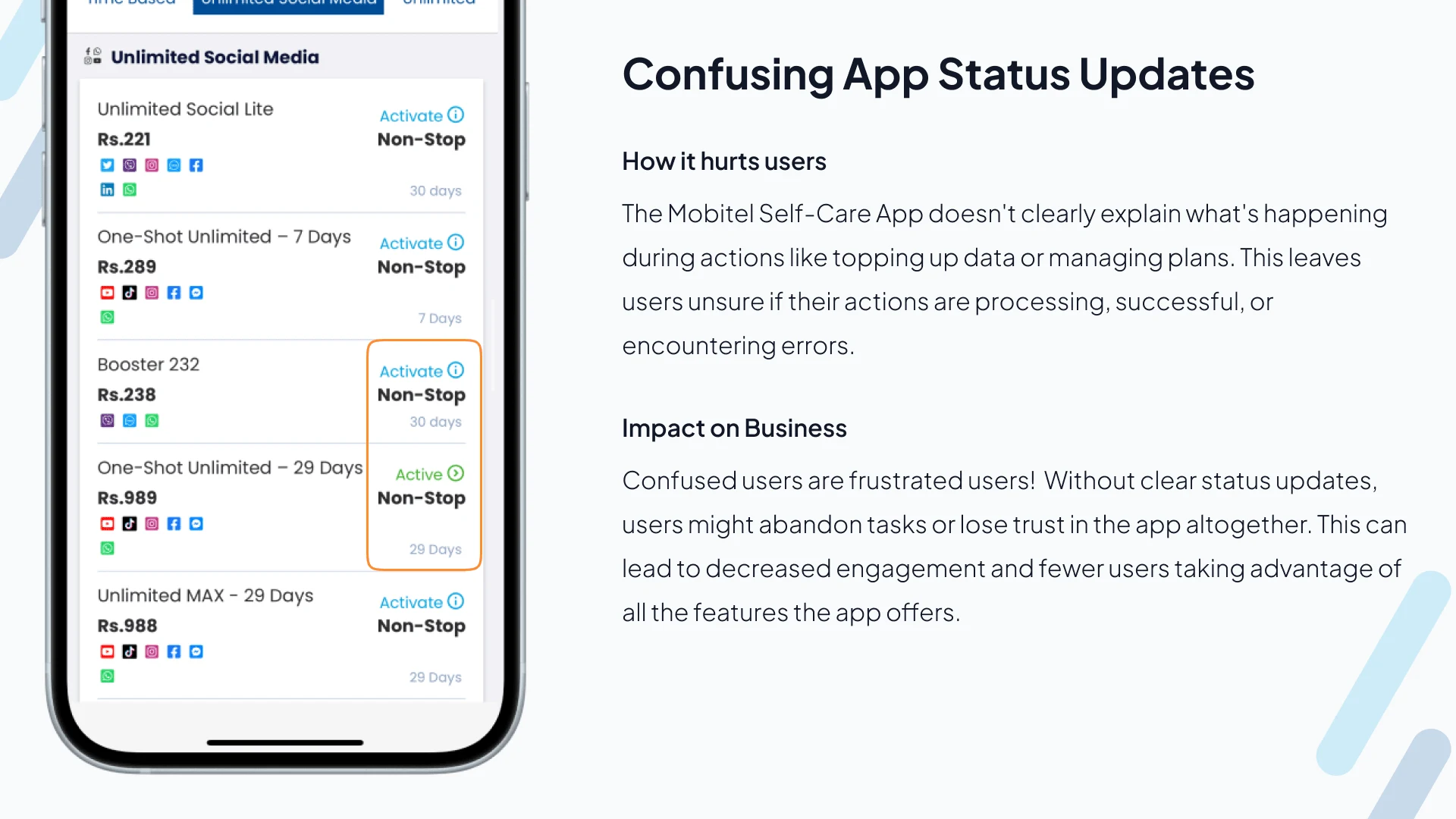
Keeping You Informed: Did the app clearly show you things like your data usage or account balance?
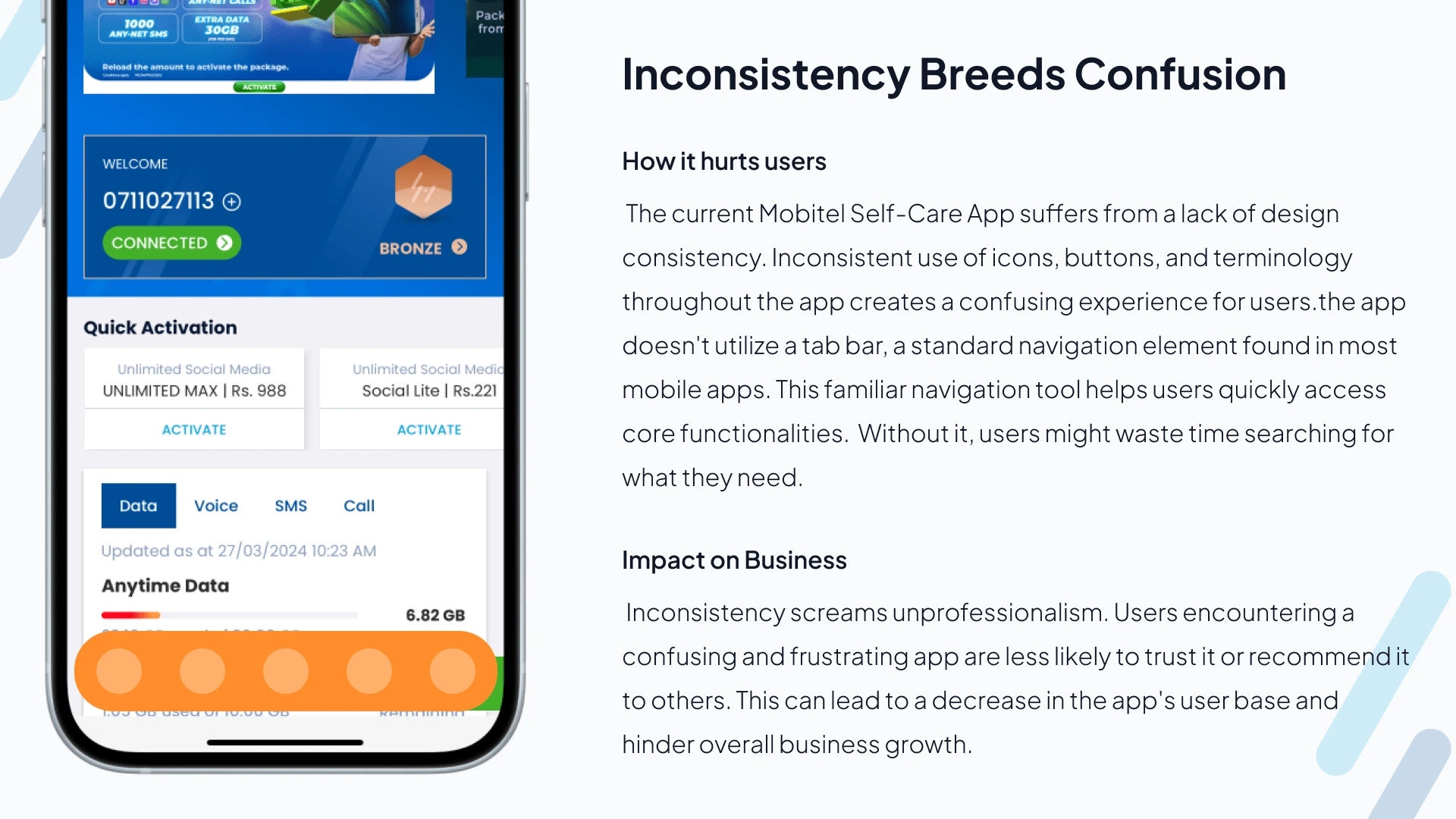
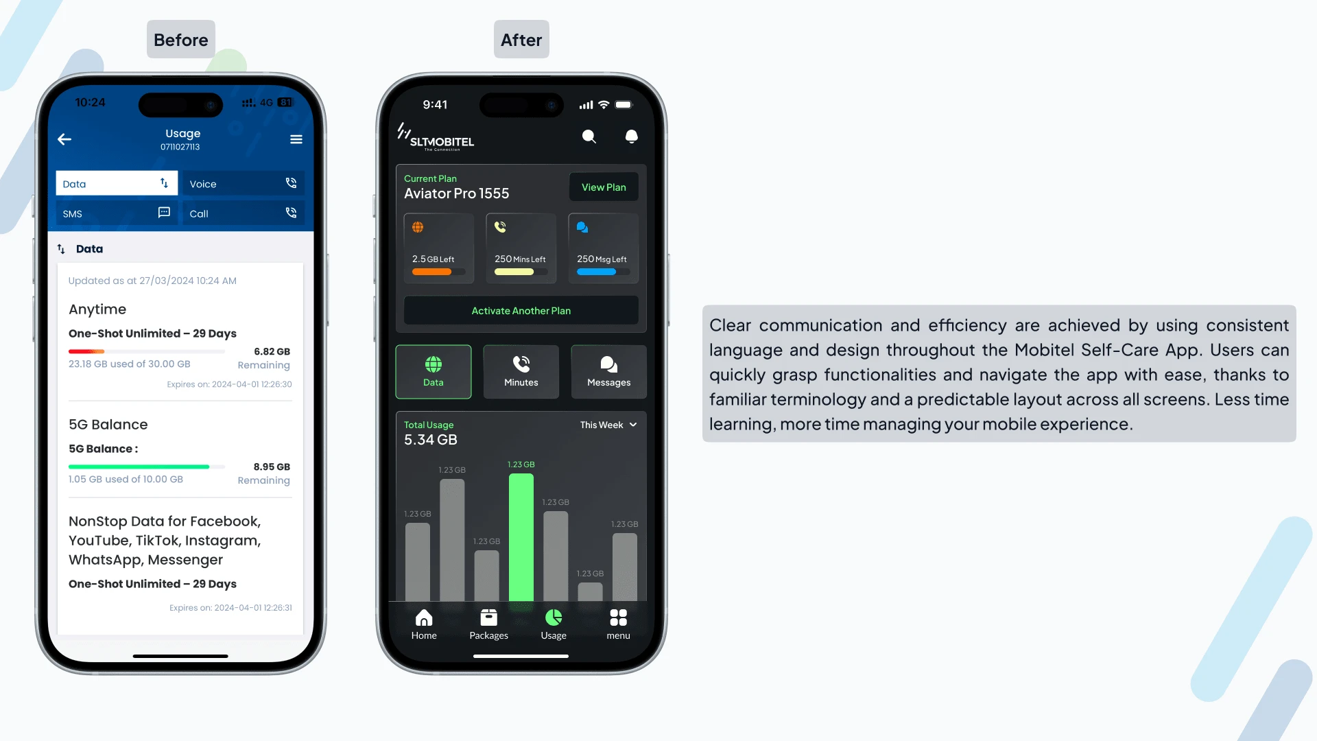
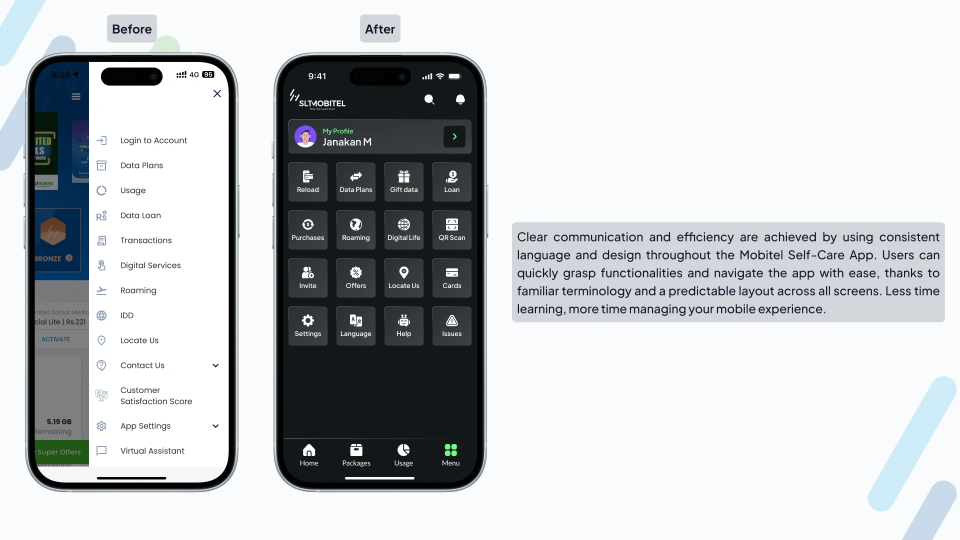
Speaking the Same Language: Was the wording consistent throughout the app, or did it use confusing terms?
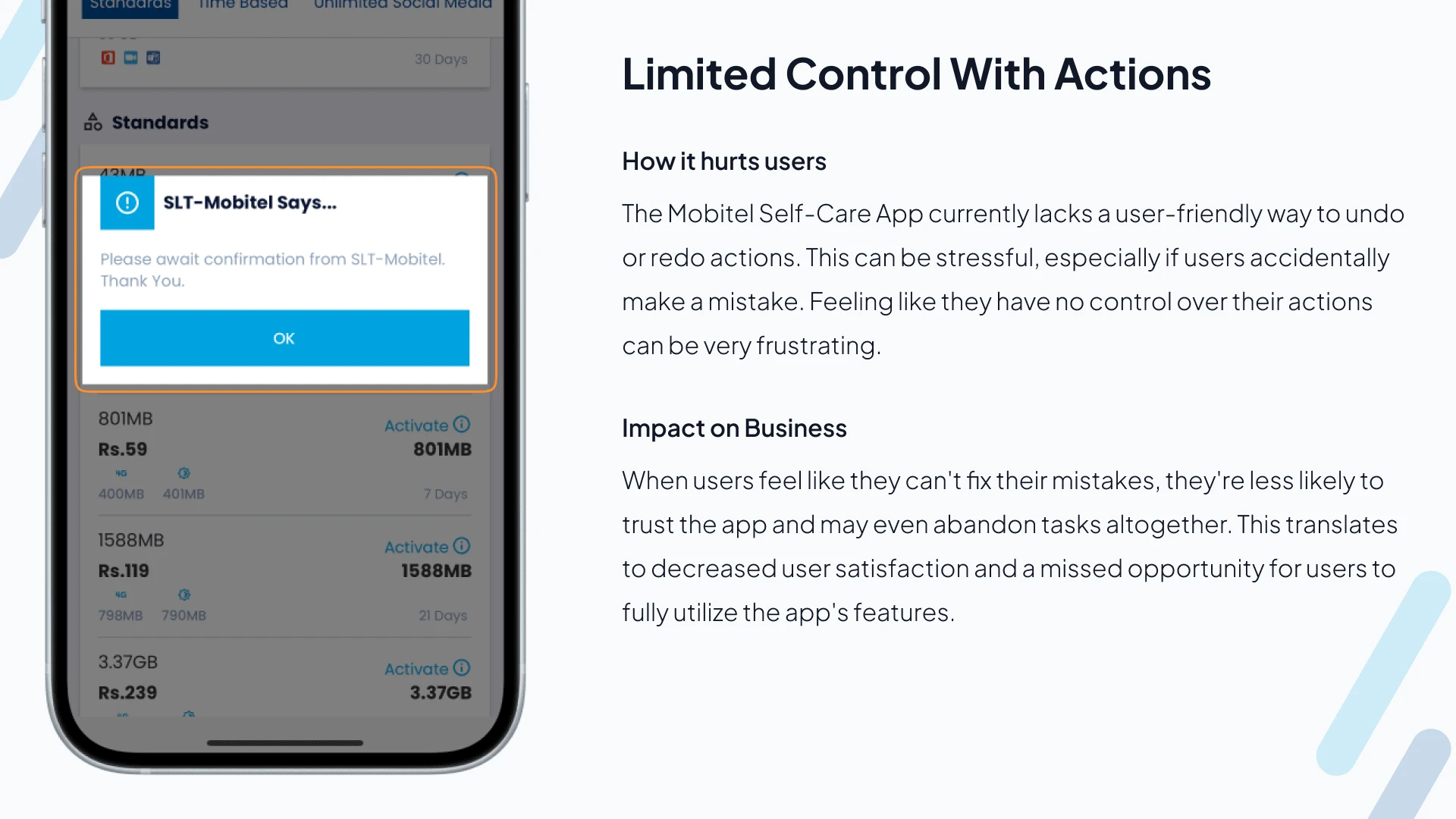
Staying in Control: Could you easily do things like top up your account or manage your plan?
Looking Sharp: Did the app look outdated or cluttered?
We also checked out what other mobile phone companies like Jio and Airtel were doing with their apps. This helped us see where Mobitel could improve in areas like design, features, how fast the app ran, and whether it offered ways to personalize your experience or get help if you needed it.
Testing the water
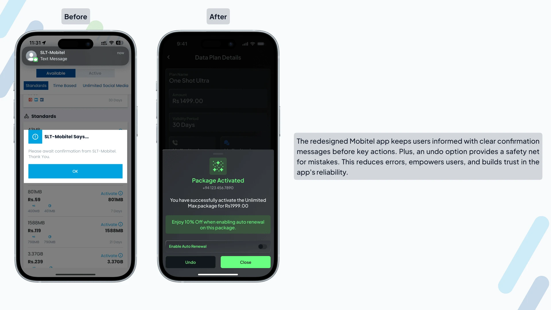
We closely examined the old Mobitel Self-Care app to identify areas causing confusion or frustration. From unclear loading messages to limited user control and outdated design, we pinpointed opportunities to improve. The new app will keep you informed with clear progress indicators, empower you with more control over your mobile experience, and use consistent language and layouts that are easy to navigate. By implementing preventative measures to avoid errors, we'll make the app smoother to use. Additionally, a modern makeover with a clean and attractive design will enhance the user experience. Finally, a comprehensive Help section with FAQs and live chat support will ensure you have the information and assistance you need, whenever you need it. These improvements will transform the Mobitel Self-Care App into a user-friendly and empowering platform that everyone can enjoy.
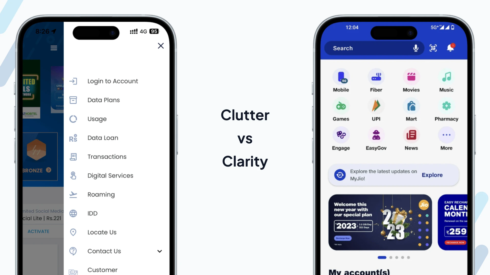
Falling Behind the Competition
We compared the Mobitel Self-Care App to leading rivals like My Jio and My Airtel, and it's clear Mobitel needs to catch up. Here's why users might be switching:
Confusing Interface: Mobitel's cluttered design pales in comparison to competitors' sleek and user-friendly interfaces.
Limited Features: Competitors offer a wider range of features, like easy recharges and advanced account management, functionalities missing in the Mobitel app.
Performance Lag: Slow loading times and crashes in the Mobitel app frustrate users, while competitors prioritize smooth performance.
Support Woes: Finding help within the Mobitel app is a struggle, unlike competitors who offer readily accessible and helpful customer support.
Missing the Personal Touch: Mobitel lacks personalized features like recommendations and promotions tailored to individual needs, a strategy that keeps users engaged with competitor apps.
By addressing these issues and learning from what competitors are doing well, the redesigned Mobitel Self-Care App can become a more attractive and user-friendly option for everyone.
Listening to Users
We wanted to understand what people loved and hated about the Mobitel app. We surveyed 17 users and read app store reviews to identify their biggest pain points. It turns out users craved better tools, personalized plans, and an easier way to get help. A confusing layout, missing features, and slow loading times were major sources of frustration. To visualize a typical user's journey, we mapped out their key interactions with the app, from signing up to managing their account, topping up data, and getting help. This helped us focus on the improvements that mattered most to real people.
Understanding User Needs
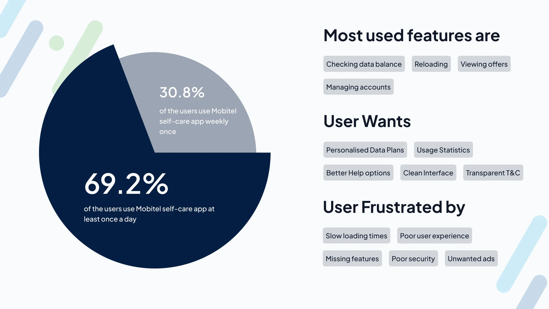
We surveyed users of the Mobitel Self-Care App to learn more about their habits and frustrations. Here's what we found:
Most users (70%) access the app daily.
Checking data balance, reloading, and managing accounts are the most common tasks.
Users requested improved tools, personalized data plans, easier access to help and FAQs, and a clean, intuitive interface.
Difficulty using features, lack of advanced data management and usage statistics, and slow loading times were major pain points.
From this survey, we can see that the Mobitel Self-Care App is used frequently by a significant portion of its users. However, there are some key areas for improvement. Users want easier access to information and features, as well as more personalization options. Additionally, the app's performance needs to be improved to reduce frustration. By addressing these pain points, the Mobitel Self-Care App can become a more user-friendly and efficient tool for its users.
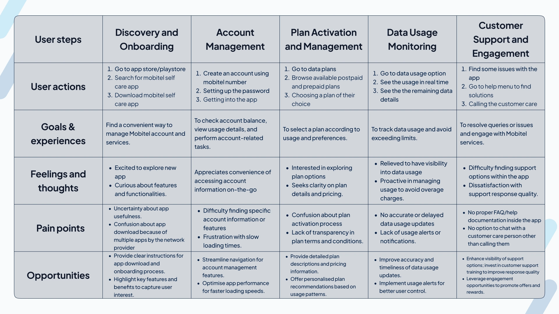
Walking in the User's Shoes
We mapped out a typical user's journey with the Mobitel app to identify areas for improvement. From downloading the app for the first time (discovery and onboarding) to managing their account, activating data plans, monitoring usage, and getting help (customer support and engagement), we pinpointed opportunities to make things easier and more helpful. For example, providing clear instructions during onboarding, streamlining navigation for account management, and offering personalized plan recommendations can all enhance the user experience.
Planning the Redesign
After analyzing the app and gathering user feedback, it was clear the Mobitel Self-Care App wasn't meeting user needs. The design lacked visual appeal and was difficult to use. App store reviews confirmed these issues, mentioning security concerns, crashes, confusing navigation, and a lack of support.
Focusing on What Matters
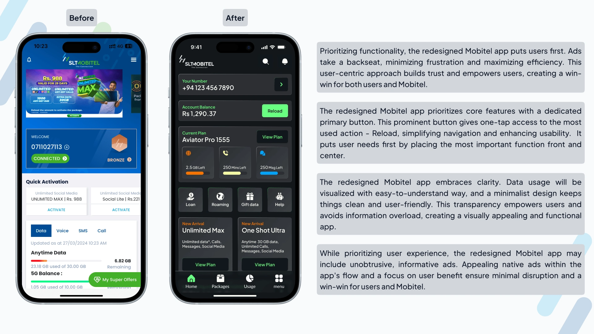
To address this disconnect, the app redesign prioritized key user journeys that matter most to both users and the business. This includes making it easier to top up data, navigate through ads displayed on the homepage, find and activate data plans, and access detailed usage information.
A User-Centered Redesign for Success
The redesigned Mobitel Self-Care App focuses on what matters most - **YOU!** We listened to user feedback and app store reviews to understand the problems and completely revamp the app. Here's how the redesign benefits both users and the business:
Easier and Faster: We streamlined key tasks like topping up data, managing data plans, and accessing usage information. This will save you time and frustration.
More Helpful: A revamped Help Center with clear instructions and a smarter AI assistant will ensure you get the information and support you need, whenever you need it.
A Pleasure to Use: We've given the app a modern makeover with a fresh look, clear navigation, and user-friendly language. This makes the app enjoyable and intuitive to use.
The result? A user-friendly and feature-rich app that empowers you to manage your mobile experience with ease. This translates to increased user satisfaction and engagement, ultimately benefiting the business.
By focusing on these core user journeys, the Mobitel Self-Care App becomes a win-win for everyone.
Creating a Fresh Look
Before getting started on the redesign, we took a step back to imagine what the ideal app would look like. We created a mood board to inspire us, filled with modern design ideas, fonts, and color schemes. This helped us define a clear direction for the app's visual style.
Next, we sketched out some basic wireframes to map out the app's structure and how users would navigate through it. These initial sketches were like a blueprint, giving us a foundation to build upon for the exciting part - creating the final visual design of the Mobitel Self-Care App!
Going Back for Better
We were excited about our initial design for the redesigned Mobitel Self-Care app. It included all the core features, but when we showed it to real users, their feedback surprised us. While the features were there, the design itself wasn't quite what they were hoping for. Users wanted a cleaner, more modern look and feel.
This feedback was a valuable reminder of the importance of user-centered design. We went back to the drawing board, determined to create an interface that users loved, not just one that had all the features. This experience highlights why iterative design is so important. By getting feedback from real people early and often, we can make sure the final product is something users will truly enjoy using.
Re-imagining the Design with User Feedback
The user feedback loop was a goldmine! We learned that our initial design, while functional, wasn't quite hitting the mark in terms of aesthetics. So, we went back to the drawing board and dug deeper into user research. We also looked at popular apps known for their design, like Spotify, Apple, and Uber, to see what we could learn. Here's how we incorporated user preferences while maintaining functionality:
Borrowing from the Best: We adopted Spotify's "bento grid" layout, which organizes the app's interface into clear sections for easy navigation. From Apple's sleek design, we drew inspiration for polished elements that make the Mobitel app look modern and professional. Finally, Uber's user-friendly icons and dark theme provided a clear visual language and a sophisticated feel.
By strategically combining these elements, we aimed to create a Mobitel Self-Care App that's not only functional but also beautiful and easy to use. We want users to enjoy interacting with the app and feel confident managing their mobile experience
Taking it a Step Further
On top of this foundation, we identified three key features to make the app even more user-friendly:
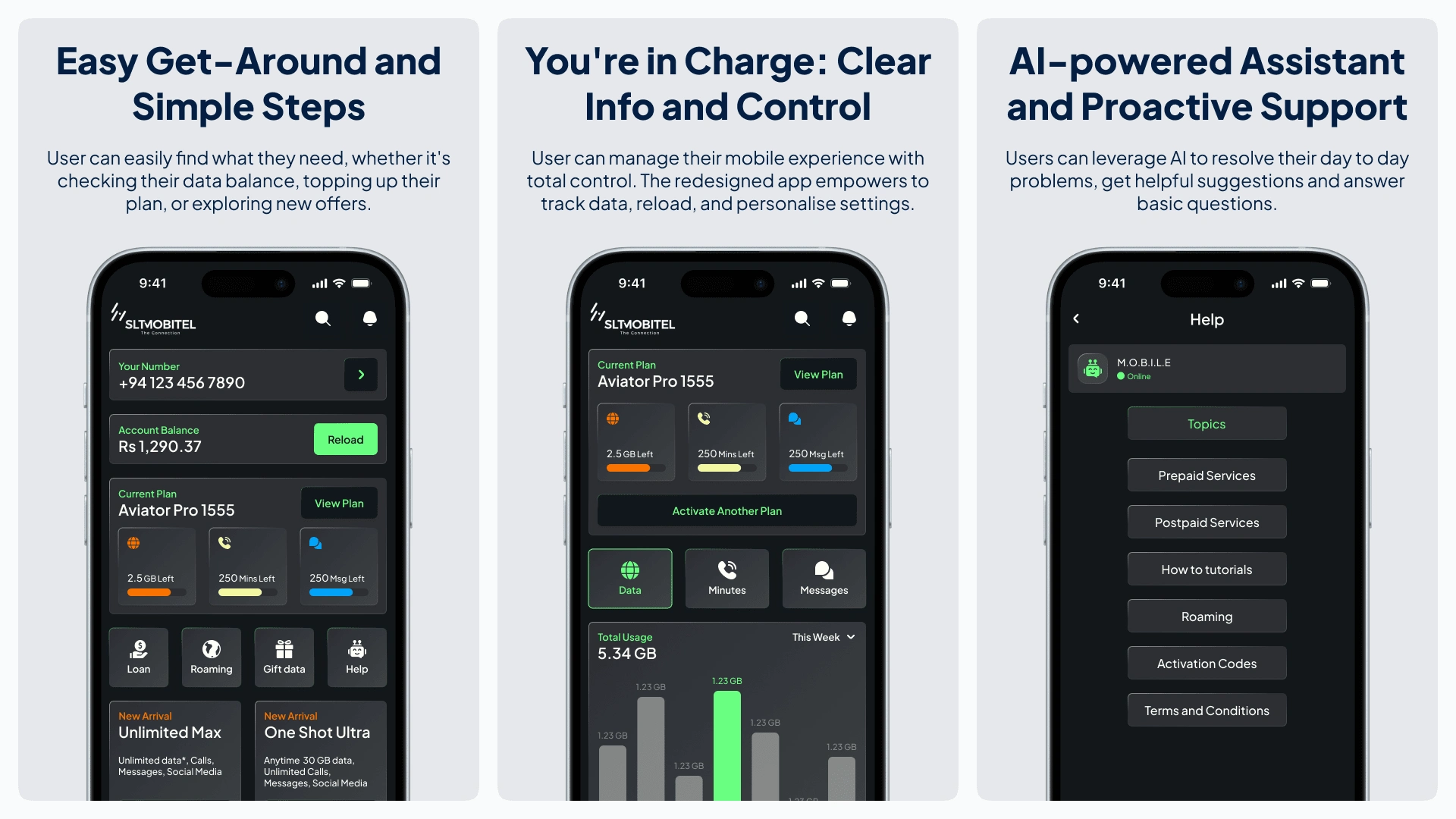
Effortless Navigation: The redesigned app will have a clear and streamlined interface. This means a revamped layout, simpler buttons, and a navigation bar for easy access to everything you need. Imagine finding what you need in seconds, whether it's checking your balance, topping up, or browsing new offers.
You in Control: The app will empower you by giving you more control over your mobile experience. This could include flexible data management options, clear progress updates during actions (like seeing a detailed success message while topping up), and the ability to personalize settings. Imagine easily tracking your data usage and avoiding exceeding limits.
Smarter Support: The redesigned app will leverage artificial intelligence (AI) to provide a more personalized and helpful experience. Imagine an AI assistant that anticipates your needs, offers suggestions, and answers basic questions. Plus, the app could send real-time usage notifications and alerts for potential issues. This, combined with live chat support, creates a comprehensive system that caters to a wider range of user needs.
By prioritizing user feedback and incorporating these innovative features, the redesigned Mobitel Self-Care App is poised to become a user-centric and feature-rich platform that empowers users and drives business growth.
A Mobile App Makeover for the Better
Imagine a Mobitel Self-Care App that's easy to use, looks great, and helps you manage your mobile experience with confidence. This case study explored how user feedback can be used to redesign the app, making it more friendly and helpful for everyone.
By listening to real people's experiences, we identified ways to improve the app's design, layout, and features. The redesigned app would be easier to navigate, with clear information and helpful tools. This could mean anything from a fresh coat of paint to features that make it simpler to top up your data or track your usage.
This approach, where the design is based on what users really want and need, can make the app more enjoyable to use. It could also lead to happier customers and better business for SLT Mobitel. After all, a user-friendly app is a win-win for everyone!
Try the interactive prototype
Like this project
Posted Sep 19, 2024
Revamped the Mobitel Self-Care App to be user-friendly, simplifying phone plan management for all users, even those who aren’t tech-savvy.
Likes
1
Views
158