Covid-Info App Development
Nadine Bolduan
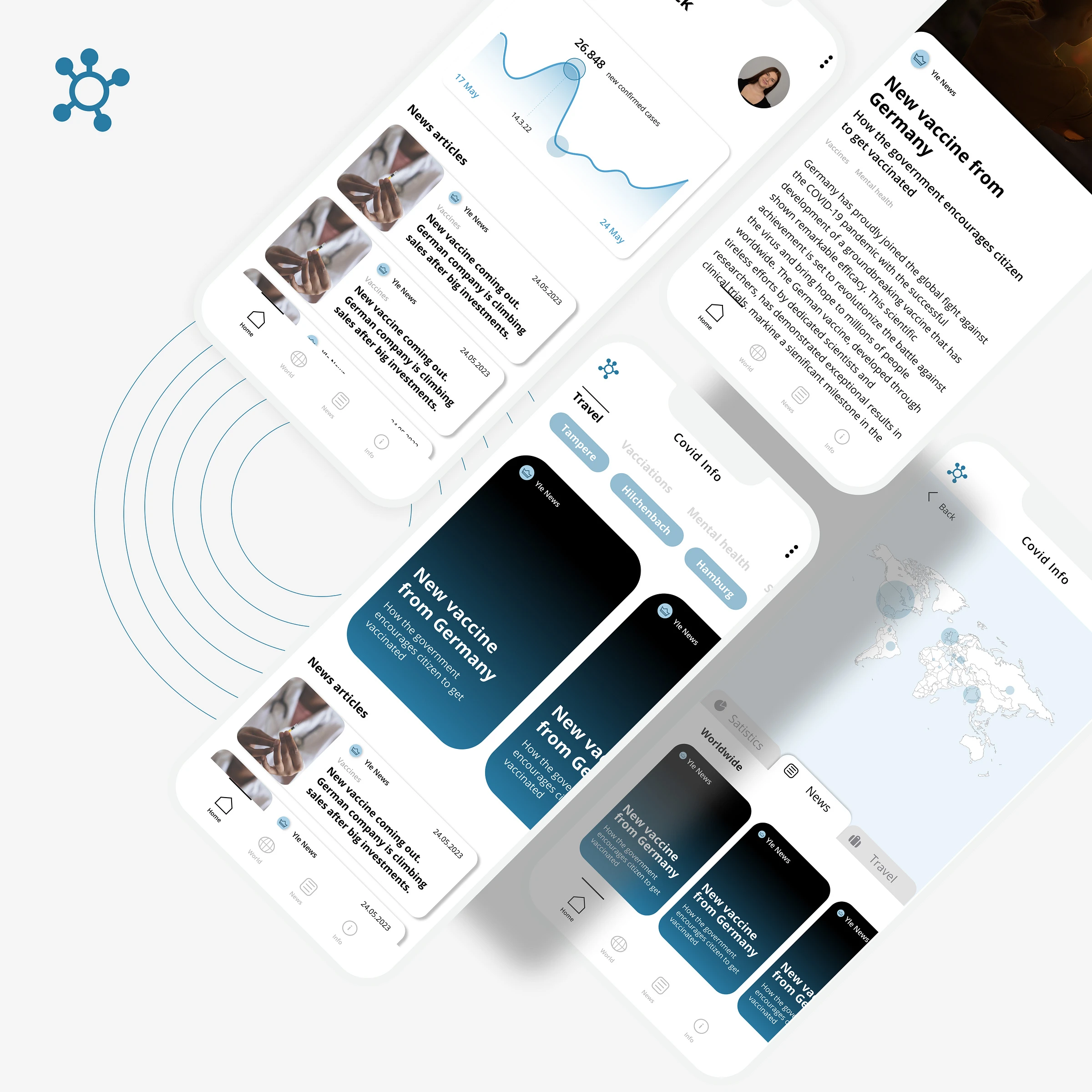
Covid-Info (App)
The app addresses the need for users to stay informed about COVID-19 restrictions and guidelines for specific locations, including their home area and any other places they may be visiting or planning to visit. It provides a user-friendly platform to quickly consume vital information through these features.
Interactive Map Visualization
Displays real-time data on COVID-19 restrictions and case numbers.
Allows users to explore different regions and view updated restrictions.
Localized News Integration
Users can follow local newspapers for selected regions.
News is presented in a "story format" (similar to Instagram), offering concise, daily updates.
Essential Travel and Health Information
Highlights local flight restrictions and travel guidelines.
Provides guidance on recognizing COVID-19 symptoms and steps to take when infected (for oneself or others).
The app combines interactivity, personalization, and accessibility, catering to the demand for digestible, location-specific COVID-19 updates and resources.
Define & empathize
Ideate & Prototype
To establish a sense of authority and trustworthiness, the news app utilizes shades of blue as its primary color palette. Secondary colors, such as subtle grays, are deliberately chosen to be non-contrasting, reinforcing a calm and modern aesthetic that allows users to focus on the textual content without unnecessary distractions. The app prioritizes interactive elements and smooth, understated animations—particularly in the story feature—to maintain user engagement while delivering a seamless and enjoyable experience.
Usability test
Purpose
The purpose of the test was to examine how well test participants would be able to find relevant information on certain example topics related to the ongoing COVID-19 pandemic situation.
The test was done with three participants and conducted by the authors of this report. The participants were students living in Finland, which was also the scenario applied to the tasks. The test was done remotely through Zoom, with the participants sharing their screen during the test and following instructions given by the test facilitator. The participants were asked to share their thoughts during the test and at the end were asked a few questions about their experience and impressions of the website.
Methodology
Each of the three sessions took around 15.00min and included a briefing/an introduction for the tester, giving tasks to the user and finally evaluating feedback by questioning the participant after fulfilling the tasks.
Test scenario
You are a student living in Finland and you need to find some information about the Corona situation.
Like this project
Posted Oct 16, 2025
Developed an app for COVID-19 updates with interactive maps and news.
Likes
0
Views
0
Timeline
Aug 16, 2021 - Dec 16, 2021