Branding and app design for IOT app
Problem Statement: To build a cross-platform app that would capture abnormal sounds in a user's environment and allow them to label these sounds.
Responsibilities: I was the design lead on this project, analyzing the user needs and building the UI around those needs.
Part One : The listener app
This project began with an IBM research team reaching out to the design team. The research team was looking for designers to help build out an audio analytics app they had been working on. The project sounded super interesting and it also sounded like a great opportunity, so a few designers and I decided to join the team.
The goal of the research team was to create a consumer app that would help build their audio algorithm. My small design team got together to figure out who this app would be created for and how it could help their current situation. We decided to collect some research on audio analytics so that we could gain a better understanding of the users.
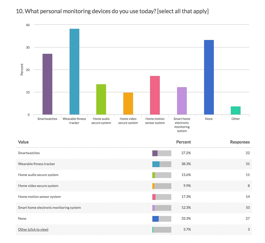
Screenshot from user research study
Our team sent out a survey and collected research from about 100 people. The survey included data about devices, security, location, as well as environments that people live in. Here are some things we drew from the responses:
Most of the users were millennials or from generation Y
Living in a suburban environment in a home or townhouse
Lives with other adults or (mobile) pets
Travels monthly for 2-7 days
After collecting research, we evaluated our user type and built personas. We created both a consumer persona and a business persona.
We used these personas as a reference throughout our process to ensure we were always addressing our user needs first.
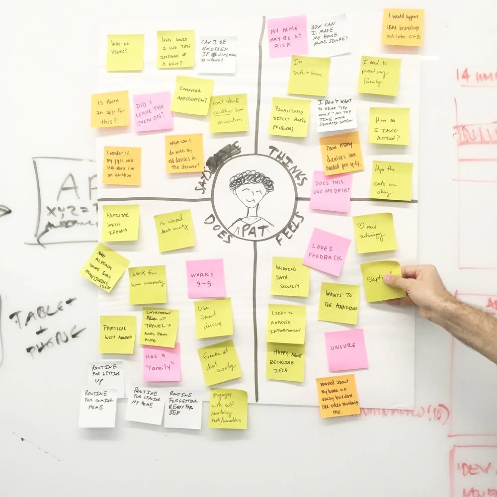
Person creation during design thinking workshop
Before we could begin designing, we scheduled a design thinking workshop with the research team. The research team and design team worked together to come up with ideas and to align on the design strategy.
Workshop outcomes:
As is + to be scenario map
Persona use cases
Design strategy
Development timeline
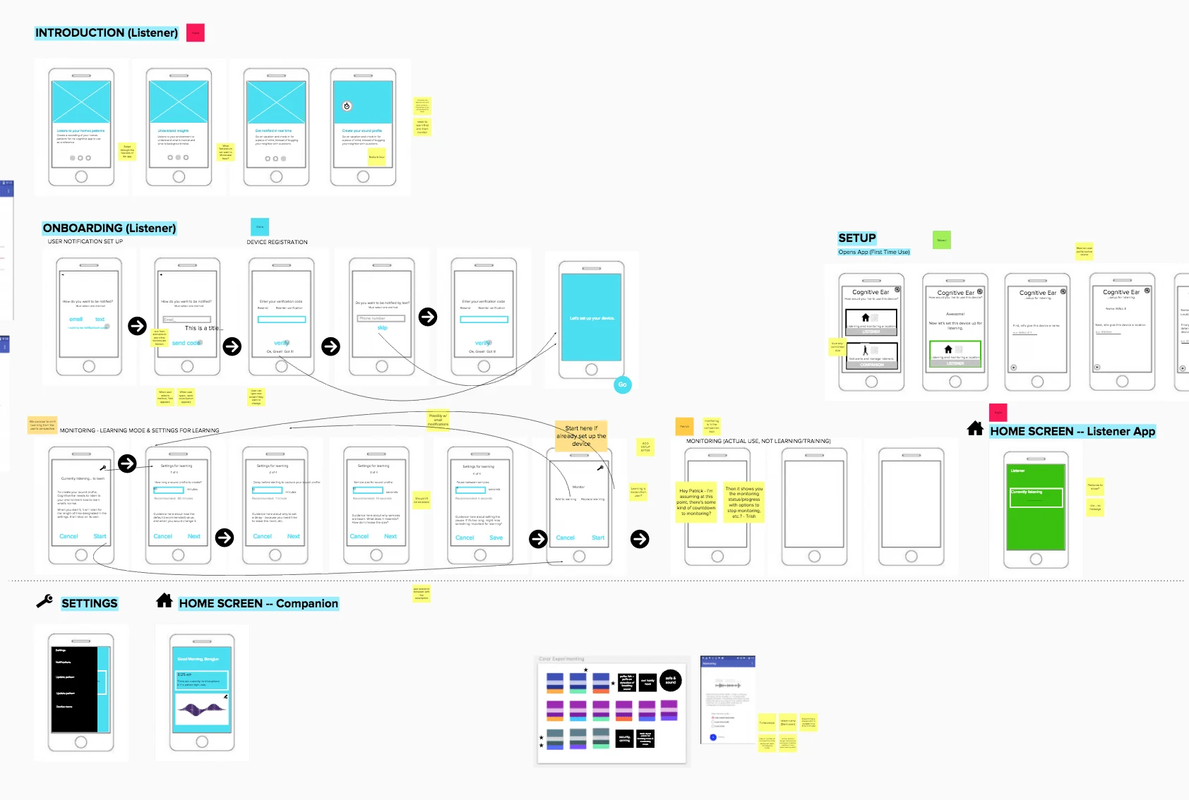
Once our strategy for the listener app was determined, we began iterating on the UI. I made sketches and low-fidelity wireframes to help the team understand what flow made the most sense for our users.
After forming our wireframes, we began to explore the branding for the listener app.
The Design Direction
I began my process by exploring potential names for the app. First, I decided to focus on the anatomy of the ear and the names associated. The name that stuck to me was Pinna (also known as the Auricle) which is the projecting portion of the eternal ear.
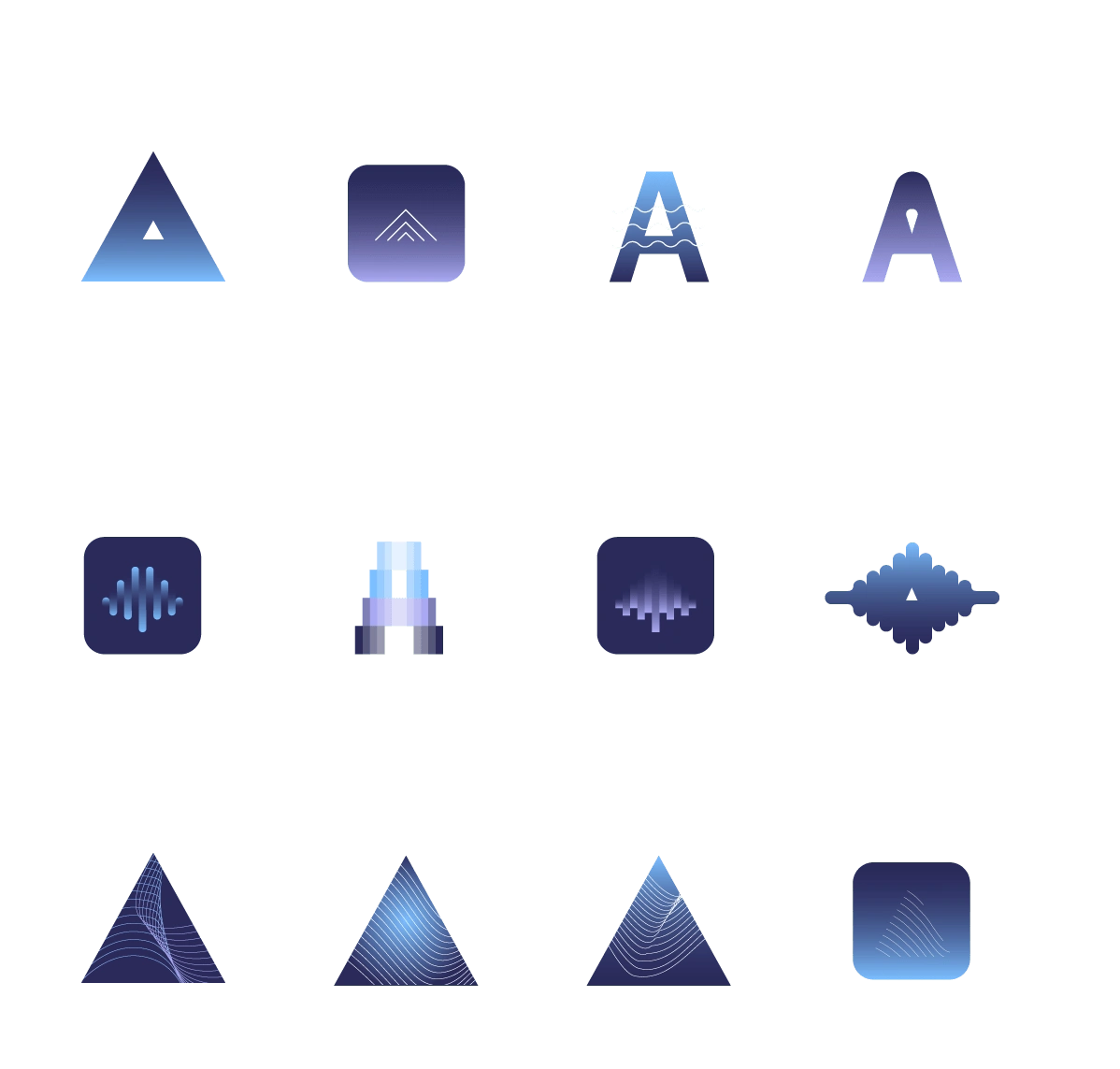
Once I got alignment from the team and we had our project name, I explored some visuals that related to audio, ears, and Internet of Things (IOT).
I looked at different color palettes, then I used the palette to explore some logos. I also did some quick A/B testing to get a preference for the logo.
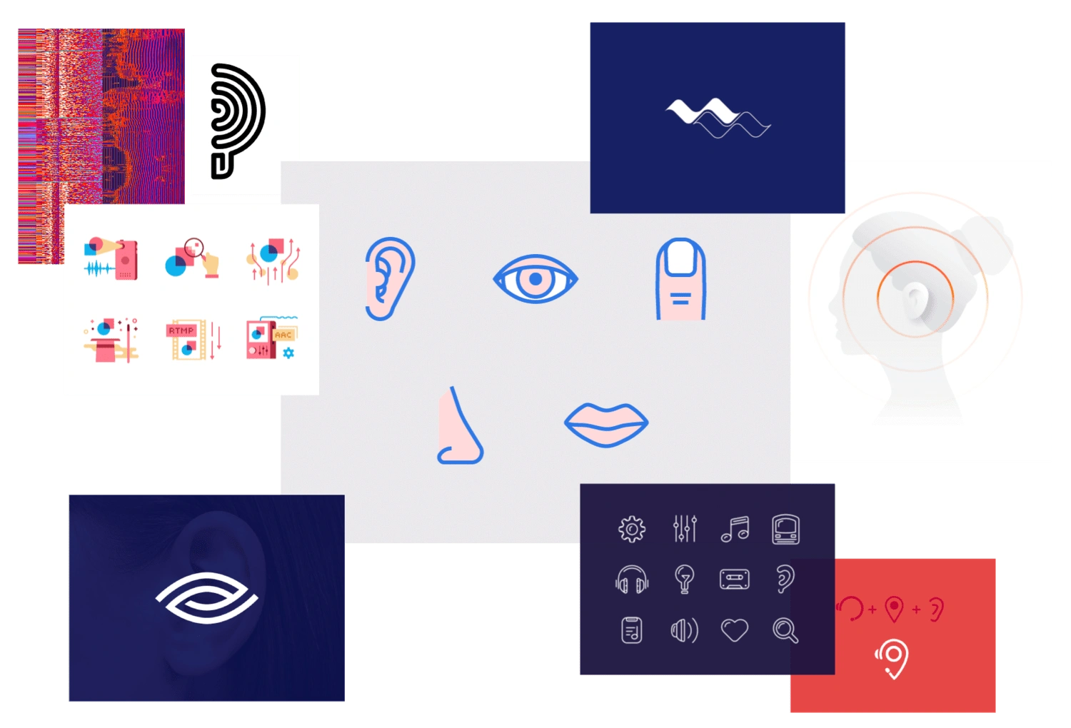
Moodboard for direction
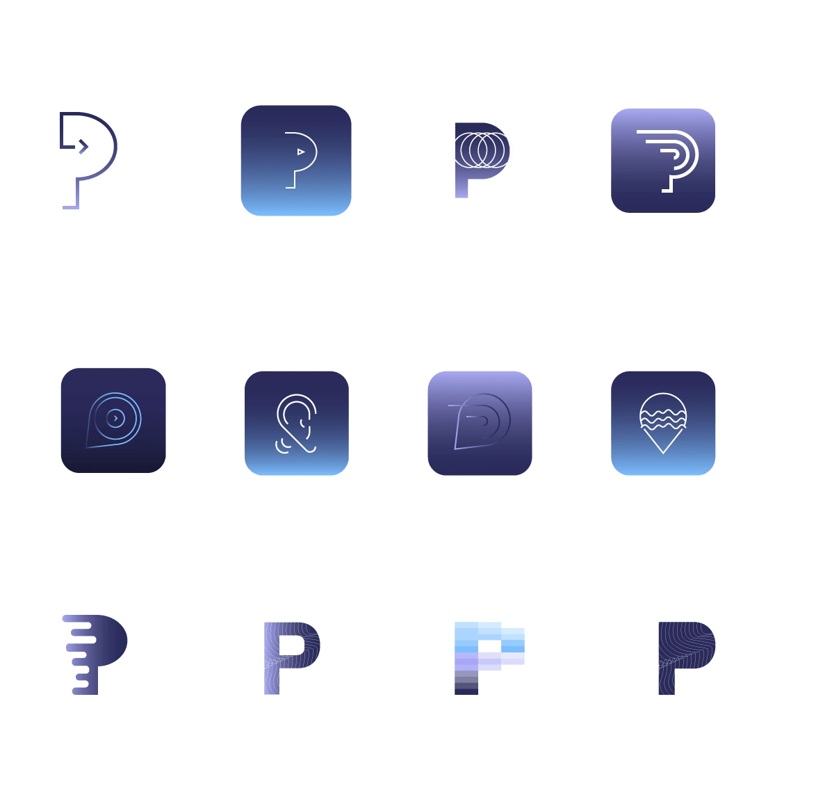
Logo design explorations
I started with as many ideas as possible for the two names, had people vote, and then narrowed down the design direction.
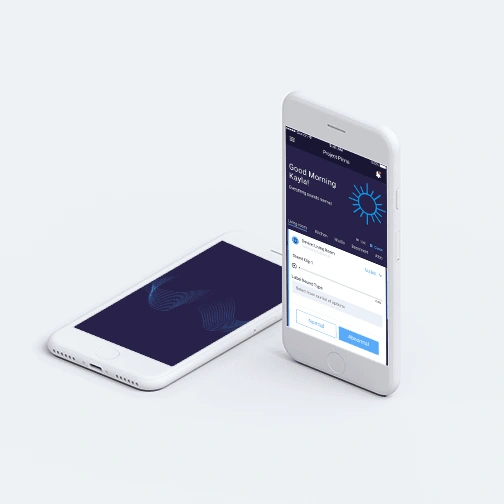
My fellow designers and I then worked on flushing out the high-fidelity flow for the app. We collaborated with the development team to implement the designs in the "listener app". Starting with the Android app, we then built out the IOS implementation as well.
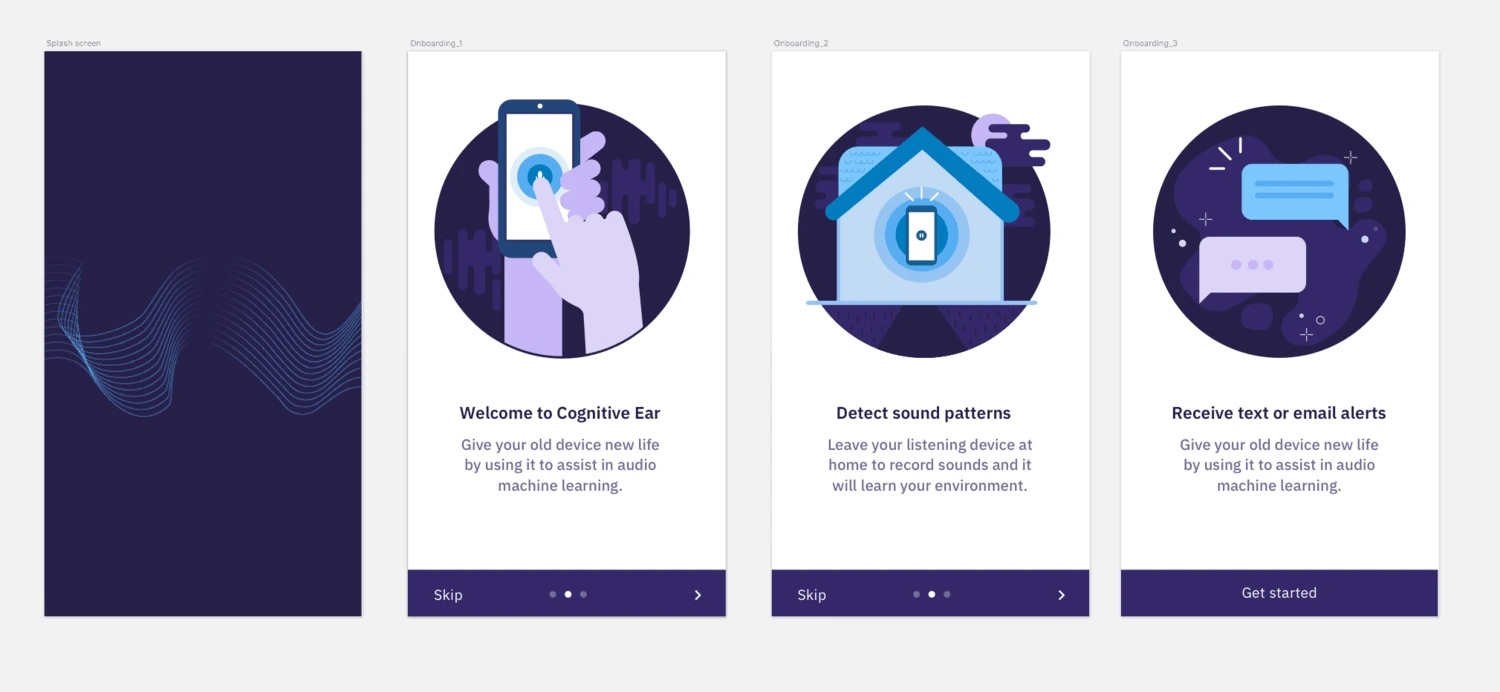
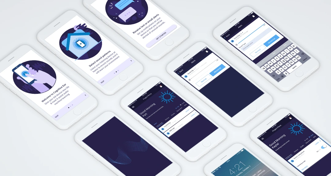
Here are some onboarding screens that I illustrated
Part two : The companion app
While working on the listener app for consumers, there was an outreach from the Interserve and the Royal National Lifeboat Institution. The businesses sought a way to ensure that their preventative maintenance was not wasting resources. They were looking for a cost-effective, non-intrusive plant monitoring system that could detect potential maintenance issues and alert the facility management team. Since the research team was already working on the sound collection piece, this was another good use for the app.
Around the same time, I was asked to submit this project for a developer new hire project and I thought this business case would be a great starting point. I submitted our product for the project and luckily it was accepted. For the project, I was given a team of six new hire developers. We had six months and my goal was to build a React Native mobile app that would solve the business user needs.
The "Hills"/user statements
I created 3 "Hills" aka user statements to help guide the project and put everything in a user-centered lens. Once our hills were formed, we got to work on the prototype. The main goals were to allow users the ability to listen to and mark the abnormal sounds that the system captures as well as a way to categorize the sounds.
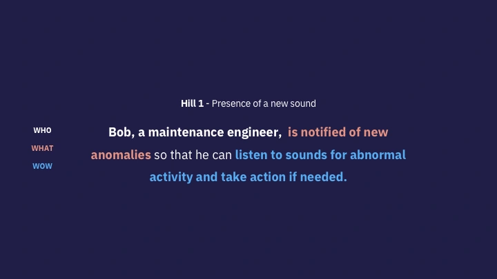
Example user statement
I worked directly with the developers and researchers to create a strategy for implementation. We used the established look and feel that we created for the listener app.
After all the hard work there was a final playback with the teams, coaches, and sponsored users. There were judges present who critiqued our work based on prototype quality and the use of design thinking. Our team was fortunate enough to win the Judge’s Choice award! It was a great reward after all of the hard work the researchers, designers, and engineers put in on this project.
Like this project
Posted Feb 8, 2024
An end-to-end app design project with IBM that involved user research, design strategy, branding, illustration, and ux design.
Likes
0
Views
21
Clients
IBM iX
