Designing a Tactile Brand Story

Deep Baroi


Overview
A visual presentation project built to tell a tactile brand story through considered composition, typography, and imagery.
The approach
The work began by defining a visual rhythm that could carry the story from slide to slide. Soft tonal contrasts, spacious layouts, and carefully placed imagery create a sense of texture while keeping the presentation easy to follow.
Material and mood
The visual language draws on tactile references and editorial restraint. Layered surfaces, close-up details, and a muted palette give the presentation a physical quality, while clean typography keeps the information grounded and legible.
Design focus
The presentation brings the visual direction together in a clear, cohesive format, balancing material-led details with a refined editorial approach. Each slide was designed to support the larger narrative, with hierarchy and pacing guiding attention through the content.
Building the visual system
A consistent system for type, image scale, spacing, and composition helps each slide feel connected without becoming repetitive. The result is a flexible presentation direction that can hold both big-picture ideas and close visual moments.
What I brought to the project
Presentation structure and visual hierarchy
Art direction for imagery, typography, and composition
A consistent slide system built for clarity and cohesion
Final presentation design across PowerPoint, Figma, and Canva
Selected slides

Presentation slide 1
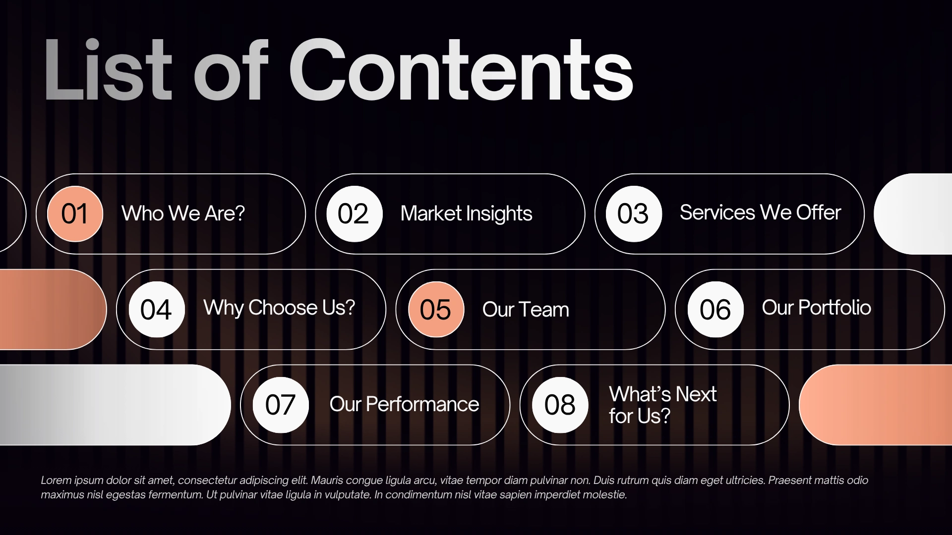
Presentation slide 2
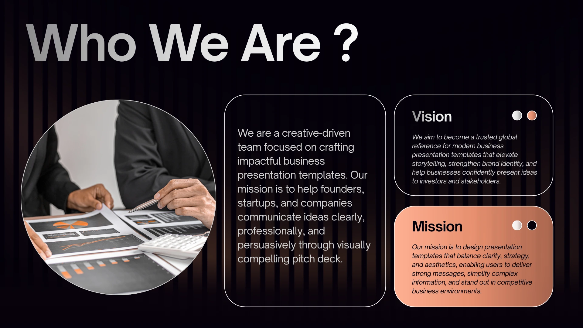
Presentation slide 3

Presentation slide 4

Presentation slide 5

Presentation slide 6

Presentation slide 7
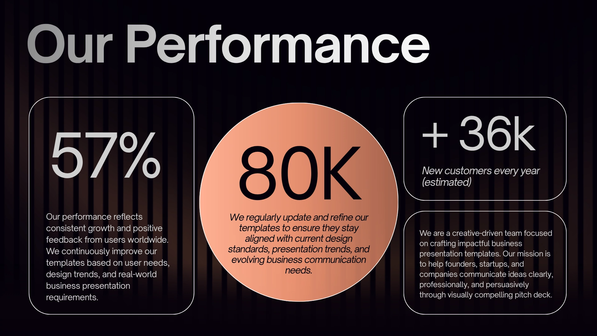
Presentation slide 8

Presentation slide 9
Like this project
Posted Aug 7, 2026
A material-led presentation that turns a brand story into an immersive visual rhythm, blending editorial restraint, warm texture, and clear narrative flow.
Likes
2
Views
6